The Tale of The Princess Kaguya isn’t just an animated movie; it’s a moving painting that breathes. In a world of hyper-polished, computer-generated 3D, Studio Ghibli did something radical in 2013. They gave us something that feels unfinished in the best way possible an ethereal, “living” sketch. For me, Kaguya is an endless wellspring of insight. It forces us to look past the technical specs of a camera body or a lens and appreciate how the core principles of cinematography intent, focus, and emotional translation apply to the medium of hand-drawn art. It’s an experience of raw childhood wonder and profound melancholy, all communicated through a visual vocabulary that is, quite frankly, astounding.
About the Visionary Behind the Cinematography
In traditional live-action, we look to the DP for the “look.” In animation, that role is absorbed by a collective, but the soul of it comes from the director. For Kaguya, that visionary was Isao Takahata. Interestingly, Takahata wasn’t an animator himself. I think that’s actually why the film looks the way it does. He functioned like a master cinematographer who happened to be using brushes instead of lights.
He spent eight years bringing this ancient folk tale to life. He wasn’t just “rendering” characters; he was designing an entire world’s internal logic. Takahata’s direction dictates not just what we see, but the texture of the feeling the frantic energy of a charcoal line or the soft bleed of a watercolor palette. He moved away from the highly detailed “traditional” Ghibli look we associate with Miyazaki and created something entirely his own. He wasn’t operating a physical camera, but he was undeniably choreographing the eye of the audience.
Inspiration Behind the Cinematography
The look of Kaguya is an unapologetic embrace of sumi-e ink wash painting and ukiyo-e woodblock prints. This isn’t realism it’s pure impressionism. The visual language is built on charcoal strokes and delicate washes, giving the film the quality of a Japanese painting come to life.
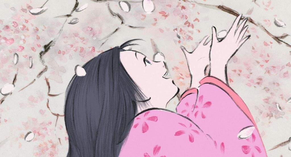
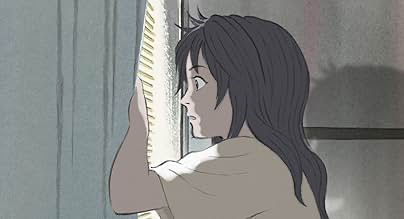
As a colorist, I love that this choice isn’t just “for show”; it’s the narrative’s heartbeat. Kaguya’s rustic, idyllic childhood is rendered with earthy lines and naturalistic colors that feel like you can almost smell the mud and bamboo. It’s a visual shorthand for authenticity. But then, look at the “meltdown” scene. When Kaguya bursts out of her house in a fit of rage, the animation breaks. The lines become frantic, the colors smear, and the art itself reflects her despair. It’s an incredibly effective cinematic choice that expresses internal character emotion in a way that live-action often struggles to achieve, even with heavy VFX.
Camera Movements

Analyzing “camera movements” in a medium where no physical camera exists is fascinating. In Kaguya, the simulated camera work is deeply expressive. During the countryside scenes, the “lens” feels observational and expansive like a wide-angle lens on a steady crane, surveying the rolling hills. It gives the viewer a sense of freedom.
However, when The Tale of The Princess Kaguya needs to hit you emotionally, the movement becomes kinetic. In that iconic flight from the city, the “camera” doesn’t just track her; it becomes her frenzy. The perspective shifts disorientingly, the background streaks past in a flurry of strokes, and it suddenly feels like a handheld camera that has lost its footing. This rapid, expressionistic visual movement is one of the most powerful sequences I’ve ever seen in animation. It’s a bold departure from the composed shots of the palace, using implied camera velocity to amplify her internal turmoil.
Compositional Choices

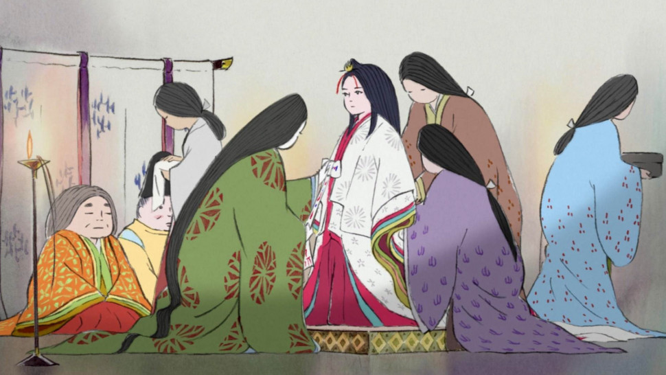
The compositions in The Tale of The Princess Kaguya are a masterclass in negative space. Takahata often uses wide shots for moments of joy, making Kaguya a small figure against a vast, open landscape. It emphasizes her connection to nature. As she’s dragged to the city, the compositions subtly shift. The frames get tighter. The open horizons are replaced by the vertical lines of palace architecture and restrictive screens.
She’s frequently framed behind partitions or in doorways, visually signaling her confinement. Even with the minimalist watercolor aesthetic, the depth cues are managed with surgical precision. In the city, the depth feels shallower, creating a sense of claustrophobia that I find deeply effective. It’s a reminder that you don’t need 8K resolution to create a sense of three-dimensional space; you just need the right lines in the right places.
Lighting Style
In The Tale of The Princess Kaguya, “lighting” is really about the deliberate application of color and shadow. You won’t find harsh, sharply defined shadows here; that would break the watercolor illusion. Instead, the lighting is soft and diffused.
But it’s always motivated. You see sunlight filtering through bamboo groves, creating dapples of light that dance across the characters. The evening scenes are bathed in the warm, muted tones of firelight or moonlight. The transition from the bright, airy yellows of the countryside to the starker blues and grays of the city is a masterstroke in using “light” to reflect a character’s depression. For me, it’s a sensitive approach that ensures the illumination never feels artificial it always serves the emotional truth of the scene.
Lensing and Blocking
Thinking about “lensing” here means considering the implied focal length. Kaguya feels like it’s shot on a varied set of “lenses.” Wide perspectives dominate the rural scenes, placing Kaguya within a welcoming world. But when we get to the city, the implied focal length feels longer it flattens the background and compresses the space around her.
The blocking is just as powerful. In her youth, Kaguya leaps, crawls, and runs with raw freedom. There’s a scene where she learns to crawl by mimicking frogs, and it’s rendered with such simple, beautiful strokes. She inhabits the entire frame. Compare that to her life as a princess, where her blocking becomes rigid and formal. She’s often seated, poised, and static a doll trapped by societal expectations. As a colorist, I find this where the “magic” happens; it’s not about lens distortion, it’s about emotional distortion, visually rendered.
Color Grading Approach
This is the heart of the matter for me. Even though Kaguya is hand-drawn, the final image undergoes a process very much like color grading. It’s about how those watercolor washes are unified and enhanced to create a cohesive cinematic feel.
The greens of the bamboo, the earthy browns of the village, and the vibrant blues of the sky are distinct, yet they harmonize perfectly. This suggests a thoughtful approach to primary and secondary color palettes. The contrast shaping is subtle; the film has a beautiful “highlight roll-off” that reminds me of high-end film stocks, where bright areas gently transition without losing texture. When the contrast does ramp up like during Kaguya’s meltdown it hits harder because of the restraint shown elsewhere. I also sense a distinct print-film sensibility in the final output. The colors have a warmth and a slight desaturation that evokes the texture of a photochemical print. My job as a colorist on a project like this would be to ensure that the individual artists’ frames breathe with a consistent, intentional rhythm.
Technical Aspects & Tools
While we’re talking about brushes and charcoal, the “technical” side of this film is staggering. Every frame was created by hand, from scratch. This was an eight-year commitment to an artisanal process in an age of digital shortcuts.
To me, the “analogue” approach is a bold statement. It means that aspects like frame rates, line consistency, and color application were managed with incredible precision by specialized teams. The fluidity of movement, especially in the more dynamic scenes, speaks to a deep understanding of animation principles. The sheer volume of frames each a unique piece of art is a colossal technical achievement. It’s a reminder that sometimes the most profound “tools” aren’t the latest software updates, but the ones that channel human creativity most directly.
- Also rtead: WALTZ WITH BASHIR (2008) – CINEMATOGRAPHY ANALYSIS
- Also read: UNDERGROUND (1995) – CINEMATOGRAPHY ANALYSIS
Browse Our Cinematography Analysis Glossary
Explore directors, cinematographers, cameras, lenses, lighting styles, genres, and the visual techniques that shape iconic films.
Explore Glossary →