When I first saw Pink Floyd: The Wall, it hit me like a ton of bricks (pun absolutely intended). Why does one frame feel “fine” while another feels like a punch to the gut?
Directed by Alan Parker and written by Roger Waters, this 1982 behemoth is a study in psychological immersion. It’s a strange beast not quite a musical, though the music drives every second of the narrative. It’s a drama that veers sharply into psychological horror. We’re thrust into the mind of Pink, a burnt-out rock star played by Bob Geldof, who is grappling with alienation, addiction, and a cascade of nightmares. The cinematography isn’t just observing his descent; it’s our guide through the madness.
About the Cinematographer

The man behind the lens for this disturbing vision was Peter Biziou. While Alan Parker is often (unfairly) overlooked despite gems like Midnight Express and Mississippi Burning, his collaboration with Biziou was a powerhouse partnership.
Biziou’s career is wild in its versatility. He shot everything from the comedy of Life of Brian to the sterile, manufactured world of The Truman Show. That range is exactly why he was perfect for The Wall. He wasn’t just “capturing scenes”; he was manifesting a fractured psyche. His work here is so tightly woven into the emotional core of the film that you can’t imagine these songs looking like anything else.
Inspiration Behind the Cinematography
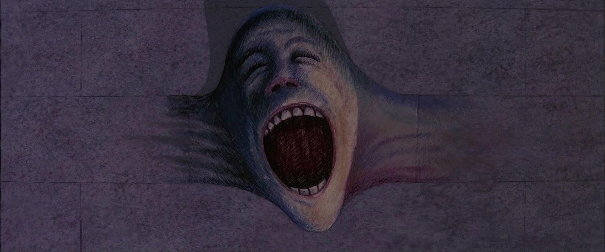
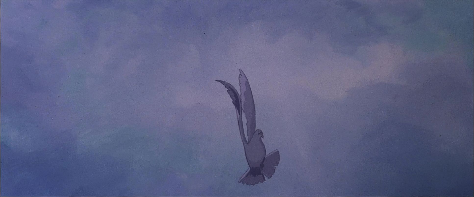
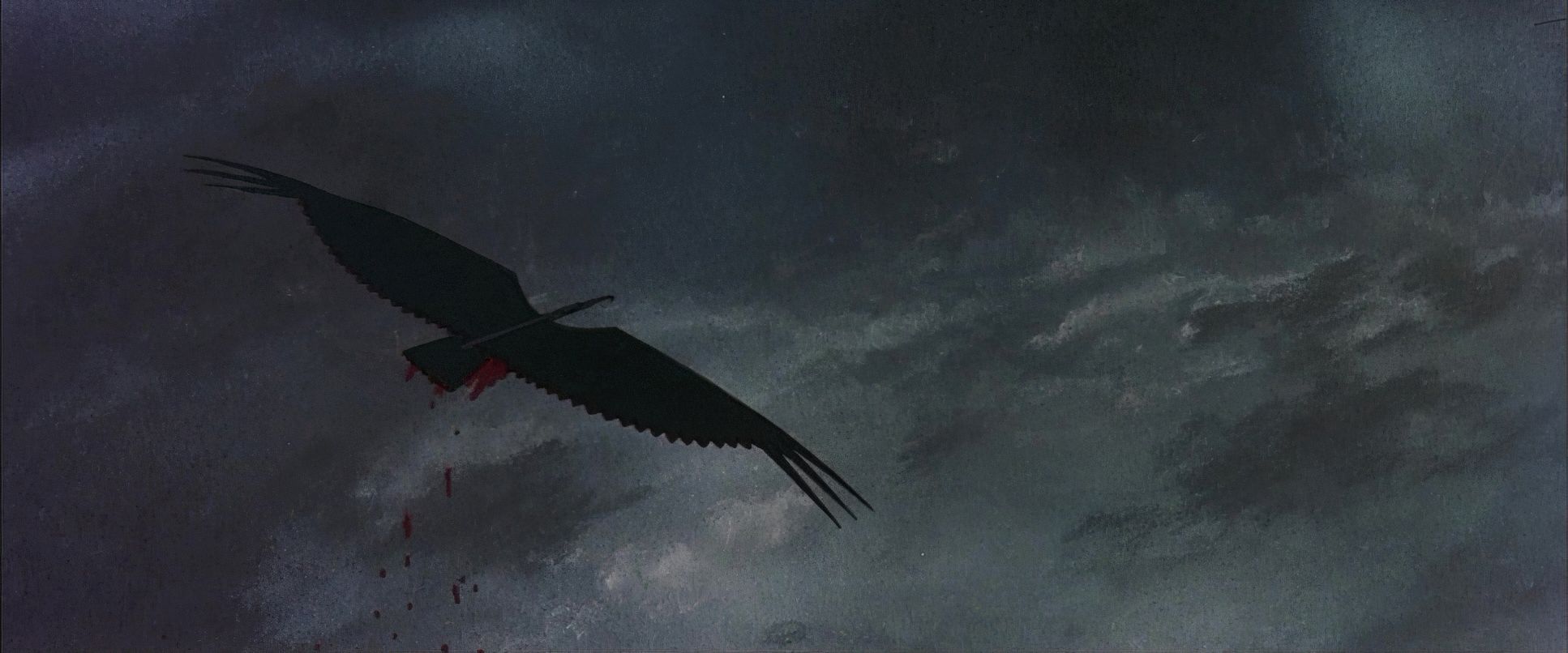
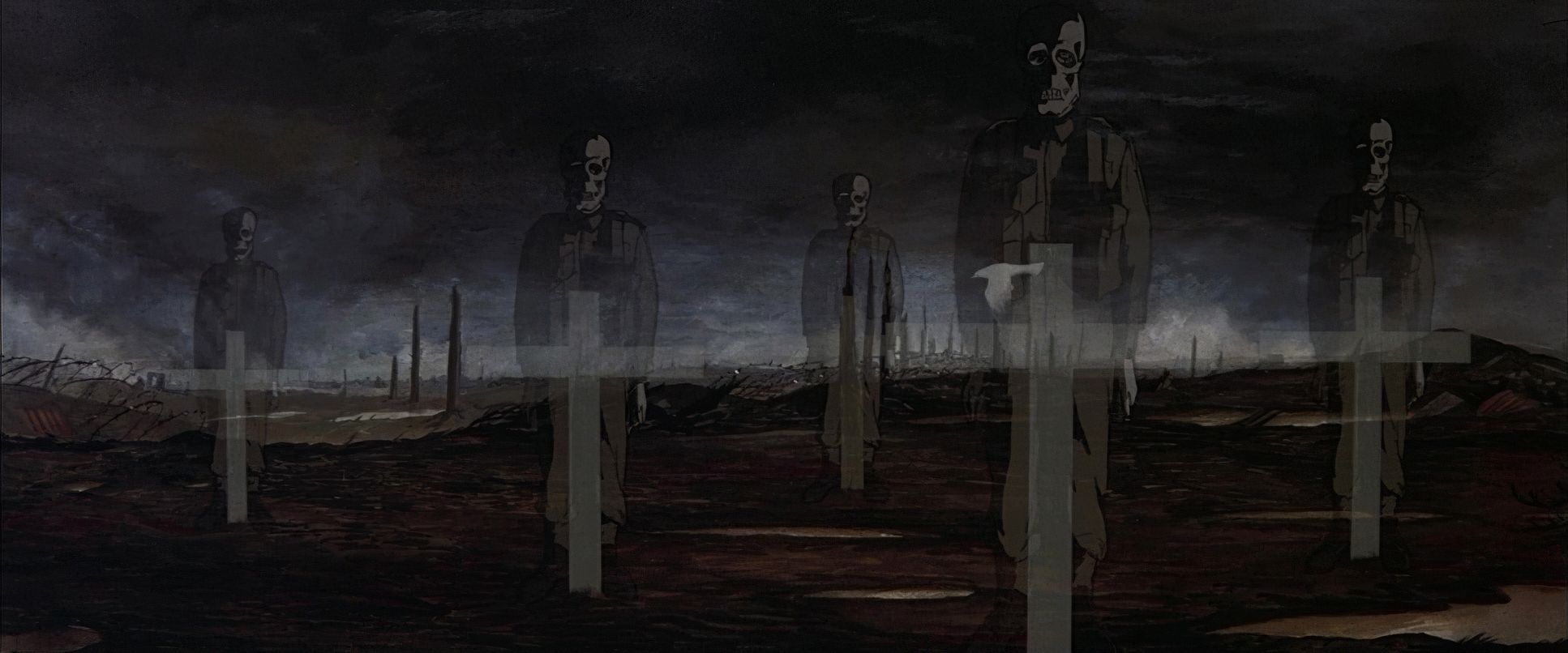
The primary DNA of the film comes from Roger Waters’ own life and the legendary artwork of Gerald Scarfe. Waters’ themes the crushing weight of fame, the “overbearing mother,” and the absence of a father provided a dark, heavy tapestry for Biziou to work with.
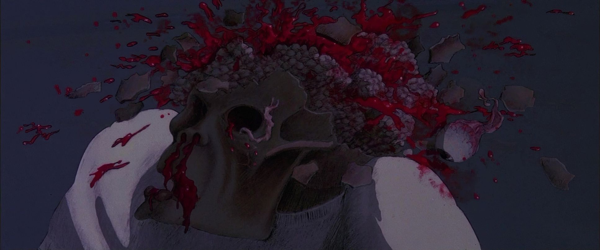
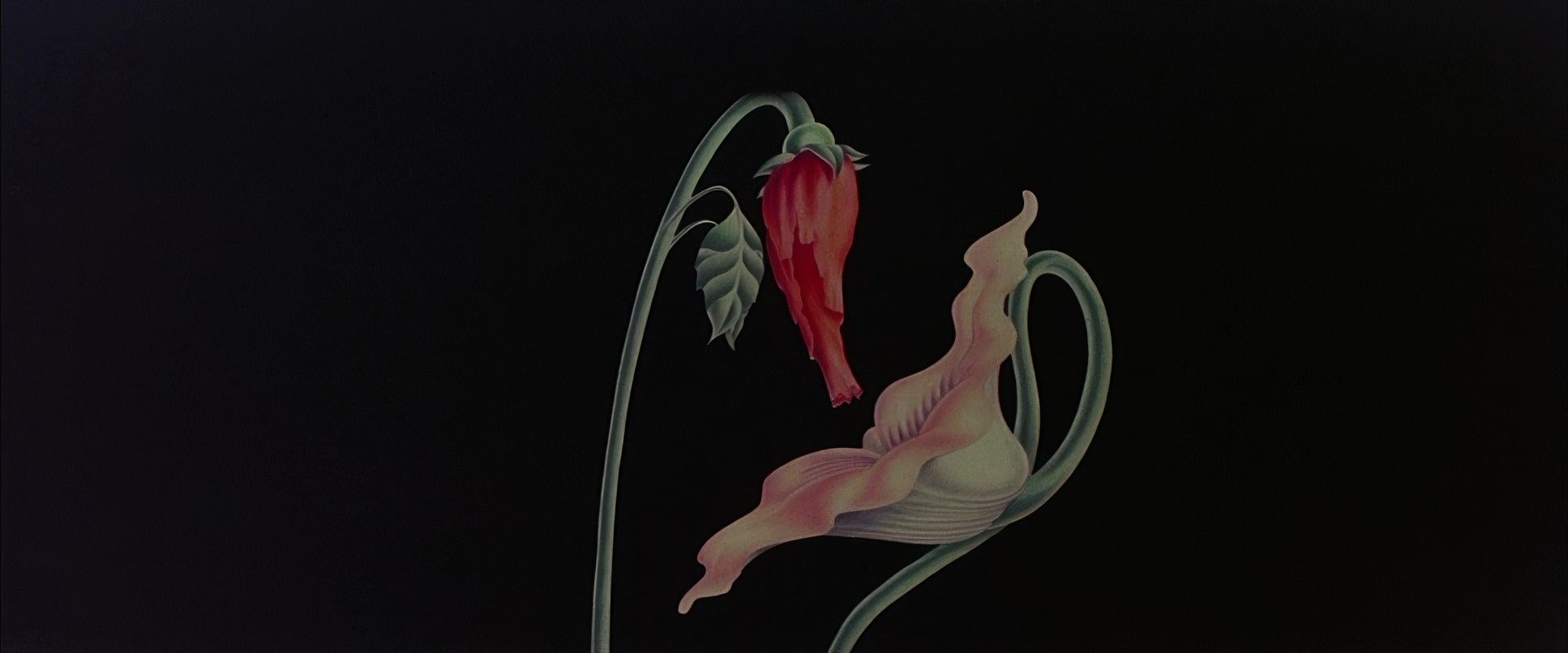
Scarfe’s grotesque animation isn’t just a side-show; it’s the aesthetic blueprint. If you’ve seen it, you know it’s some of the creepiest hand-drawn art ever put to film. Biziou’s challenge was to create a live-action world that could transition into these fever dreams without feeling jarring. The cinematography had to be grounded enough to feel real, yet pliable enough to bend into the surreal. It’s a constant dance between the perceived and the imagined, and it’s gloriously unsettling.
Lighting Style
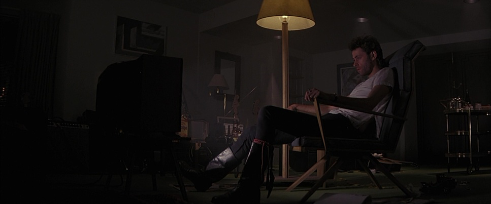
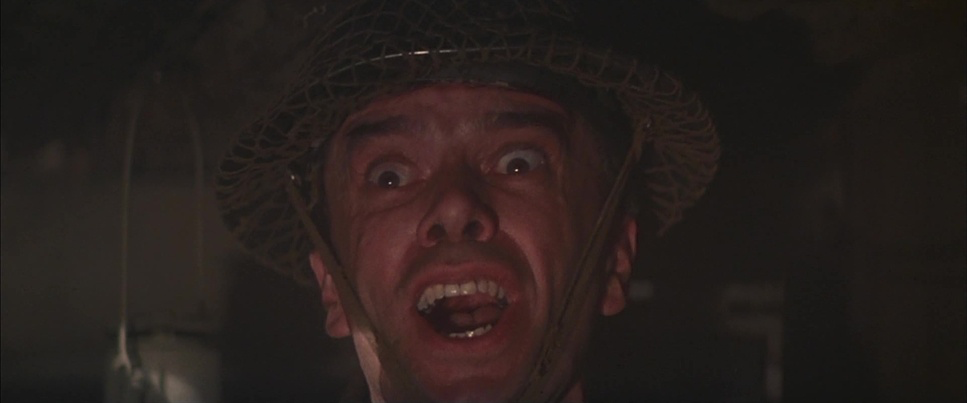
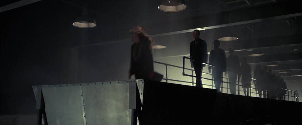
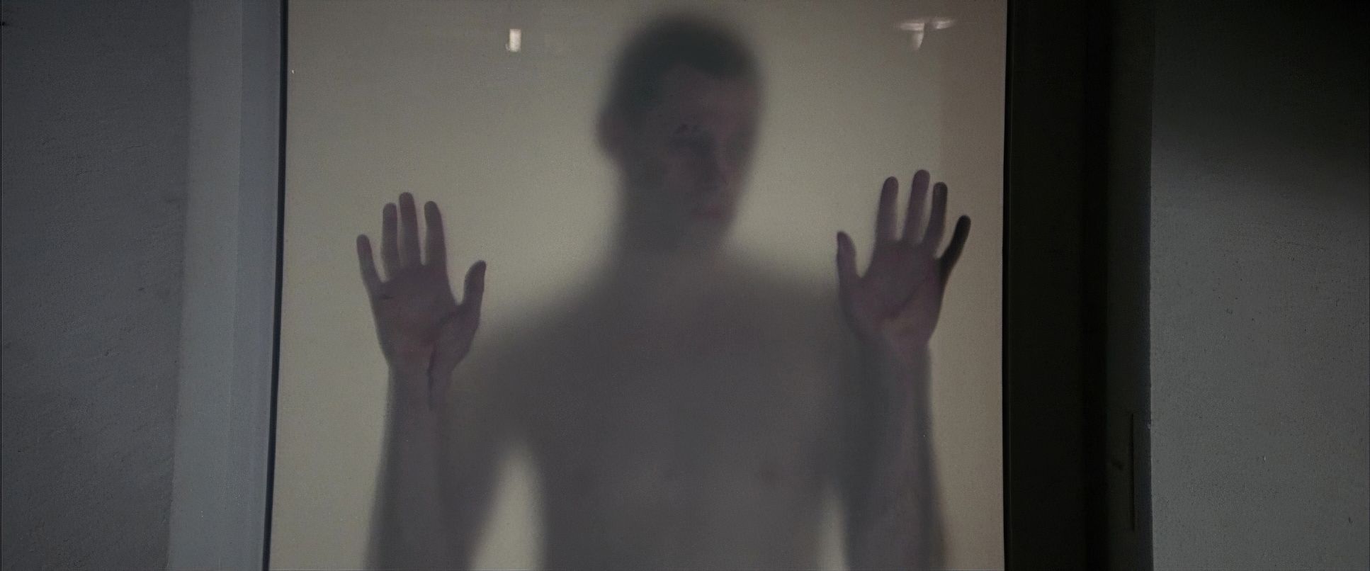
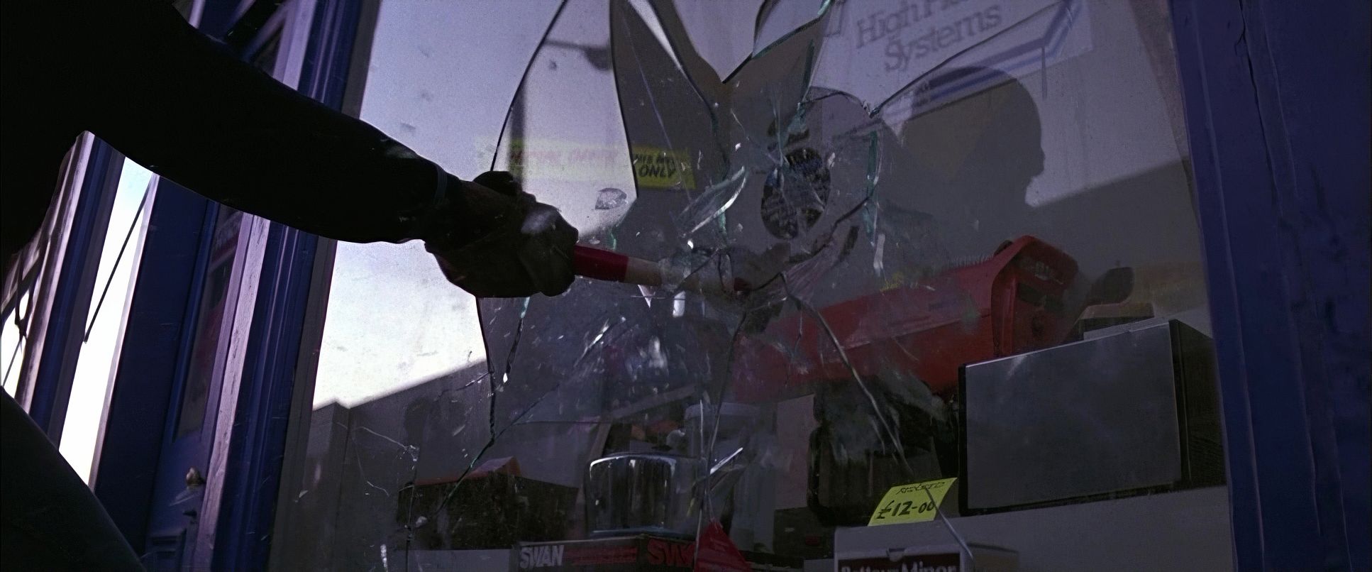
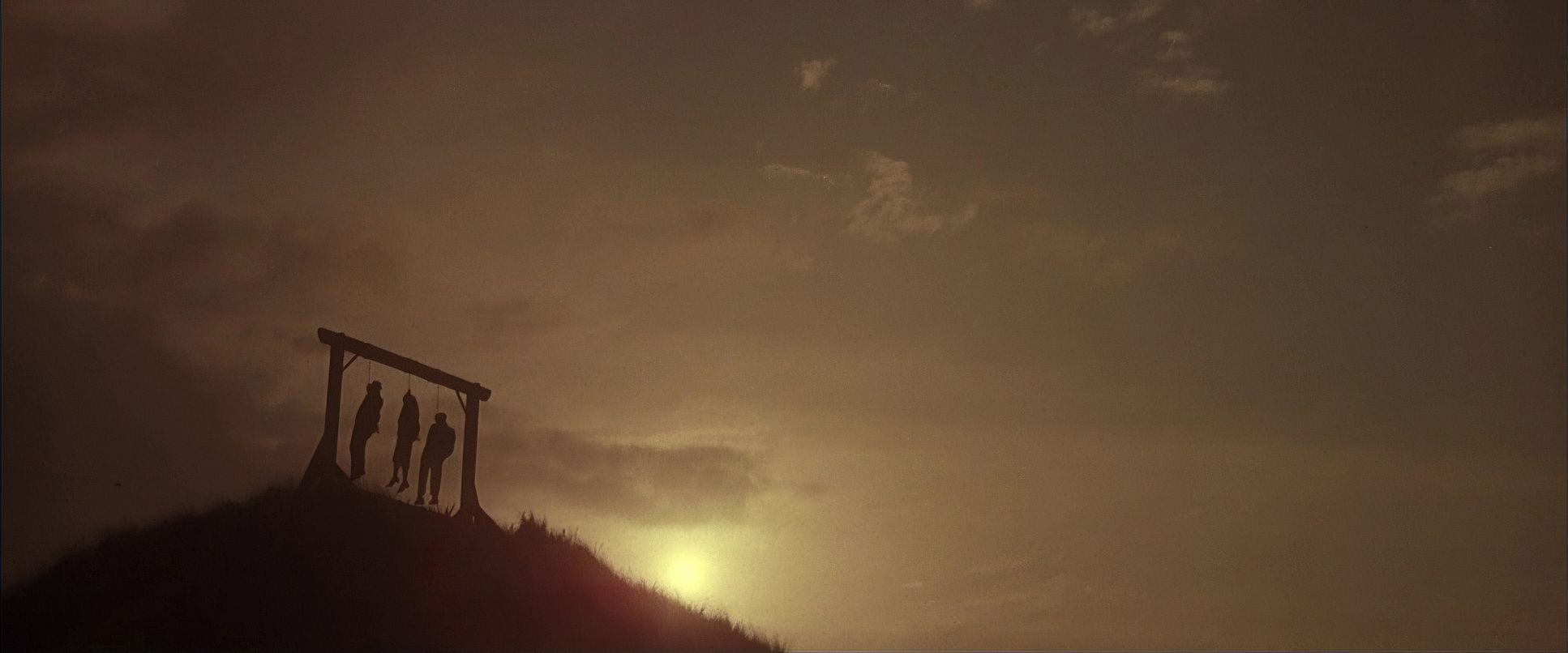
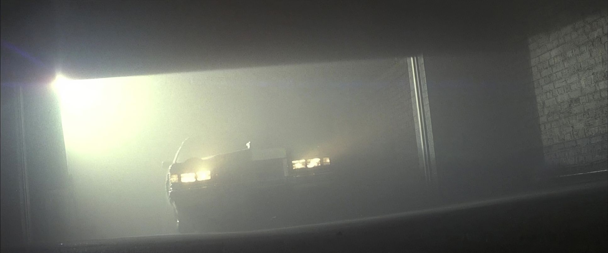
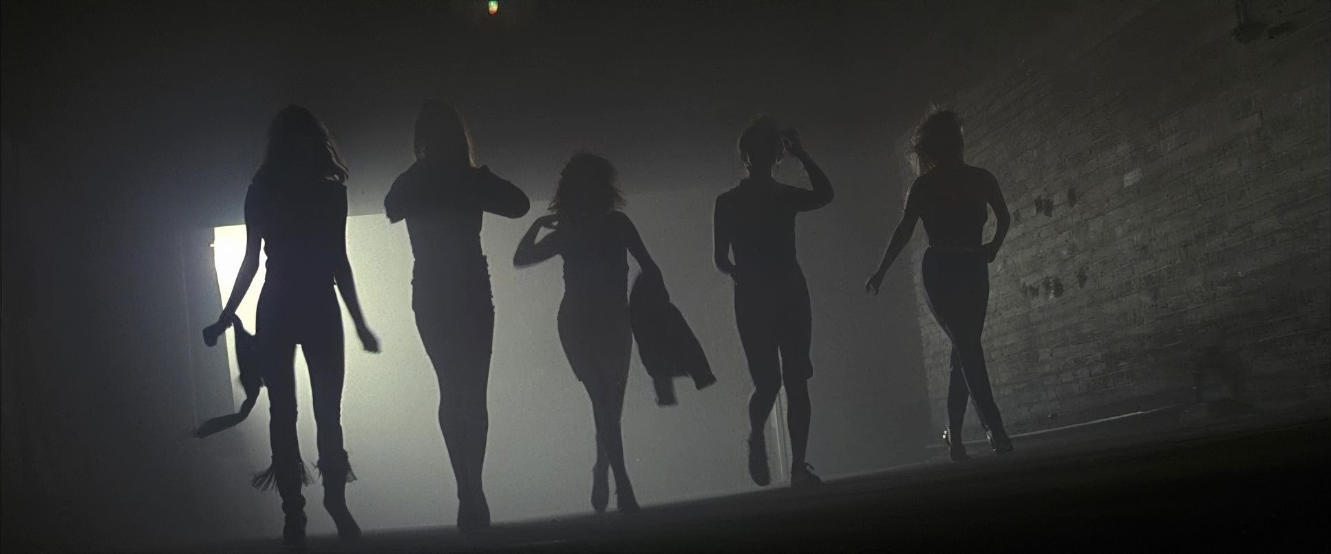
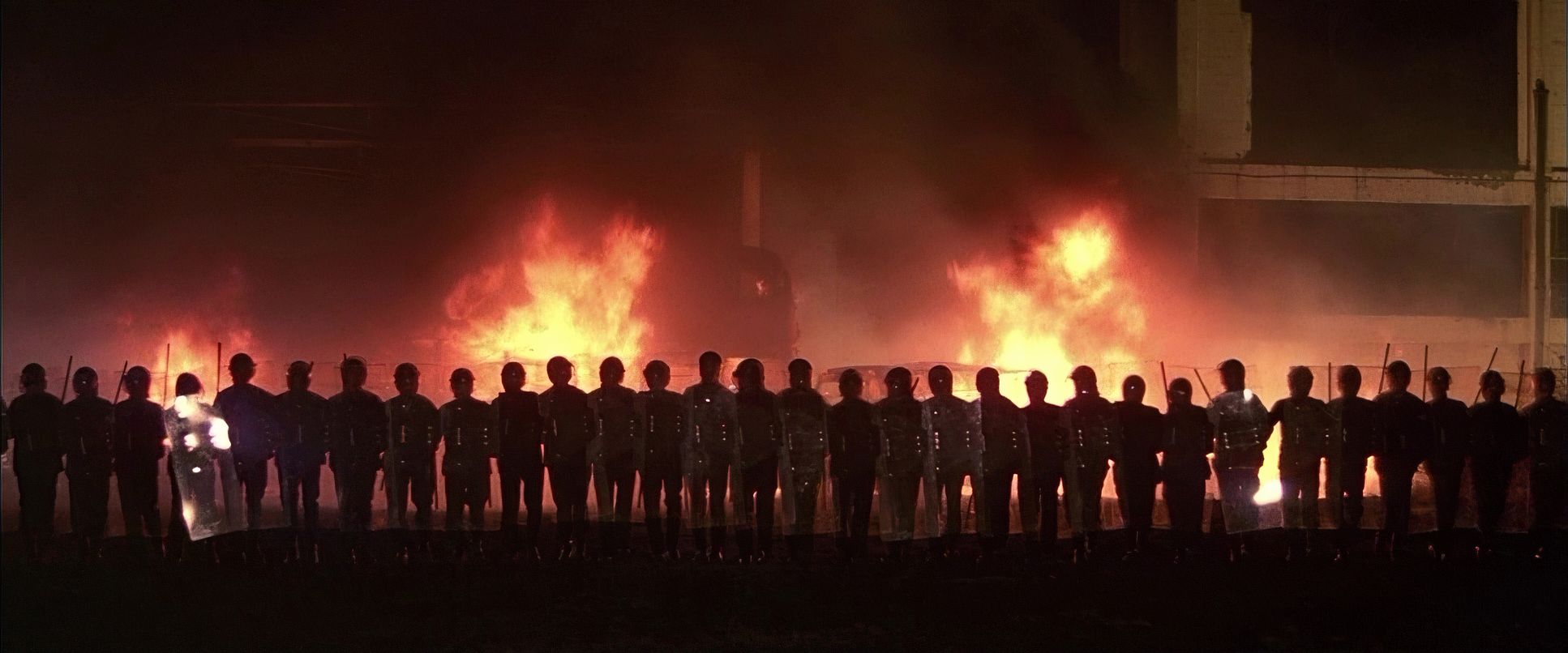
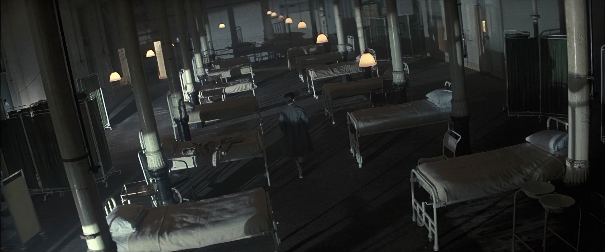
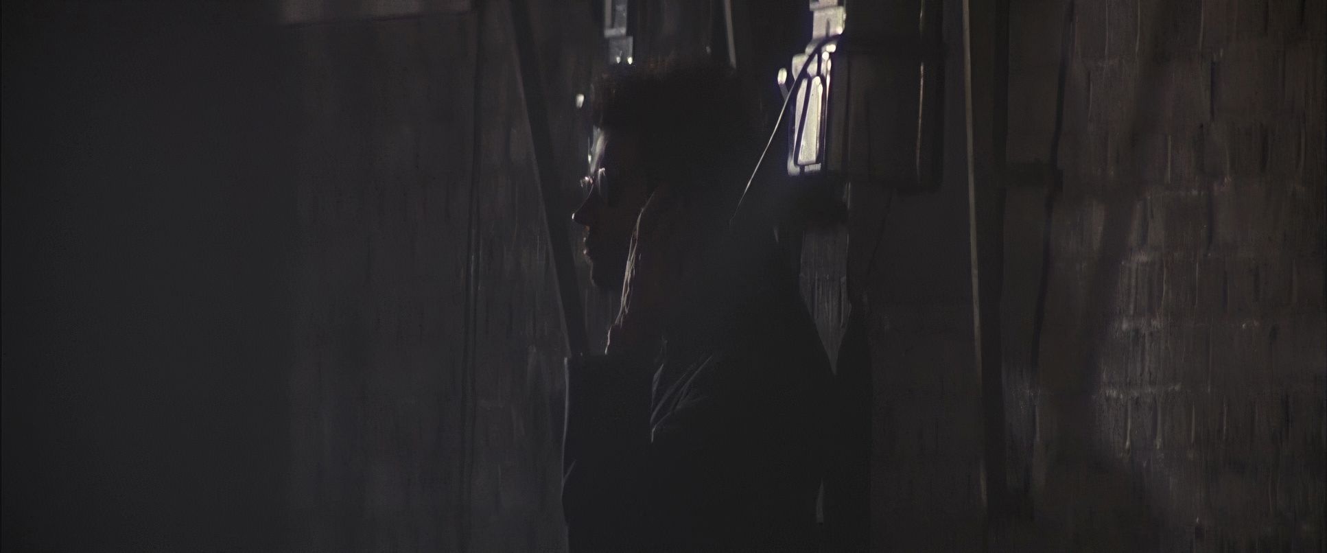
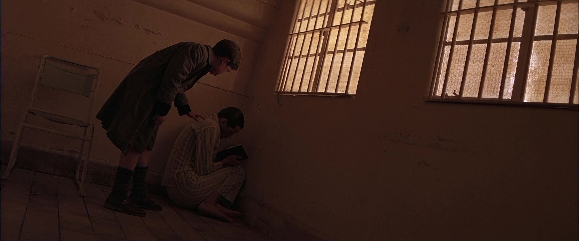
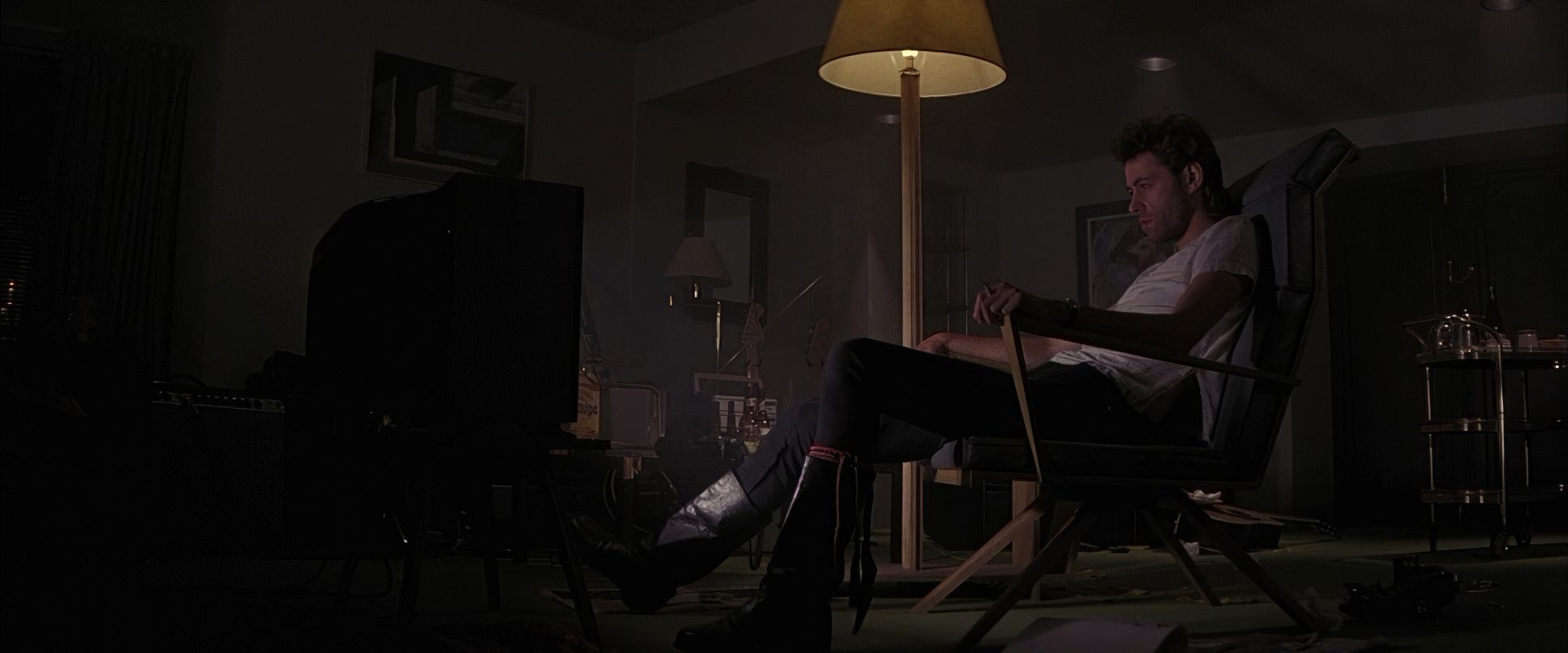
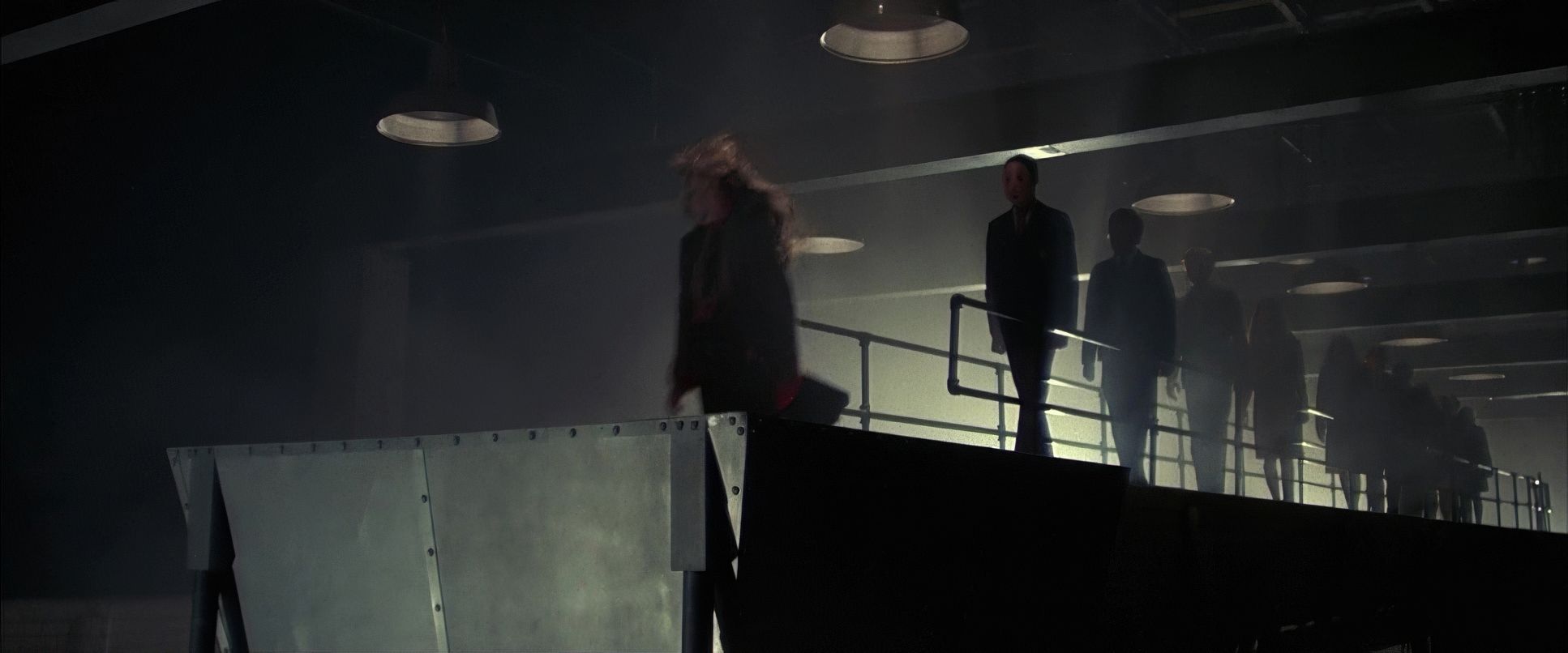
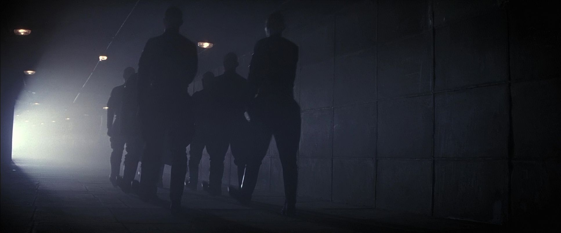
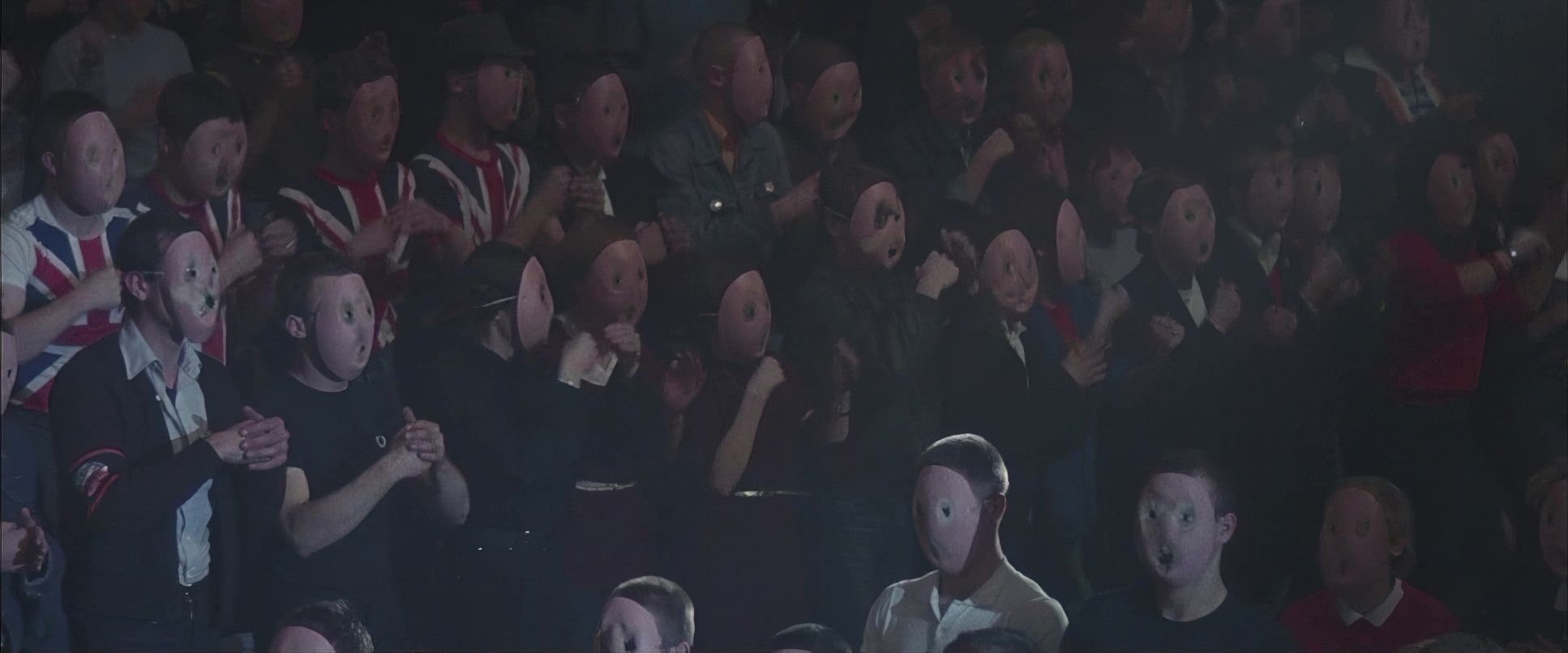
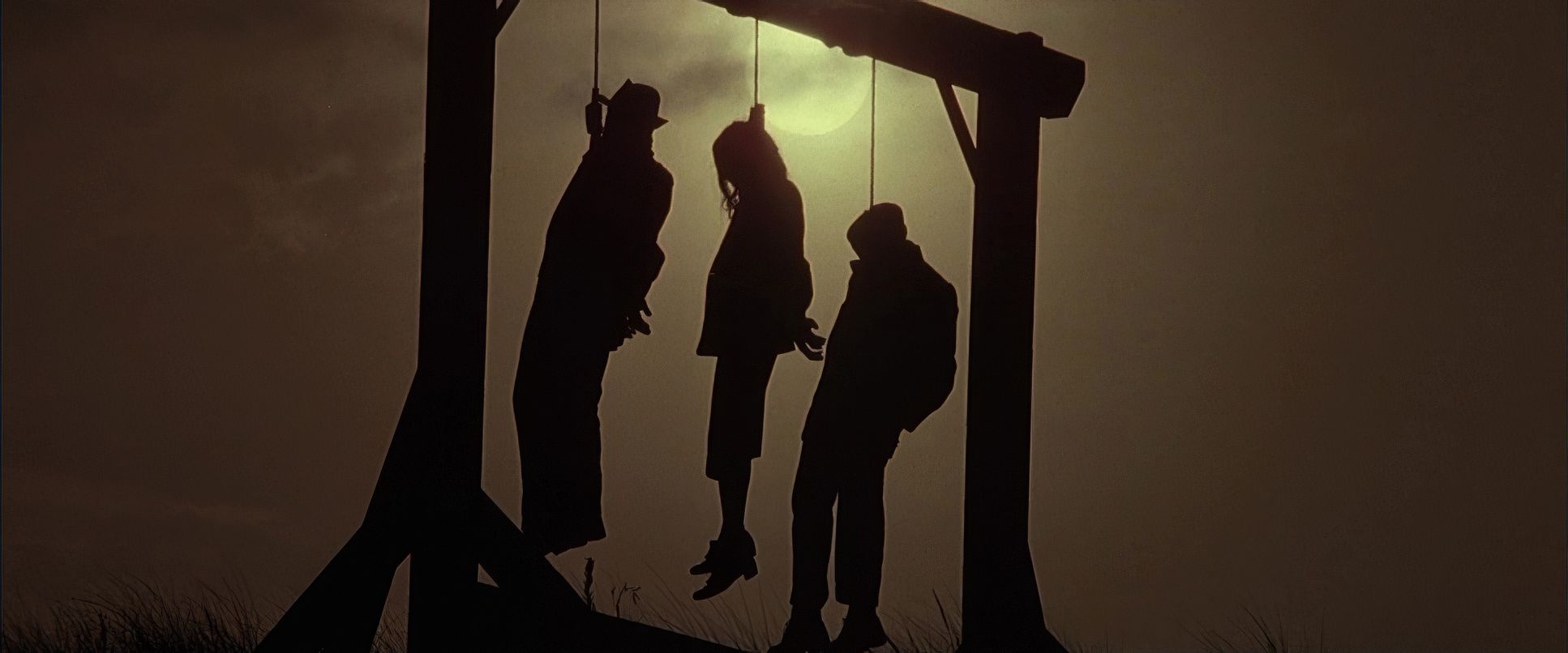
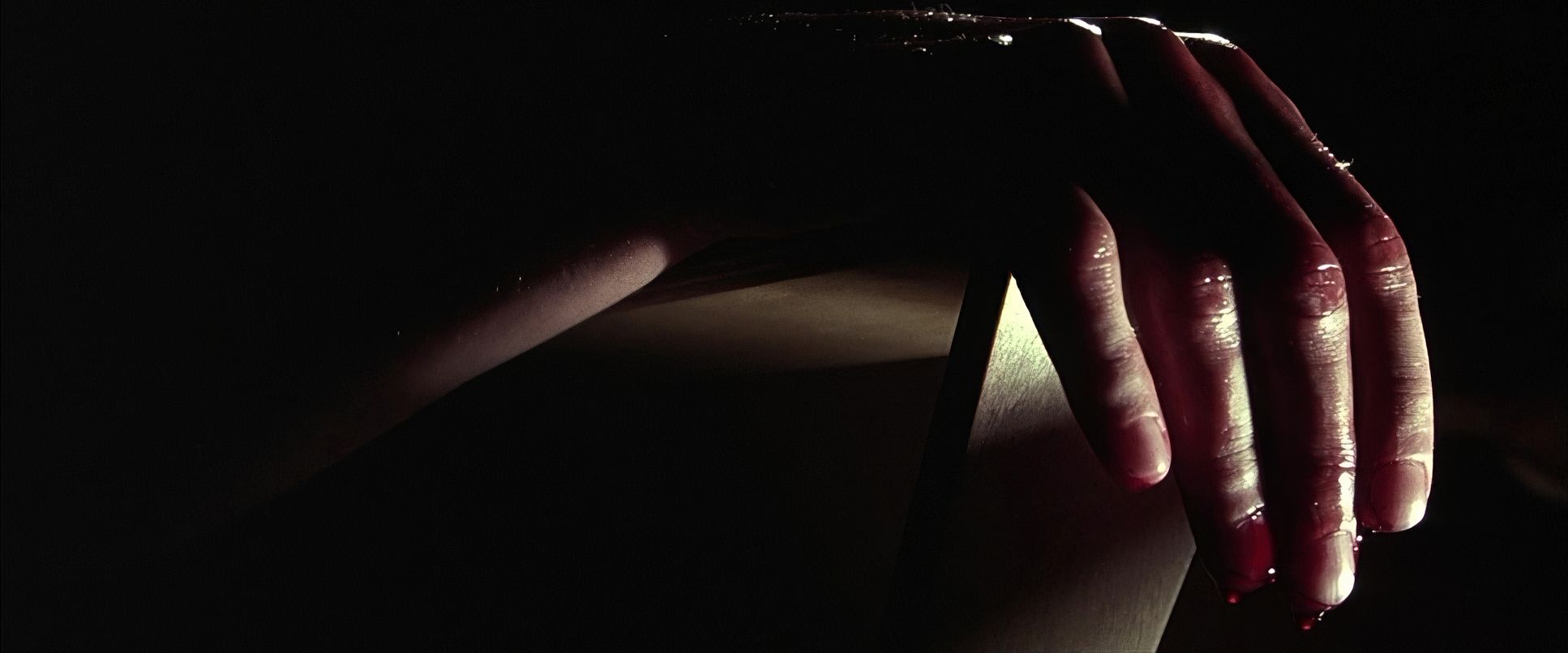
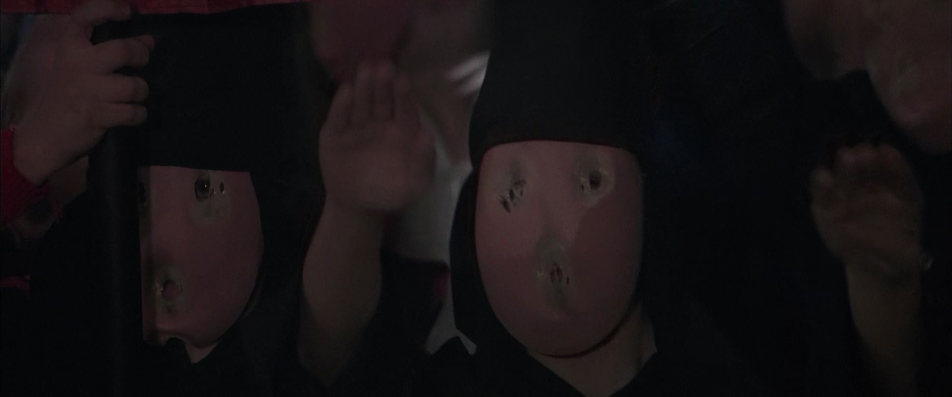
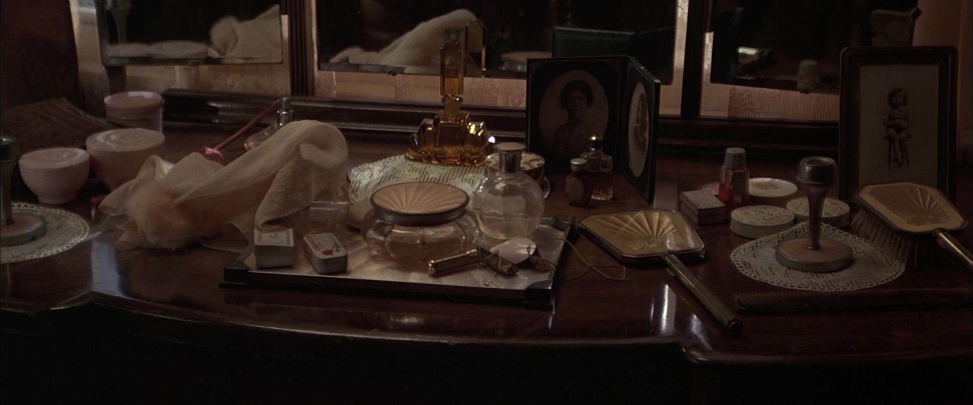
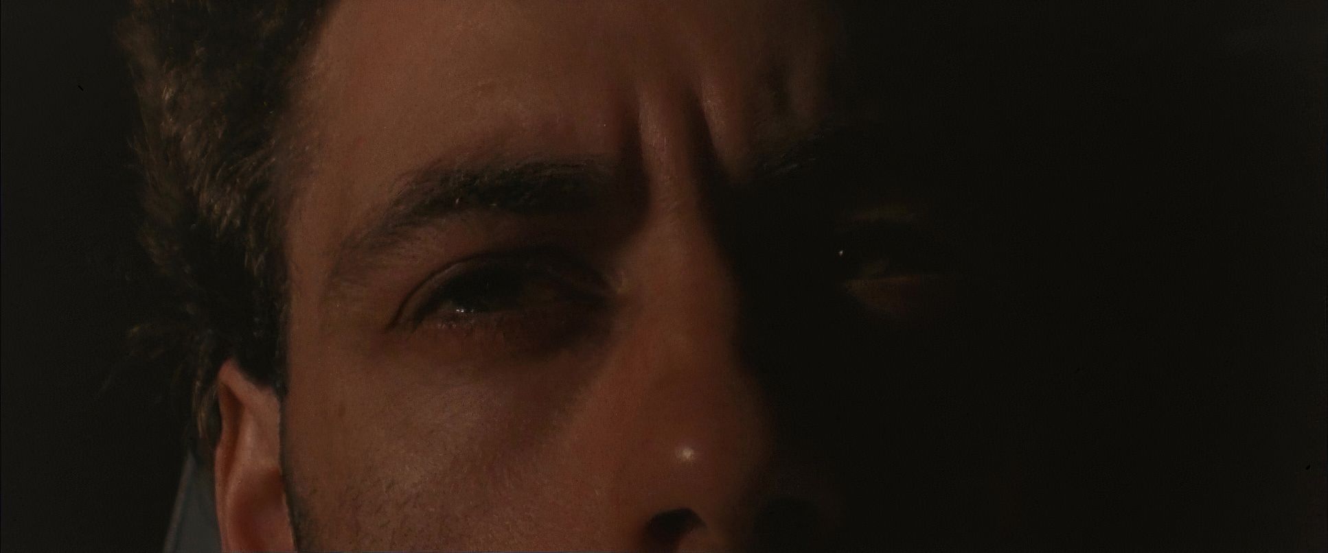
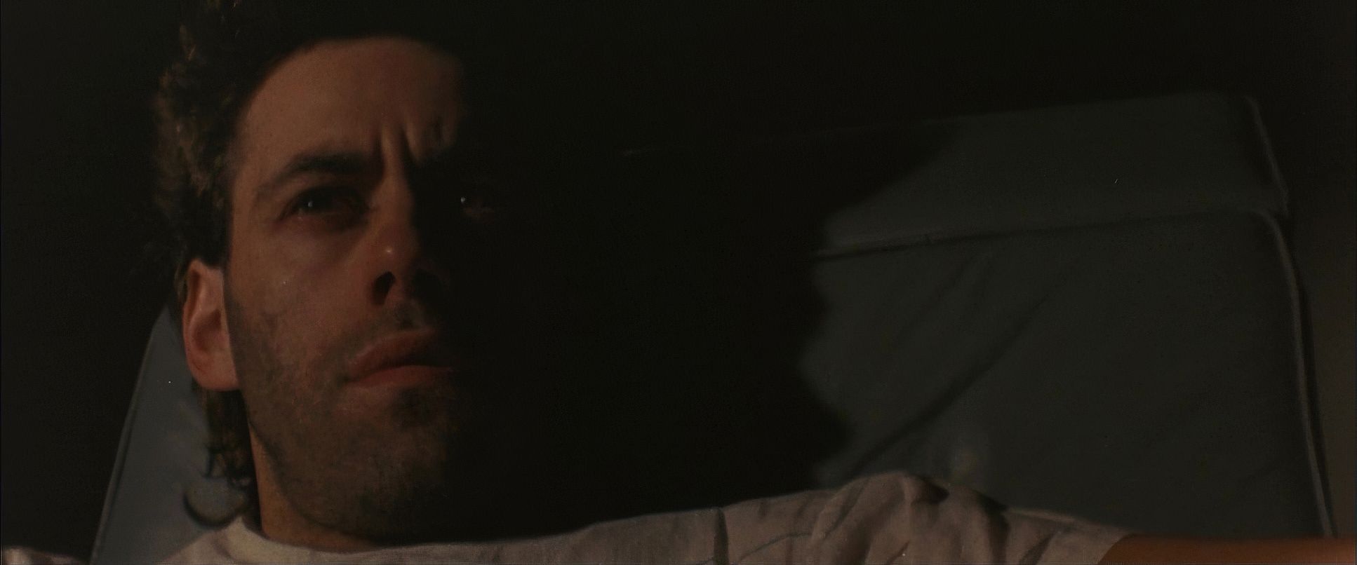
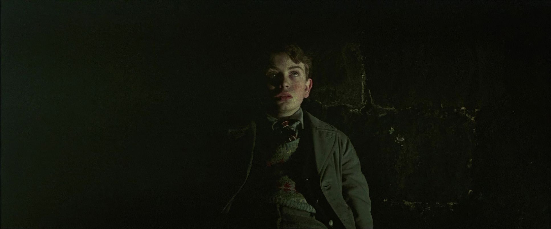
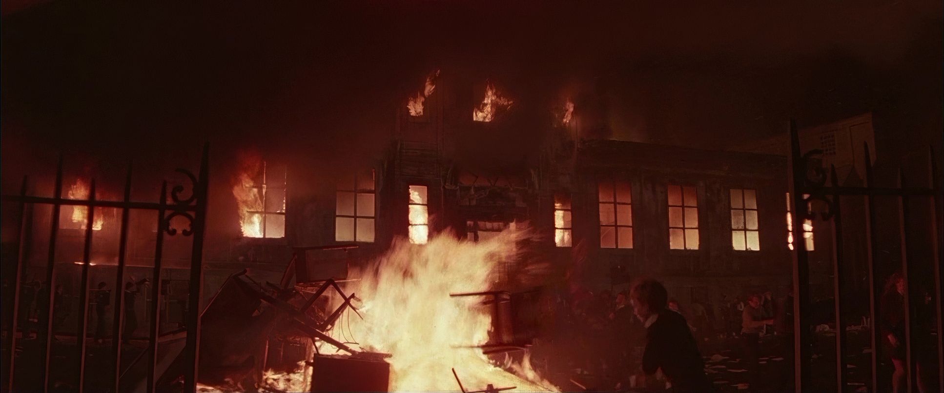
The lighting in The Wall is anything but subtle. It’s expressionistic, harsh, and totally motivated by Pink’s mental state. Biziou uses a high-contrast style that carves characters out of the darkness. In this film, shadows aren’t just an absence of light they feel like a physical weight.
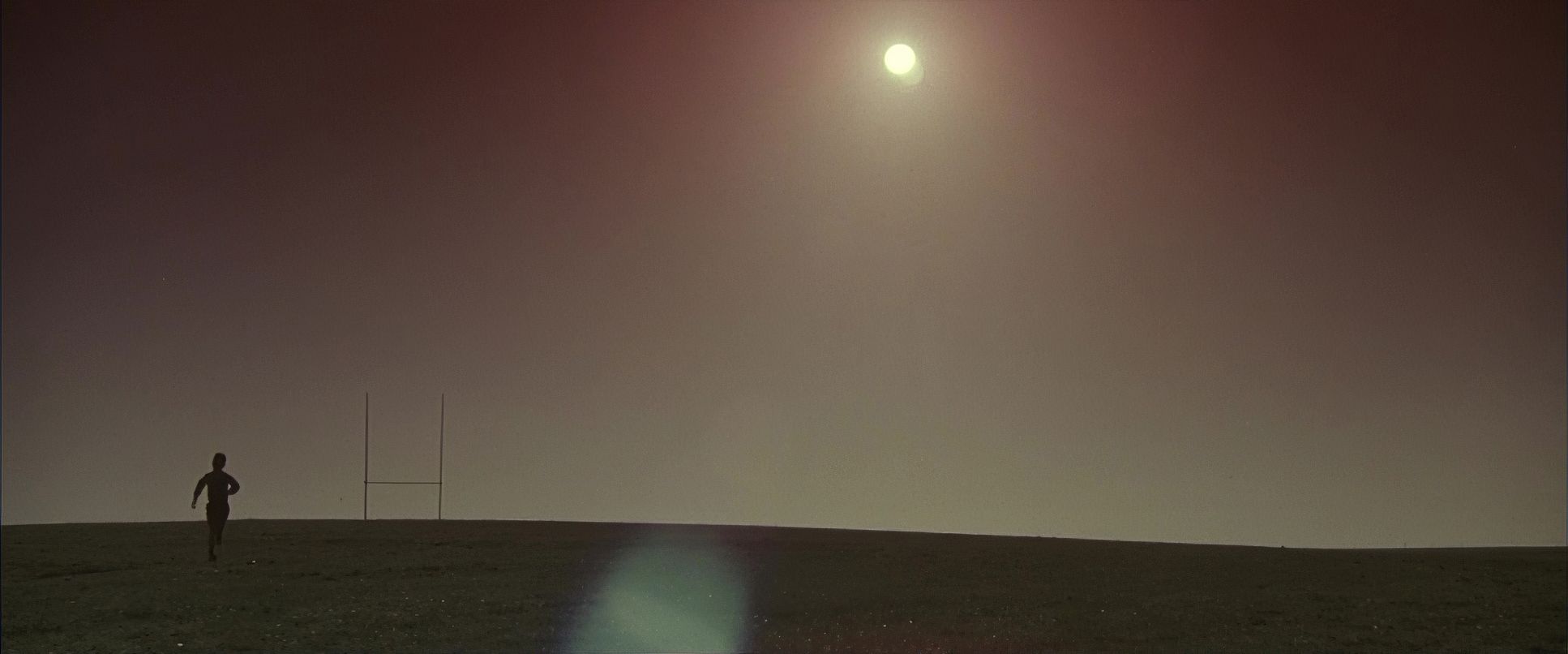
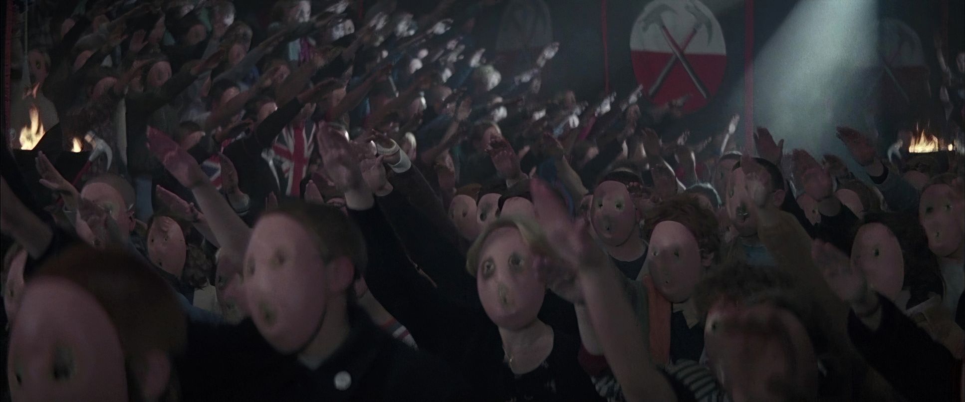
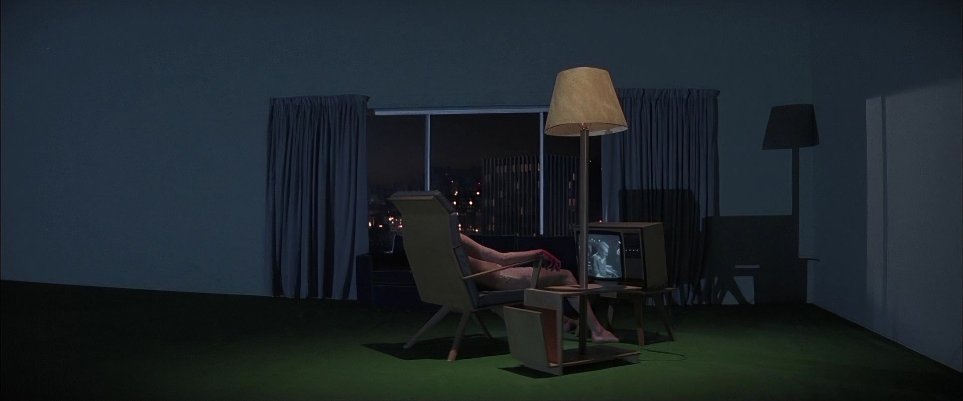
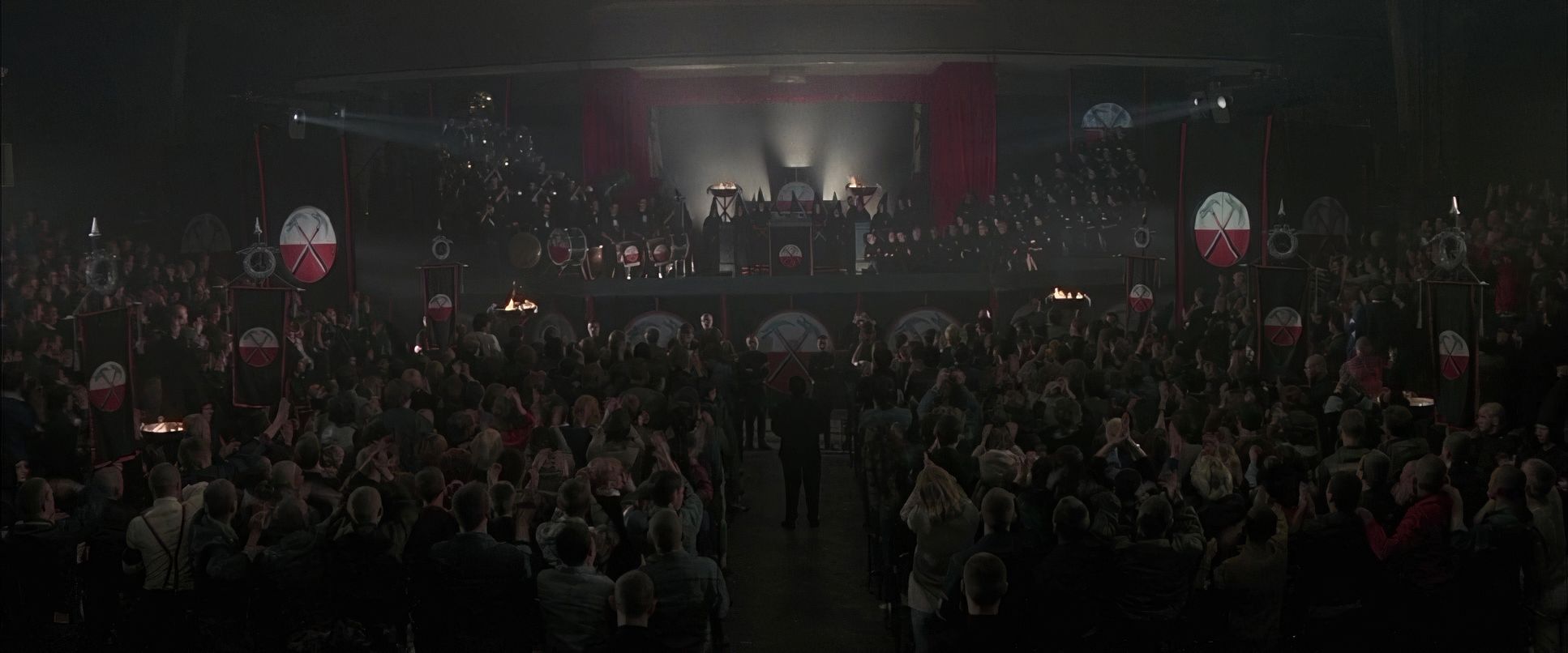
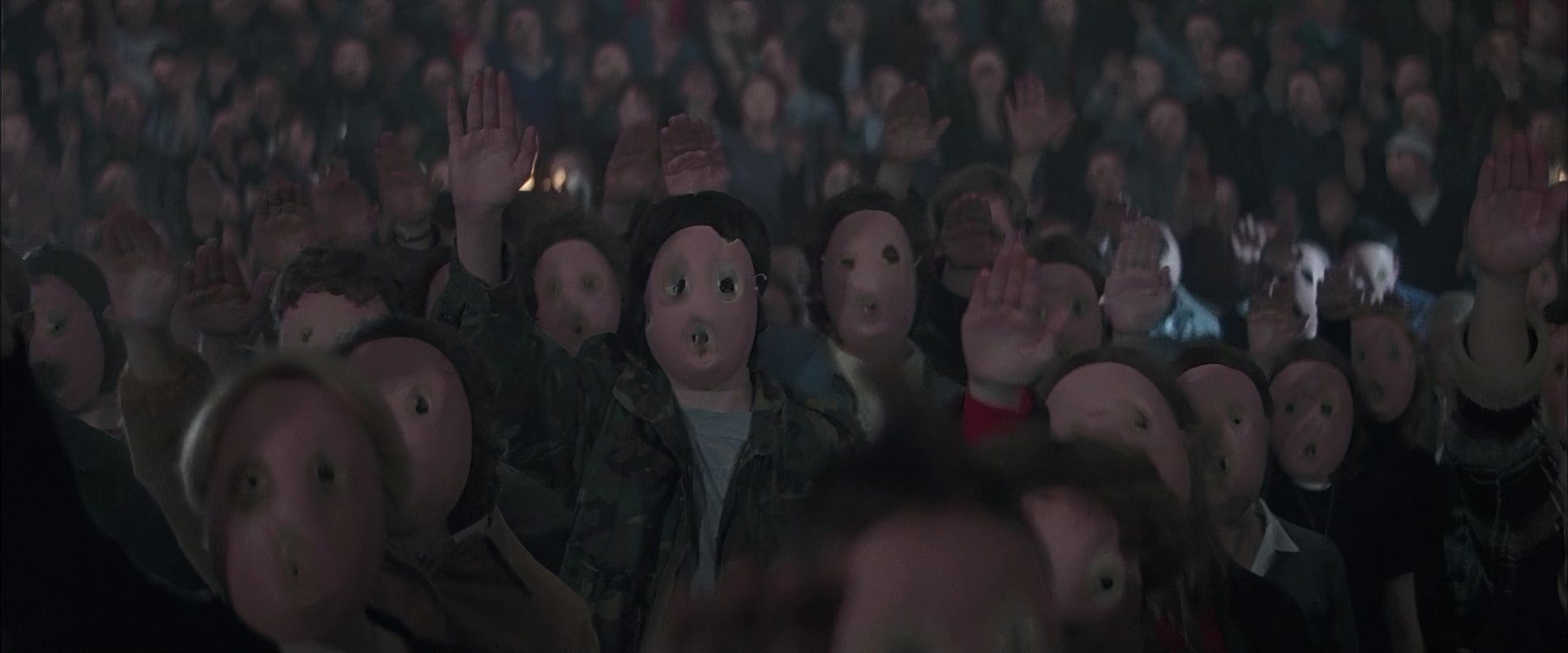
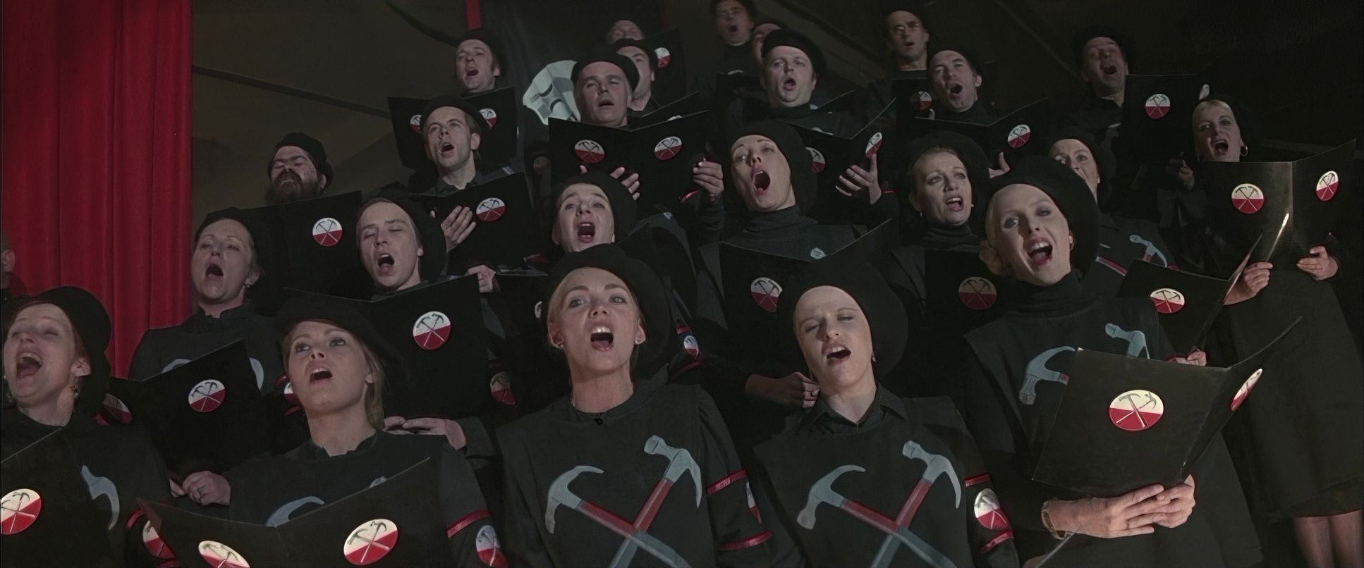
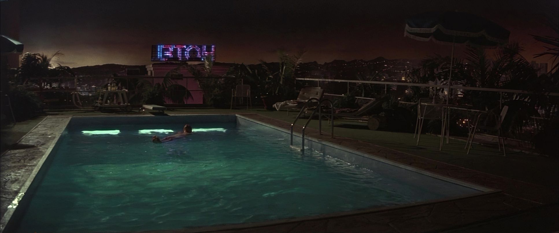
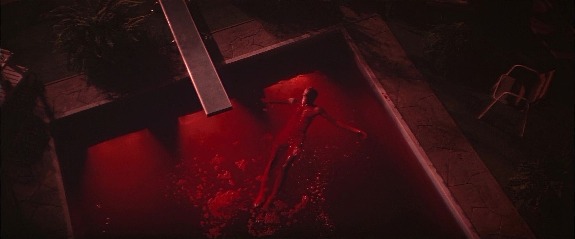
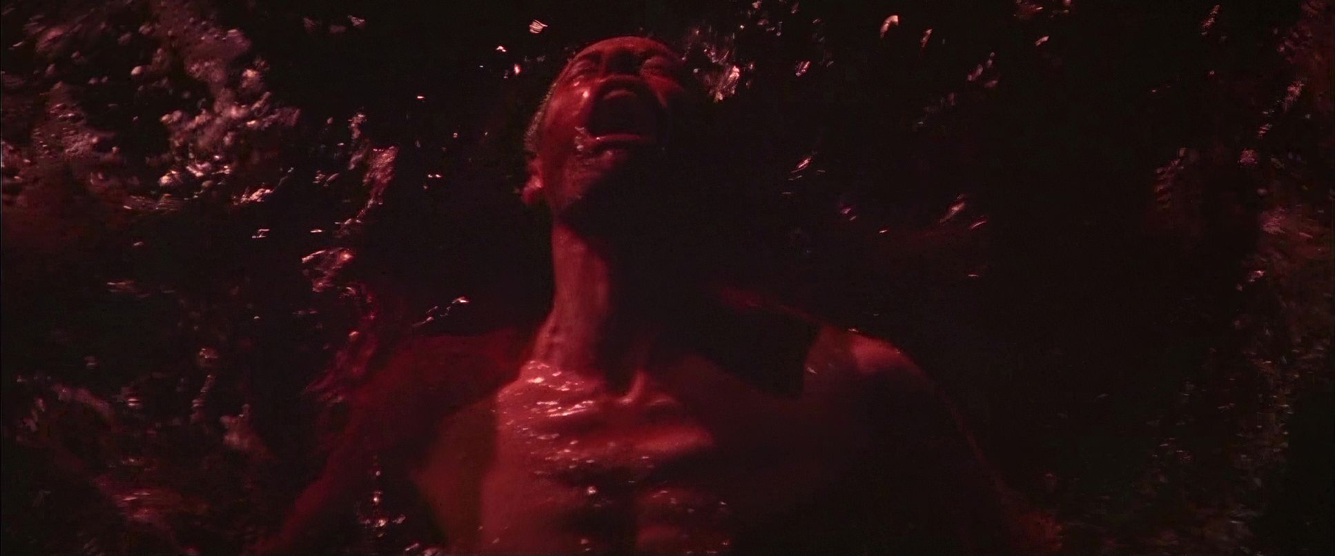
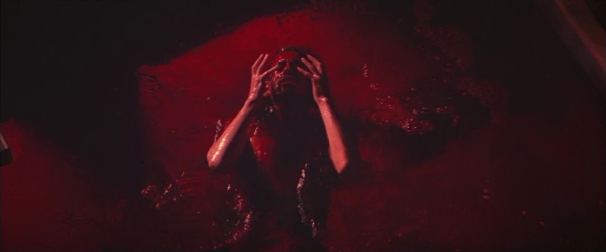
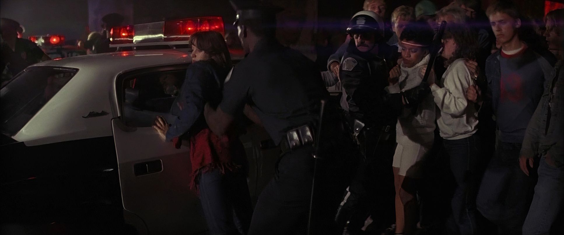
As a colorist, I look at the “motivated” sources: the sickly green glow of a hospital, the clinical fluorescence of a school hall, or the garish, pulsating strobe of a rock concert. During the hotel room breakdown, the shadows cling to Pink, obscuring his face and emphasizing his fragmentation. When the crew breaks in to “wake him up,” the light is unforgiving and grim. There’s nowhere to hide. Biziou also plays heavily with color temperature cold blues for isolation and fiery reds for the “Nazi rally” hallucinations. It’s bold, gritty, and raw.
Color Grading Approach
This is where I really nerd out. The Wall isn’t just photographed; it’s painted. Looking at the 1982 print, you see that beautiful, organic 35mm quality rich blacks, subtle grain, and that highlight roll-off we spend hours trying to emulate today in DaVinci.
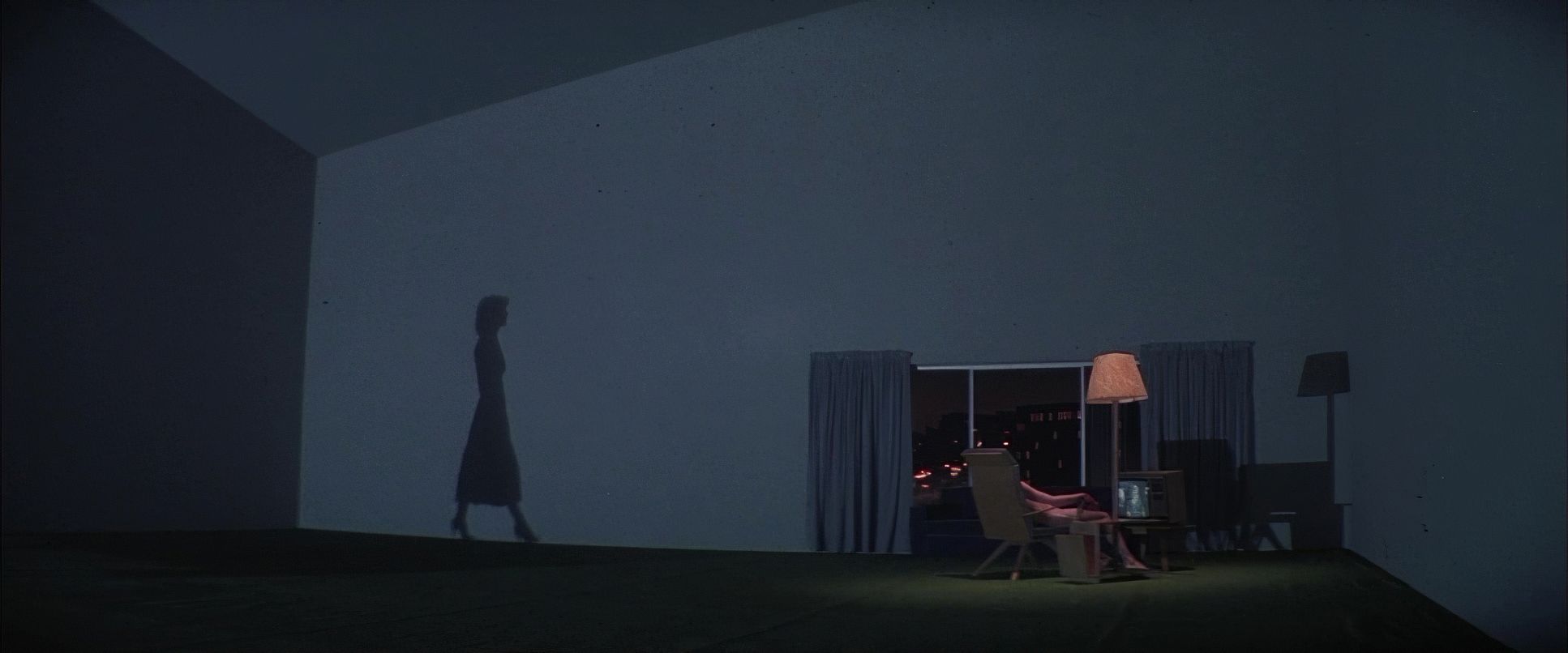
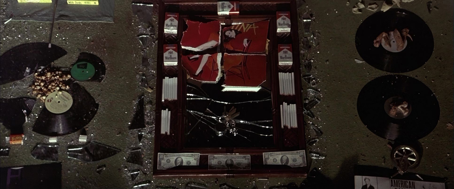
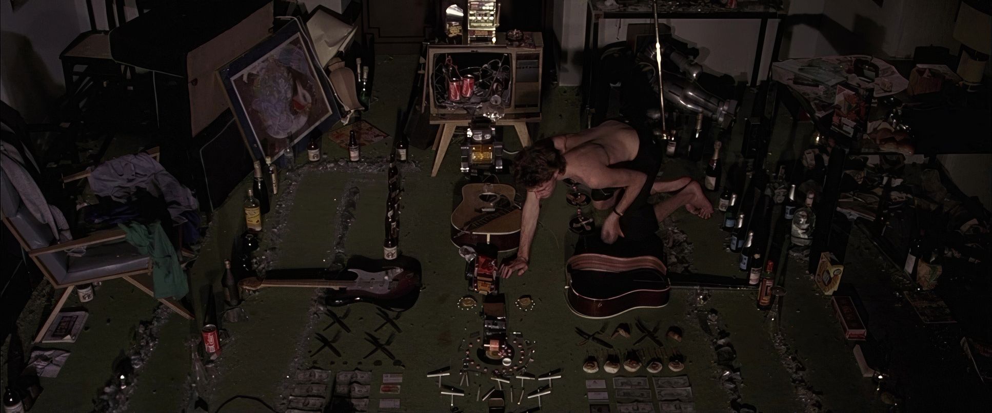
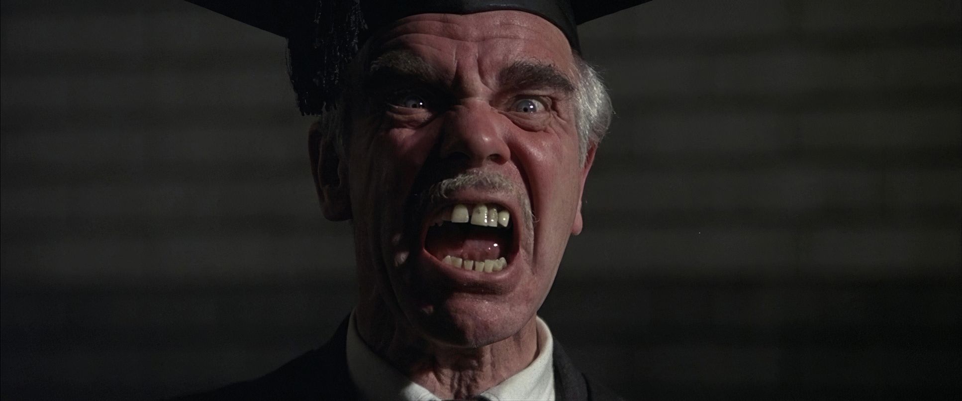
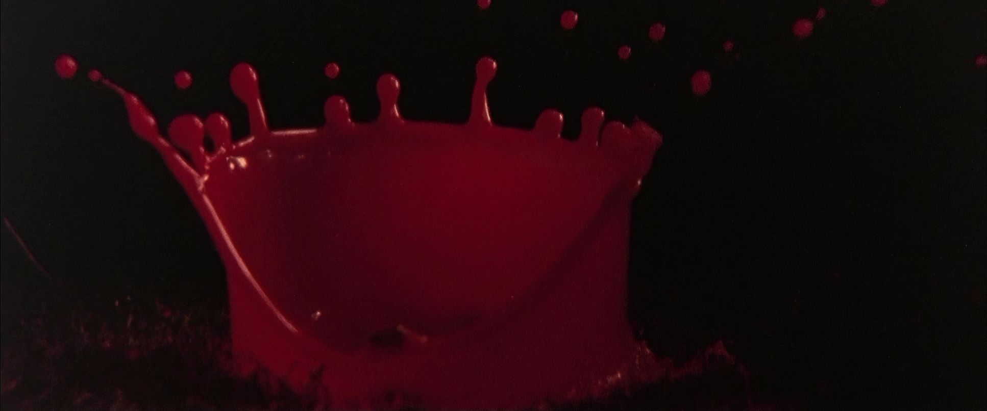
The grade is aggressive. Much of Pink’s “real” world is desaturated drained of life to match his emotional burnout. But when the hallucinations hit? The hues explode into acidic greens and searing reds. I love the hue separation here; certain colors are allowed to “sing” against muted backgrounds, like the blood-red of a stage light or the jaundiced yellow of a drug-induced stupor. In the “Comfortably Numb” sequence, Pink looks sickly and pale in his room, but the moment he’s pushed onto the stage, the world becomes a kaleidoscope of distorted intensity. It’s a masterclass in using color for mood rather than “realism.”
Compositional Choices
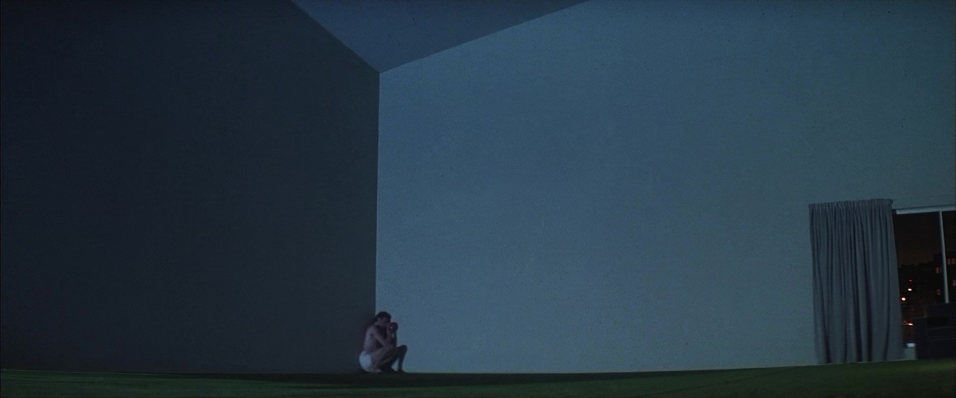
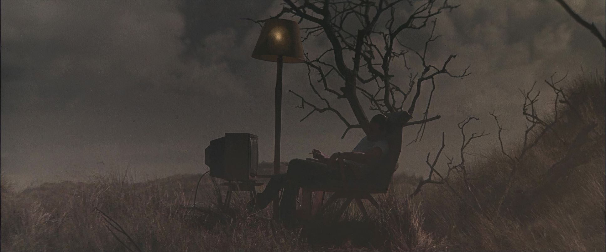
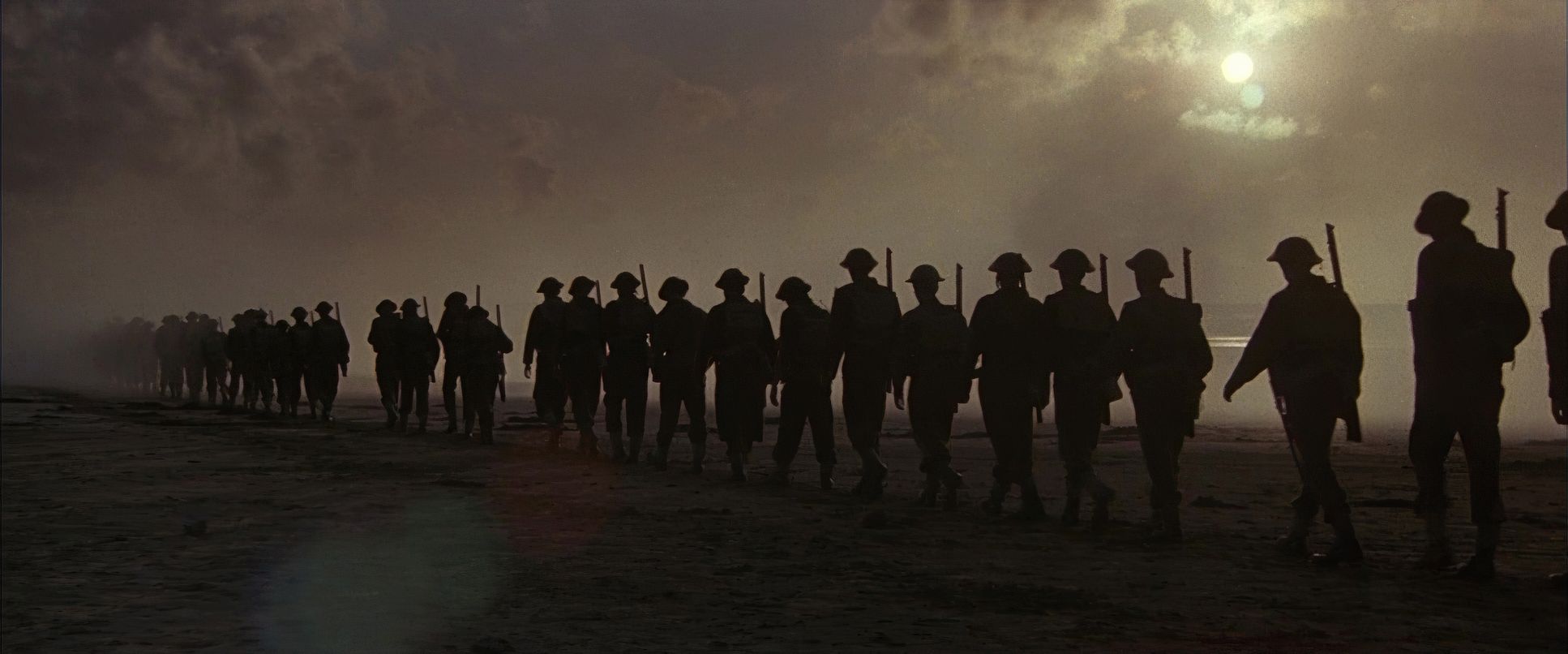
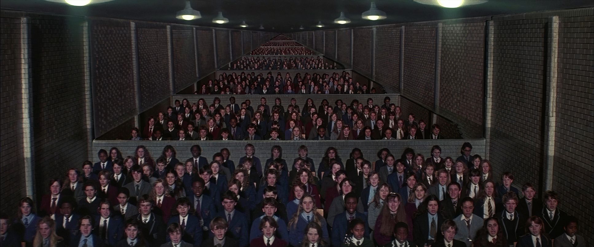
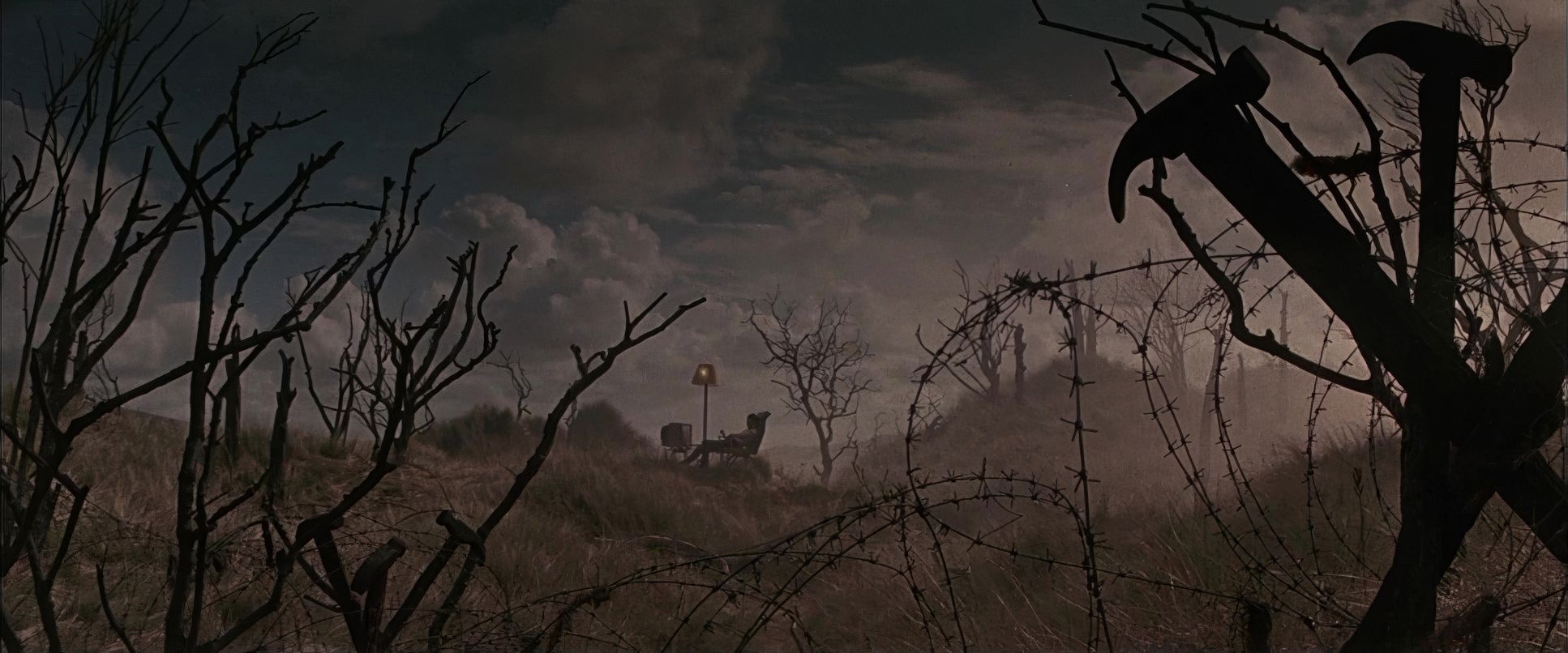
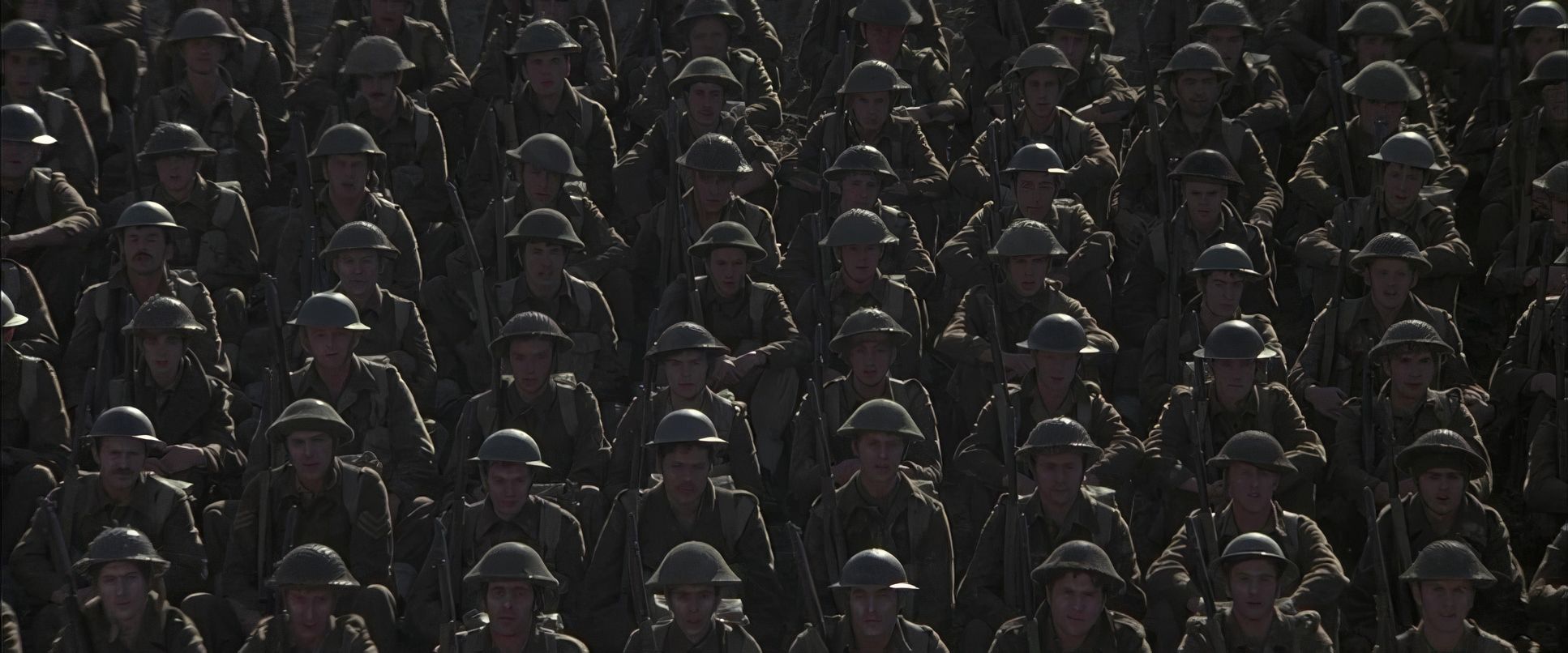
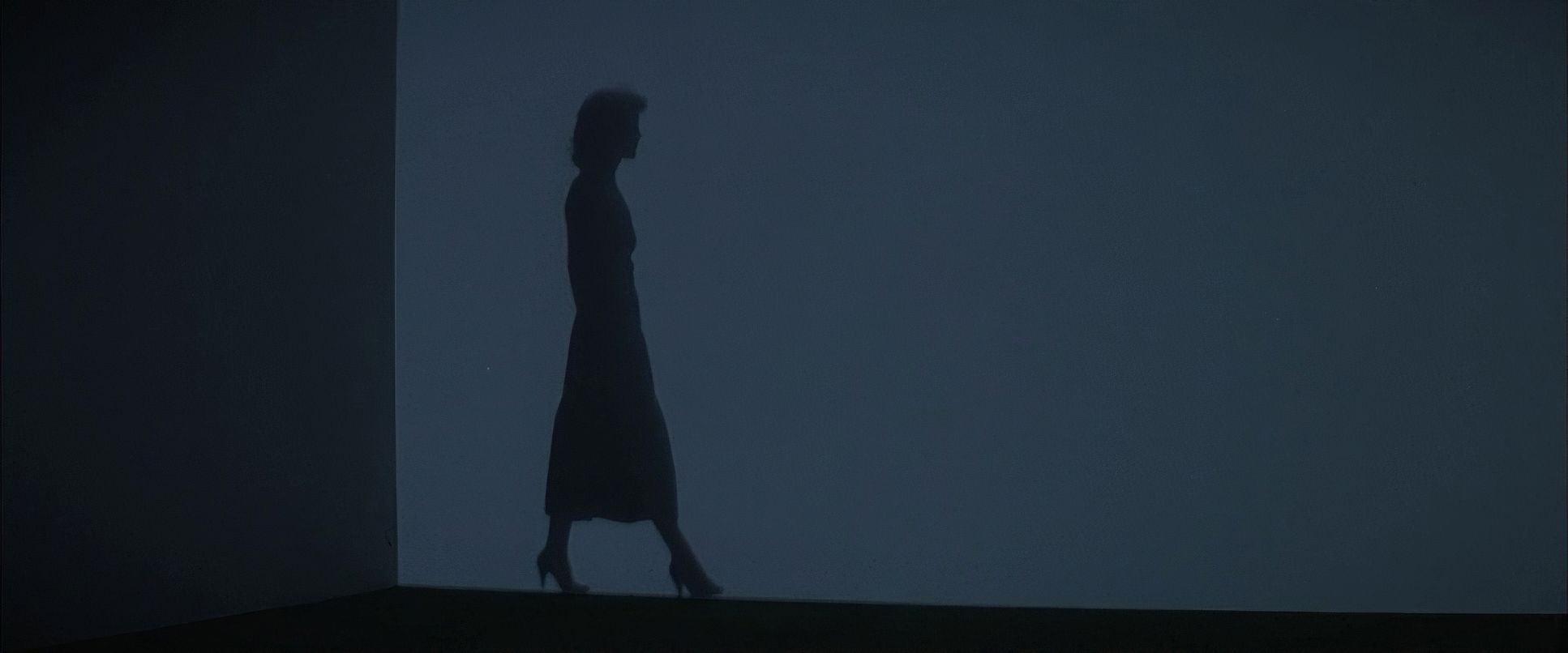
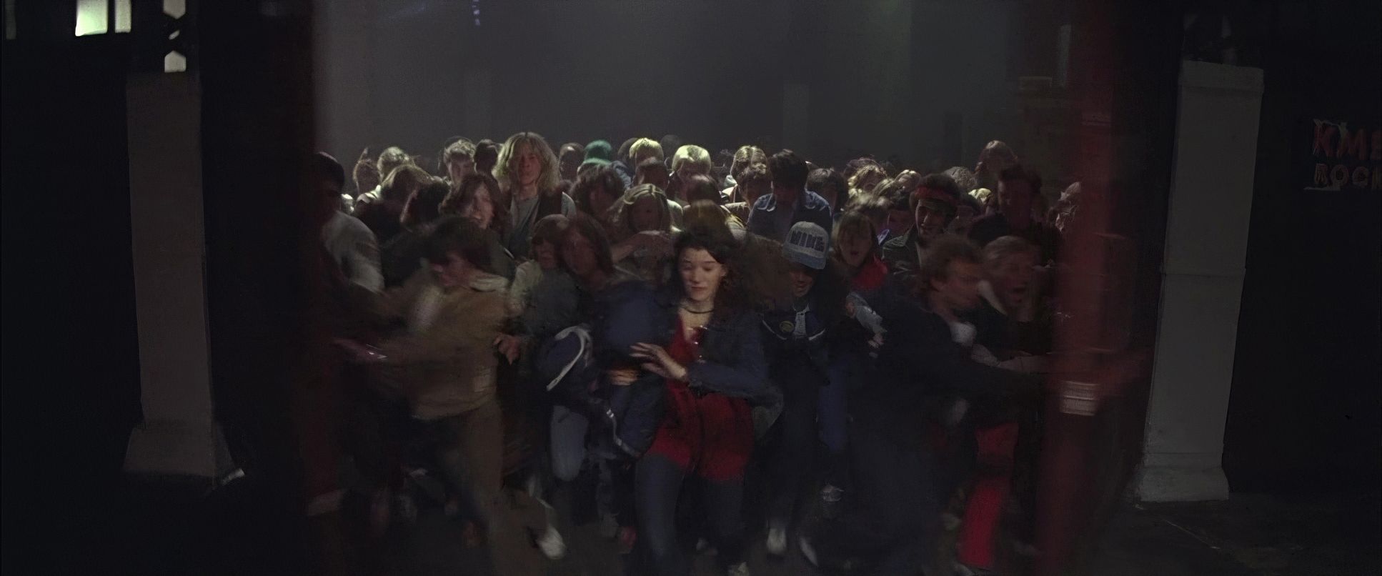
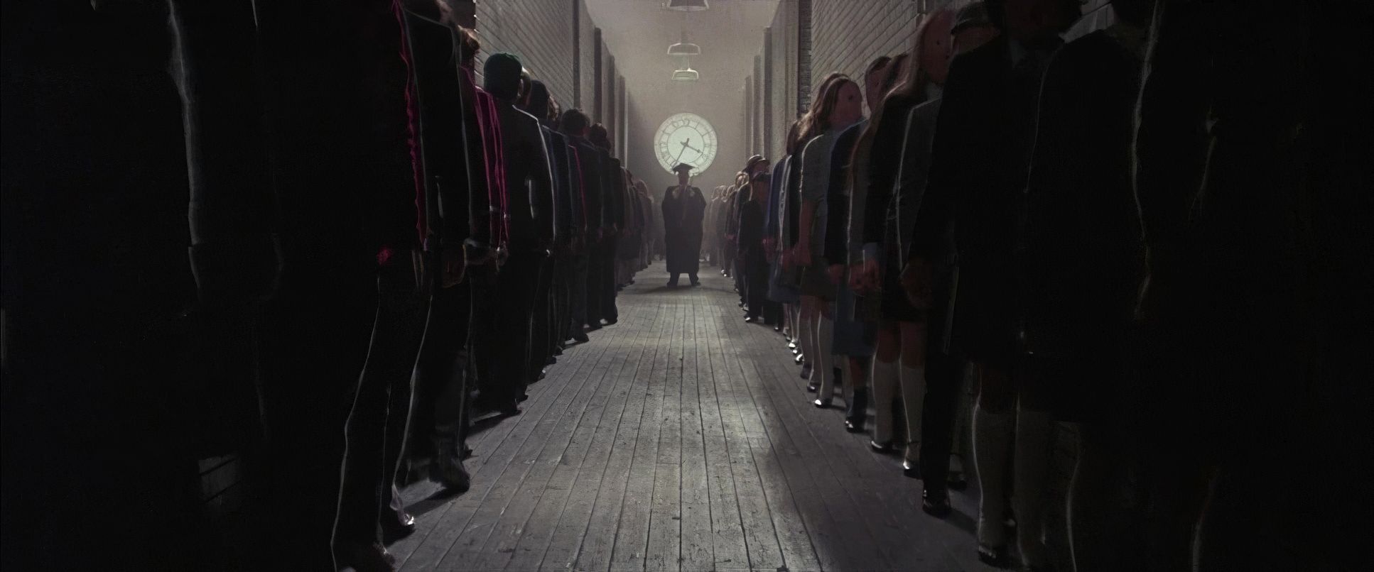
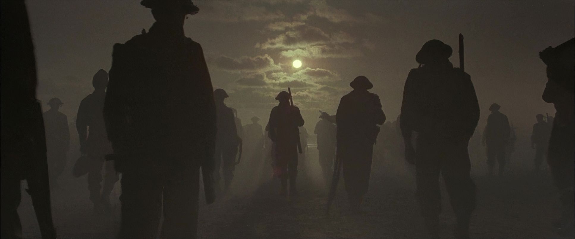
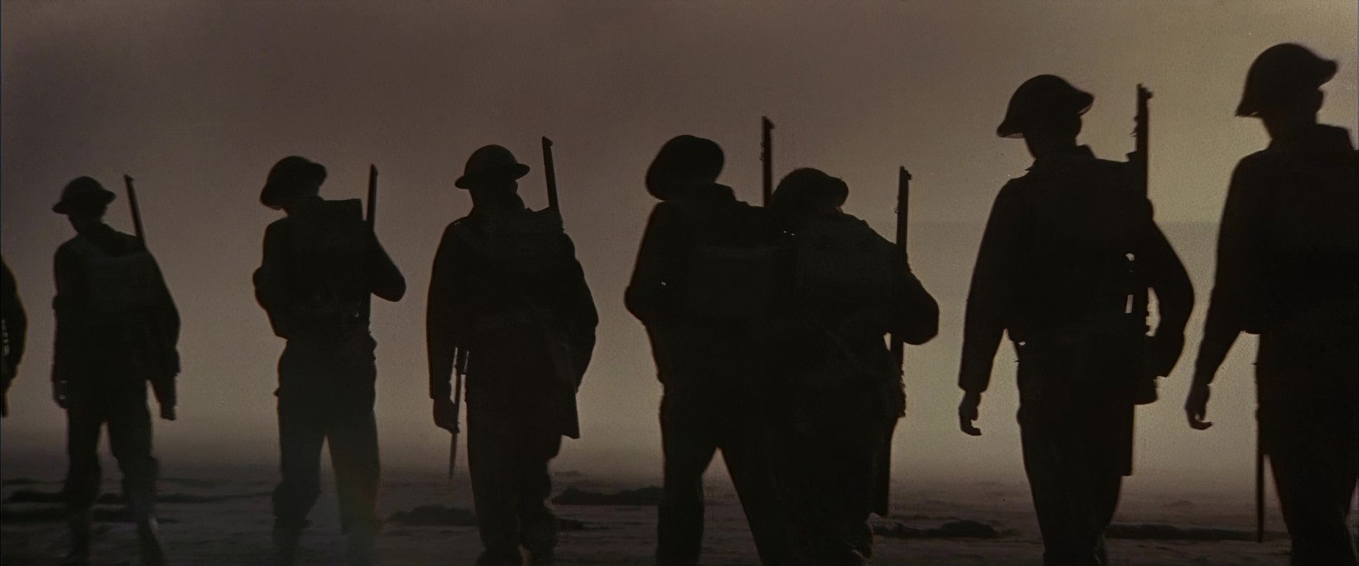
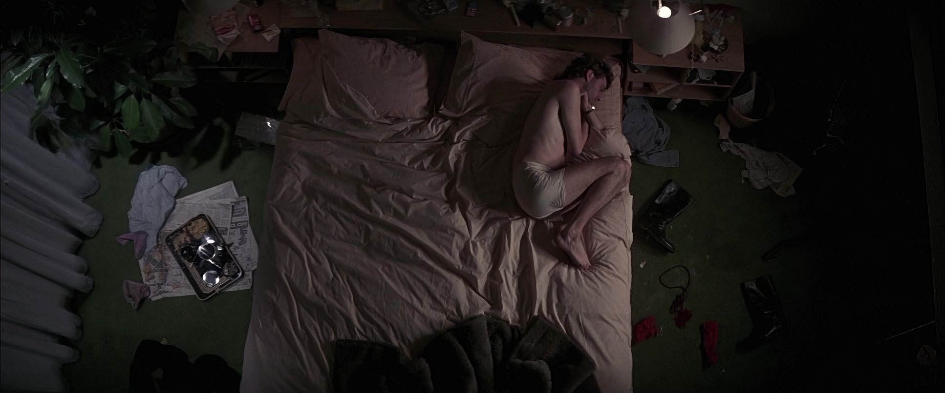
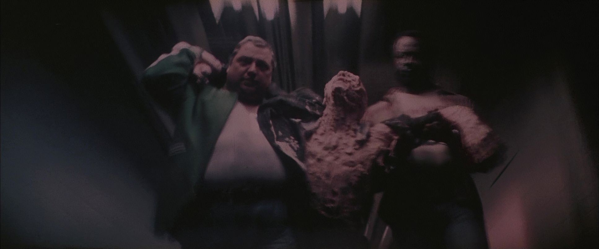
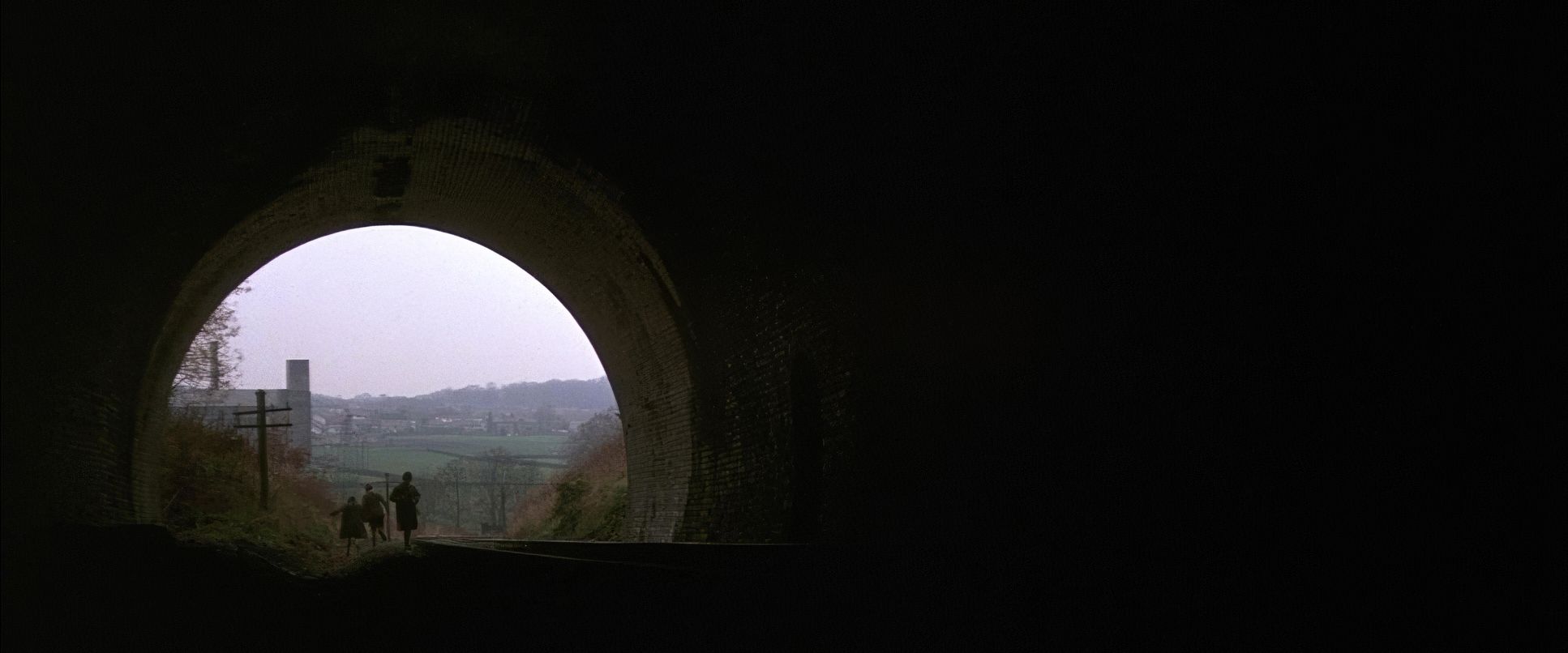
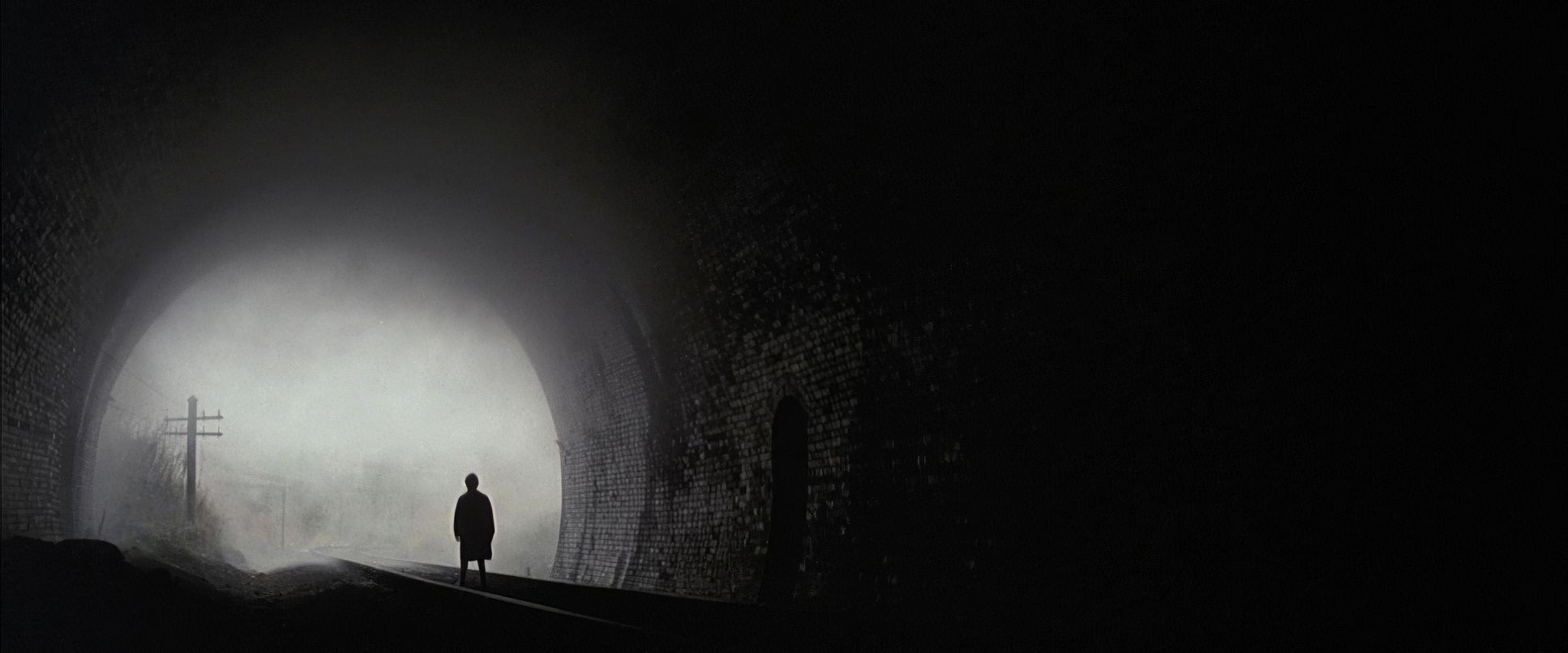
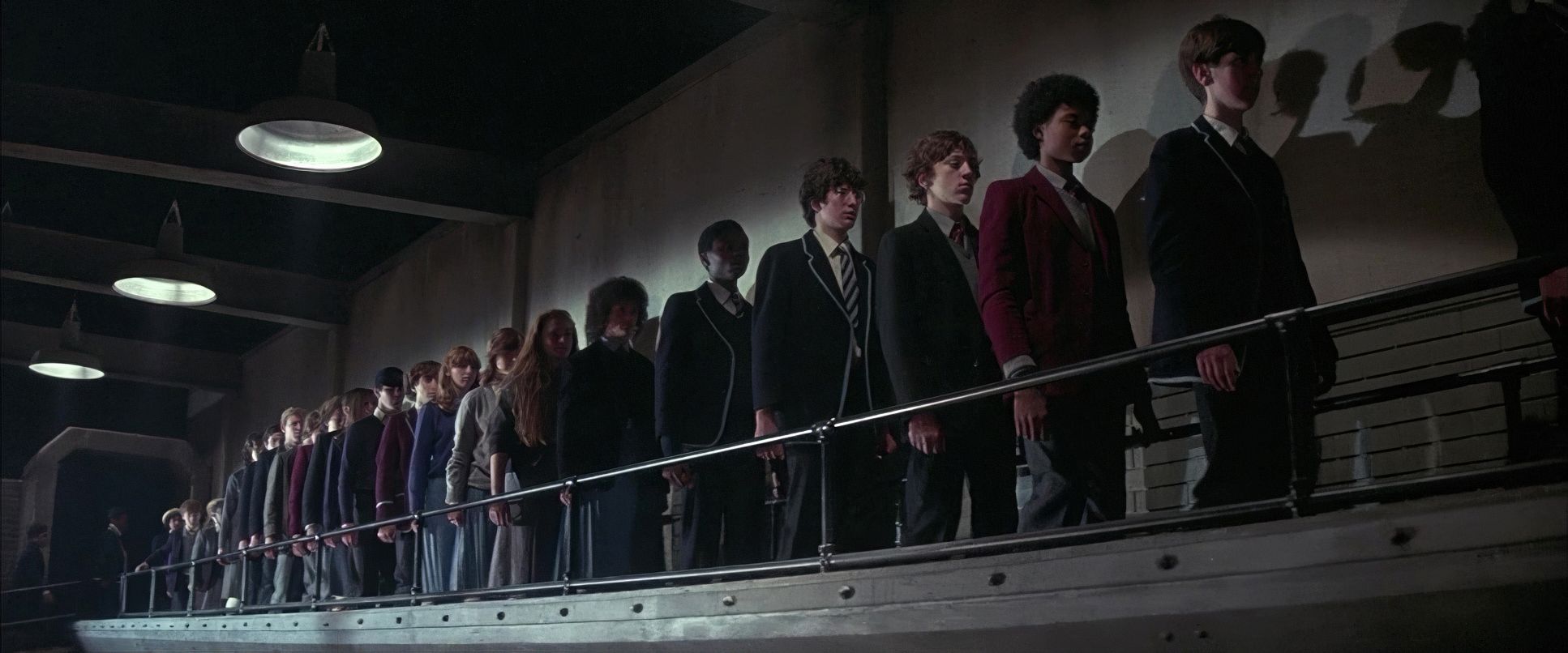
Biziou uses composition to make us feel Pink’s distress. He frequently uses wide shots to dwarf Pink against massive, empty hotel suites or oppressive school corridors. The negative space is loud it emphasizes how alone he actually is. You see this tiny figure against a massive wall, and the metaphor hits home instantly.
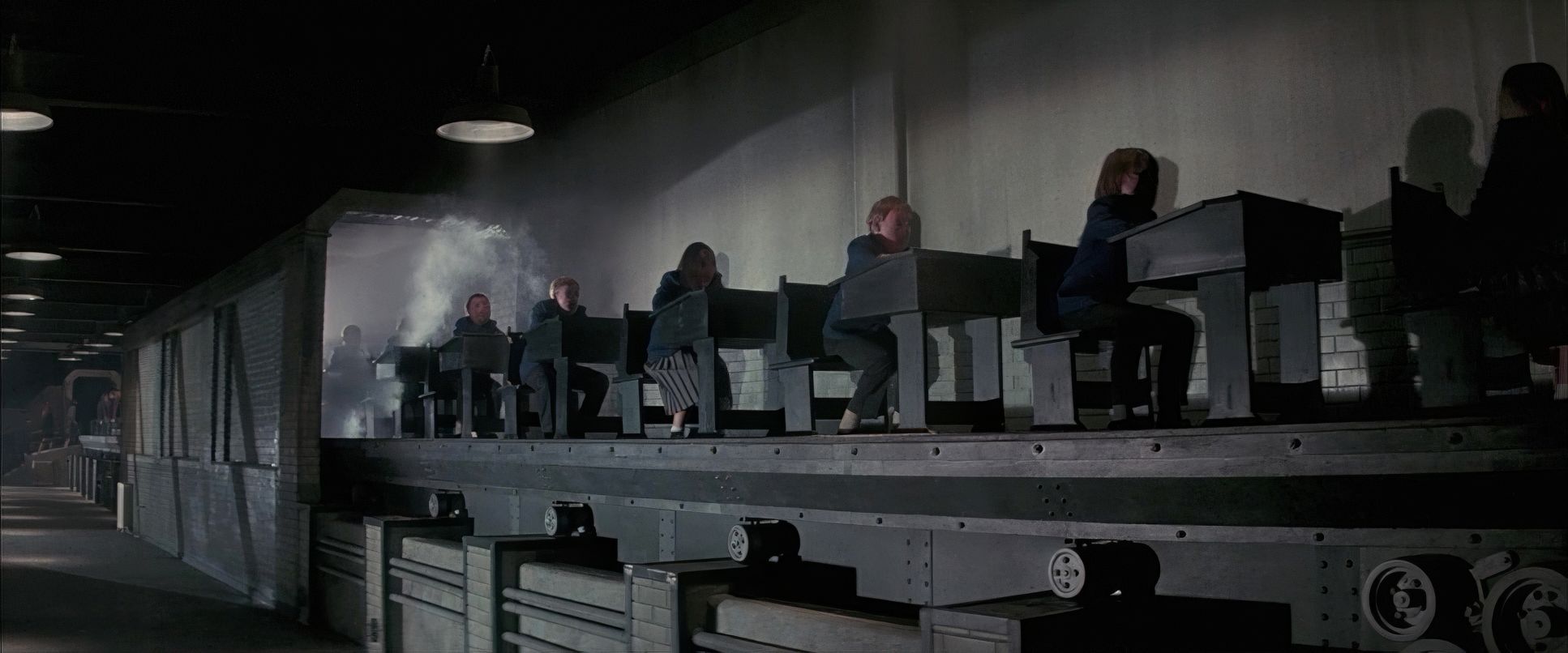
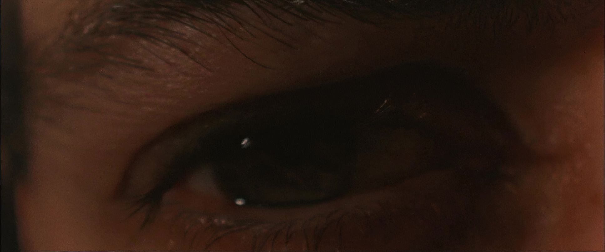
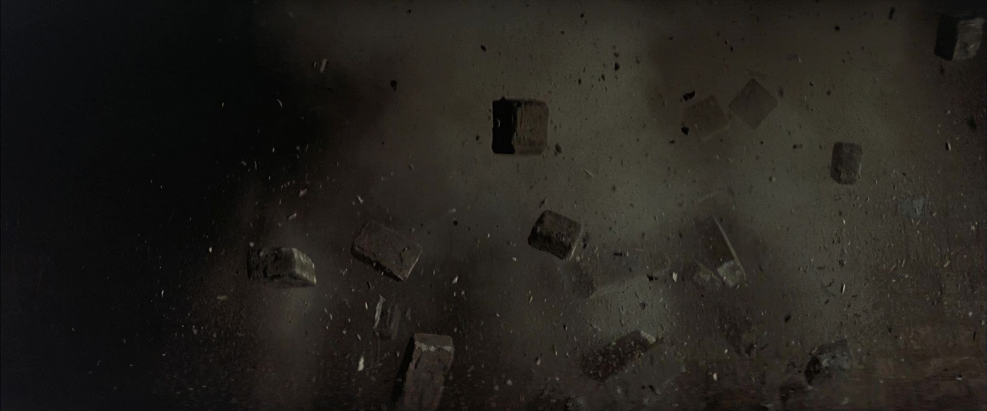
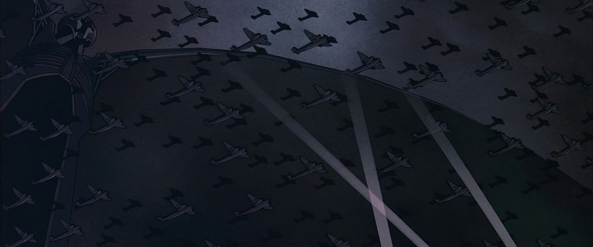
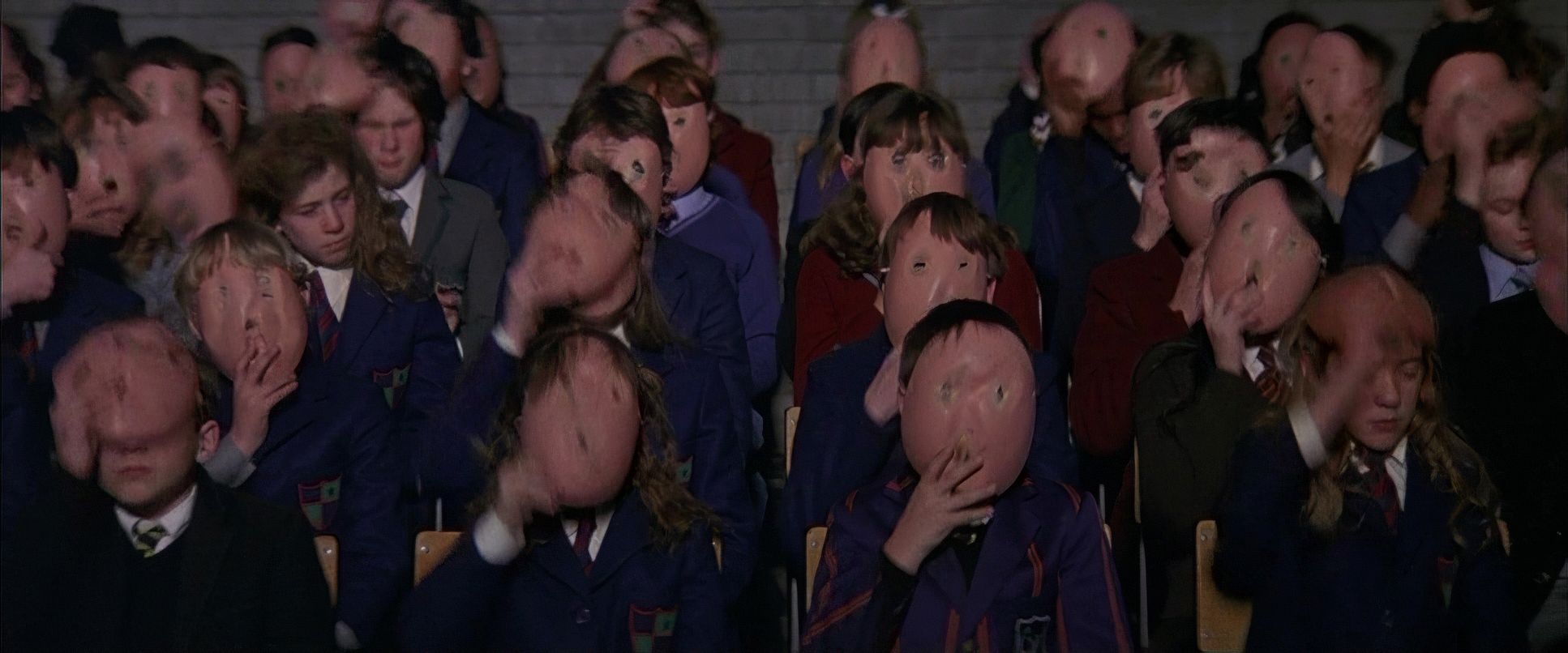
The close-ups are just as brutal. They don’t just show a face; they force us into a private torment. Biziou also uses “depth cues” brilliantly showing Pink in the foreground while memories of his past unfurl behind him. It creates a sense that his trauma is always literally behind him, looming. Even the iconic marching hammers (born from Scarfe’s animation) use stark, graphic framing that feels both inevitable and soul-crushing.
Camera Movements
Movement in this film is rarely just for show; it’s tied to Pink’s pulse. When he’s withdrawn, the camera is a distant, unblinking eye. He feels trapped.
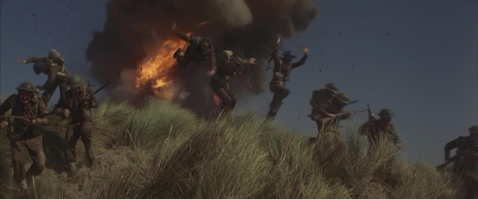
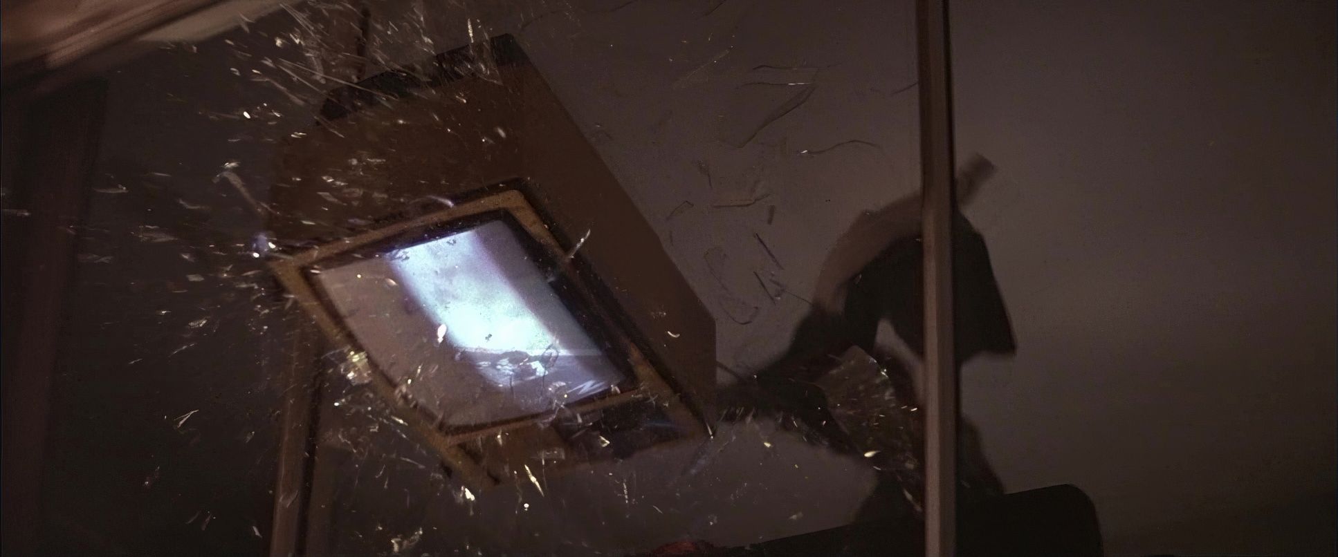
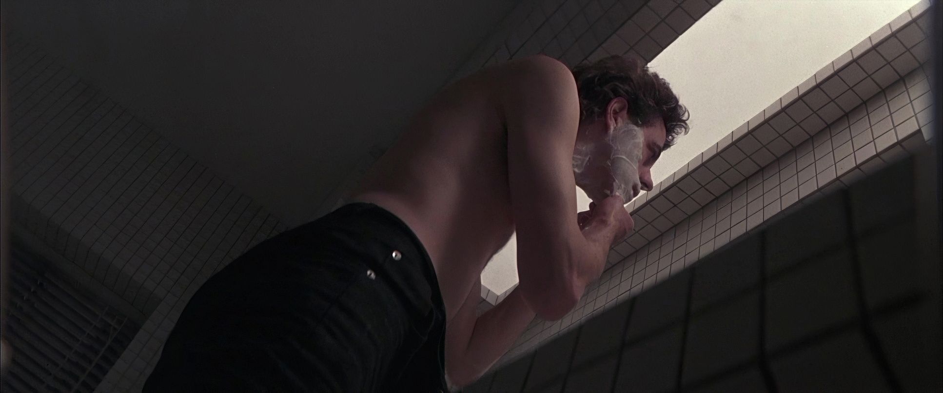
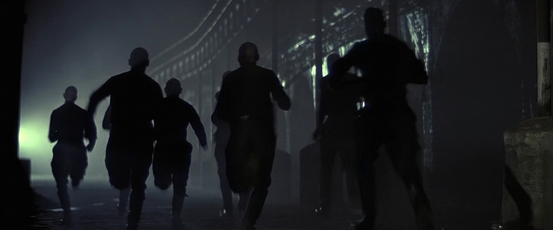
But as the breakdown accelerates, the camera gets personal. Think of those slow, unsettling pushes into his face during the shaving scene. It feels like the walls are closing in. In contrast, the concert sequences use dynamic tracking shots that capture the dehumanizing chaos of rock stardom. Every pan and tilt serves as a brushstroke on the canvas of his deteriorating mind.
Lensing and Blocking

The choice of glass here is fundamental. Biziou uses wide-angle lenses to create distortion, especially in close-ups during moments of paranoia. It makes the world feel warped and claustrophobic. Conversely, longer lenses compress the space, making the crowds feel inescapable.
Blocking is equally symbolic. Pink is almost always isolated, even when surrounded by people. Think of the scene where young Pink reaches out to an older man in the park, only to be pushed away. The physical distance in the frame tells you everything you need to know about his longing for a father. By the time we get to the concert-as-a-rally, his blocking evolves into that of a dictator, showing the terrifying power of mass manipulation. The visuals tell the story because, frankly, the characters barely speak.
Technical Aspects & Tools
Pink Floyd: The Wall | Technical Specifications
| Genre | Drama, Music, Psychological Horror, Musical, Psychedelic, Horror, Thriller |
| Director | Alan Parker |
| Cinematographer | Peter Biziou |
| Production Designer | Brian Morris |
| Costume Designer | Penny Rose |
| Editor | Gerry Hambling |
| Time Period | 1980s |
| Color | Desaturated |
| Aspect Ratio | 2.39 |
| Lighting | Hard light, High contrast, Side light |
| Lighting Type | Artificial light |
| Story Location | London, England |
| Filming Location | London, England |
| Camera | Panavision Panaflex |
| Lens | Panavision C series, Panavision E series |
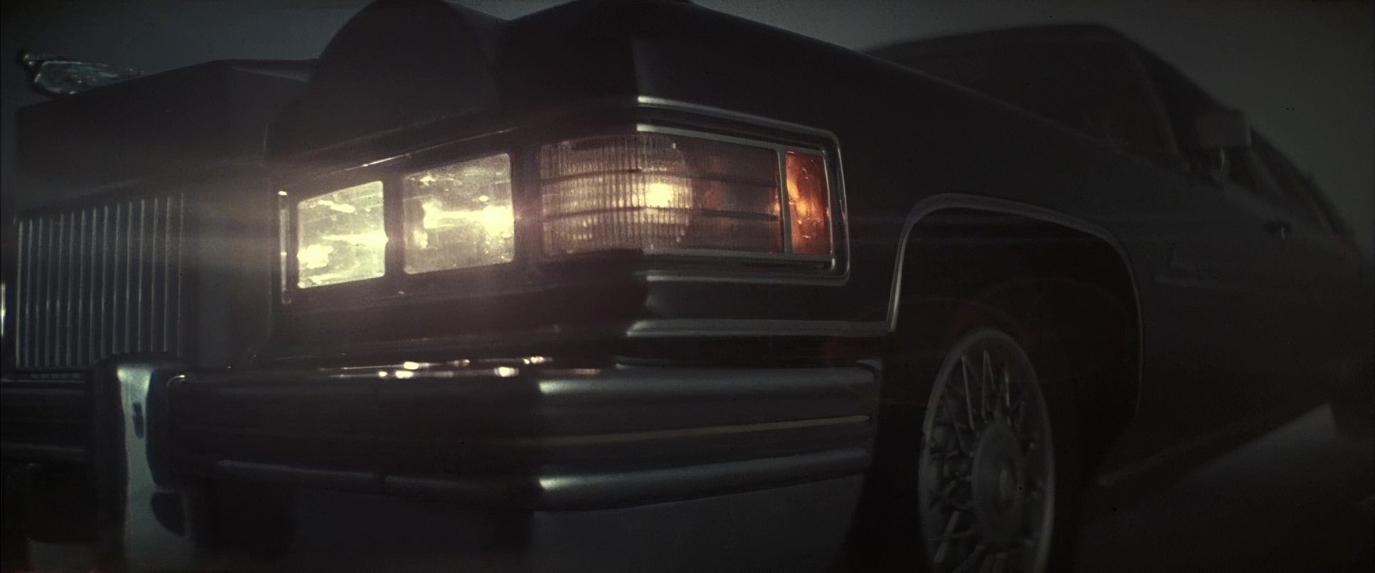
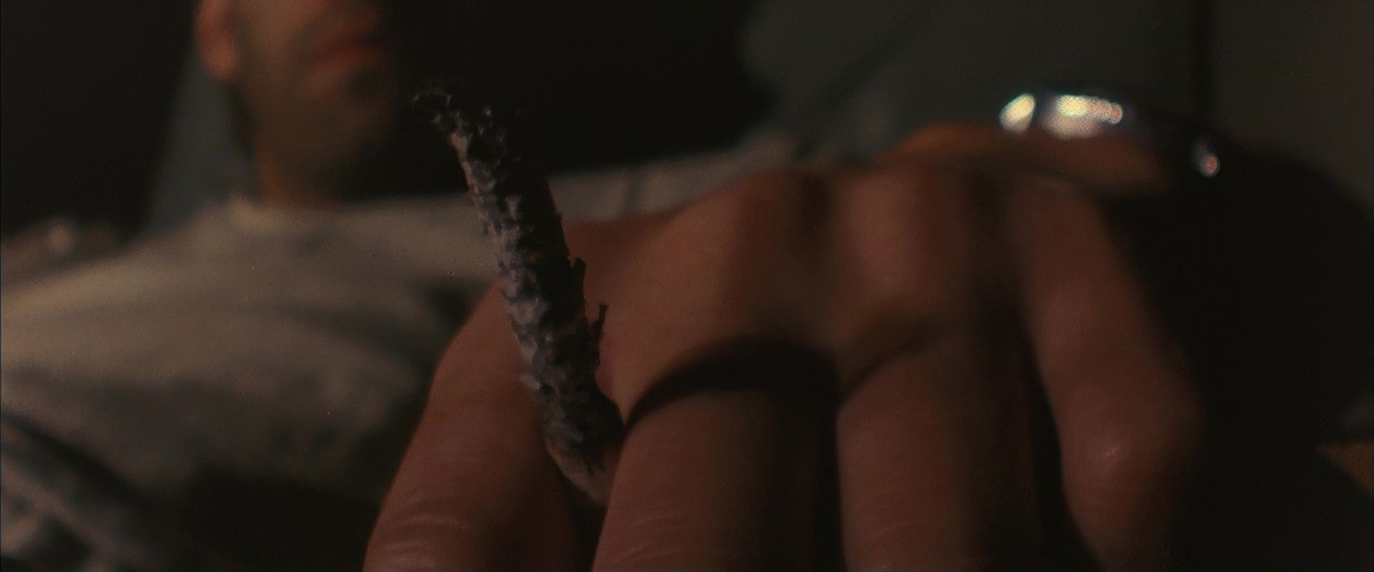
Shot on 35mm (likely Kodak) with Panavision Panaflex cameras, the film has a tactile quality that digital often struggles to replicate. That grain isn’t “noise” it’s texture. It makes Pink’s reality feel like it’s physically decaying.
What’s truly impressive is how they married Gerald Scarfe’s animation with the live-action footage. This wasn’t a simple digital overlay; it involved complex optical printing, precise matte work, and rotoscoping. The goal was to make the animation feel like an organic extension of Pink’s world. It was groundbreaking for 1982 and, honestly, it still holds up as a terrifying psychological space.
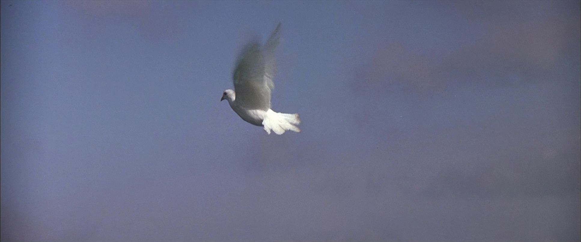
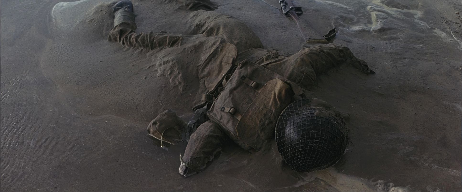
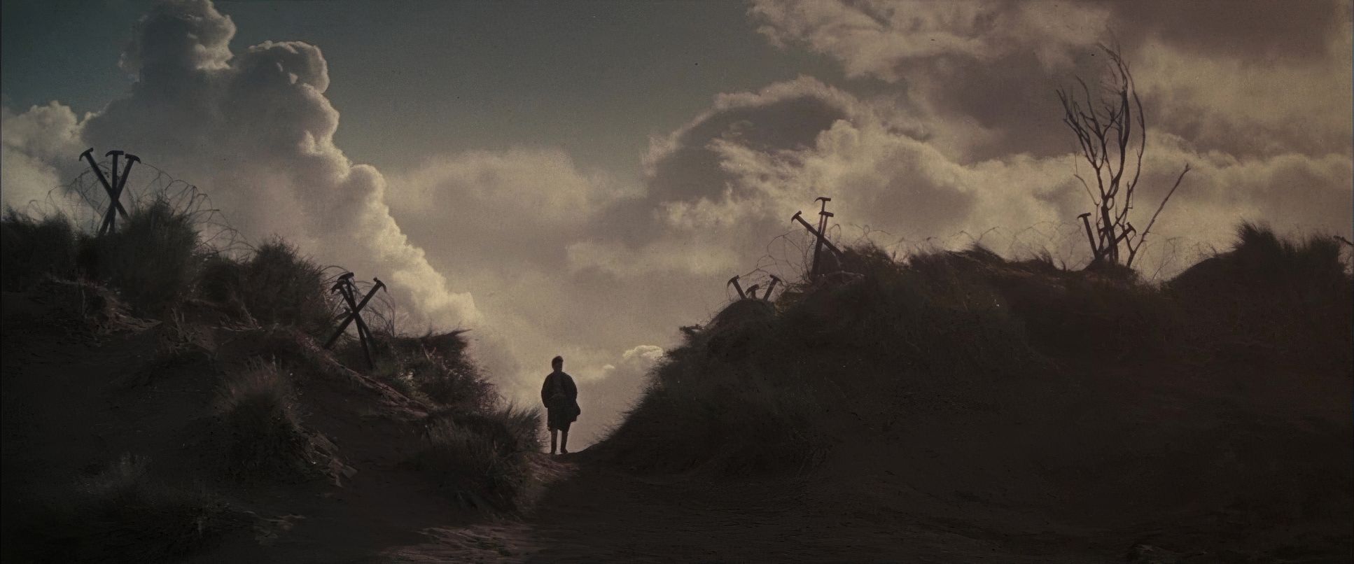
Pink Floyd: The Wall (1982) Film Stills
A curated reference archive of cinematography stills from PINK FLOYD: THE WALL (1982). Study the lighting, color grading, and composition.
- Also read: SPRING, SUMMER, FALL, WINTER… AND SPRING (2003) – CINEMATOGRAPHY ANALYSIS
- Also read: THE HUSTLER (1961) – CINEMATOGRAPHY ANALYSIS
Browse Our Cinematography Analysis Glossary
Explore directors, cinematographers, cameras, lenses, lighting styles, genres, and the visual techniques that shape iconic films.
Explore Glossary →