Few films hit that mark quite like Patton (1970). On the surface, it’s often dismissed as just another “Big War Movie,” but look closer and you’ll find a deeply layered character study meticulously carved out by its cinematography. When I revisit it, I’m not just watching a biopic; I’m dissecting a masterclass in how a camera can unmask a personality. It’s a film that gets under your skin through every considered frame and every balanced tone. For me, it’s a living testament to what happens when craft and sheer cinematic audacity collide.
About the Cinematographer
Fred J. Koenekamp, ASC, was the eye behind Patton, and his career was defined by an incredible, chameleon-like versatility. While he’s often celebrated for his work on high-octane action and comedies, Patton is his “mountain top.” It is a colossal achievement of precision. It’s actually quite easy to lose the Director of Photography’s voice on a production of this scale when you have thousands of extras, real tanks, and endless landscapes, the spectacle usually takes over. But Koenekamp didn’t just capture the chaos; he organized it. He gave it emotional weight and constantly tethered the “epic” back to the “individual.” Considering the logistical nightmare of 1970s production, the fact that this film remains so crisp and intentional on a modern Blu-ray is a massive shout-out to his foresight and skill.
Camera Movements
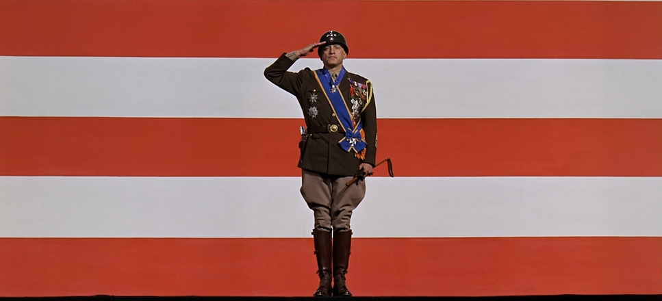
The camera movement in Patton is all about purpose. There are no “cool” flourishes for the sake of it; every dolly or crane shot feels like an anchor for the audience. Take that legendary opening monologue it’s a masterclass in restraint. George C. Scott stands before that massive American flag, and the camera just… holds. Or it imperceptibly pushes in. It refuses to cut away. There are no frantic edits to “save” the performance; the camera simply allows Scott’s unfiltered presence to fill the 65mm frame. It’s a confrontational intimacy that sets the tone for the next three hours.
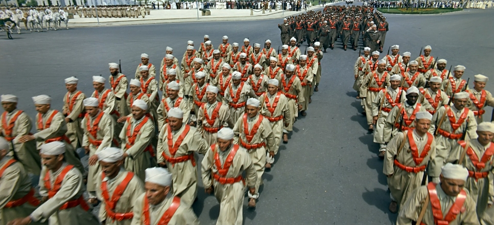
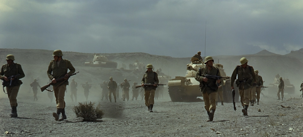
When we shift to the desert, Koenekamp opens the throttle. We see massive columns of tanks rolling across the plains, captured with these heavy, sweeping crane shots that instill a sense of dread. The camera isn’t just an observer here; it’s a choreographer. It’s this constant tug-of-war between the intimate stillness of the man and the epic sweep of the war that creates such a compelling visual rhythm.
Compositional Choices
Compositionally, Patton is a study in “The Grand and The Granular.” Again, look at that opening. Scott is positioned centrally, almost like a theatrical tableau, stripped of any distracting detail. It’s a bold, minimalist choice to start an epic with such a stark portrait.
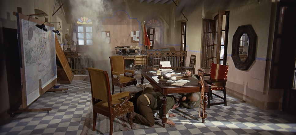
In the battle sequences, Koenekamp leans into the massive 2.20:1 aspect ratio. He uses foreground elements a trench, a piece of shrapnel to lead your eye through the midground and into that hazy, 65mm horizon. It creates an illusion of infinite space. But my favorite moments are when Patton moves into the ornate European palaces. Suddenly, the composition shifts. The camera frames him within these grand architectural voids, using negative space to show how isolated he is, or conversely, placing him centrally to show how he dwarfs his surroundings despite the opulence. Every frame feels like it was built to amplify his psychological state.
Lighting Style
Koenekamp’s lighting is beautifully “motivated” and surprisingly aggressive. The “starkly lit” quality of the opening monologue immediately tells you this isn’t a “soft” movie. Using hard, directional sources to sculpt Scott’s face, Koenekamp emphasizes every sharp angle and the intensity in his eyes. It makes Patton look less like a man and more like something chiseled out of stone.
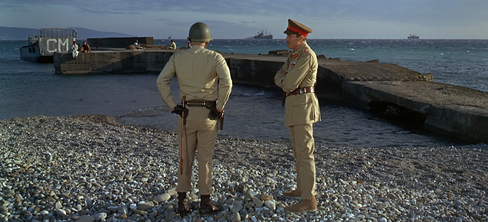
For the exteriors in the North African desert, the lighting embraces the harshness of the midday sun rather than fighting it. It creates these deep, unforgiving shadows and sharp highlights that define the rugged terrain. In the palace interiors, things get a bit softer and more diffused likely motivated by those massive windows or practical lamps but Koenekamp never loses that sense of gravitas. He keeps the contrast high enough that Scott’s presence always commands the room.
Lensing and Blocking
This is where the technical nerd in me gets excited. Because Patton was shot on 65mm (Dimension 150), the lensing has a very specific feel. For the battle scenes, Koenekamp used wider glass to soak in the Spanish landscapes. On 65mm, these wider focal lengths preserve a staggering amount of detail and depth, allowing you to see multiple planes of action without losing focus on the scale.
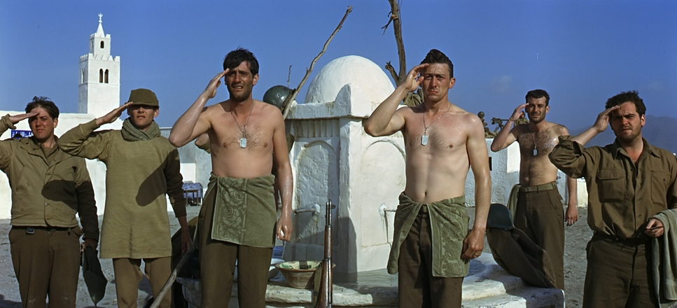
For the close-ups, they likely switched to medium or slightly telephoto lenses. These compress the perspective just enough to force the viewer to lock into Scott’s piercing gaze. The blocking, meanwhile, was a Herculean task. Orchestrating thousands of Spanish conscripts and WWII-era tanks to look like a tactical formation across miles of land is insane. You can feel the weight of it. Even the way they block the “Pearl Handle” revolvers shows a deep collaboration between the lens and the character’s ego. The extras didn’t just hit marks; they were reacting to Scott, who stayed in character to make them feel like real soldiers. That documentary-like authenticity is what makes the blocking feel so “lived-in.”
Color Grading Approach
As a colorist, looking at Patton is like looking at a masterclass in “print-film” density. Shot on Kodak 5254 100T, the original negative has this incredible latitude. When I watch the restoration, I’m looking at how they’ve handled the contrast shaping. The desert scenes have this beautiful, sun-baked golden warmth, but the blacks remain robust and deep. That high contrast isn’t just an aesthetic choice; it’s a reflection of Patton’s uncompromising personality.
The hue separation is handled with incredible subtlety. The muted olives and tans of the uniforms allow the vibrant reds of the flag or the glint of steel to pop without feeling “graded” in the modern, artificial sense. There’s a “tonal sculpting” here that gives the 65mm image a three-dimensional pop. And that highlight roll-off? It’s classic film. The sun-drenched skies transition into white with a silkiness that digital sensors still struggle to replicate. It’s a look that feels grounded in 1944 but looks modern in 2025.
Inspiration Behind the Cinematography
The visual DNA of Patton is rooted in contradiction. He was a “romantic warrior” born in the wrong century, and the cinematography reflects that spiritual dimension. I’ve always felt the inspiration here wasn’t just “war photography,” but the work of the Old Masters in an art museum.
The camera constantly juxtaposes Patton’s raw, almost barbaric individualism against the cultivated, grand European architecture. He is shown as both a man of the wild and a visitor in a civilized world. This duality the primal vs. the bureaucratic is woven into every frame. It’s an epic canvas used to paint an intimate, intricate study of one man’s psyche.
Technical Aspects & Tools
Patton (1970)
Technical Specifications
| Genre | Drama, History, War, Military, World War II, Biopic, Political, Epic |
| Director | Franklin J. Schaffner |
| Cinematographer | Fred J. Koenekamp, Russ Meyer |
| Production Designer | Urie McCleary, Gil Parrondo |
| Editor | Hugh S. Fowler |
| Time Period | 1940s |
| Color | Blue |
| Aspect Ratio | 2.20 – Anamorphic |
| Format | Film – 65mm / 70mm |
| Lighting | Hard light |
| Lighting Type | Daylight, Sunny |
| Story Location | Africa > Algeria |
| Filming Location | Earth |
| Film Stock / Resolution | 5254/7254 100T |
The technical story of Patton is one of pure pragmatism. Because the Pentagon hated the script and refused to help, the production moved to Spain under General Franco’s regime. This was a blessing in disguise. Spain had a massive stockpile of WWII-era German and American equipment and thousands of troops ready to play extras.
While eagle-eyed historians might spot a Spanish tank modified to look like a Panzer, the sheer “huge scope” achieved by filming in Spain is undeniable. Combining that logistical freedom with the 65mm / 70mm format was a stroke of genius. The 65mm negative (Dimension 150) provides a resolution and “largeness” that 35mm simply couldn’t touch. It’s the reason the Blu-ray looks so incredibly crisp today the “data” on that large-format negative is just immense.
- Also read: HIGH NOON (1952) – CINEMATOGRAPHY ANALYSIS
- Also read: A STREETCAR NAMED DESIRE (1951) – CINEMATOGRAPHY ANALYSIS
Browse Our Cinematography Analysis Glossary
Explore directors, cinematographers, cameras, lenses, lighting styles, genres, and the visual techniques that shape iconic films.
Explore Glossary →