Alfred Hitchcock’s 1951 psychological thriller, Strangers on a Train, is a film that demands a closer look from anyone who works with images. It’s a masterclass in tension, certainly, but its enduring power lies in how the cinematography underpins every psychological tremor and moral ambiguity. This isn’t just a “swap murders” scheme between a tennis star and a charming psychopath it is a meticulously crafted visual essay on duality, obsession, and the insidious nature of temptation.
I approach a film like this not just as a viewer, but as someone who understands the deliberate choices made in the finishing suite. Every frame feels intentional. It’s a testament to a director at the peak of his powers collaborating with a cinematographer who truly spoke his language.
The Visual Architect: Robert Burks, ASC
The man behind the glass was Robert Burks, ASC. You can’t discuss Hitchcock’s legendary run without mentioning Burks he lensed twelve of his films, including giants like Rear Window and Vertigo. Burks had this remarkable, almost telepathic ability to translate Hitchcock’s intricate storyboards into a striking cinematic reality.
His style wasn’t flashy for the sake of a “cool shot”; it was precise and functional. For Strangers on a Train, Burks’ work is defined by a deft manipulation of light and shadow and an almost invisible command of the camera. He was a master of efficiency, extracting maximum dramatic impact from minimal techniques. You can see him balancing the need for expositional clarity with the shadowy, moral murkiness the script demands. It’s a perfect marriage of classical Hollywood aesthetics and a modern psychological edge.
The “Double” as a Visual Directive
The core inspiration here is undeniably the film’s central theme: “doubles.” Hitchcock weaves this motif into the very DNA of the cinematography. This isn’t just a clever thematic device; it’s a visual directive. Two strangers, two paths, two mirrored desires it all demanded a language that underscored duality.
Influenced by Patricia Highsmith’s novel, Hitchcock needed to externalize the internal decay of a character like Bruno Antony. The lighting and framing are never neutral; they actively participate in a psychological game. The cinematography puts the audience in an uncomfortable position of complicity. As Bruno suggests, “Everyone has somebody they want to put out of the way.” The camera essentially acts as the silvering on a dark mirror held up to the viewer.
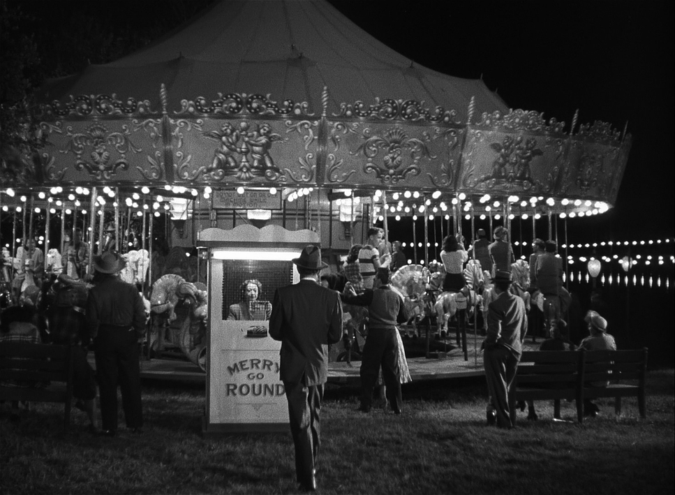
Kinetic Tension: Why the Camera Won’t Sit Still
The camera movements here are a masterclass in purposeful storytelling. Hitchcock and Burks weren’t afraid to let the camera linger, but when it moves, it does so with absolute conviction. Look at the opening: those parallel tracking shots of shoes converging on the train platform. It’s simple, but it immediately primes the audience for a collision of fates.
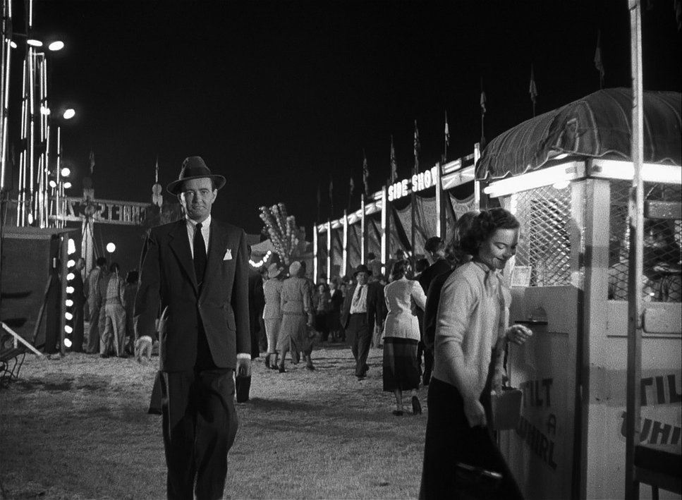
Then you have the infamous merry-go-round climax. The camera isn’t just observing the chaos; it’s part of it. The rapidly spinning, uncontrolled carousel becomes a literal metaphor for Guy’s life spiraling out of control. While the carousel is chaotic, Burks’ camera is in total command guiding our eye and focusing our terror. I also love the subtle movements, like the slow push-ins during Bruno’s monologues. They increase the intensity just enough to make us feel his twisted proximity.
The Geometry of Guilt: Compositional Choices
Composition is where the psychological weight of this film really resides. Burks uses the 1.37:1 frame to create a constant sense of entrapment. The use of intersecting lines is a brilliant visual motif think of the train car where the blinds cast “shadowy lines” across Bruno’s face while Guy remains “unmarked.” It’s not just decorative; it’s a visual distinction of their souls.
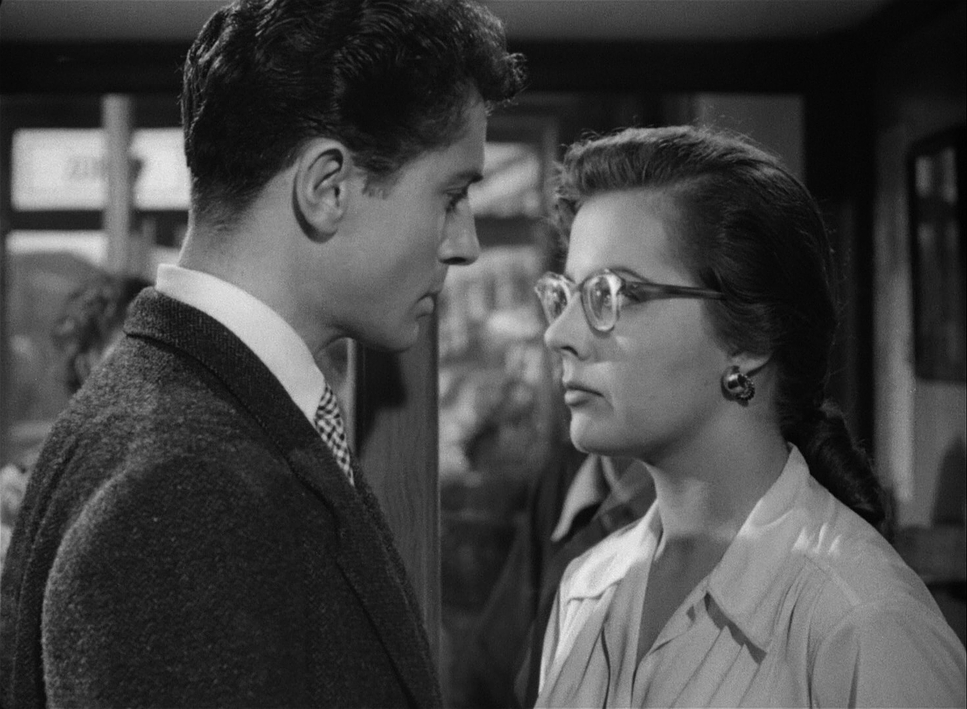
Later, the bars of a fence become a potent metaphor. When Guy and Bruno meet behind the gate, those bars literally dissect the frame, caging Guy even as he tries to deny his part in the scheme. And, of course, there’s the iconic shot through Miriam’s fallen glasses. Seeing a strangulation through a distorted, magnified lens is a horrifyingly bold choice. These aren’t accidents; they are meticulously planned depth cues designed to manipulate how we feel.
The Architecture of Chiaroscuro: Lighting Style
The lighting is deeply rooted in noir, but it’s tailored specifically for Hitchcock’s brand of suspense. In this world, shadows aren’t just an absence of light; they are active characters. While the sources feel “motivated” streetlights, lamps, windows their application is hyper-stylized.
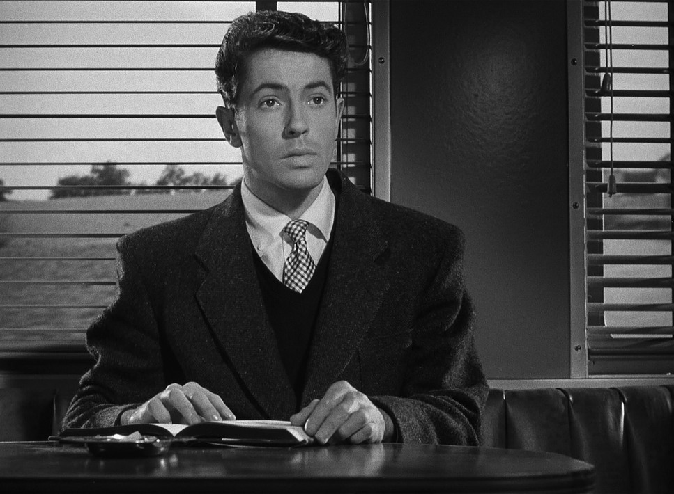
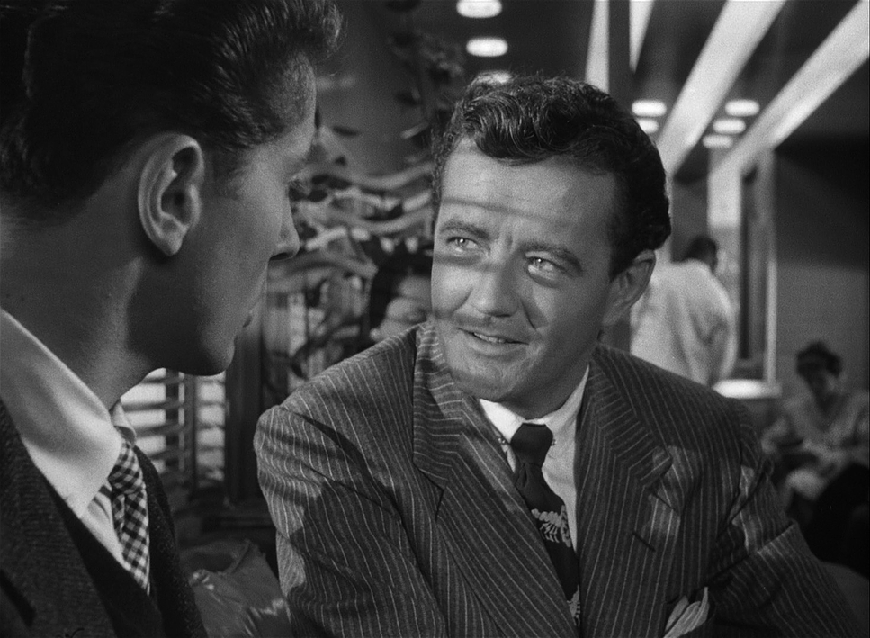
Think about Bruno. He constantly moves through areas of chiaroscuro, his face half-lit and half-shrouded. It visually embodies his dual nature: the charming facade masking the psychopathic core. Early on, Guy is lit more evenly to represent his innocence, but as Bruno’s influence grows, Guy starts falling into those same ambiguous lighting scenarios. Even in a “well-lit” home, you’ll see shadows clinging to the edges of the frame. It’s a sophisticated way to shape our perception of morality without a single line of dialogue.
Predatory Blocking and the 1.37 Frame

The lensing and blocking are incredibly precise. Burks and Hitchcock utilized the 1.37:1 spherical aspect ratio to its full potential, often opting for wider angles to emphasize the scale of the tennis stadium, then tightening the screws for intimate scenes.
The blocking is where the power dynamics live. Characters are rarely just standing there. On the train, Bruno strategically corners Guy, physically trapping him in the frame. During the tennis match, the blocking is genius—Guy is playing under immense pressure, and the camera picks out one lone, watchful figure in the crowd: Bruno. It’s a constant, predatory presence. I’ve always found the decision to keep Guy “visually simple” at the start a very deliberate choice; it makes his eventual descent into the “shadowy world” of the final act much more impactful.
The Colorist’s Perspective: Contrast Shaping in B&W

As a colorist, looking at a black-and-white masterpiece like this is a fascinating exercise in tonal range. Even though there’s no “color,” we are still manipulating luminance and contrast which is effectively the “color” of monochrome.
If I were grading this today, my focus would be entirely on contrast shaping. I’d want those deep, inky blacks to swallow threats, juxtaposed against stark, brilliant whites. I’d pay close attention to the highlight roll-off, ensuring that while the whites feel sharp and bright, they don’t lose their texture.
In B&W, hue separation translates to luminance values. A good grade ensures that the green of the grass and the red of a dress don’t just blend into the same muddy gray. In Strangers on a Train, the crispness of the tennis whites against the darker spectators is vital. It’s about tonally sculpting the image to maximize the drama, guiding the eye through light and shadow rather than a color palette.
Technical Craft: Mitchells and 35mm Grain
Strangers on a Train
Technical Specifications: 35mm Film • 1.37:1 Spherical
| Genre | Crime, Thriller, Psychological Horror, Murder Mystery, Mystery, Film Noir |
| Director | Alfred Hitchcock |
| Cinematographer | Robert Burks |
| Production Designer | Ted Haworth |
| Costume Designer | Leah Rhodes |
| Editor | William H. Ziegler |
| Time Period | 1950s |
| Color | Desaturated, Black and White |
| Aspect Ratio | 1.37 – Spherical |
| Format | Film – 35mm |
| Lighting | Hard light |
| Lighting Type | Daylight, Sunny, Artificial light |
| Story Location | North America > United States |
| Filming Location | North America > United States |
The technical execution here is a testament to the tools of the 1950s. Shot on 35mm film likely Eastman Double-X 5231 the image has a beautiful latitude and crispness. To pull off those elaborate, silent camera movements, they likely used Mitchell BNC cameras, which were the workhorses of the era.
The lighting relied on large arc lights for those punchy exteriors and Fresnel lights for the precise, hard-shadowed interiors. This allowed Burks to create that signature “hard light” look that defines the film’s psychological tone. Whether it was the dollies used for the train station or the process photography used to blend live action with projected backgrounds, every piece of kit was chosen to serve the narrative. The technology never pulls you out of the story; it amplifies it.
- Also read: SPARTACUS (1960) – CINEMATOGRAPHY ANALYSIS
- Also read: THIS IS SPINAL TAP (1984) – CINEMATOGRAPHY ANALYSIS
Browse Our Cinematography Analysis Glossary
Explore directors, cinematographers, cameras, lenses, lighting styles, genres, and the visual techniques that shape iconic films.
Explore Glossary →