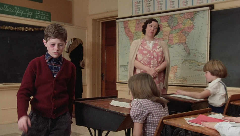
A Christmas Story, I still remember the hazy mid-90s VHS airings on the WGN Super Station. The fuzzy lines and the channel watermark weren’t “distractions” they were part of the texture. That “warm and fuzzy” feeling people talk about isn’t just about the script; it’s about how the image itself feels like a security blanket. It’s why the original became a 24-hour marathon staple on TNT, while the sequels especially A Christmas Story 2 felt like such a cold, visual letdown. As a colorist, I’m convinced the difference isn’t just the acting; it’s the masterful, quiet cinematography that most people feel but can’t quite name.
About the Cinematographer
The look of A Christmas Story was the work of Reginald H. Morris, a Canadian DP who understood something many modern cinematographers forget: you don’t have to be flashy to be brilliant. Morris’s style was rooted in naturalism. He wasn’t trying to draw your eye to the “coolness” of the camera; he was trying to pull you into a world. In A Christmas Story, he didn’t just light the Parker house; he created a visual diary. He found a way to balance the grounded reality of a blue-collar 1940s Indiana with the heightened, whimsical exaggerations of a child’s memory. It’s a deceptively difficult tightrope to walk, and he did it with incredible elegance.
Inspiration Behind the Cinematography
Everything starts with Jean Shepherd’s voice. His narration is dry, witty, and deeply subjective, and the cinematography had to mirror that. The goal wasn’t a documentary of the 1940s; it was a translation of how Christmas feels to a kid the massive anxiety of the Santa line, the obsession with a specific toy, the “end of the world” feeling of a triple-dog-dare.
The “warmth” wasn’t an accident. It was a deliberate choice to wrap the audience in nostalgia. Unlike the sequel, which suffered from “pointless tension” and forced drama, the original used its visuals to focus on the simple, quiet truths of growing up. Morris’s visual strategy was to protect that tone at all costs, ensuring the camera felt like a participant in the family’s life rather than a cold observer.
Lighting Style
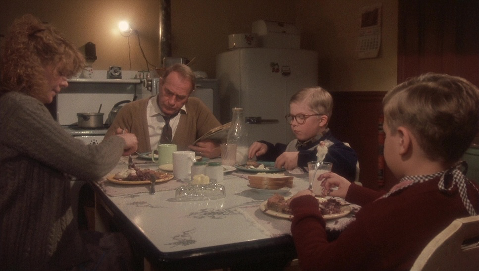
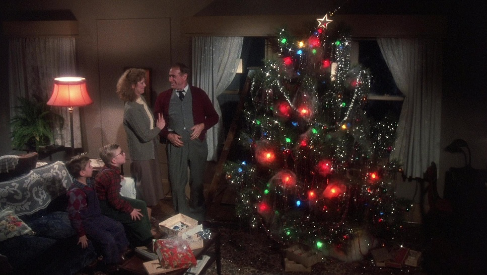
If you want to know why A Christmas Story feels so “cozy,” look at the light. Morris leaned heavily into motivated lighting. He used the practicals the table lamps, the flickering TV, the fireplace, and the Christmas tree to drive the scenes. These sources create pools of amber and orange that feel lived-in and organic.
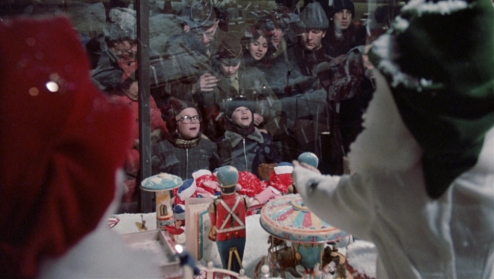
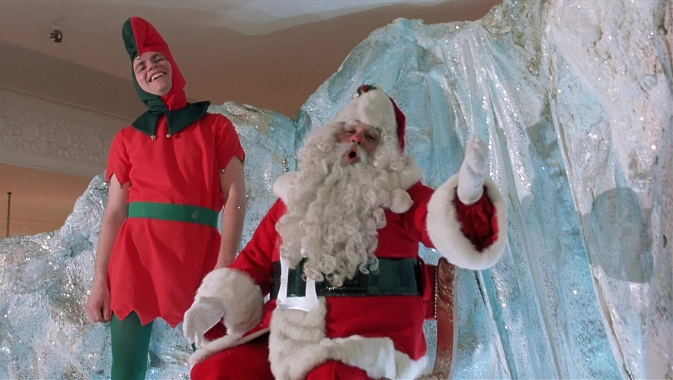
There’s a beautiful contrast at play: the warm, inviting interiors are often pitted against the cool, steely blues peeking through the windows, reminding us of the Indiana winter outside. But check out the department store scenes specifically the window display. That’s where you see hard light and top light used to create a “fairytale” theatricality. It’s a sharp contrast to the soft highlights in the Parker home. The absence of harsh, digital-style shadows keeps the humor intact, even when Ralphie is in “peril.” It’s a style that feels grown from the story, not manufactured in a lab.
Lensing and Blocking
Looking at the frames, it’s clear Morris favored spherical prime lenses. They have that classic early-80s character a slight softness toward the edges and a beautiful, creamy bokeh that digital lenses often lack. He used ultra-wide lensesfor those iconic POV shots, like looking up at the “giant” Santa in the department store. It makes the adults look like titans and the world feel impossibly huge.
The blocking is just as smart. Characters aren’t just standing there; they are positioned to show power dynamics. Ralphie is constantly dwarfed by his environment, while his parents are often framed as a solid, immovable unit. Even the physical comedy, like the infamous flagpole scene, is framed with such precision that the visual punchline lands perfectly without needing the camera to do the work for the actors.
Compositional Choices
Morris’s compositions are a masterclass in child-perspective storytelling. He lives in the low-angle shot. Whether it’s the imposing figure of the Old Man or the “mythical” presence of the leg lamp, the camera is positioned to make everyday objects feel monumental.
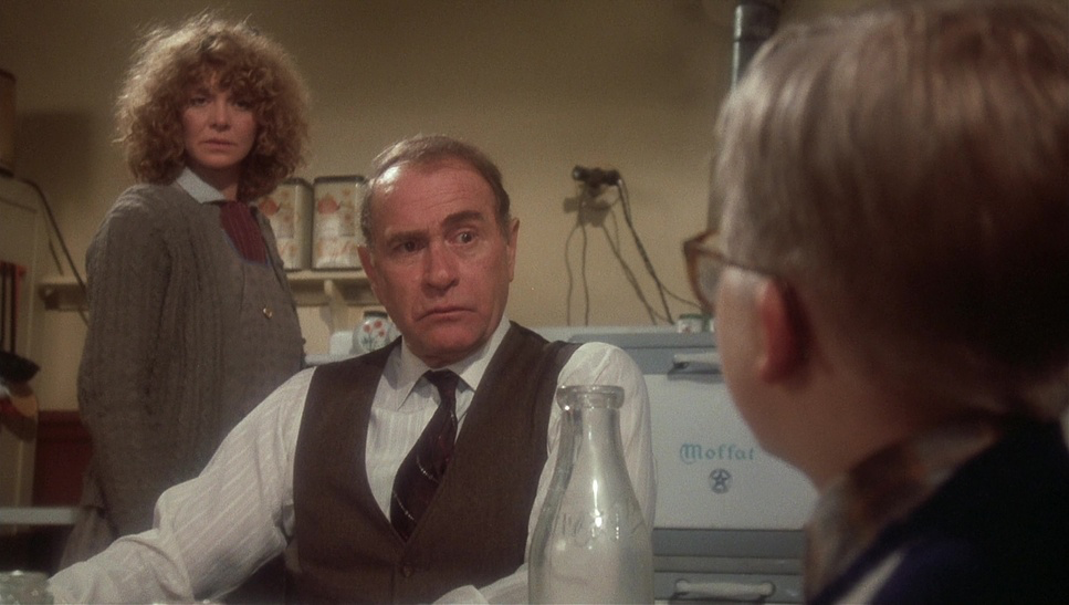
The depth cues are also vital. In the Parker living room, Morris layers the frame Ralphie in the foreground, Randy in the mid-ground, and the cluttered, messy house in the back. It creates a sense of sanctuary. The leg lamp isn’t just a prop; it’s framed as a vibrant, glowing character that dominates the space. Compare that to the “flat and empty” sets of the sequel, and you see why the original feels so much more “real.”
Camera Movements
InA Christmas Story, the camera moves with a purpose, not just because it can. We see gentle dollying through the department store to mimic Ralphie’s wide-eyed wandering. But often, the camera just holds. It trusts the composition to tell the story. There are those brilliant moments where Ralphie looks directly into the lens, breaking the fourth wall. It reminds us that this isn’t happening now—it’s a memory being recounted. It’s less about “action” and more about “observation,” letting us settle into Ralphie’s shoes.
Color Grading Approach
This is where I get a bit nerdy as a colorist. In the sequel’s critique, there’s a line about how they tried to recreate the “warmth” but missed the mark because they didn’t use film. They’re 100% right.
The “glow” of the 1983 film isn’t a digital filter; it’s photochemical color timing. It’s the result of how light hit that 35mm emulsion. The highlight roll-off is the secret sauce. In digital, highlights often “clip” or look brittle; on film, they roll off in a beautiful, naturalistic curve. The blacks are “lifted” just enough to feel organic, and the hue separation is incredible. The reds of the Santa suit and the greens of the tree pop without looking garish. It’s “tonal sculpting” through chemical baths, giving the image a weight and a texture that a modern “digital look” just can’t replicate without looking over-processed.
Technical Aspects & Tools
Shot on 35mm (likely Kodak stock of the time) using Panavision Panaflex cameras, the film has an inherent grain that acts as a bridge to the past. That grain is a “living” texture. The finishing process was entirely photochemical, meaning every color decision was made by physical light exposure through filters.
The “equipment” the original was shot on wasn’t just about the brand it was about a workflow that prioritized the organic over the sterile. The original leveraged the strengths of analog tools to build a world. The sequel, conversely, felt like it was fighting against the “cleanliness” of digital, resulting in those “terrible green screenshots” and “bad dramatic recreations.” It’s a reminder that the best gear in the world is useless without a DP who knows how to make it feel “human.”
- Also read: BEFORE MIDNIGHT (2013) – CINEMATOGRAPHY ANALYSIS
- Also read: HERO (2002) – CINEMATOGRAPHY ANALYSIS
Browse Our Cinematography Analysis Glossary
Explore directors, cinematographers, cameras, lenses, lighting styles, genres, and the visual techniques that shape iconic films.
Explore Glossary →