Let’s talk about Wonder (2017), Wonder is a fascinating case study for that. Stephen Chbosky’s adaptation of the R.J. Palacio novel is basically a masterclass in empathy. Honestly, this film could have easily spiraled into manipulative, “hallmark” sentimentality. It’s a dangerous line to walk. But it stays grounded, and a huge part of that success comes down to a very specific, very deliberate visual strategy. We’re following Auggie Pullman, a kid with a rare genetic condition navigating the meat-grinder of fifth grade, but the film is smarter than just focusing on him. It’s a kaleidoscope of perspectives the parents, the sister, even the bully. That kind of narrative requires a camera that knows when to be intimate and when to back off.
About the Cinematographer
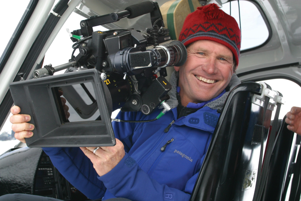
The look of Auggie’s world was spearheaded by Don Burgess, ASC. If you don’t know the name, you definitely know the work: Forrest Gump, Cast Away, Spider-Man. Burgess is a veteran in the truest sense. He’s a chameleon. What I love about his work is that he doesn’t have a “signature” style that he forces onto a script. Instead, he serves the story. For Wonder, he brings this warm, naturalistic touch a sense of “lived-in” reality that feels earned. He’s spent decades collaborating with directors who prioritize performance over flashy camera tricks, which is exactly what a story this sensitive needed. Burgess understands that sometimes the loudest visual statement is just quiet observation.
Inspiration Behind the Cinematography
The core of the visual language here is simple: Empathy. How do you visually communicate “walking in someone else’s shoes”? That’s the challenge. The film fragments itself, shifting to show the world through his sister Via’s eyes, or her friend Miranda’s. The camera has to shift its emotional emphasis along with them.
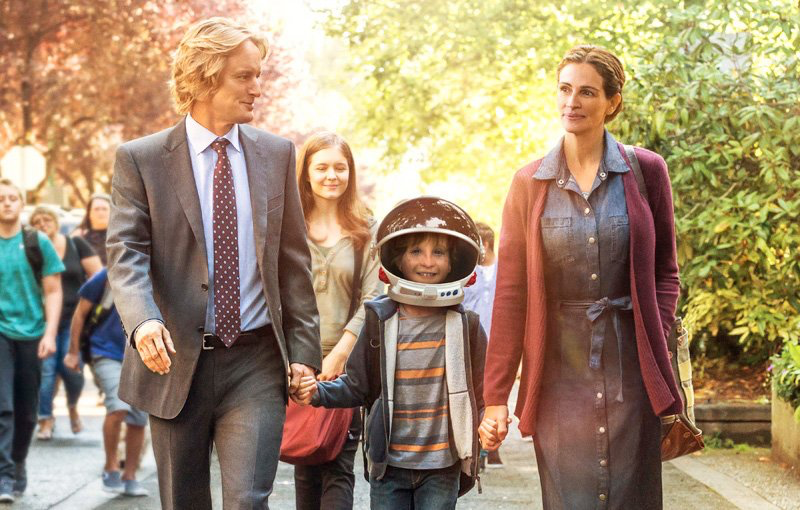
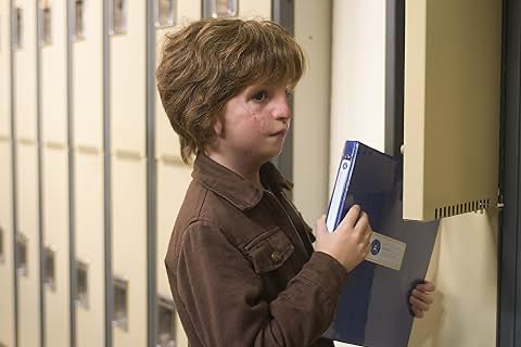
For Auggie, the inspiration clearly leans into that astronaut helmet. It’s a whimsical motif, sure, but it carries this heavy, poignant undertone of wanting to be invisible. The visual team had to capture a specific dichotomy: the vibrant, intelligent world inside Auggie’s head versus the external reactions of the people around him. The camera doesn’t gawk. It doesn’t sensationalize his face. Instead, it’s an invitation to look and understand. That’s a delicate North Star to follow, but it keeps the film from feeling exploitative.
Camera Movements
The movement in Wonder is remarkably disciplined. It’s motivated, understated, and designed to pull you into Auggie’s head without you realizing it. In those early school scenes, the camera feels like an extension of his own tentative steps.
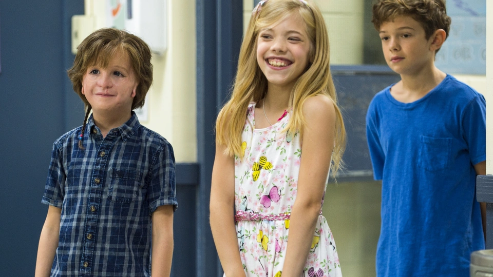
We see a lot of fluid, gentle tracking through the hallways. It’s not that aggressive, shaky handheld stuff you see in “gritty” dramas. It’s controlled almost balletic. It keeps us at his eye level, making the school environment feel as enormous and daunting as it feels to a ten-year-old. I noticed the use of dolly shots specifically to signal connection. When Auggie finally bonds with Jack Will, the camera feels more integrated. When he’s isolated, it lingers a slow push-in or a subtle track away to amplify the silence. Nothing feels gratuitous. Even the “man-to-man” talks with Owen Wilson’s character are handled with almost zero movement. The camera just sits there and lets the honesty of the moment breathe.
Compositional Choices
Compositionally, this film is all about the journey from isolation to acceptance. Early on, Auggie is often framed centrally but surrounded by massive amounts of empty space. He looks small. Vulnerable. When he has the helmet on, the frame almost embraces the whimsey, letting him disappear into his own world.
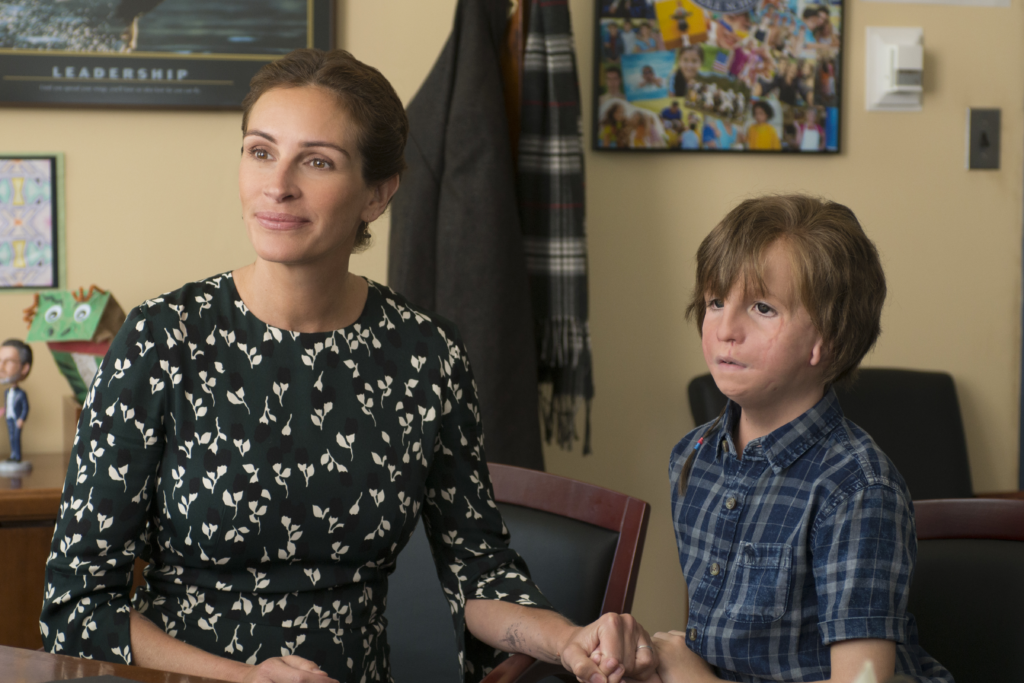
In the school scenes, the initial wide shots treat Auggie as a tiny speck in a sea of faces. It’s a classic “outsider” frame. But as he makes friends, the compositions shift. He starts appearing in group frames, even if he’s just on the edge at first. The eyeline matching here is vital; the film is very deliberate about showing how the world perceives Auggie and how he looks back. Those close-ups of Jacob Tremblay? They’re brave. Even with the heavy prosthetics, the camera is sensitive, seeking out the depth of the performance rather than the “look” of the makeup. It takes a lot of trust between a DP and a performer to pull that off.
Lighting Style

Now, let’s look at the light. Burgess leans hard into soft, warm, naturalistic sources. It’s all motivated windows, lamps, overheads. This keeps the extraordinary subject matter grounded in a believable reality.
The Pullman home is usually bathed in this diffused, gentle glow. It feels safe. It’s a sanctuary, especially compared to the cooler, slightly harsher lighting of the school classrooms. But even in the “colder” environments, Burgess avoids anything stark. The goal wasn’t to make Auggie look monstrous; it was just to show he was different. As a colorist, I really appreciate how the lighting on his face was sculpted to work with the prosthetics, not against them. They kept the highlights rolled off beautifully, ensuring his skin had an organic, delicate feel. That’s a massive technical challenge when you’re dealing with prosthetic textures, but it’s essential for the audience to connect emotionally.
Lensing and Blocking
For lensing, they likely went with spherical glass. It provides a natural rendering of perspective with minimal distortion pure realism. They used wide angles sparingly, mostly just to show how small Auggie feels in big spaces. The heavy lifting is done with medium and longer focal lengths. Those longer lenses compress the space, drawing us into the characters’ personal bubbles during those poignant conversations. It creates that soft fall-off in the background that keeps your eyes exactly where they need to be: on the eyes of the actors.
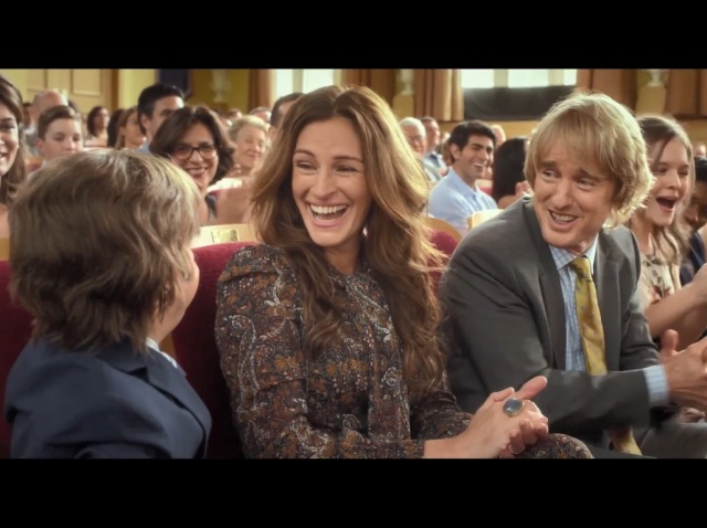
The blocking is just as intentional. Early on, Auggie is physically separated sitting alone in the cafeteria or on the playground. As the story progresses, the blocking brings him into “protective clusters” with Jack Will or Summer. I also loved the blocking with his parents; Julia Roberts and Owen Wilson are often positioned as a physical barrier between Auggie and the world, or leaning in to show that deep connection. Even Via’s feeling of being “overlooked” is shown through blocking she’s often just outside the primary familial core in the frame. It’s subtle, but it tells the story.
Color Grading Approach
This is my home turf, and I have to say, the grade here is a masterclass in restraint. It’s warm and inviting, but they never pushed it into that “saccharine” or oversaturated territory. It’s a naturalistic look that prioritizes depth over flash.
In my view, the grade was built to protect the skin tones. Everything feels healthy and authentic. The mid-tones hold a ton of information, which gives the image a sense of dimension. The shadows aren’t “crushed” or digital; they have a gentle, warm kiss to them, almost like a print-film aesthetic. This makes the film feel timeless rather than like a 2017 digital production.
The highlight roll-off is incredibly smooth. When you look at the windows or lamps, the light diffuses into the white rather than “clipping” harshly. It’s a compassionate grade. The contrast isn’t “punchy” or aggressive; it’s nuanced. It lets the performance do the work. You see a bit of hue separation between the earthy, warm home and the neutral, slightly cooler school, but it’s never jarring. It’s a perfect example of a grade that enhances the truth of a scene instead of trying to dictate it.
Technical Aspects & Tools
We don’t have the literal camera reports, but based on the texture and the era, I’d bet my suite they shot on the ARRI ALEXA. Its color science and dynamic range are still the gold standard for rendering skin tones, and for a film like this, you need that film-like latitude.
They probably paired it with high-end spherical primes for the intimate moments and zooms for the school hallways where they needed flexibility with the kids. The aspect ratio gives it that cinematic scope while keeping the focus tight on the faces. The real technical MVP, though, is the marriage between the prosthetics and the digital intermediate. Keeping those prosthetics looking like “skin” across different lighting setups and focal lengths is a nightmare. It requires meticulous color matching and texture management in the grade. The goal was clearly to make the technology disappear so we only see Auggie.
- Also read: THE HOLDOVERS (2023) – CINEMATOGRAPHY ANALYSIS
- Also read: THE BLUES BROTHERS (1980) – CINEMATOGRAPHY ANALYSIS
Browse Our Cinematography Analysis Glossary
Explore directors, cinematographers, cameras, lenses, lighting styles, genres, and the visual techniques that shape iconic films.
Explore Glossary →