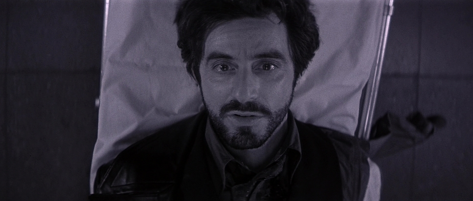
Let’s talk about the opening of Carlito’s Way. We start at the end a 45-second, desaturated, nearly black-and-white sequence on a stretcher. As a colorist, that choice hits me immediately. It’s a visual spoiler that sets the tone for everything that follows. Brian De Palma and Al Pacino gave us a swan song for the classic gangster, a film that feels more “grown-up” than Scarface but maintains that operatic, high-stakes energy. Every time I watch it, I find something new in how the image supports Carlito’s doomed attempt to “go straight.”
About the Cinematographer

The man behind the glass was Stephen H. Burum. If you look at De Palma’s filmography The Untouchables, Mission: Impossible Burum is the common denominator. They had a shorthand that most director-DP duos would kill for. Burum wasn’t just “lighting a set”; he was building a world that could accommodate De Palma’s insanely long takes and voyeuristic tendencies. His technical precision is legendary. To pull off those deep-focus shots where the foreground and background are equally sharp requires a massive amount of light and a surgical eye for focus. Burum gave De Palma the playground he needed to be bold.
Inspiration Behind the Cinematography
You can’t talk about De Palma without talking about Hitchcock. That voyeuristic, “eyes everywhere” sensibility is baked into the DNA of Carlito’s Way. But there’s also a gritty, New York realism here that feels authentic to the 70s and 80s, even though it was shot in the 90s. The visual style serves as a tension between the “old Carlito” and the “new Carlito.” It’s an operatic tragedy. The cinematography wraps Carlito in this visual blanket of doom; he’s often isolated in the frame, a man alone even when the room is packed. It’s that “half-in, half-out” philosophy visualized.
Lensing and Blocking
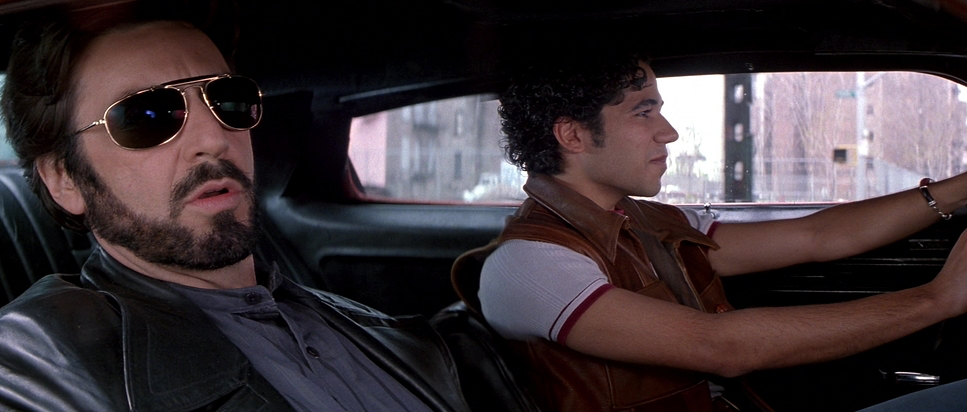
This is where the technical nerd in me gets excited. They shot this on 35mm using Panavision Gold and G2 cameras, paired with C-series lenses. Choosing that 2.35:1 aspect ratio wasn’t just about looking “cinematic” it was about the horizontal space. Burum used that wide frame to layer his blocking. You’ll see characters positioned in the far foreground, midground, and background, all telling a story simultaneously. The C-series glass gives the image a specific character, a certain “roundness” to the highlights and a beautiful fall-off that you just don’t get with modern digital sensors. The blocking isn’t just actors walking; it’s a choreographed dance between the Panavision G2 and the cast.
Camera Movements
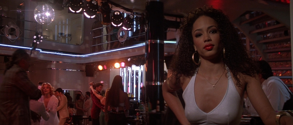
In a De Palma film, the camera is a character. Period. It doesn’t just sit there; it glides. In the nightclubs, the camera is a “fly on the wall,” weaving through the crowd and pulling us into Carlito’s world. Then, of course, you have the Grand Central Station chase. It’s a logistical nightmare that looks like a dream. It feels like one continuous, breathless take. The tension doesn’t come from fast cutting it comes from the lack of cutting. We are stuck with Carlito in real-time, feeling every second of that desperate flight. Even the smaller moments, like a swivel in Gail’s apartment, feel theatrical, almost like a stage play captured on film.
Compositional Choices
Burum and De Palma loved their deep focus. They used the architecture of New York the doorways, the subway pillars, the cramped clubs to trap Carlito. He’s constantly framed by his environment, suggesting he can never truly break free. Look at how often he’s seen through reflections or through a “frame within a frame.” It’s a visual metaphor for his predicament. When he’s with Gail, the depth of field might soften, giving them an intimate bubble. But the moment he steps back into the “street,” the world opens up into deep focus, reminding us that his past is always lurking in the background.
Lighting Style
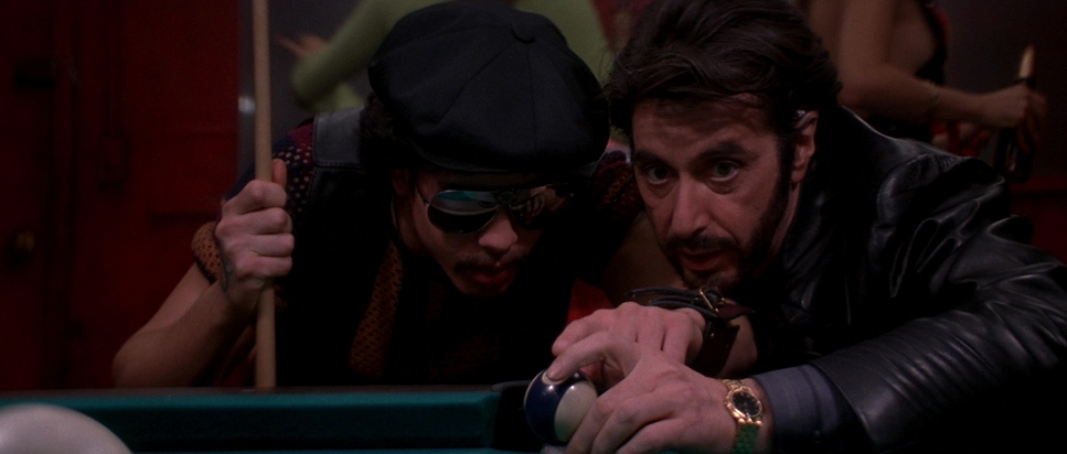
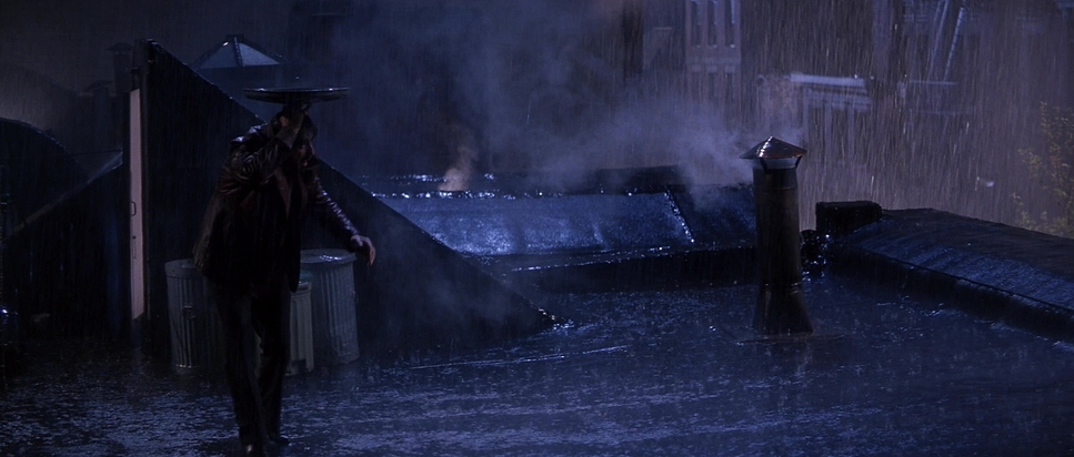
The lighting here is pure neo-noir but with a vibrant, 90s-infused palette. It’s all about motivated sources. The clubs are drenched in ambers and magentas from practical lamps, creating a seductive but claustrophobic vibe. But look at the contrast shaping it’s aggressive. We get these inky, deep shadows that cut across faces. There’s a recurring motif where Carlito’s face is literally split: half in light, half in shadow. It’s his internal conflict made visible. Soft light is used for the intimate interior moments, but it’s always balanced against that unforgiving, artificial night light of the city.
Color Grading Approach
As a colorist, this is the soul of the movie for me. If I were grading this today, I’d be obsessed with preserving that “print-film” look. The colors are vibrant, but they have a density to them they feel “thick.” You have that high-contrast, desaturated opening that bleeds into the lush, saturated world of Carlito’s present. I’d focus heavily on hue separation in the club scenes, making sure those reds feel “dangerous” without losing the skin tones. There’s a painterly quality to the grain structure of the 35mm stock that gives it an “oddly timeless feel.” It doesn’t look like a “90s movie”; it looks like cinema. I’d want to sculpt those ambers and sepias in the narration scenes to feel wistful, contrasting them against the cooler, harsher tones of the subway climax.
Technical Aspects & Tools
Carlito’s Way
Technical Specifications
| Genre | Crime, Thriller, Gangster, Mafia |
| Director | Brian De Palma |
| Cinematographer | Stephen H. Burum |
| Production Designer | Richard Sylbert |
| Costume Designer | Aude Bronson-Howard |
| Editor | Bill Pankow, Kristina Boden |
| Colorist | Dennis McNeill |
| Time Period | 1990s |
| Color | Desaturated, Black and White |
| Aspect Ratio | 2.35 – Spherical |
| Format | Film – 35mm |
| Lighting | Soft light |
| Lighting Type | Artificial light |
| Story Location | New York City |
| Filming Location | New York City |
| Camera | Panavision Gold / G2 |
| Lens | Panavision C series |
The film is a testament to analog craft. Using the Panavision ecosystem the G2 and those C-series lenses allowed for a level of visual texture that digital still struggles to replicate. Every shot required massive coordination between the grip and electric departments, especially for those ambitious Steadicam moves. There were no digital safety nets here. The Grand Central sequence is a marvel of pre-visualization and physical rigging. It’s proof that when you have a director who knows exactly what he wants and a DP who knows exactly how to get it, you don’t need CGI to create tension.
- Also read: A FISTFUL OF DOLLARS (1964) – CINEMATOGRAPHY ANALYSIS
- Also read: TRUE ROMANCE (1993) – CINEMATOGRAPHY ANALYSIS
Browse Our Cinematography Analysis Glossary
Explore directors, cinematographers, cameras, lenses, lighting styles, genres, and the visual techniques that shape iconic films.
Explore Glossary →