It’s not always about the plot; sometimes it’s about the sheer audacity of the visual craft. In 1977, this “little” comedy famously beat out Star Wars for Best Picture. That tells you everything. It wasn’t just a win for Woody Allen; it was a win for a quiet, innovative spirit that proved cinematography could be experimental and intimately personal at the same time. To me, it’s a meticulously crafted visual essay on human neuroses.
About the Cinematographer
The man behind the lens was the legendary Gordon Willis. If you know his work on The Godfather or All the President’s Men, you know he wasn’t interested in making “pretty” pictures. They called him the “Prince of Darkness” for a reason. Willis didn’t just capture reality; he sculpted it. He had this incredible habit of underexposing scenes to get a rich, moody aesthetic that felt naturalistic yet entirely deliberate. For Allen who was trying to move away from broad slapstick into something more introspective Willis was the perfect anchor. His sophisticated, grounded style allowed the film to “grow up.”
Technical Aspects & Tools
Annie Hall
Technical Specifications | 35mm Spherical
| Genre | Comedy, Drama, Romance |
| Director | Woody Allen |
| Cinematographer | Gordon Willis |
| Production Designer | Mel Bourne |
| Costume Designer | Ruth Morley |
| Editor | Wendy Greene Bricmont, Ralph Rosenblum |
| Time Period | 1970s |
| Aspect Ratio | 1.85 – Spherical |
| Format | Film – 35mm |
| Lighting | Soft light |
| Lighting Type | Artificial light |
| Story Location | New York, New York |
| Filming Location | North America, United States |
| Camera | Panavision Cameras |
| Lens | Panavision Lenses |
| Film Stock / Resolution | Eastman 100T 5247 |
The technical backbone here was 35mm film, specifically Eastman 100T 5247. It’s a classic stock, and Willis knew exactly how to push it. He leaned on Panavision cameras and prime lenses to keep the image sharp and honest. But the real magic happened in how the visual capture met the edit. Think about the split screens, the fourth-wall breaks, and that animated sequence. Those aren’t just “post-production tricks.” They required clean plates and seamless transitions shot with mathematical precision. Annie Hall proves that tools only matter when they serve a specific, stubborn artistic vision.
Inspiration Behind the Cinematography
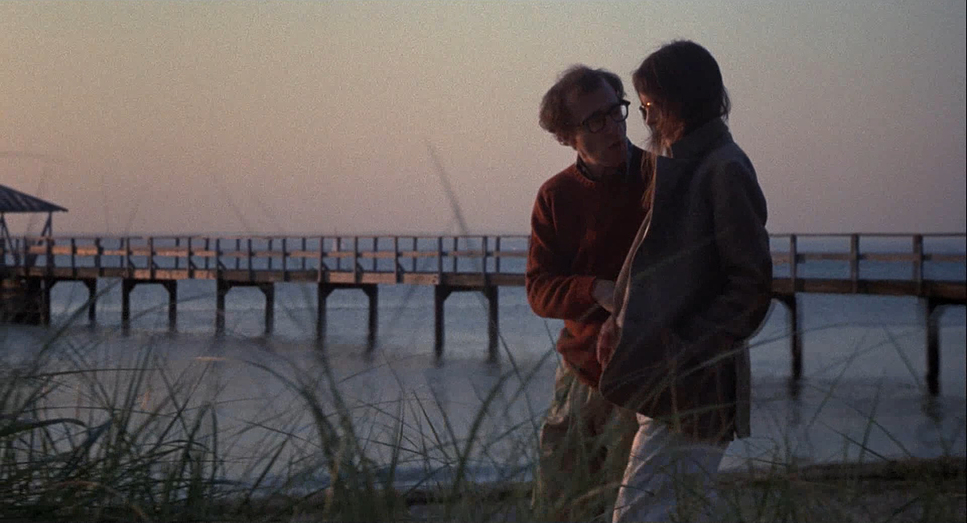
How do you visualize a scattered, neurotic stream of consciousness? That was the challenge. The narrative is a delightful chaos memories, anxieties, and direct addresses to the camera. One reviewer noted that no Best Picture winner before this was so experimental. To make it work, the cinematography had to be incredibly flexible. Willis wasn’t just lighting a set; he was visualizing Alvy Singer’s internal world. When characters pull passersby into an argument or subtitles reveal inner thoughts, the camera has to maintain an informal intimacy. It’s what prevents the film from feeling like a disjointed gimmick.
Lighting Style

This is where the “Prince of Darkness” moniker really shines. Willis wasn’t afraid of a black frame. He used practical lamps and available light to shape a scene rather than just flooding it with light. Shooting on 5247, he pushed the dynamic range to its limits, creating a low-key look that feels authentic to 1970s New York. His contrast shaping is masterly. The blacks are deep and solid they provide a foundation. The highlights have that beautiful, organic roll-off that we spend so much time trying to emulate in digital grading today. It’s about emotional truth over “clean” perfection.
Compositional Choices

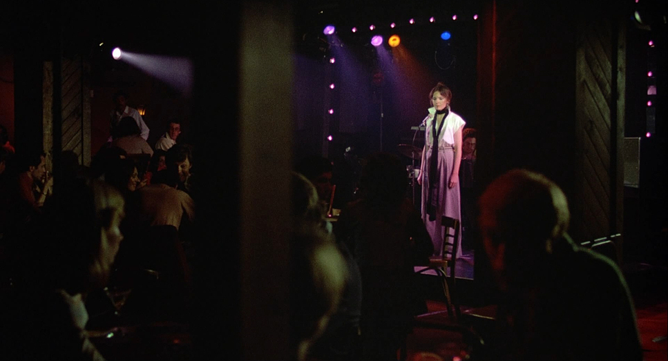
The composition in Annie Hall is deceptively simple. Every frame feels lived-in. Willis used depth cues a lamp in the foreground, a doorway in the back to make tight New York interiors feel three-dimensional. It’s never rigid. He often used wider shots to swallow the characters into the city backdrop, emphasizing Alvy’s isolation or the tiny “bubble” he shared with Annie. Then you have the split-screens. Literally dividing the frame to show two interconnected realities is a bold move. It’s a genius way to frame the conversational, stand-up comedy style that defines Alvy’s character.
Lensing and Blocking
Willis favored prime lenses. No lazy zooming here. If he wanted a different perspective, he moved the camera. Most of the conversational scenes feel like they were shot on a 50mm it’s the most “human” perspective. It mimics how we actually see people. The blocking is just as intentional. Alvy and Annie’s dynamic is told through space. Sometimes they are intertwined; other times, they are physically separated by furniture or walls to show the growing distance. Even Diane Keaton’s “clumsy” persona is a choice of movement, blocked in perfect contrast to Alvy’s rigid, tense posture.
Camera Movements
The camera in Annie Hall is like a patient therapist. You won’t see aggressive crane shots or flashy whip pans. The movement is motivated by the characters. Dolly moves are used sparingly, usually to pull us into a walk-and-talk on a Manhattan sidewalk. When Alvy breaks the fourth wall, the camera holds steadfast. It doesn’t move. That stillness reinforces the idea that he’s confiding in us, not performing for a crew. It’s a masterclass in quiet confidence. The camera never gets in the way of the story.
Color Grading Approach
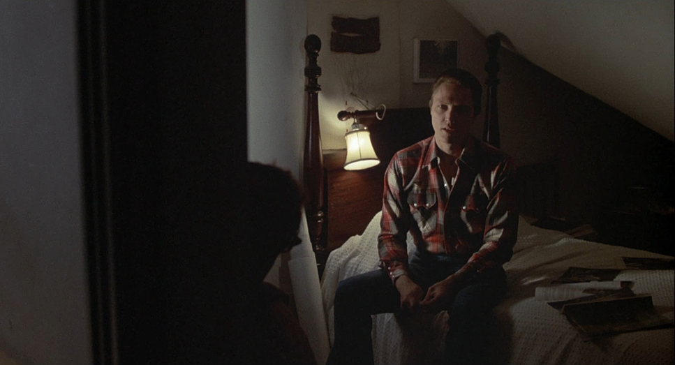
As a colorist, looking at Annie Hall is a lesson in respecting the lab. If I were grading this today, I wouldn’t try to “fix” it. I’d lean into that naturalistic 70s palette. I’d want those tungsten practicals in Alvy’s apartment to sing with golden yellows and oranges. That warmth needs to contrast against the cooler, desaturated grays of the New York streets.
The biggest trap in a modern grade would be lifting the blacks. I’d fight that. Willis wanted those shadows to stay dark, so I’d preserve that depth. The highlight roll-off is the other priority. Film handles overexposure with a grace digital struggle to match. I’d make sure those bright windows or blooming lamps retain their soft, organic fall-off. It’s about honoring the print-film sensibility while giving it enough polish for a modern display. You want the mundane to feel poetic.
- Also read: CROUCHING TIGER, HIDDEN DRAGON (2000) – CINEMATOGRAPHY ANALYSIS
- Also read: CORALINE (2009) – CINEMATOGRAPHY ANALYSIS
Browse Our Cinematography Analysis Glossary
Explore directors, cinematographers, cameras, lenses, lighting styles, genres, and the visual techniques that shape iconic films.
Explore Glossary →