Cameron Crowe’s Almost Famous (2000).This isn’t just a great movie; it’s a masterclass in how visual storytelling can sync perfectly with narrative and emotion. Every time I watch it, I feel like I’m right there, backstage with Stillwater or riding on that bus, feeling the hum of the road and the pulse of the music. It’s a film that resonates because it’s so deeply personal and authentic, and a huge part of that authenticity comes from its cinematography.
About the Cinematographer
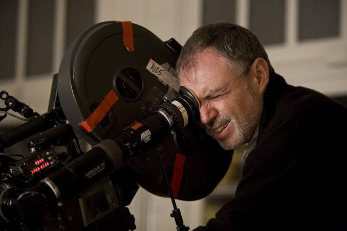
When we talk about the visuals of Almost Famous, we have to talk about the maestro behind the camera, John Toll, ASC. Now, John Toll isn’t necessarily the first name you’d associate with an indie-rock coming-of-age story, especially considering he won back-to-back Oscars for massive epics like Legends of the Fall and Braveheart.
But honestly, that’s why it works. He brings a sense of “gravitas” to a teenage boy’s bedroom and a cramped tour bus. He applies that same eye for naturalism and poetic realism he used on The Thin Red Line to a much more intimate, character-driven world. It’s a testament to his versatility that he could pivot from vast battlefields to the “Doris” tour bus without missing a beat. He isn’t being flashy here; he’s acting as a storyteller first, choosing elevated visuals over a more conventional, gritty rock ‘n’ roll aesthetic.
Inspiration Behind the Cinematography
The core inspiration for the look, at least from where I’m sitting, stems directly from its autobiographical roots. This isn’t just a script; it’s Cameron Crowe’s memories filtered through the lens of a wide-eyed teenager, William Miller.
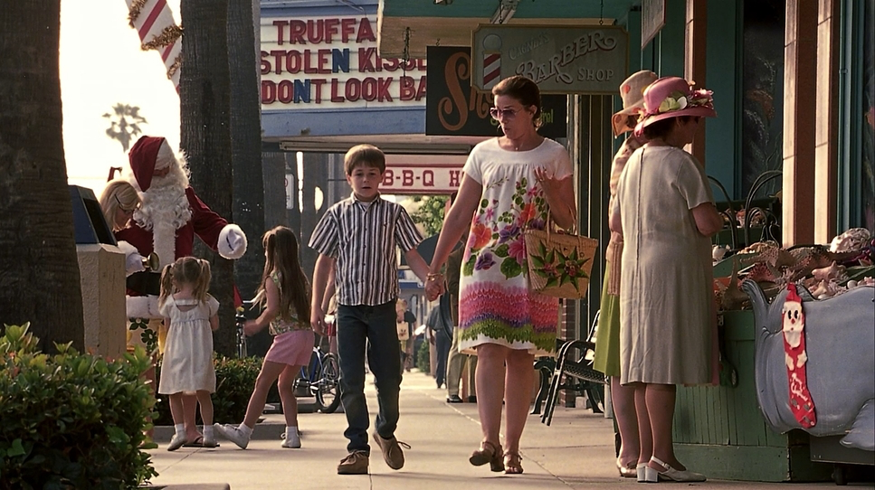
The camera effectively becomes William’s eyes, capturing the rock world with a blend of awe and naive wonder. We aren’t seeing the cynical, grimy side of the 70s rock scene at least not at first. Instead, we experience it through William’s youthful, slightly idealized gaze. This means the visual approach leans heavily into a nostalgic glow. The goal was to bottle that fleeting magic and sense of possibility, making us feel the 70s rather than just showing us a bunch of period-accurate costumes.
Lensing and Blocking
The choices in lensing and blocking are incredibly intuitive, and they do a lot of the heavy lifting when it comes to the film’s rhythm. John Toll and Crowe clearly thought about how each lens choice would serve William’s journey.
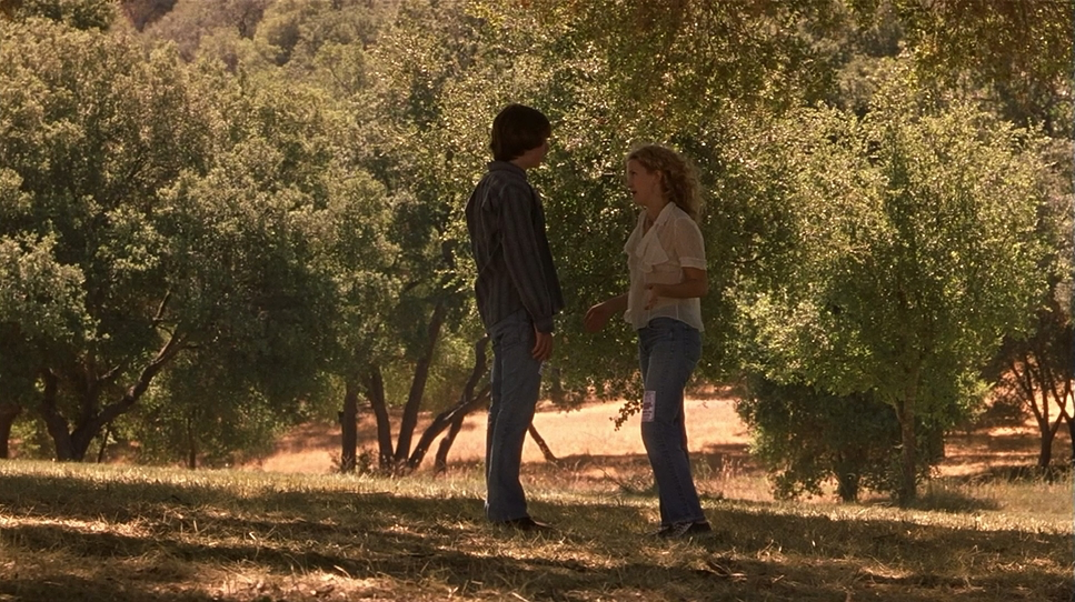
I love the application of focal lengths here. Wider lenses likely those Panavision Primes are used to establish the grander scale of the concerts or the bustling chaos of airports, making you feel immersed in the band’s universe. But for those quiet, profound moments between William and Penny, or William and Russell, the camera shifts toward longer lenses. This compresses the background and forces us to focus solely on the characters’ faces, amping up the emotional weight.
The blocking is just as smart. Think about the tour bus: characters are often crammed together, their physical proximity mirroring that forced camaraderie and the growing tensions that come with it. Conversely, when Penny Lane or Russell are feeling the weight of their choices, they’re often isolated in the frame. It tells you everything you need to know about their headspace without needing a single line of dialogue.
Camera Movements
The camera movements are deliberate and often subtle. There’s a fluidity to them, a natural rhythm that syncs with the story’s unhurried pace. In the early scenes, the camera feels observational tracking William as he tries to keep up with the band or slowly pushing in on his reactions. It’s a subtle way of reminding us he’s an outsider looking in.
During the concert sequences, though, things get more dynamic. The camera sweeps across the stage and through the crowds, occasionally going handheld to inject some raw, energetic authenticity. You really feel the buzz and the chaos. But my favorite moments are when the camera settles. The infamous plane scene isn’t about wild moves; it’s about the subtle, almost imperceptible sway of the frame, hinting at the turbulence both outside and within the characters. It’s never moving just for the sake of moving; it’s always serving William’s evolving perspective.
Compositional Choices
John Toll’s compositions are masterful. There’s a beautiful balance between wide, almost tableau-like shots of the touring life and those intimate close-ups that bring us directly into the characters’ inner worlds.
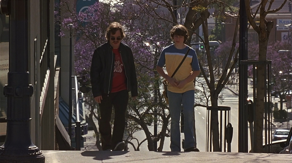
Early on, William is often framed in negative space a small figure slightly apart from the core group. It reinforces his “journalistic objectivity,” or at least his attempt at it. As he integrates more, we see him within the band’s spatial relationships, but he’s still often positioned slightly off-center. It’s a gentle visual reminder that, at the end of the day, he’s still an observer, not a band member.
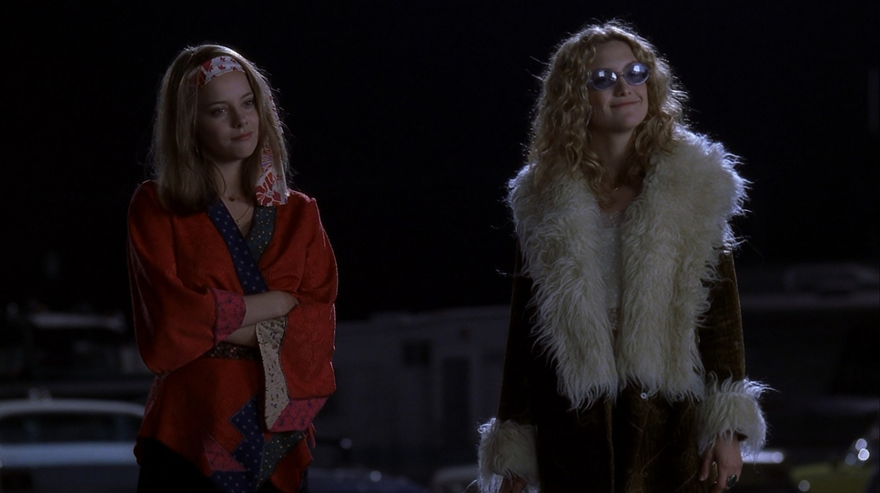
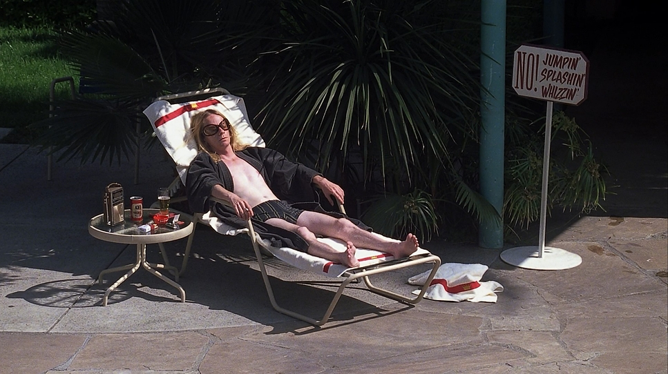
The frames are also rich with atmospheric depth. Toll uses natural haziness, practical lights, and layered foreground elements to make the hotel lobbies and bus interiors feel “lived-in.” And when we get those iconic shots like Russell on the roof declaring “I am a golden god!” the composition isolates him against the night sky, perfectly embodying that larger-than-life rock star mystique.
Lighting Style
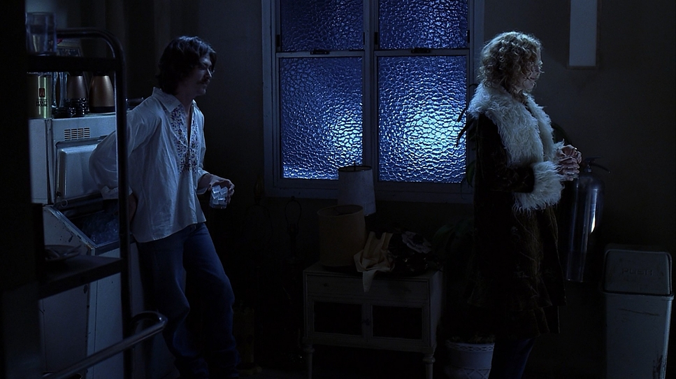
The lighting is arguably the film’s most defining characteristic. It’s a beautiful example of motivated lighting; it almost always feels like it’s coming from practical sources stage lights, hotel lamps, or the California sun.
Toll leans heavily into natural light for exteriors, letting the sun sculpt faces with a soft, warm glow. For the bus and hotel interiors, he uses rich, amber practicals. It creates a great contrast: the public, electrifying glare of the stage versus the shadowy warmth of private moments. While the general vibe is soft and nostalgic, Toll isn’t afraid of some “harder” top-lighting or side-lighting in specific moments to ground the scene and give it some grit. There’s a subtle use of diffusion that softens the edges, evoking a classic print-film sensibility that avoids digital harshness and embraces a dreamlike quality.
Color Grading Approach
Now we’re really in my wheelhouse. As a colorist, the grading of Almost Famous is just sublime a masterclass in period-appropriate aesthetics. The color palette is very heavy on browns, sepia tones, burgundies, and light reds. It’s not about vibrant, punchy primaries; it’s about warmth and an organic, slightly desaturated feel.
The goal wasn’t a pristine, clinical image, but one that feels like a cherished memory or a faded photograph. The yellows aren’t aggressive; they’re golden. The browns are rich and textural, not muddy. From a technical perspective, the contrast shaping is crucial. The film maintains a healthy contrast that gives the image dimension without crushing the blacks or blowing out the highlights. The highlight roll-off is smooth and gentle the hallmark of 35mm film which prevents any digital “ping” and keeps the look bittersweet and timeless. It’s never trying to look “modern,” and that’s exactly why it works.
Technical Aspects & Tools
| Genre | Drama, Music, Road Trip |
| Director | Cameron Crowe |
| Cinematographer | John Toll |
| Production Designer | Clay Griffith |
| Costume Designer | Betsy Heimann |
| Editor | Joe Hutshing, Saar Klein |
| Colorist | David Orr |
| Time Period | 1970s |
| Color | Warm, Desaturated, Yellow |
| Aspect Ratio | 1.78 – Spherical |
| Format | Film – 35mm |
| Lighting | Hard light, Backlight |
| Lighting Type | Daylight, Sunny |
| Story Location | North America > United States of America |
| Filming Location | North America > United States |
| Camera | Panavision Gold / G2 |
| Lens | Panavision Primo Primes |
The raw technical foundation here is firmly rooted in analog filmmaking. Shot on 35mm film (using Panavision Gold/G2 cameras and Primo Primes), the inherent texture and grain structure are the bedrock of the film’s character.
The recent 4K restoration from Paramount is a massive win. It’s not just about the resolution; it’s about how they handled the grain. On older versions, the grain could look noisy or “mushy” in the shadows, but here it’s consistent and cinematic. While the Dolby Vision HDR is included, I’ll be honest: because the palette is so intentionally subdued and sepia-toned, you aren’t going to see an “overwhelming” boost in color. But that’s a good thing. The HDR is used here to preserve subtle tonal gradations, not to make it look like a cartoon.
- Also read: SERENITY (2005) – CINEMATOGRAPHY ANALYSIS
- Also read: THE FUGITIVE (1993) – CINEMATOGRAPHY ANALYSIS
Browse Our Cinematography Analysis Glossary
Explore directors, cinematographers, cameras, lenses, lighting styles, genres, and the visual techniques that shape iconic films.
Explore Glossary →