I don’t just watch The Fugitive (1993) I study it. It’s one of those rare 90s thrillers that manages to be a massive blockbuster pulling in over $300 million and seven Oscar nods while maintaining a gritty, artisan soul. Tommy Lee Jones’s win for Best Supporting Actor was well-deserved, but for me, the real star of the recent 4K restoration is the visual grammar. Revisiting this film is like sitting down with a mentor. It’s a masterclass in pacing and visual “weight.” It reminds you that you can keep an audience breathless for 130 minutes not through frantic cutting, but through the potent use of color, light, and composition.
About the Cinematographer
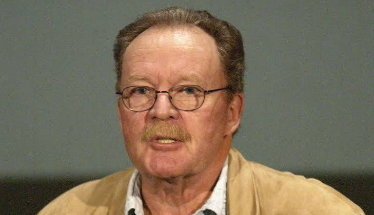
The visual “architect” here was Michael Chapman, and you can see his DNA all over the frame. This is the man who shot Taxi Driver and Raging Bull, so he’s a legend at capturing urban decay and raw human desperation. Chapman didn’t care about making things “pretty.” He cared about making them feel authentic. In The Fugitive, he treats the Chicago landscape as a cold, indifferent character that is constantly trying to swallow Dr. Richard Kimble whole. His experience with harsh, naturalistic textures was the secret sauce here; he knew exactly how to make a character’s internal struggle feel palpable through the glass.
Color Grading Approach
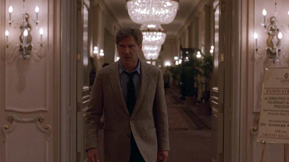
From my perspective in the grading suite, the 4K remaster is a revelation. I’ve seen too many “restorations” that use heavy-handed noise reduction (DVNR) to make old film look like plastic, but this transfer preserves the organic 35mm grain beautifully. The “blue-gray” palette isn’t just a wash; it’s a foundational choice. What I love is the hue separation. Even when the scene is drenched in cool, cyan-leaning shadows, the skin tones remain protected and “thick,” which is a hallmark of great print-film chemistry. The highlights roll off smoothly, never hitting that harsh digital “clip.” When you see the texture of the beard hair on Harrison Ford’s face in 4K, it isn’t just about resolution it’s about the “presence” of the negative. It looks like it was shot yesterday, but with a tonal density that modern digital sensors still struggle to replicate.
Lighting Style
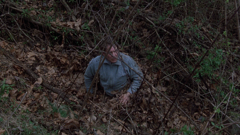
Chapman’s lighting is predominantly naturalistic, almost “unlit” in its grit, which is exactly what a thriller needs. We don’t see the overly polished, three-point lighting of modern action flicks. Instead, he embraces the “sodium-vapor” vibe of the 90s. Most of the film lives in a cool, harsh palette that emphasizes Kimble’s isolation. However, notice how Chapman pivots for the flashbacks or the courtroom; the lighting shifts to a noticeably warmer, “golden” incandescent glow. As a colorist, I see this as a dynamic range strategy it subconsciously tells the viewer when they are safe and when they are in danger. He uses light to sculpt emotion without ever being overtly “theatrical.”
Compositional Choices
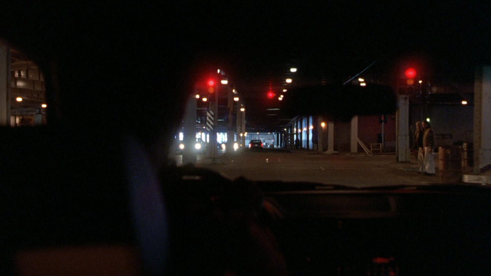
This is where the film really breathes. While some versions are cropped for 1.78:1 (16:9), the true power of The Fugitive lies in its original 2.39:1 Anamorphic frame. Chapman uses that wide horizontal canvas to trap Kimble. He’s frequently framed as a small figure against the vast, crushing architecture of Chicago.
The iconic sewer confrontation is the peak of this craft. When Ford yells, “I didn’t kill my wife,” and Jones drops that chilling “I don’t care,” the framing is unflinching. There’s zero wasted space. Later, the use of foreground elements doorways, columns, and unsuspecting crowds creates a “visual vise” that makes the viewer feel just as claustrophobic as the protagonist.
Camera Movements
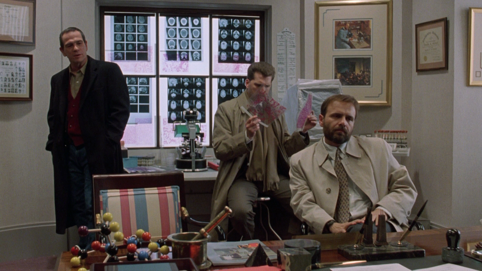
The camera in The Fugitive is an active participant in the manhunt. It doesn’t just observe; it pursues. Take the interrogation scene: that slow “boom down” on Ford’s face as he breaks is a surgical use of a camera move to force empathy.
And then there’s the train wreck. This sequence is visceral because the camera is right there in the pocket with Ford. It’s agile and kinetic, maintaining spatial awareness even in total chaos. Whether it’s the handheld-esque fluidity of the urban chases or the more calculated, robust tracking shots of the U.S. Marshals, the movement always feels motivated by the narrative’s forward momentum.
Inspiration Behind the Cinematography
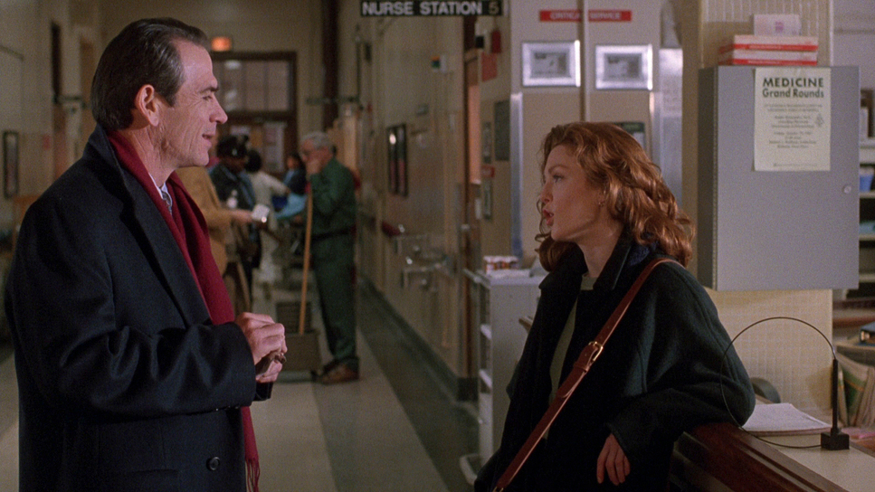
You can really tell that Andrew Davis “directed the hell out of this.” The inspiration seems to be rooted in a “sustained urgency.” The film moves fast, but crucially, it doesn’t “chop and cut” every five seconds. The cinematography provides the urgency so the editing doesn’t have to be frantic. The goal was clearly to establish Kimble’s innocence through visual conviction. Without that initial, undeniable connection we get through the lens during his moments of grief, the entire chase would just be an empty exercise in action.
Lensing and Blocking
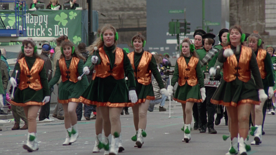
Chapman’s use of Panavision glass is brilliant. He balances wide-angle establishing shots with long-lens close-ups that compress the background and draw us into Kimble’s internal panic. The “Peter Pan off the dam” sequence is a perfect example of blocking. The wide shots establish the terrifying verticality of the dam, making the jump look suicidal, while the closer shots capture the marshals’ shock. Holding these shots and letting the actors move within the frame, rather than relying on endless cuts, requires a level of precision in blocking that you rarely see today.
Technical Aspects & Tools
The Fugitive (1993) — Technical Specifications
| Genre | Action, Adventure, Crime, Mystery, Thriller, Detective, Police |
| Director | Andrew Davis |
| Cinematographer | Michael Chapman |
| Production Designer | J. Dennis Washington |
| Costume Designer | Aggie Guerard Rodgers |
| Editor | Dennis Virkler, Richard Nord, Dov Hoenig, Dean Goodhill, David Finfer, Don Brochu |
| Colorist | Bob Putynkowski |
| Time Period | 1990s |
| Aspect Ratio | 1.78 – Spherical |
| Format | Film – 35mm |
| Lighting | Soft light, Top light |
| Lighting Type | Artificial light |
| Story Location | Illinois > Chicago |
| Filming Location | Illinois > Chicago |
| Camera | Panavision Cameras |
| Lens | Panavision Lenses |
Shooting on 35mm film was the best decision for this story. The sharpness we see in the 4K release likely downscaled from an 8K scan proves how much “data” was actually on that original negative.
Then there’s the “invisible magic.” The train wreck utilized a real train and incredible miniature work. As a professional, I miss this. Miniatures provide a physical weight and interaction with light that CGI often fails to mimic. And while the urban legend of a “crew member’s face” being visible in early VHS cuts of the wreck is a fun bit of trivia, the 4K cleanup has finally allowed us to see the sequence exactly as Davis and Chapman intended: crisp, terrifying, and physically real.
- Also read: MANCHESTER BY THE SEA (2016) – CINEMATOGRAPHY ANALYSIS
- Also read: THE UNTOUCHABLES (1987) – CINEMATOGRAPHY ANALYSIS
Browse Our Cinematography Analysis Glossary
Explore directors, cinematographers, cameras, lenses, lighting styles, genres, and the visual techniques that shape iconic films.
Explore Glossary →