When I think of films that manage to be visually sumptuous yet narratively potent, Brian De Palma’s The Untouchables (1987) is usually the first one that comes to mind.
Siskel and Ebert famously called it “a great looking movie,” noting the effort that went into creating that authentic 1930s Chicago. While some critics found it “lifeless” or too “framed and put on the wall,” I see it differently. From my desk, I see a deliberate, almost architectural approach to cinematography. When you view this film through the lens of a colorist, it reveals a profound masterclass in visual communication.
I’m always looking beyond the surface. I know from the “WTF Really Happened” trivia that the film plays fast and loose with history Ness’s daughter, Malone’s entire arc, and that iconic train station shootout are largely Hollywood inventions. But to me, that only underscores why the visual language matters so much. If the story isn’t strictly factual, the imagery has to feel undeniably true to the world it’s building. Burum and De Palma didn’t just film a story; they built a myth.
About the Cinematographer

The man behind the glass, Stephen H. Burum, is an absolute legend. His collaboration with De Palma is one for the history books, spanning from The Untouchables to Carlito’s Way and Mission: Impossible. Burum has this incredible, rare ability to translate De Palma’s complex, highly stylized fever dreams into tangible, breathtaking imagery.
Burum’s style is defined by precision and a formal elegance that perfectly complements De Palma’s meticulous staging. He’s a master of deep focus, using light and glass in concert to render these expansive, multi-layered compositions. What I appreciate most is that his technical mastery never feels like it’s “showing off” it subtly grounds even the most operatic moments in a tangible reality. He doesn’t just light a scene; he sculpts it.
Inspiration Behind the Cinematography
The primary goal here was an “authentic look of the 1930s,” but it went deeper than just period costumes. It’s baked into the very fabric of the film. I imagine Burum and De Palma diving into archival photos of Prohibition-era Chicago, absorbing the grit of the brickwork, the sharp lines of the suits, and that stark contrast between gaslight and shadow.
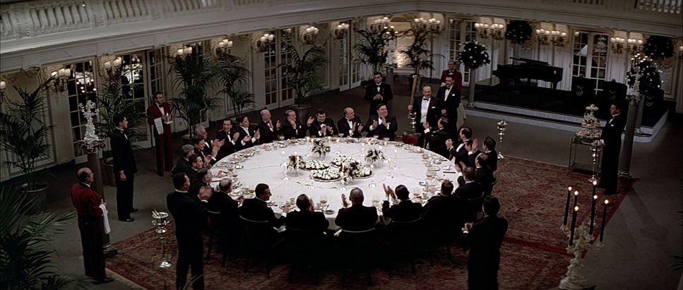
Beyond the history, there’s a heavy pulse of classic Noir and gangster cinema here. De Palma is the king of the “homage,” most famously with the “Battleship Potemkin” tribute at the train station. This allows the film to exist in a fascinating headspace: it’s simultaneously a researched period piece and a grand, operatic spectacle. It’s a tightrope walk, but Burum navigates it with grace, blending gritty realism with mythic grandeur. The locations weren’t just backdrops; they were characters, imbued with history through careful composition.
Technical Aspects & Tools
The Untouchables (1987) — 35mm Anamorphic
| Genre | Crime, Drama, History, Thriller, Action, FBI, Gangster, Police, True Crime, CIA / FBI, FBI / CIA |
| Director | Brian De Palma |
| Cinematographer | Stephen H. Burum |
| Production Designer | William A. Elliot |
| Costume Designer | Marilyn Vance |
| Editor | Gerald B. Greenberg, Bill Pankow |
| Time Period | 1930s |
| Aspect Ratio | 2.35 – Anamorphic |
| Format | Film – 35mm |
| Lighting | Soft light |
| Lighting Type | Daylight, Artificial light, Practical light |
| Story Location | Chicago > Police Headquarters |
| Filming Location | Chicago > Rookery Building |
| Camera | Panavision Gold / G2 |
| Lens | Panavision C series |
| Film Stock / Resolution | 5247/7247 Vision 125T |
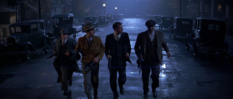
In 1987, you couldn’t “fix it in post” the way we do now; the craft relied on optical mastery. Burum shot The Untouchables using Panavision Gold and G2 cameras. Contrary to some reports, they utilized Panavision C-Series Anamorphic lenses. This is a crucial distinction. Anamorphic glass gives the film that expansive 2.35:1 aspect ratio and a specific “feel” to the depth of field that spherical lenses just can’t replicate.
They shot on Kodak 5247/7247 Vision 125T stock. As a colorist, I find this fascinating this was a pre-Digital Intermediate (DI) world. There was no color wheels or power windows. The look was baked into the negative and refined through the photochemical printing process. When we revisit these films today for restoration, my job is to honor that original intent preserving the grain and that specific highlight roll-off that defined the 35mm era.
Lensing and Blocking
Burum’s choice of Anamorphic glass was bold. While Anamorphics are known for their beautiful “flaws” and flares, Burum used them with surgical precision to capture the epic scale of Chicago. He often favored long lenses to compress perspective, isolating Ness or Capone during moments of high tension. The C-Series lenses provided a clean aesthetic, but they aren’t clinical they have a unique personality, especially in how they render out-of-focus areas.
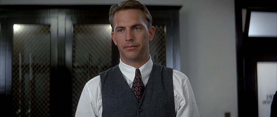
Blocking, in De Palma’s hands, is as vital as the dialogue. Characters are positioned with terrifying accuracy. Look at Ness: his transformation from “young innocent” to “tough lawman” is shown through his physical presence in the frame. I used to think the wide, static shots of Ness were just about scale, but now I see the “colorist’s perspective”: Burum’s use of deep focus in those architectural frames makes Ness look small and isolated. It emphasizes that Capone isn’t just a man; he’s the system.
Camera Movements
De Palma’s films are defined by their “unseen” observer. We see his signature tracking shots gliding through opulent spaces think of the camera weaving through Capone’s world. These aren’t just flashy moves; they create a palpable sense of spatial awareness. They pull you in, making you feel like a silent witness.
Contrast that with the “balletic chaos” of the train station shootout. The camera might be on a crane or handheld, but it’s always controlled. And then, the slow motion. De Palma uses it sparingly, but when he does, it’s to make you feel the gravity of every single bullet. The Steadicam work here is ethereal, often signifying power or an impending sense of doom as it weaves through a scene.
Lighting Style
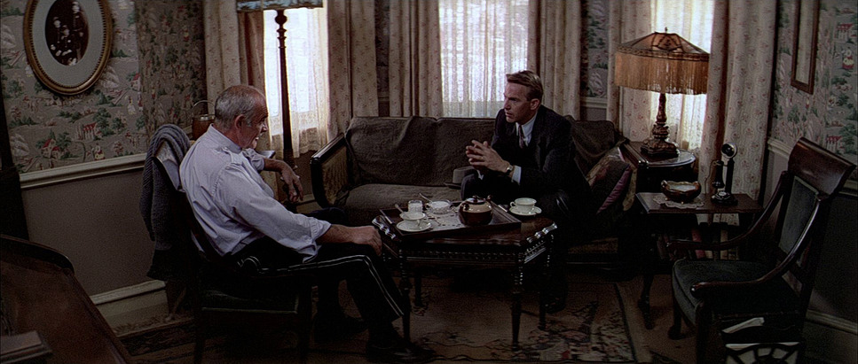
The lighting here is a masterclass in motivated illumination. Burum leans heavily into a low-key, Noir-inspired aesthetic. Shadows aren’t just “dark spots”; they are active compositional elements. Think of Malone’s apartment strong, directional sources casting textured shadows that wrap around faces. It’s moody, dangerous, and morally ambiguous.
High contrast is a hallmark of this film. It’s used to sculpt faces and define the sharp edges of the architecture. Even when they used powerful studio lamps, the light always feels like it’s coming from a streetlamp or a window. This “motivated” approach makes the stylized scenes feel grounded. As a colorist, I love the dynamic range here; Burum pushes the film stock to its limits, holding rich, inky blacks while keeping the glint off a polished gun punchy and bright.
Color Grading Approach
Stepping into my world, the palette of The Untouchables is incredibly satisfying. The “1930s look” translates to a subtly desaturated, muted approach. It’s not a flat, lifeless desaturation, though it’s nuanced.
The contrast shaping is the star here. I see a grade that aims for deep, rich blacks that maintain their texture, conveying the grit of Chicago. The hue separation focuses on browns, muted blues, and greens colors that feel “faded by time.” Skin tones are kept naturally warm but never “orange” or oversaturated.
There’s a “print-film sensibility” that I always look for. Colors have a certain weight and richness that comes from the interaction of light with silver halide. The highlight roll-off is graceful; bright areas don’t just “clip” to white; they gently compress. And the grain? It’s not an artifact; it’s a character. It gives the image an organic, tactile quality that digital sensors still struggle to mimic.
Compositional Choices
Burum’s compositions evoke classical artistry. Ebert’s comment about the film feeling “framed and put on the wall” wasn’t a criticism to me it’s a testament to the strength of the frame. These are moving paintings.
There’s a constant emphasis on depth, using foreground elements to pull your eye deep into the scene. And, of course, the split diopter. This is the quintessential De Palma move. It allows two planes one extreme foreground, one background to both be in sharp focus. It creates this unnerving, “impossible” visual complexity. It’s a brilliant way to show two characters who are spatially separated but narratively tied together. It makes the frame feel dense with information and, more importantly, implication.
- Also read: APOCALYPTO (2006) – CINEMATOGRAPHY ANALYSIS
- Also read: PRIDE & PREJUDICE (2005) – CINEMATOGRAPHY ANALYSIS
Browse Our Cinematography Analysis Glossary
Explore directors, cinematographers, cameras, lenses, lighting styles, genres, and the visual techniques that shape iconic films.
Explore Glossary →