Pride & Prejudice (2005) is undeniably in that second category. It’s a film I return to constantly, not just for the romantic sweep, but for its exquisite visual architecture. It takes Jane Austen’s narrative and turns it into a living, breathing experience.
It’s often cited as one of the most beautifully shot films ever, and I’m not going to argue with that. Every frame feels meticulously crafted yet somehow effortless. It captures the 1800s without feeling like a dusty museum piece. The visual storytelling isn’t background noise; it’s a character that informs every look, every relationship, and every unspoken feeling beneath the surface of polite society.
About the Cinematographer

The visual signature of Pride & Prejudice belongs to Roman Osin, and his work here speaks volumes about a craftsman deeply attuned to emotion. This isn’t just “pretty” photography; it’s the result of a profoundly collaborative relationship with Joe Wright. You can feel their shared vision in the way the camera becomes an almost invisible observer, yet remains an incredibly potent narrator.
Osin understood the delicate balance between the sprawling English landscapes and the subtle flicker of a secret. He prioritized emotional authenticity over spectacle. Using light, shadow, and movement, he peels back the layers of Lizzie’s character and the weight of societal expectation. For me, seeing such deliberate, empathetic choices is inspiring it’s a reminder that cinematography is ultimately about how we feel, not just what we see.
Inspiration Behind the Cinematography

Joe Wright wanted a “mythic quality” for this world, and you see that most clearly in Darcy’s dawn proposal. That specific blend of morning mist and the sun fighting to break through isn’t just a nice shot it’s the emotional landscape personified. It’s mystery and hope colliding in a single frame.
The team was clearly trying to materialize the intangible. Take the iconic “hand flex.” Wright described it as a cinematic attempt to show the “electricity” between two lovers. They weren’t content with just showing the actors; they wanted to evoke the subtext Austen wrote. Even the accidental presence of a pig with “the biggest balls I’d ever seen” (as Wright put it) became a grounded, playful metaphor for the mating rituals of the time. The cinematography doesn’t just illustrate the book; it translates its spirit into light.
Camera Movements
The movement in this film is a masterclass. We have to talk about the “one shots.” The field ball sequence is a prime example it’s an uninterrupted take that requires insane choreography from the actors and the crew. By avoiding cuts, Osin immerses us in the room. We aren’t just watching a party; we’re moving through it, catching glances and social dynamics in real-time. It’s an elegant way to show evolving affections without the editor forcing the rhythm.
But then, you have the “quick zoom” effect. It’s used when a character is startled or unstable. It’s a sharp, direct visual analogue to a sudden jolt or an intake of breath. These aren’t flashy, music-video zooms; they’re precise punctuation marks that underscore internal turmoil. The contrast between those sweeping, observational long takes and these sharp, emotional zooms creates a visual rhythm that perfectly matches the story’s ebb and flow.
Compositional Choices

Every shot here is loaded with context. The landscapes often frame the characters to show their place in the world or their isolation. Think of Lizzie alone against the Derbyshire peaks. The vastness of the peaks against her silhouette tells you everything you need to know about her independent spirit fighting against societal constraints.
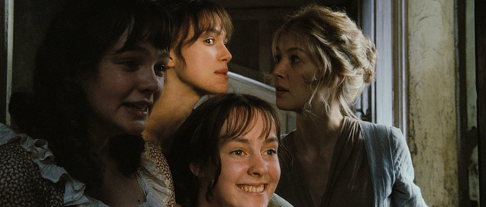
There’s a beautiful contrast in how relationships are framed. Look at Jane and Lizzie whispering under the sheets; their shared space and tight proximity visually articulate their bond. Then compare that to the church service close-up on Lizzie. Her hyper-fixation on Darcy is so intense she isn’t even looking at the person speaking to her. One composition is wide and communal; the other is tight and singularly focused. As a colorist, I see how framing adds psychological weight to a scene, and Osin uses it here to sculpt our understanding of every character dynamic.
Lighting Style

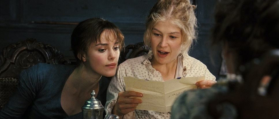
This is a masterclass in motivated naturalism. The nighttime scenes are actually, believably candlelit. That is incredibly hard to pull off without the image becoming a muddy mess or looking overly theatrical. The filmmakers embraced the darkness, using the flickering warmth of candles to sculpt faces. The highlights don’t blow out; they have that soft, organic roll-off that feels inherent to the era.
In the daytime, especially outdoors, it’s all about a soft, diffused glow. The light feels atmospheric and painterly. From my perspective in the grading suite, this kind of lighting provides the perfect foundation. It offers rich mid-tones and a natural dynamic range that allows for subtle adjustments without breaking the illusion. It’s not about high-contrast drama; it’s a gentle, enveloping light that mirrors the romance.
Lensing and Blocking
The precision here is staggering. The actors rehearsed the dances for weeks, and you can tell. This allowed Osin to flow the camera gracefully through the “organized chaos” of the balls.
The choice of glass is just as vital. They used Cooke S4 lenses, which are famous for that “Cooke Look” warm, smooth, and incredibly kind to skin tones. You see the shift to longer lenses during intimate moments, gently compressing the background and forcing us to focus on the tension. The “hand flex” or the rain scene where Darcy watches Lizzie’s mouth these are moments where the lens choice amplifies the yearning. It’s an intuitive pairing of glass and blocking that guides the viewer through every beat.
Color Grading Approach

From a grading perspective, Dave Rees did a phenomenal job maintaining a “print-film” sensibility. The palette is soft, leaning into those desaturated, earthy tones, but it never feels “muddy.” Instead, it feels historical. This isn’t a modern, high-vibrancy grade; it feels like an aged photograph or a classic painting.
The contrast shaping is gentle. There’s a beautiful highlight roll-off in the morning mist scenes that preserves every bit of detail. Skin tones are rendered with a soft, natural luminosity. I love how color is used to differentiate the world: the warm, chaotic energy of the Bennett house versus the cooler, more guarded stateliness of Pemberley. The shadows hold depth without “crushing,” and the highlights bloom just enough to give the light a volumetric quality. It’s an integral part of the film’s emotional architecture.
Technical Aspects & Tools
Pride & Prejudice (2005)
35mm Anamorphic • Kodak Vision2 500T • 2.35:1
Production
Post & Color
Optics & Imaging
Since this was 2005, the film was shot on 35mm, specifically Kodak Vision2 500T (5218). That stock is legendary for its latitude and organic grain, which adds so much to the period feel. You can’t easily replicate that highlight roll-off digitally; it’s what gives the film its painterly quality.
They used Arricam ST and LT cameras with those Cooke S4s, shooting in a 2.35:1 anamorphic aspect ratio. Even though it went through a Digital Intermediate (DI) for the final grade, the “soul” of the image comes from that 35mm chemistry. The DI process allowed Dave Rees to fine-tune the density and hue separation frame-by-frame, giving us that polished, timeless look. The real tools here, though, were the vision of Wright, the execution of Osin, and the ability of the colorist to preserve that intent through the pipeline.
- Also read: MOONRISE KINGDOM (2012) – CINEMATOGRAPHY ANALYSIS
- Also read: MOON (2009) – CINEMATOGRAPHY ANALYSIS
Browse Our Cinematography Analysis Glossary
Explore directors, cinematographers, cameras, lenses, lighting styles, genres, and the visual techniques that shape iconic films.
Explore Glossary →