The Notebook (2004) While this one often gets pigeonholed as a “hopeless romantic” tear-jerker or—if you’ve been watching recent YouTube recaps a “toxic” love story, I see it as a masterclass in how cinematography and grading can carry a narrative. For me, it’s not just about the plot beats; it’s about the emotional architecture Robert Fraisse built with light.
About the Cinematographer
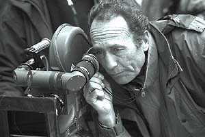
The visual architect here was Robert Fraisse, AFC. If you look at his filmography, The Notebook feels like a massive pivot. He did the high-octane action of Ronin (1998) and the gritty, visceral reality of Enemy at the Gates (2001). Those are films where the camera is designed to put you in the thick of a firefight.
So, seeing him move into a sweeping period romance really speaks to the versatility of a seasoned DP. Moving from snipers and car chases to the tender intimacy of first love requires a total shift in philosophy. You’re trading the urgency of a long lens for the gentle embrace of soft light on a face. Fraisse brought a refined, European classicism to the film, but he gave it a warmth that made it resonate globally. It’s proof that a great DP isn’t limited by genre; they’re empowered by it to explore different facets of how we feel.
Inspiration Behind the Cinematography
Nicholas Sparks actually based the story on his wife’s grandparents, who were still acting like newlyweds after 60 years. That idea of a “true love that lasts forever” is the bedrock of the visual style.
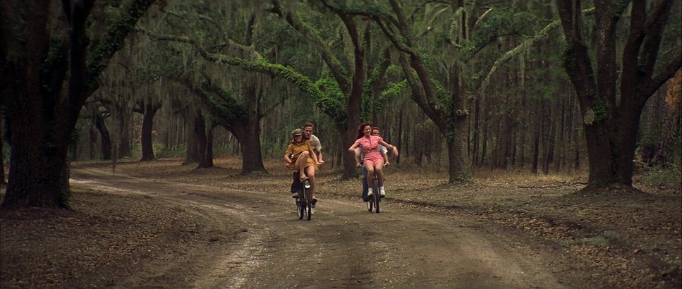
For Fraisse and director Nick Cassavetes, that translated into an approach that feels timeless and almost dreamlike for the past, contrasted with a more grounded present. The cinematography isn’t just showing us events; it’s making us feel the passage of time. They originally scouted North Carolina, but ended up in South Carolina, which turned out to be a lucky break. The lush, painterly backdrop of the South became a character in itself. Those grand landscapes and the cozy Southern charm mirror the expansive nature of young love. The visual language constantly reminds you: this isn’t just any love story; it’s a memory being cherished and recounted, frame by frame.
Camera Movements
The camera work in The Notebook is elegantly understated. It’s a masterclass in “motivated” movement the camera only moves when the emotion demands it. We see these gentle, deliberate dolly shots that slowly push into a moment of intimacy or pull back to emphasize a growing distance.
In the 1940s sequences, the camera glides with Noah and Allie. It feels fluid, like an extension of their internal state. When they’re falling in love, the camera follows their gaze. When Allie is hesitant, the camera lingers and holds its ground. Even the famous “kiss in the rain” scene avoids flashy spectacle; it uses subtle tracking and close-ups to create a vortex of emotion that draws you in. Then, you look at the elderly couple’s scenes: the camera is more restrained and often static, reflecting the quiet, steady rhythm of their later years. It’s a beautiful visual cadence.
Compositional Choices
Composition is where Fraisse highlights the class divide that threatens the relationship. He uses classic, balanced frames, but always with an eye for impact.
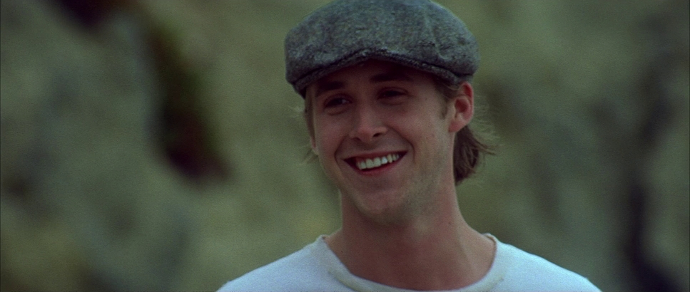
When Noah and Allie are in their “bubble,” the compositions are intimate. They share the same space and are bathed in the same light. Cassavetes reportedly cast Ryan Gosling because he looked like a “regular guy,” and the framing supports that placing him in these shallow depth-of-field shots that blur out the world until only he and Allie exist.
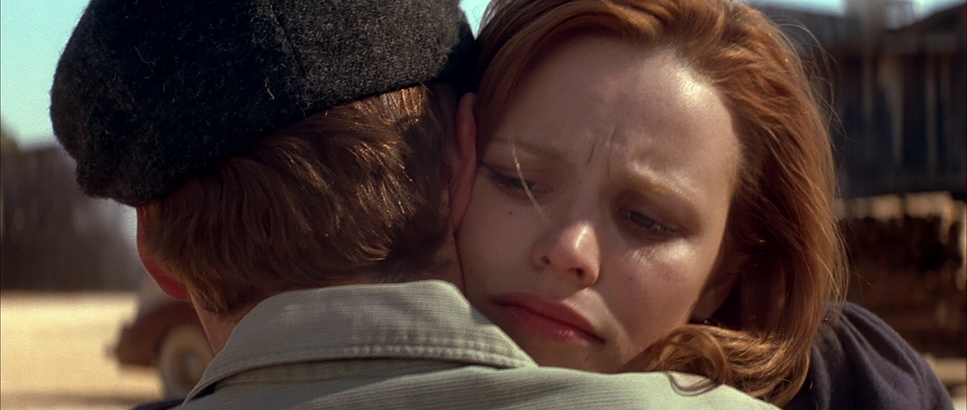
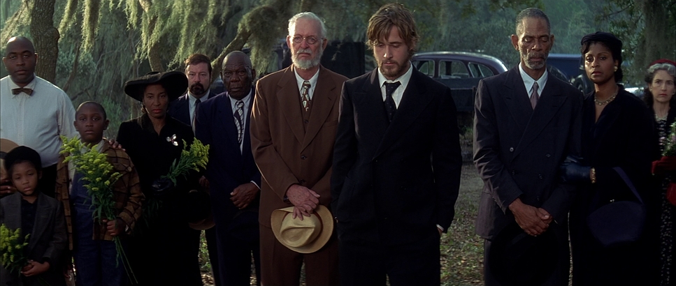
But when the “real world” intrudes, the framing shifts. I always think of the lunch scene with Allie’s parents. Noah is often isolated or visually smaller in the frame, especially when Allie’s mom (who “hates poor people,” as one recap puts it) is on screen. The parents appear rigid, framed against imposing backgrounds that suggest their status. It’s a sophisticated use of visual hierarchy to show the barriers between their two worlds.
Lighting Style
If this film were a painting, it’d be all about the “Golden Hour.” The lighting is soft, warm, and romantic a deliberate choice to evoke nostalgia. For the past sequences, the highlights are soft with a gentle roll-off, avoiding anything harsh or clinical.
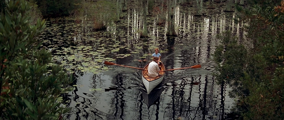
Think of the boating scene with the geese: the light is painterly and ethereal. Even in the rain, the light feels motivated and natural. I used to wonder if a harsher light might have made the parental disapproval feel more “villainous,” but on second thought, that sustained, soft, almost suffocating warmth in those scenes actually speaks more to the oppressive politeness of their world. It makes the societal pressure feel more insidious. For the present-day scenes, the lighting gets even more diffused, reflecting the quiet comfort of old age, though it carries that undercurrent of Allie’s fading memory.
Lensing and Blocking
This is where we get into the “nerdy” craft stuff. To pull us into the romance, Fraisse leaned into lenses that provide a shallow depth of field likely staying in that 50mm to 85mm range for the close-ups. It makes the world melt away.
Blocking is equally paramount. When Noah and Allie are together, they’re physically close, occupying the same plane of focus. Their movements are like a dance. But when they argue, or when Allie’s family pulls her away, the blocking becomes rigid. They’re placed on opposite sides of the frame, or physical barriers like a doorway are used to separate them. There’s a scene where Allie’s mom shows her her own “first love” at a construction site; the blocking isolates Allie, making her feel detached from her mother’s “wisdom.” It’s a powerful way to shape our perception of the relationship without a word of dialogue.
Color Grading Approach

Now, this is where my colorist heart truly geeks out. The grading here defines the emotional landscape. For the 1940s, the palette is steeped in nostalgia: warm, slightly desaturated, with these beautiful cyan and green tones in the shadows. It feels like an old photograph coming to life.
The contrast is gentle. You’ve got a beautiful filmic highlight roll-off the bright skies don’t just “clip” into white; they transition softly. Skin tones are rendered with these peachy, golden hues, while the blues (like Allie’s famous shutters) are pushed toward cyan for a bit of pop. It’s vibrant but never garish. For the present day, the shift is subtle more neutral, a little less saturated. It maintains continuity but nudges us into a different emotional register. It has that organic richness that’s often missing in modern, clinical digital workflows.
Technical Aspects & Tools
The Notebook
Tech Specs: 35mm Anamorphic • 2.35:1 Ratio| Genre | Drama, Romance |
| Director | Nick Cassavetes |
| Cinematographer | Robert Fraisse |
| Production Designer | Sarah Knowles |
| Costume Designer | Karyn Wagner |
| Editor | Alan Heim |
| Colorist | John Persichetti |
| Time Period | 1930s |
| Color | Mixed, Saturated, Green, Cyan, Magenta, Pink |
| Aspect Ratio | 2.35 – Anamorphic |
| Format | Film – 35mm |
| Lighting | Hard light, High contrast, Backlight |
| Lighting Type | Artificial light, HMI, Fluorescent |
| Story Location | Seabrook > City |
| Filming Location | Mount Pleasant > Intersection |
| Camera | Moviecam Compact |
| Lens | Cooke Xtal Express |
Since this was 2004, we’re firmly in the 35mm film era. To get that look, Fraisse used a Moviecam Compact paired with some legendary glass: Cooke Xtal Express anamorphic lenses. As a colorist, I can tell you that “creamy” bokeh and the 2.35:1 aspect ratio aren’t just a choice they’re the soul of the film’s romantic texture.
They likely shot on Kodak Vision series stocks (5218 and 5219), which gave them the dynamic range to keep detail in the shadows during those intimate “touchy” scenes while preserving the sun-drenched fields. The grain structure of 35mm adds a layer of authenticity that we’re always trying to emulate in digital post-production today. Even though they used a Digital Intermediate for the final grade, the foundation was pure film, which is why it still feels so “thick” and emotional twenty years later.
- Also read: CAST AWAY (2000) – CINEMATOGRAPHY ANALYSIS
- Also read: THE HATEFUL EIGHT (2015) – CINEMATOGRAPHY ANALYSIS
Browse Our Cinematography Analysis Glossary
Explore directors, cinematographers, cameras, lenses, lighting styles, genres, and the visual techniques that shape iconic films.
Explore Glossary →