Quentin Tarantino’s The Hateful Eight (2015) is at the top of that list. It isn’t just another Tarantino Western; it’s a stubborn piece of cinema. It refuses to follow modern digital trends, opting instead for a defiant, old-school aesthetic that honestly feels like a masterclass in how form can amplify a story. For me, it’s the ultimate example of how specific technical constraints like shooting an entire movie in a cabin on the widest format possible can actually make the narrative tension feel more explosive.
About the Cinematographer
You can’t analyze this look without talking about Robert Richardson, ASC. The man is a titan. If you’ve followed his work with Tarantino, you know he’s not interested in “safe” lighting. He’s known for that signature, high-contrast style often using intense top-light that hits characters like a spotlight. What I love about Richardson is that he doesn’t just capture a scene; he carves it. He’s painting with light and shadow to define the emotional stakes long before a character even speaks. In The Hateful Eight, his partnership with Tarantino feels like a shared manifesto on cinematic maximalism. Every setup is a deliberate choice to serve the grit of the story, proving that he’s not just a DP, but a visual dramatist.
Technical Aspects & Tools
The Hateful Eight: Technical Specs
| Genre | Crime, Drama, Mystery, Western |
| Director | Quentin Tarantino |
| Cinematographer | Robert Richardson |
| Production Designer | Yôhei Taneda |
| Costume Designer | Courtney Hoffman |
| Editor | Fred Raskin |
| Colorist | Walter Volpatto, Yvan Lucas |
| Time Period | 1800s |
| Color | Cool, Desaturated, Cyan, Blue |
| Aspect Ratio | 2.76+ |
| Format | Film – 65mm / 70mm |
| Lighting | Soft light |
| Lighting Type | Daylight, Overcast |
| Story Location | United States > Wyoming |
| Filming Location | United States > Colorado |
| Camera | Arriflex 765 |
| Lens | Panavision APO Panatar |
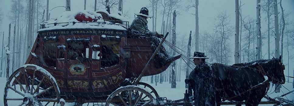
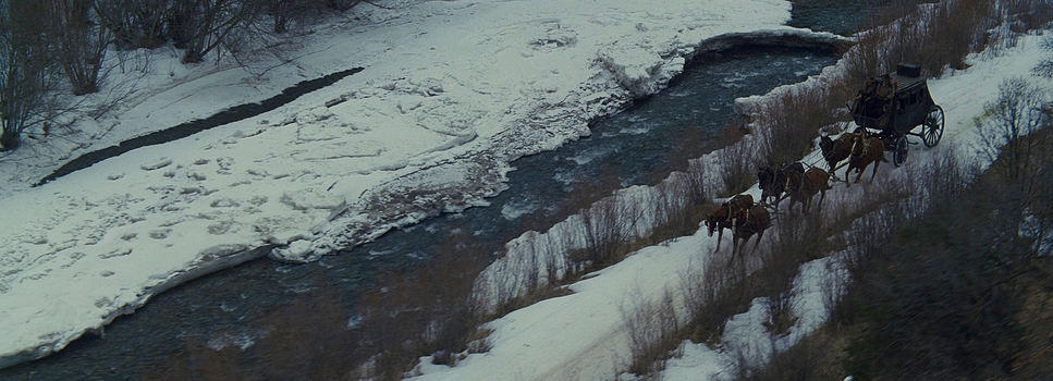
The decision to shoot on Ultra Panavision 70mm wasn’t just a gimmick; it was a commitment to a specific texture that digital simply can’t touch. To pull this off, they used Arriflex 765 cameras massive 65mm sync-sound beasts to handle the heavy lifting. Tarantino famously went on a crusade to restore 70mm projection equipment in theaters just to screen the roadshow version, complete with an overture and intermission. It’s a total throwback. When you watch it, you might even catch that slight “sprocket bob” in the frame a subtle reminder that you’re watching physical film moving through a gate. In an era of sterile, pixel-perfect 3D, choosing a format from five decades ago is a loud thematic statement.
Lensing and Blocking
The soul of this film lives in the glass. They used Panavision APO Panatar anamorphic lenses, which were originally designed for the epic widescreen era of the 1960s. These lenses have a very specific “flavor” a gorgeous fall-off, organic flares, and a slight softness that takes the edge off the image without losing detail.
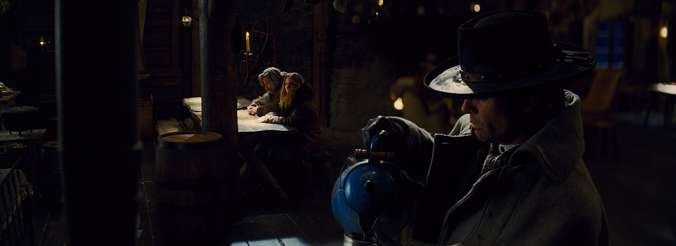
Because of these wide-angle capabilities, Richardson could keep the Arriflex 765 in the corners of Minnie’s Haberdashery and capture five or six characters in a single, deep frame. This dictated the blocking. Instead of traditional “coverage” (cutting back and forth between faces), the actors are often arranged theatrically. You’ll have one character in a clean single in the foreground, while two others are plotting in the background, all perfectly sharp. It forces the audience to hunt for clues in the frame, making the spatial relationships between the characters just as important as the dialogue.
Compositional Choices
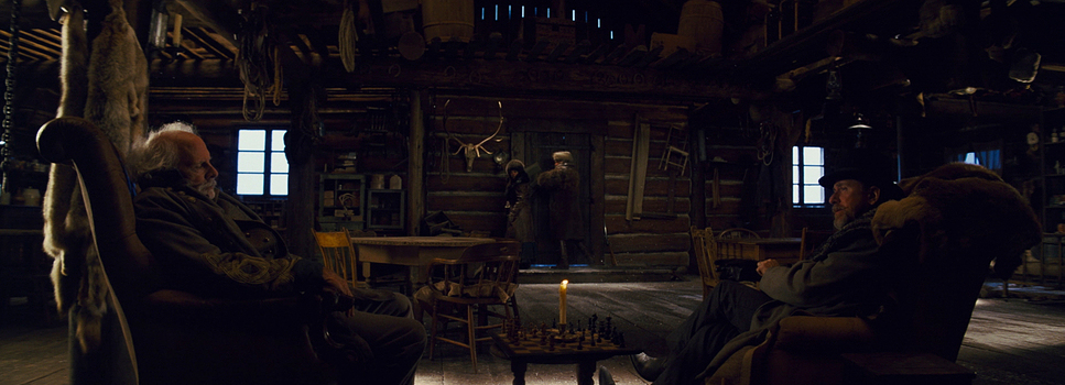
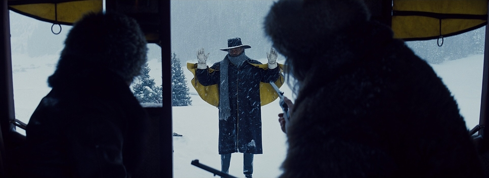
Using a 2.76:1 aspect ratio inside a single, cramped cabin sounds like a technical contradiction, but it’s brilliant. This ultra-wide canvas creates a paradox: it feels grand and claustrophobic at the same time. As a colorist, I always say the most important “location” in a film is the human face, and this format proves it. Every twitch, every bead of sweat, and every suspicious glance is magnified.
Richardson uses deep staging that reminds me of what Kubrick did in The Shining. He places characters at varying depths, making them look small and isolated against the massive, oppressive backdrop of the blizzard outside. The use of negative space here is heavy; the cabin feels like a fragile wooden box being crushed by a cold, hostile world. It’s a sophisticated play on depth that turns a “whodunnit” into a visual chess match.
Lighting Style
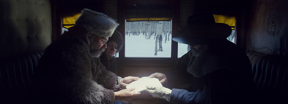
The lighting in The Hateful Eight is as cold and unforgiving as the Wyoming winter. It’s largely a motivated scheme Richardson relies on practical sources like lanterns, the hearth, and that steely, overcast daylight filtering through the windows. The mood is defined by stark contrast.
I’m particularly struck by the “chiaroscuro” quality of the night sequences. Characters emerge from deep, rich blacks, their features sculpted by the harsh, warm glow of a flickering fireplace. This contrast isn’t just for style; it highlights the moral ambiguity of everyone in that room. There’s a beautiful tension between the warm ambers of the interior and the cyan-heavy, desaturated blues of the exterior. It’s a gritty, no-nonsense approach that makes the cabin feel less like a sanctuary and more like a trap.
Inspiration Behind the Cinematography
The DNA of this film is a wild mix of classic Westerns and 80s horror. You can’t ignore the parallels to John Carpenter’s The Thing and not just because Kurt Russell is in both. That feeling of “paranoia in a snowstorm” is baked into the cinematography. You can almost feel the temperature in the theater dropping.
Tarantino also leaned heavily into Sergio Corbucci’s The Great Silence. That film gave us the blueprint for the bleak, snow-covered Western where humanity is at its worst. These aren’t just nods to the past; they are the foundation for how the blizzard is treated as a character. The weather isn’t just a backdrop; it’s a suffocating force that justifies why these eight people are stuck with each other.
Camera Movements
In this movie, the camera doesn’t move unless it has a damn good reason to. It’s not about flashy, handheld chaos; it’s about measured, unsettling shifts. A lot of the time, the camera acts as a silent observer, letting the dialogue breathe.
When it does move, it’s usually a slow, deliberate push or a creeping dolly-back to reveal a new piece of the puzzle. There’s a “weight” to the movement that feels architectural. This restraint makes the violent outbursts the sudden whip-pans or jarring jolts hit ten times harder. It’s the visual equivalent of holding your breath for twenty minutes and then finally being forced to gasp.
Color Grading Approach
From my desk as a colorist, this grade is a study in intentionality and restraint. Working with Walter Volpatto and Yvan Lucas, the team leaned into a muted, filmic palette that respects the 70mm stock. It’s not “over-graded.” It avoids the clinical, hyper-saturated look of modern digital Westerns.
The highlight roll-off is incredibly smooth, especially on the practical lanterns you never see that nasty digital clipping. The blacks have a tangible density to them, and the mid-tones carry a nuanced weight that makes the period costumes feel authentic. I love the hue separation here; the cool, cyan-tinted daylight outside creates a perfect foil for the earthy browns and leathers inside. And because the rest of the palette is so controlled and desaturated, when the blood finally hits the screen, it feels incredibly visceral. It’s a grade that doesn’t try to show off; it just supports the grim realism of the story.
- Also read: FERRIS BUELLER’S DAY OFF (1986) – CINEMATOGRAPHY ANALYSIS
- Also read: ABOUT TIME (2013) – CINEMATOGRAPHY ANALYSIS
Browse Our Cinematography Analysis Glossary
Explore directors, cinematographers, cameras, lenses, lighting styles, genres, and the visual techniques that shape iconic films.
Explore Glossary →