John Hughes’s Ferris Bueller Day (1986) might feel like pure, unadulterated fun a “modern-day fairy tale” but beneath that infectious optimism lies a sophisticated visual strategy. It’s a love letter to Chicago that speaks to how to live fully without apology. Visually, that message isn’t just riding on Matthew Broderick’s charisma; it’s woven into every frame by Tak Fujimoto. So, let’s skip school for a bit and dive into the visual magic of Ferris’s epic day off.
About the Cinematographer
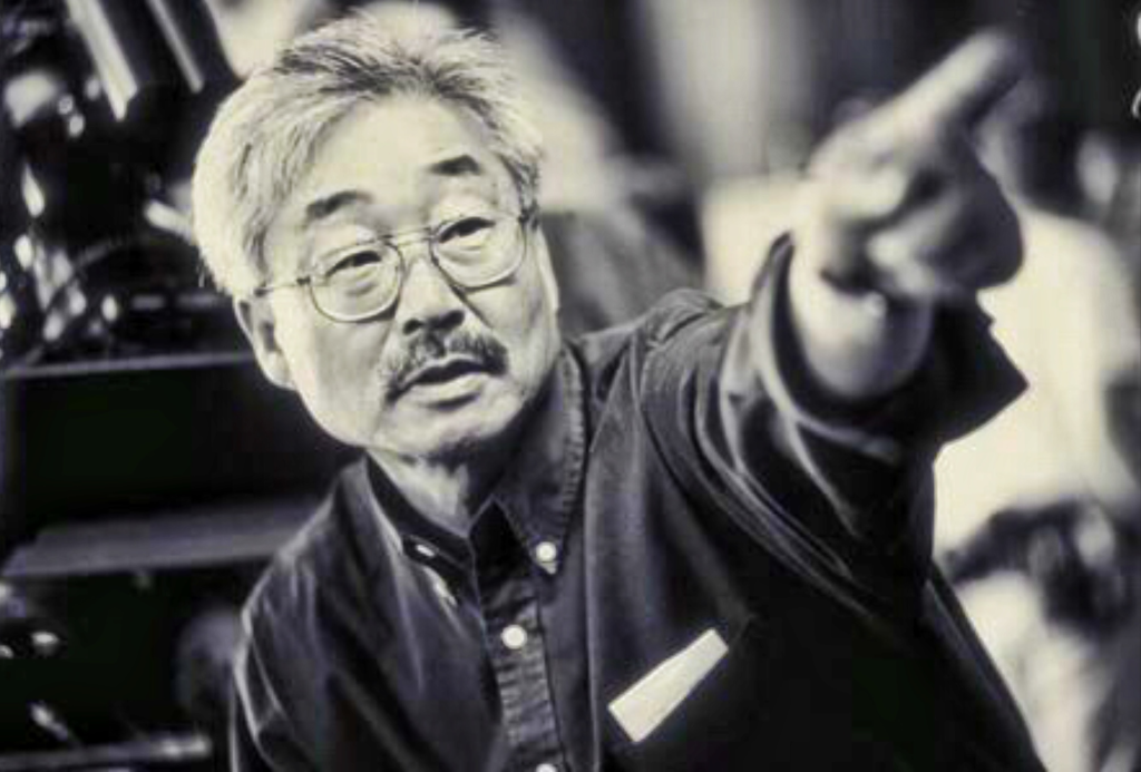
The lensman behind that vibrant energy was Tak Fujimoto. If the name doesn’t ring a bell, his resume definitely will. He’s a veteran who’s done everything from the clinical, haunting frames of The Silence of the Lambs to the gritty, poetic textures of Badlands. What I love about Fujimoto is his versatility; he doesn’t have a “one size fits all” ego. He adapts.
For John Hughes, who was the king of capturing authentic teenage voices, Fujimoto was the perfect partner. He wasn’t interested in flashy, “look at me” camerawork. Instead, he built a visual environment that felt real and lived-in. He stayed grounded. This naturalism allowed the focus to stay on Ferris, Cameron, and Sloane, making their adventure feel spontaneous rather than a heavily “directed” Hollywood production.
Inspiration Behind the Cinematography
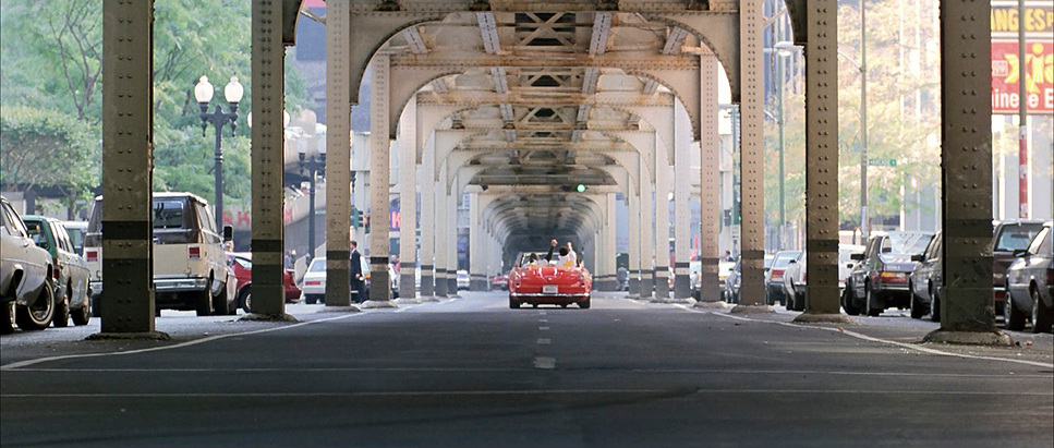
Hughes’s intent was clear: this was a love letter to Chicago. As a native, he knew the city’s soul, and that informs the entire look. The city isn’t just a backdrop; it’s the fourth member of the group. The visual inspiration came from wanting to show landmarks like the Sears Tower and the Art Institute with a sense of grandeur but also accessibility.
Beyond the geography, the film’s core theme living without fear demanded a style bursting with optimism. This isn’t a gritty, cynical portrayal of rebellion. It’s bright and escapist. Fujimoto’s work captures that specific feeling of “getting away with it.” It’s a visual manifestation of that rush you get when you break the rules and the world suddenly feels wide open and full of possibility.
Color Grading Approach
This is where my world truly intersects with Ferris Bueller Day. Looking at Ferris Bueller through the lens of a colorist, you see a masterclass in 80s photochemical density. Shot on 35mm Kodak stock (likely 5247 or 5294), the film has that gorgeous, organic highlight roll-off and warm “Eastman” characteristics that digital struggle to replicate.
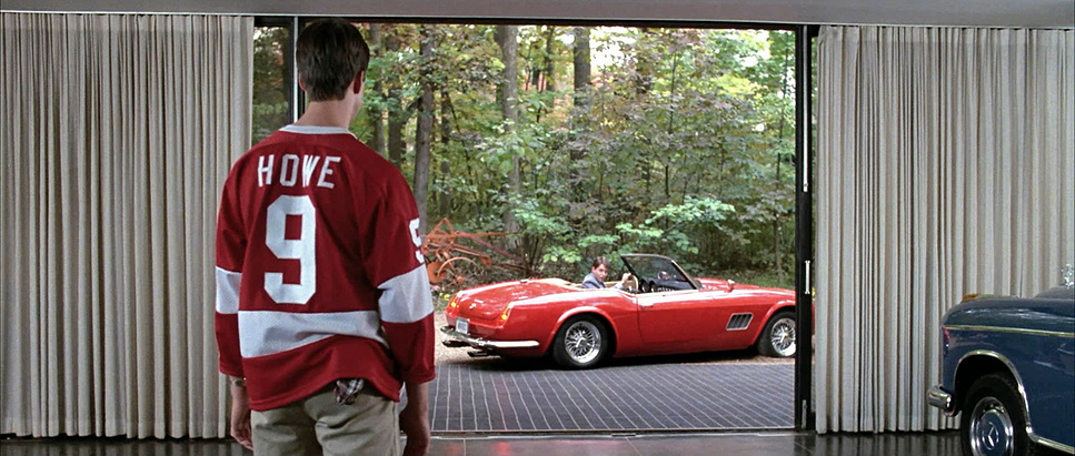
If I had this project on my wheels today, I’d be obsessing over the hue separation, particularly in that iconic Ferrari red. It needs to pop against the Chicago blues and greys without bleeding into orange or looking artificial. I’d focus on tonal sculpting keeping the contrast moderate so the shadows stay clean and the highlights feel sunny but not “clipped.” There’s a distinct print-film sensibility here; the colors are cohesive and nostalgic, leaning into subtle magentas and warm browns in the low-end. It’s about letting the natural light do the heavy lifting, then using the grade to evoke that feeling of a perfect, unforgettable summer day.
Lighting Style
The lighting is overwhelmingly bright and “high-key,” and as a colorist, I see this as a narrative tool. By keeping the exposure up and the shadows lifted, Fujimoto creates a “technical shield” against angst. This movie never slips into the dark, moody corners of a typical teen drama because the light won’t allow it.
The lighting is almost always motivated by the Chicago sun. Interiors, like the Art Institute or the high-end French restaurant, feel inviting and authentic, using soft, diffused sources that keep the atmosphere relaxed. Even when Principal Rooney or Jeannie are in “peril,” the lighting stays bright and theatrical. It keeps the stakes comedic. This approach ensures the cast looks vibrant and fresh, reinforcing that youthful spirit that makes the film feel timeless. It’s a lighting scheme that basically radiates “vacation.”
Camera Movements
The movement here is a lesson in controlled spontaneity. Fujimoto rarely gets chaotic. Instead, he uses a blend of smooth, deliberate dollies and tracking shots that mirror the trio’s sense of freedom. During the grand tour of the city, the camera glides, emphasizing the sheer joy of the adventure.
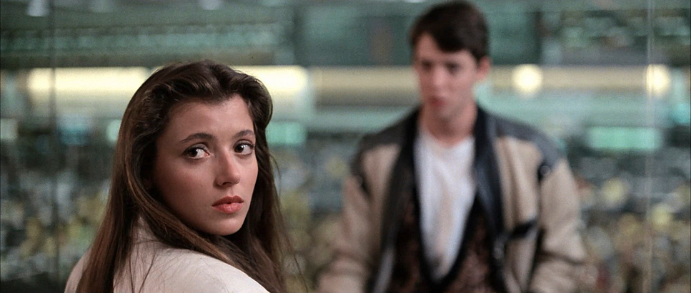
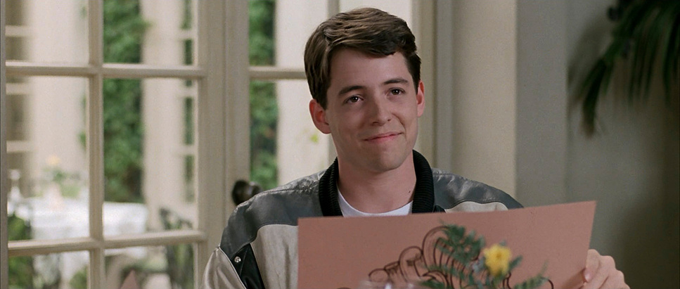
Then you have the fourth-wall breaks the hallmark of the film. When Ferris talks to us, the camera usually settles into a steady, intimate medium close-up. It doesn’t move. This stillness forces a connection, making us complicit in his schemes. It’s a bold choice that requires precise execution to not feel alienating. The contrast between these static, “confessional” moments and the fluid motion of the parade or the backyard chase creates a dynamic rhythm that keeps the energy high.
Compositional Choices
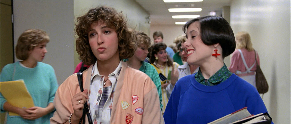
Fujimoto’s compositions are deceptively simple. He uses wide, open frames to emphasize the scope of their freedom. When the trio is in the city, they are often framed against massive landmarks. They look small, but the composition makes them feel like they own the space.
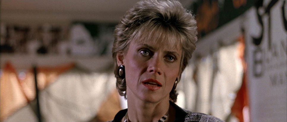
The character dynamics are also built into the framing. Ferris is almost always leading, with Cameron initially tucked slightly behind or off-center, reflecting his “stressed out, neurotic” state. But watch how the compositions shift as Cameron finds his voice. By the time we get to the climax with the Ferrari, his framing becomes more central and assertive. Even the way Rooney is framed often isolated and looking hapless against the vastness of the city is visual storytelling in its purest form.
Lensing and Blocking
The choice of glass here is instrumental in defining relationships. Fujimoto balances wider lenses (maybe 24mm or 35mm) to give us that environmental context during the parade, making the audience feel immersed in the crowd. Conversely, for the fourth-wall breaks or Cameron’s moments of vulnerability, he likely tightened up to a 50mm or 85mm to isolate them from the world and pull us into their internal state.
The blocking is equally organic. Hughes and Fujimoto stage characters to underscore their emotional arcs. Ferris’s movements are always expansive and confident, while Cameron starts the film physically constrained. The Art Institute sequence is a beautiful example of “meditative blocking” the characters move through the gallery at different paces, inviting us to reflect with them. And then there’s the Ferrari; Hughes actually called for specific “insert shots” using the real car to fetishize its detail, while the wider shots used replicas. The lensing had to be meticulous to bridge that gap.
Technical Aspects & Tools
Ferris Bueller’s Day Off (1986) – Technical Specifications
| Genre | Adventure, Comedy, Coming-of-Age, Family, High School/Teen, Drama, Road Trip |
| Director | John Hughes |
| Cinematographer | Tak Fujimoto |
| Production Designer | John W. Corso |
| Costume Designer | Marilyn Vance |
| Editor | Paul Hirsch |
| Colorist | Bruce Pearson |
| Time Period | 1980s |
| Aspect Ratio | 2.35 – Anamorphic |
| Format | Film – 35mm |
| Lighting Type | Daylight |
| Story Location | Illinois > Chicago |
| Filming Location | California > Long Beach |
| Camera | Panavision Panaflex |
| Lens | Panavision Lenses |
| Film Stock / Resolution | Eastman 5384 |
Getting into the weeds of the production, the technical challenges were massive. The legendary 1961 Ferrari 250GT California Spyder? Most of what you see were replicas fiberglass shells that the crew apparently hated because they were so unreliable. Fujimoto had to match the lighting and texture of these “fakes” to the real Ferrari used in the close-up inserts. It’s a nightmare continuity task that they pulled off flawlessly.
Then there were the logistical hurdles. Matthew Broderick actually had a knee injury during the backyard running scenes, which forced them to rethink the choreography for the parade. They also rearranged the entire sequence of the film in post, moving the museum scene to happen before the parade. The first cut was nearly three hours long! It just goes to show that a “perfect day” is actually the result of some very intense problem-solving in the cutting room.
- Also read: ABOUT TIME (2013) – CINEMATOGRAPHY ANALYSIS
- Also read: THE GENTLEMEN (2019) – CINEMATOGRAPHY ANALYSIS
Browse Our Cinematography Analysis Glossary
Explore directors, cinematographers, cameras, lenses, lighting styles, genres, and the visual techniques that shape iconic films.
Explore Glossary →