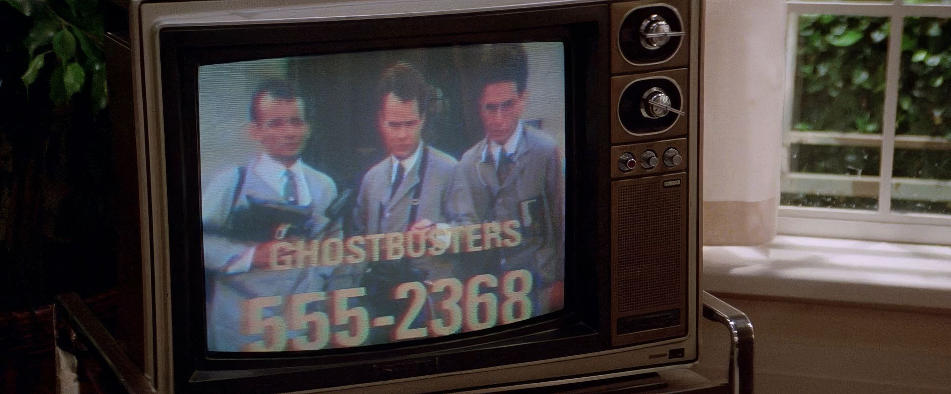
Ghostbusters (1984) shouldn’t work as well as it does. On paper, it’s a high-concept collision of Saturday Night Live humor and interdimensional horror. I look at this film and see something much deeper than a 1984 comedy hit. I see a visual blueprint for how you use cinematography to anchor the impossible.
For me, this isn’t just a nostalgia trip. It’s a case study in tone. We’ve all seen modern blockbusters where the VFX feels “pasted on” because the lighting is too perfect or the camera moves are too frantic. Ghostbusters holds up 40 years later because it makes the supernatural earn its place in a very real, very gritty New York. You can practically feel the humidity and the street grime in every frame.
About the Cinematographer
The visual soul of this film belongs to Laszlo Kovacs, A.S.C. If you’re a student of the New Hollywood era, you know Kovacs was the king of “gritty authenticity” he’s the man who shot Easy Rider. Bringing a guy with Hungarian émigré sensibilities to a Bill Murray comedy was a stroke of genius.
Kovacs didn’t treat this like a “funny movie.” He treated it like a film about three guys starting a small business in a crumbling city. His lighting wasn’t flashy; it was foundational. He understood that for a joke to land or for a ghost to be scary the environment has to feel lived-in. He used his lens as an observer, giving the actors room to breathe and riff, while subtly crafting a world that felt heavy and real enough to make the eventual Stay Puft Marshmallow Man feel like a genuine threat rather than a cartoon.
Inspiration Behind the Cinematography

The DNA of the film changed when Ivan Reitman took the reins from Dan Aykroyd’s original “space-travel” concept. By shifting the focus to a “grounded business” story set in Manhattan, the cinematography had to pivot.
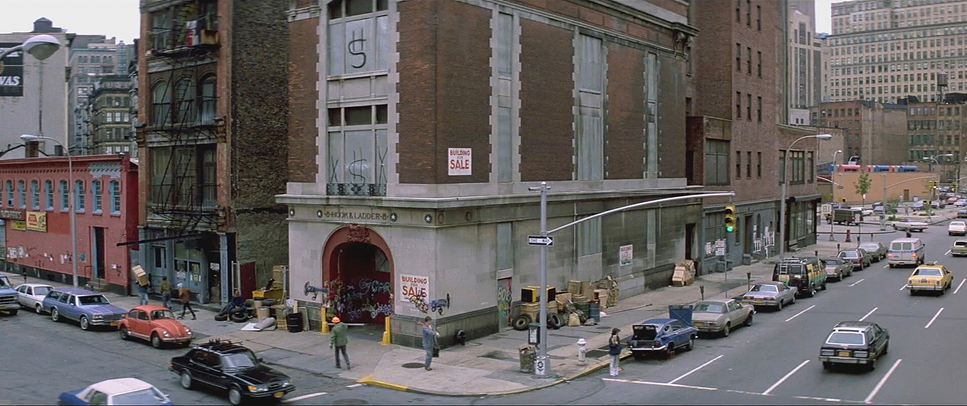
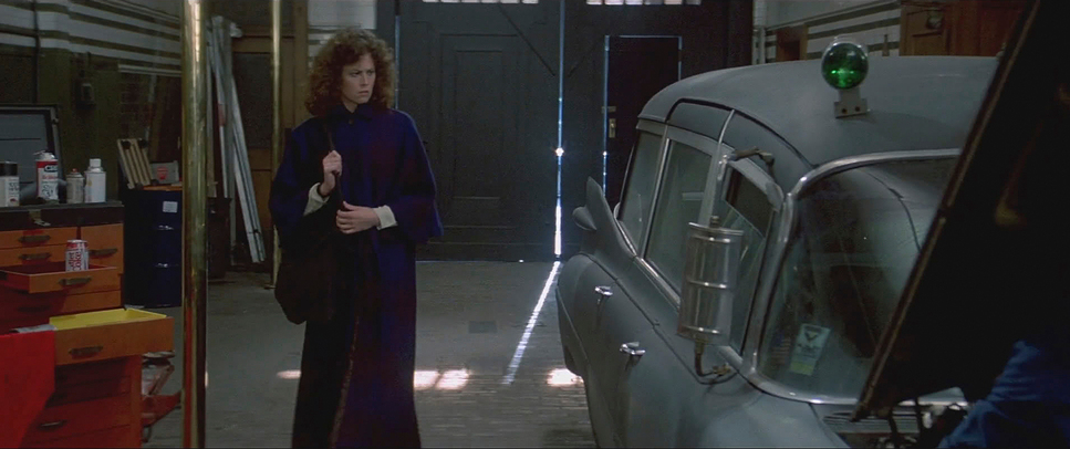
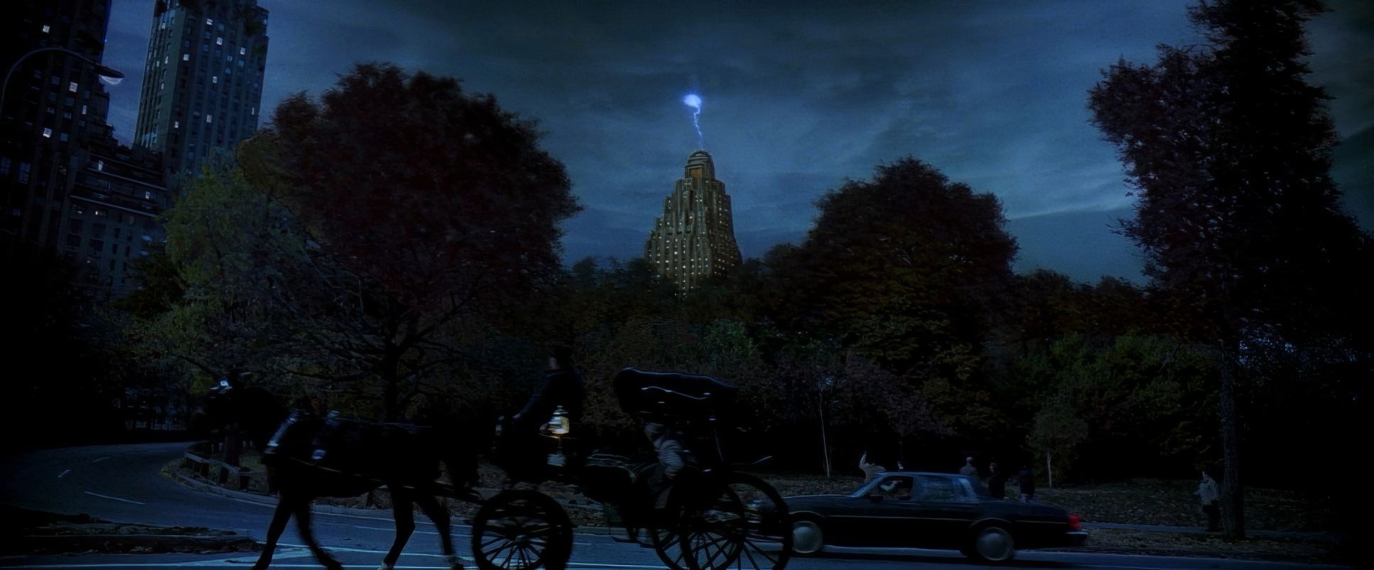
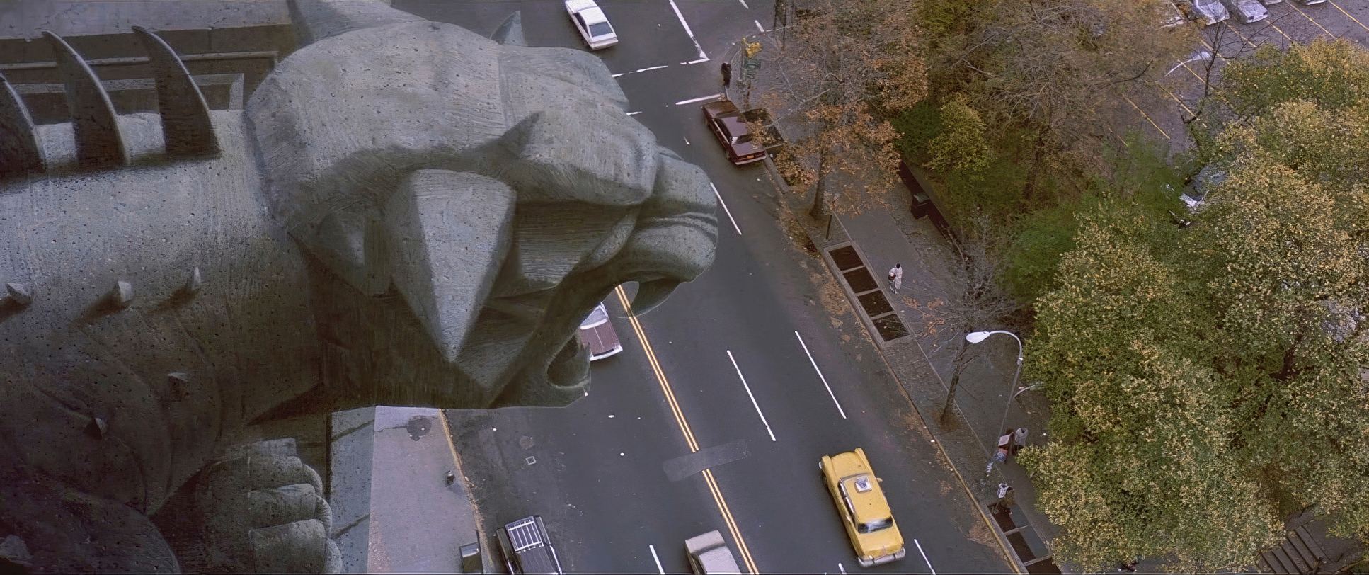
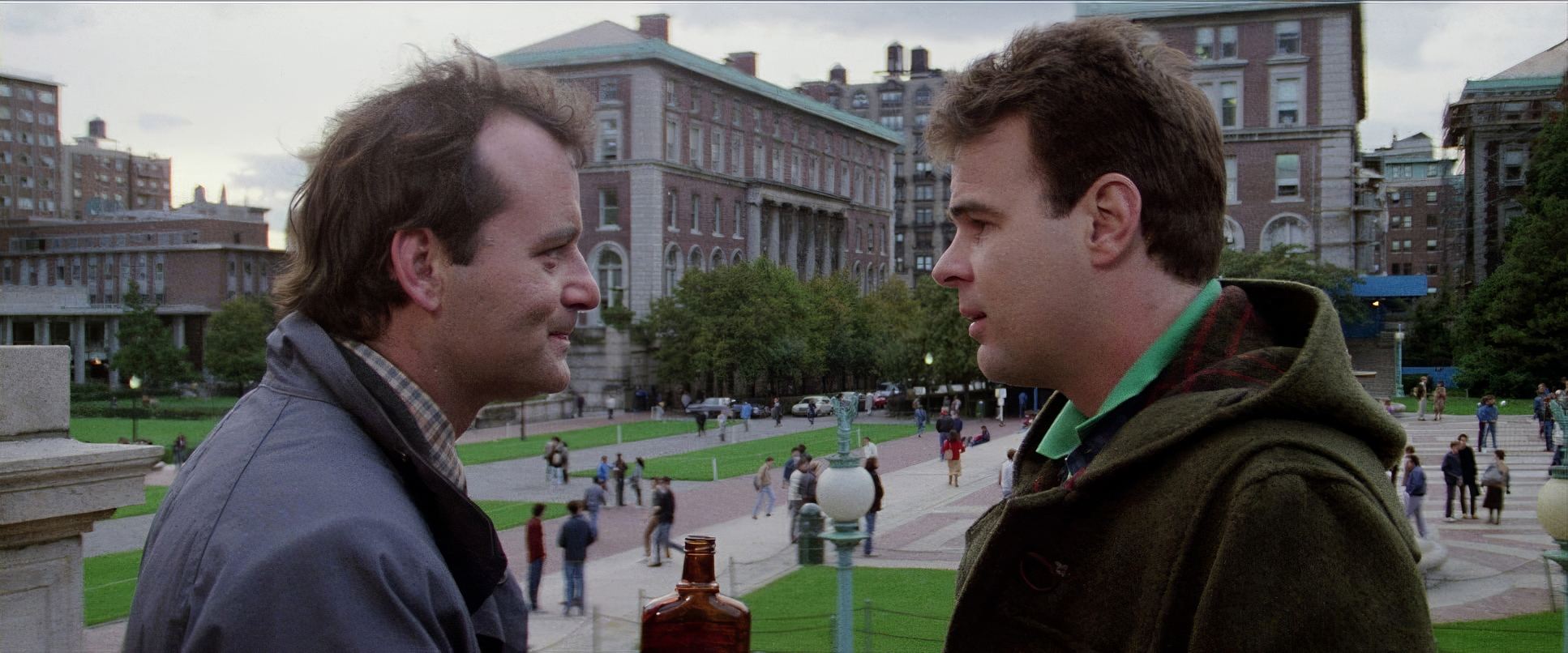
Kovacs’s inspiration clearly comes from the city itself. New York isn’t a backdrop here; it’s a character. By shooting the firehouse, Dana’s apartment, and those university offices with a textured, “dirty” realism, he anchors the audience. We buy into the ghosts because we buy into the world they’re haunting. The Ghostbusters aren’t superheroes; they’re bumbling entrepreneurs with heavy equipment. That “practical realism” is the secret sauce. When things finally get weird, the contrast is massive because the foundation was so stubbornly ordinary.
Camera Movements

One thing I love about this film is its restraint. You don’t see the “look at me” crane shots that plague modern sci-fi. Kovacs uses a thoughtful economy of movement.
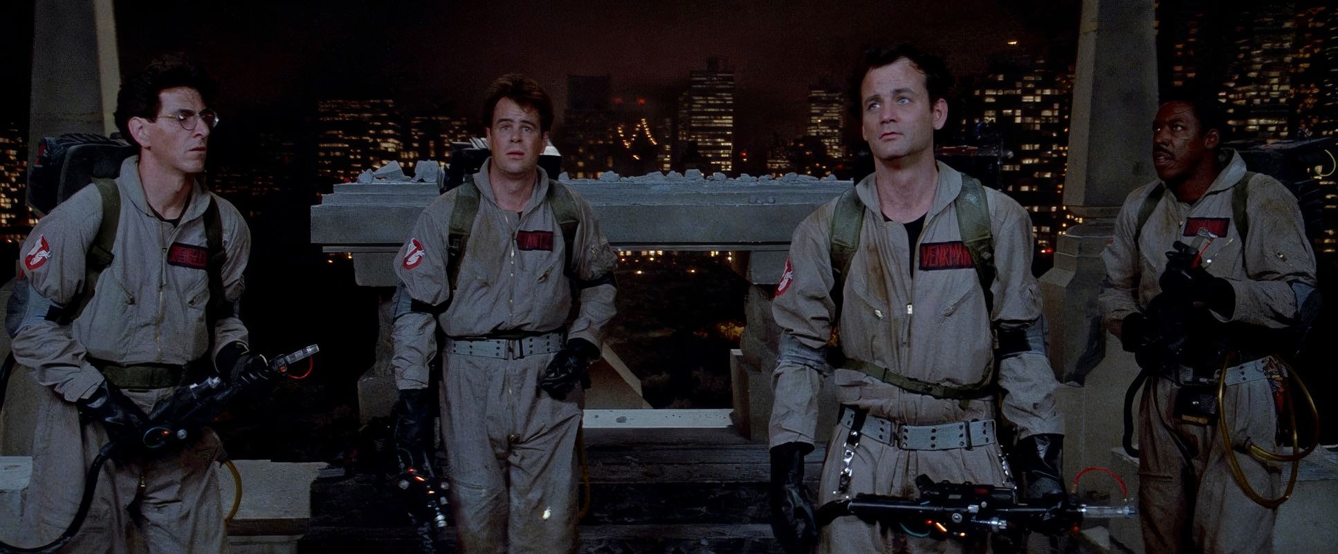
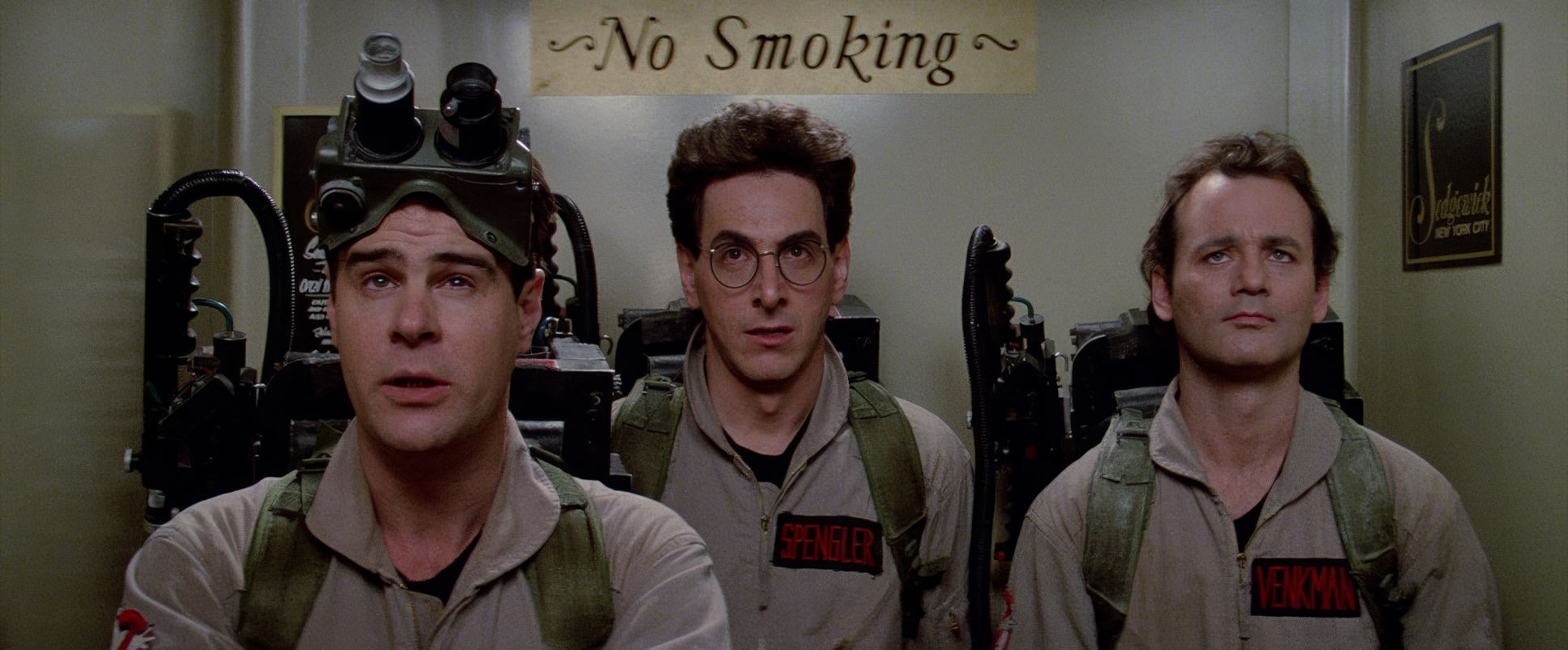
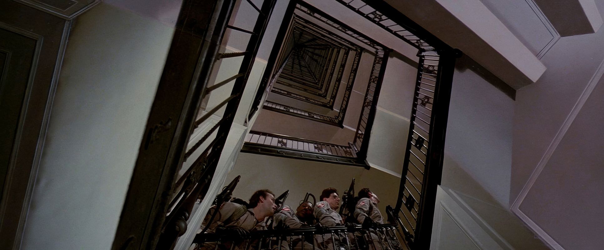
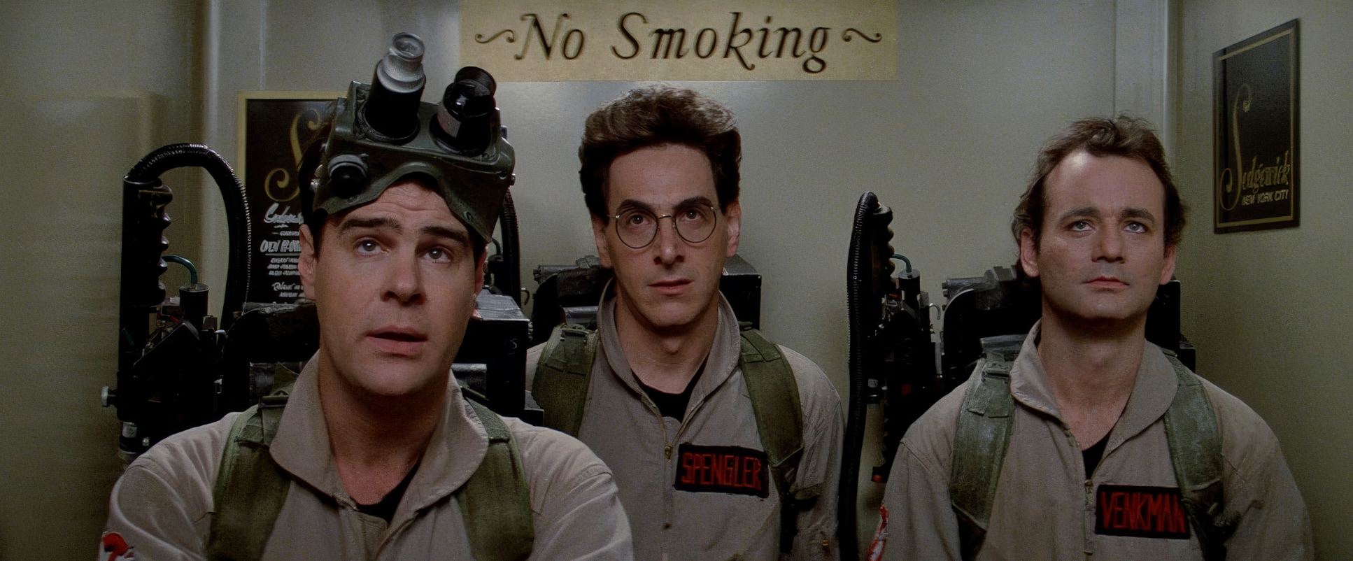
Take the elevator scene. It’s a masterclass in using a static, tight frame to build tension. By keeping the camera relatively still and boxing the three leads into that cramped space, the visual language does half the comedic work. We see the sweat, the nervous glances, and Egon trying to shrink away from his own equipment. It’s character development through framing. When the camera does move like the smooth dolly shots following the Ecto-1 or the wide helicopter pans of a city under siege it feels earned. It scales up the stakes only when the story demands it, always cutting back to the human element to keep us grounded.
Compositional Choices
Kovacs was a master of “The Geometry of Comedy.” He often leaned into classical techniques like the rule of thirds to keep things aesthetically pleasing, but he knew exactly when to break the frame to create unease.
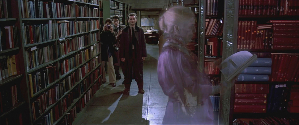
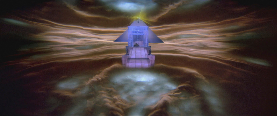
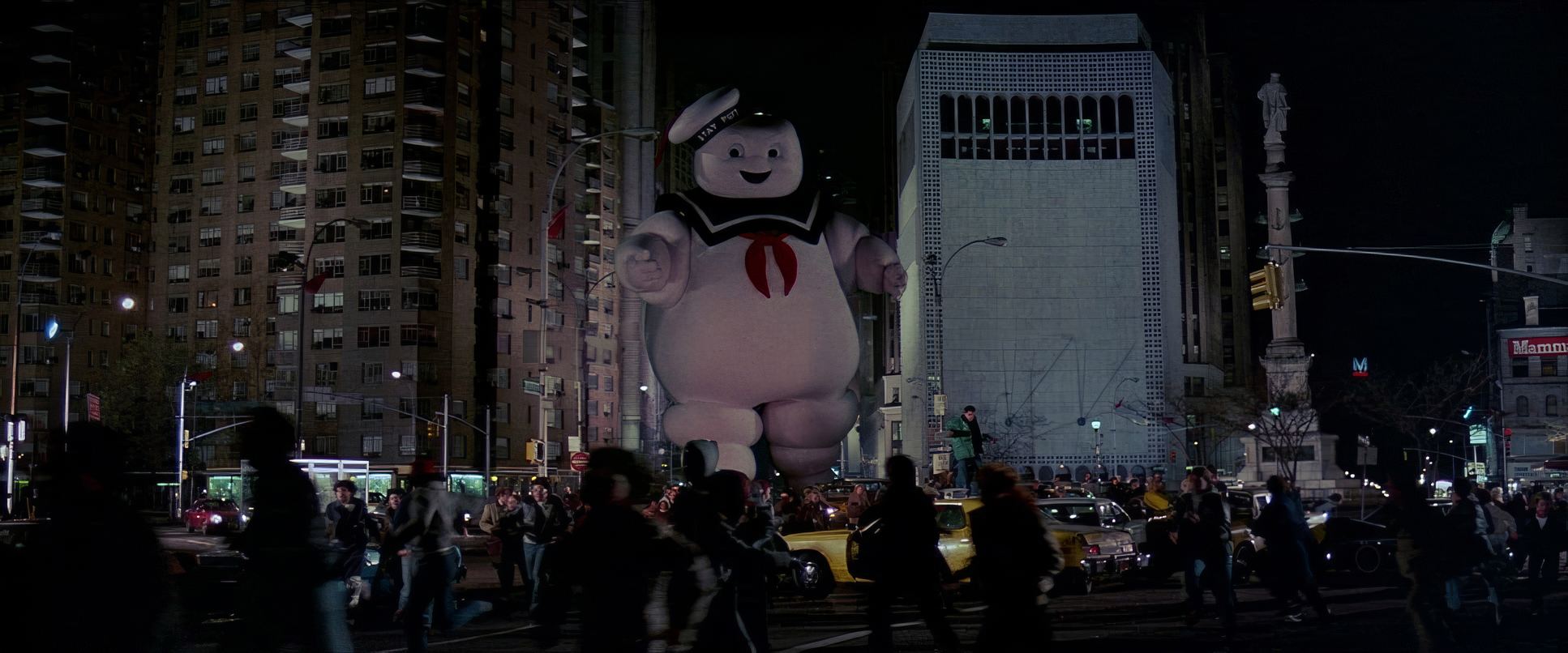
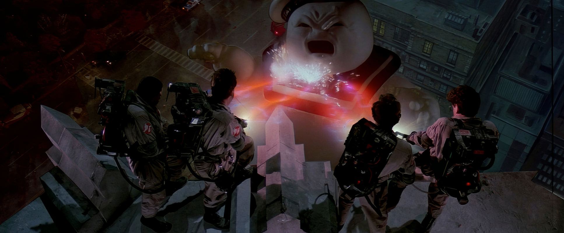
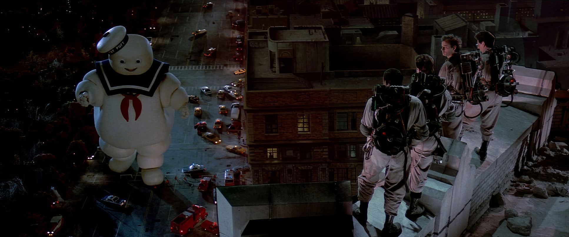
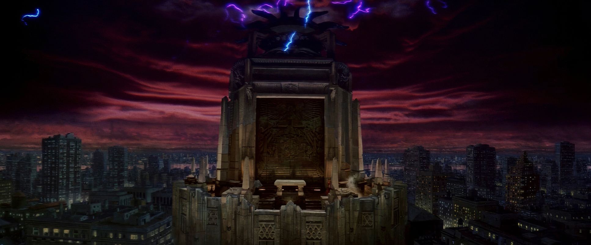
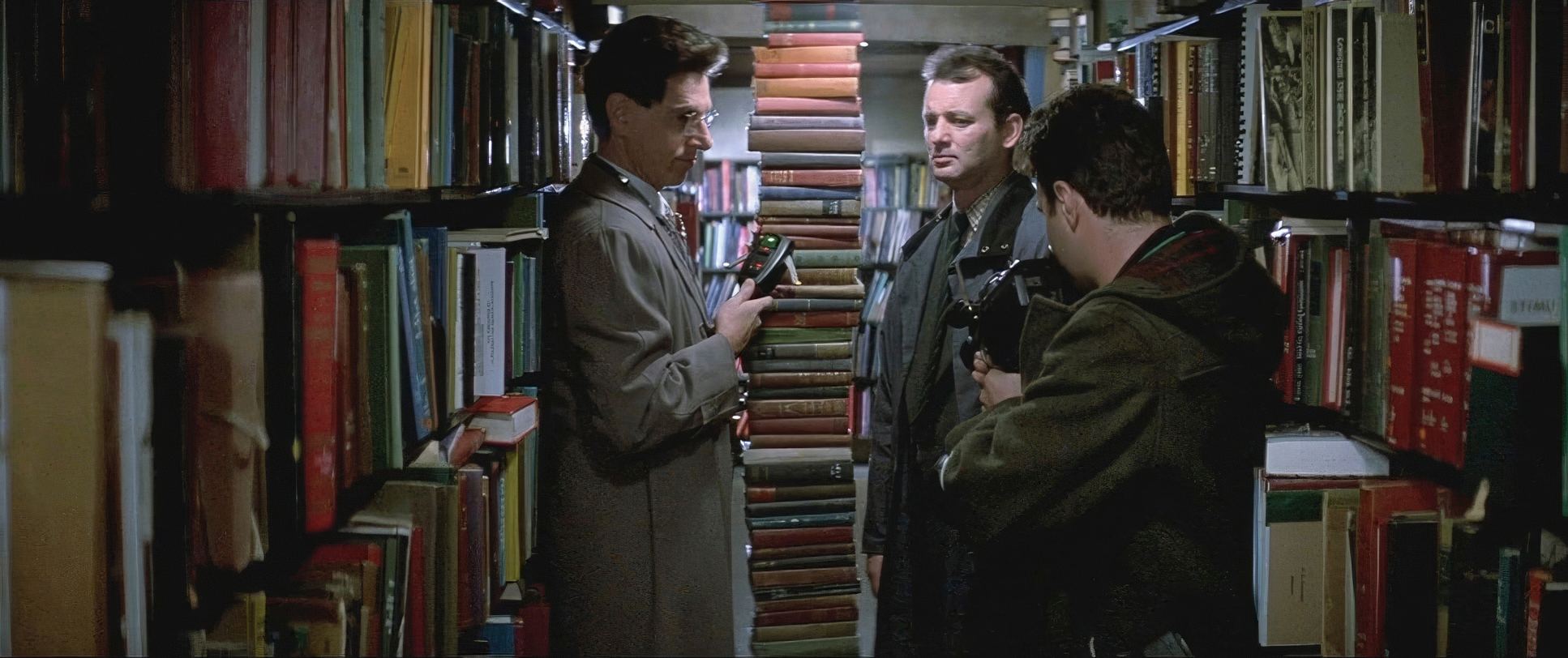
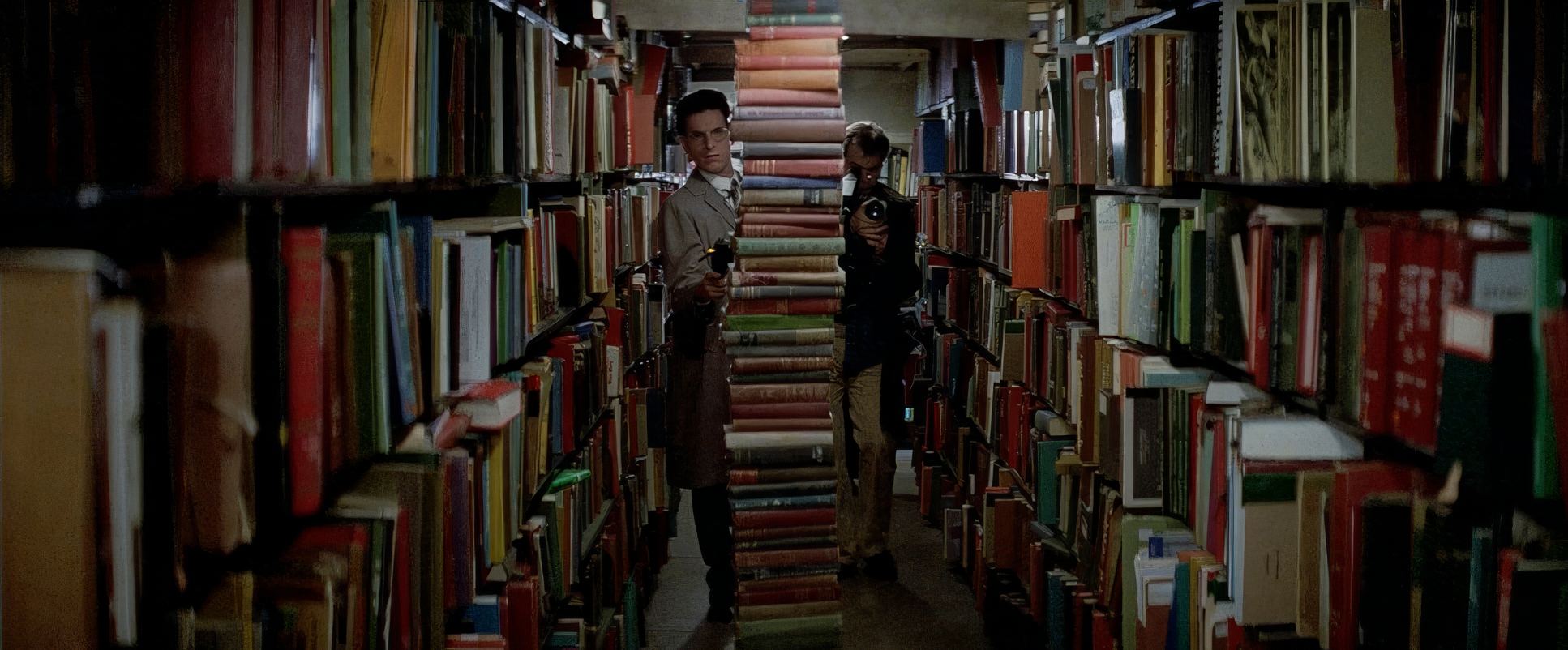
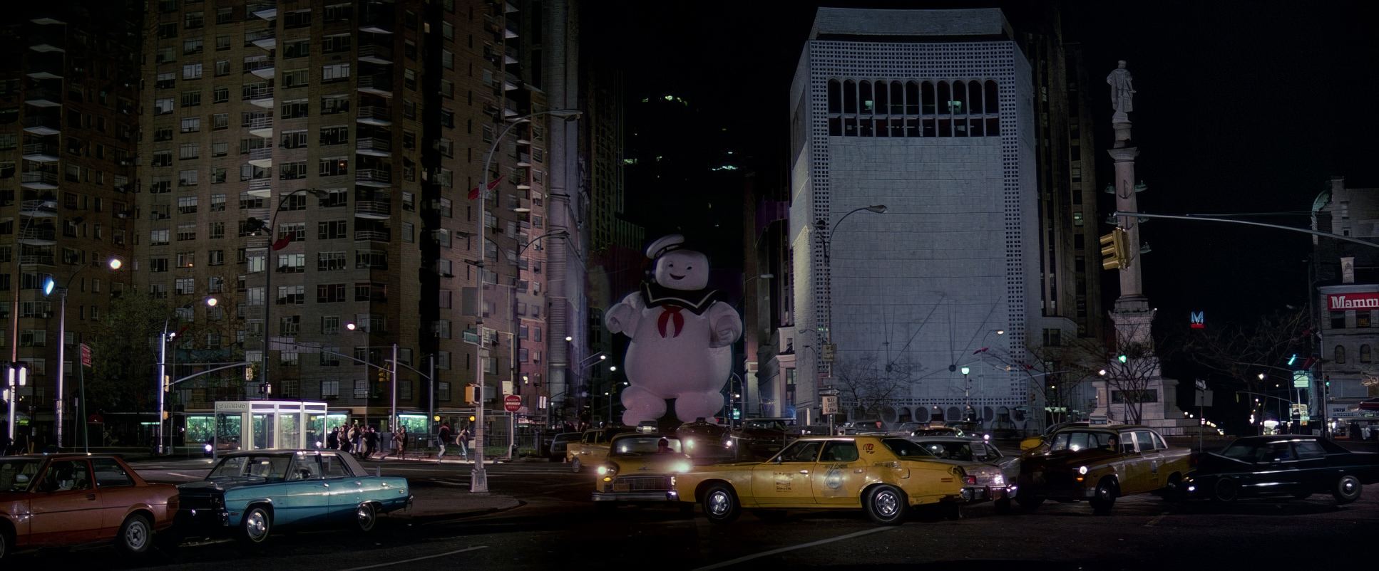
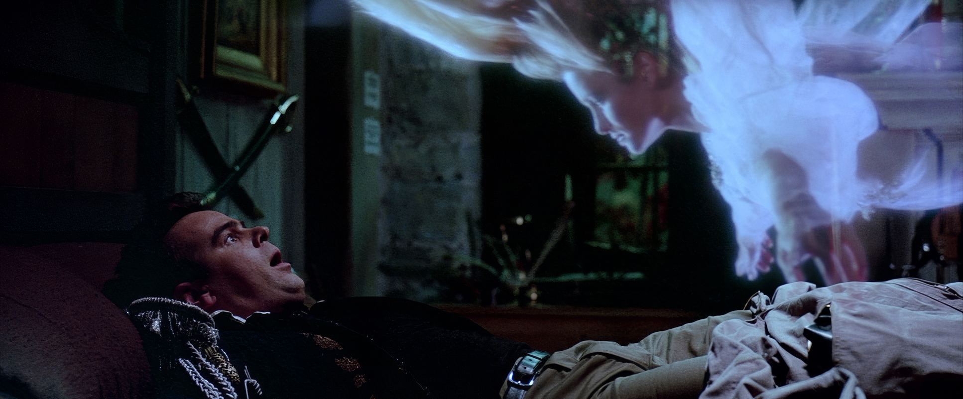
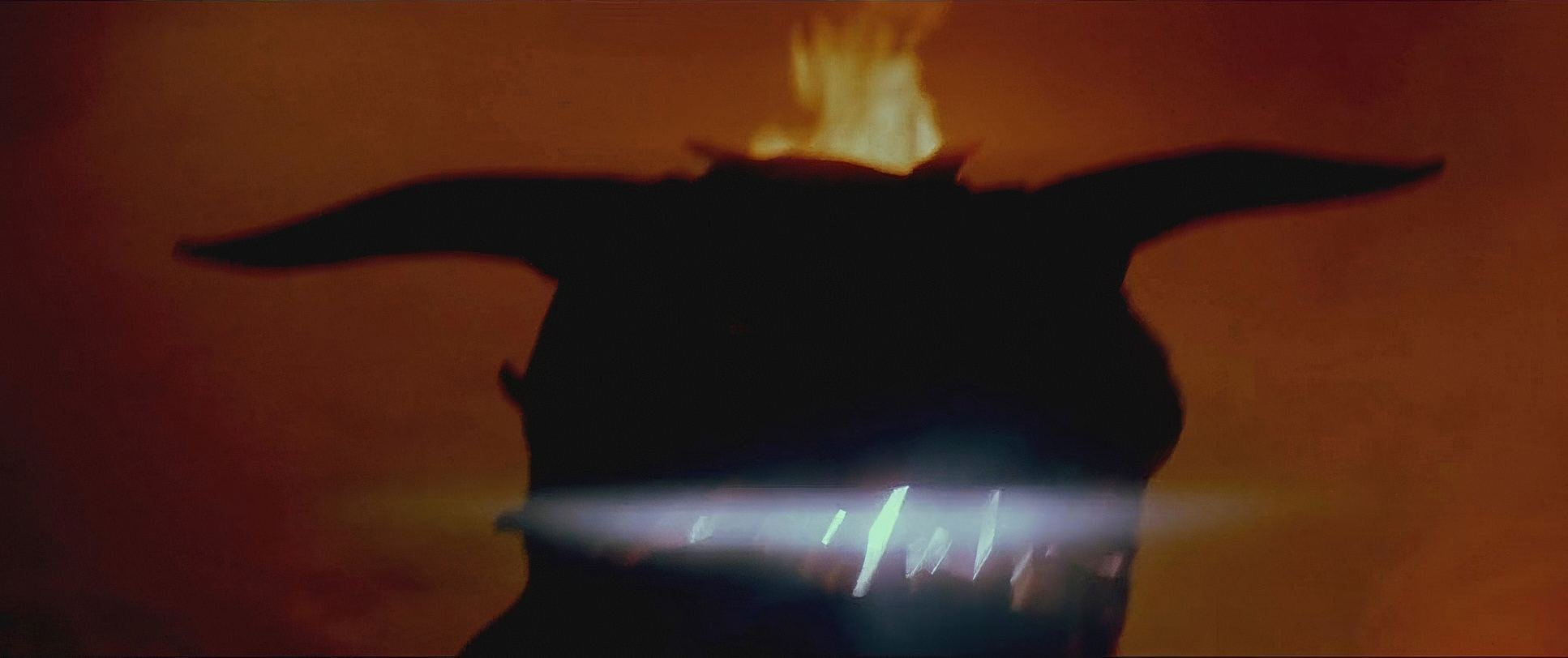
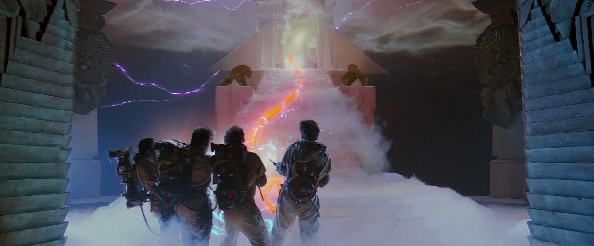
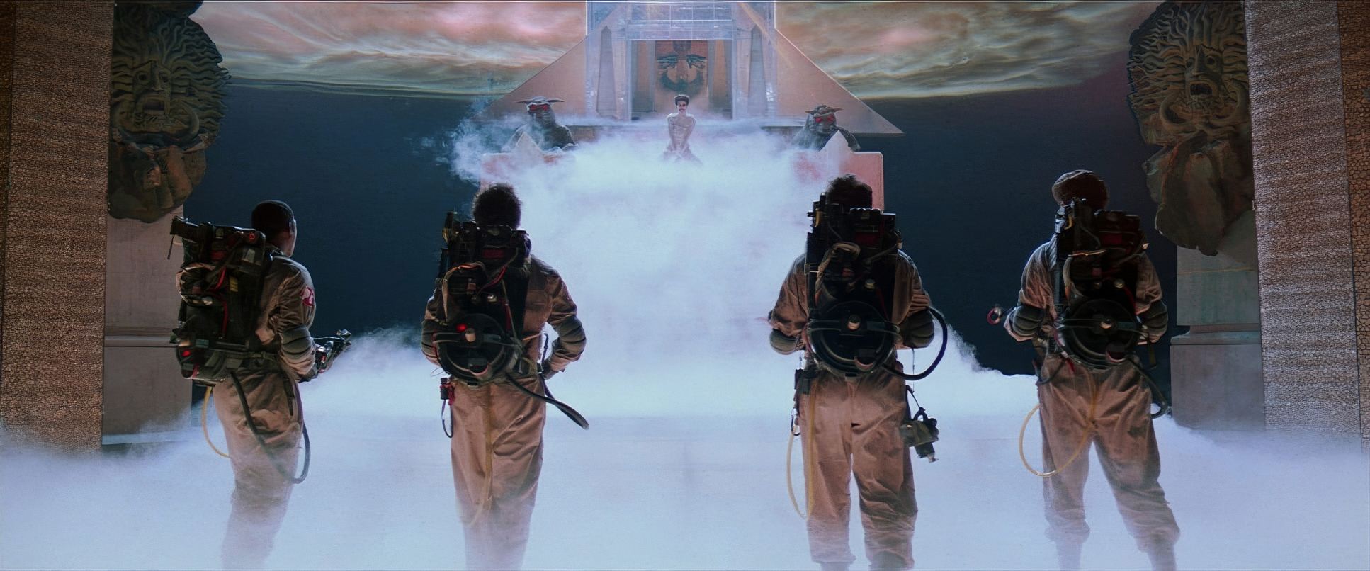
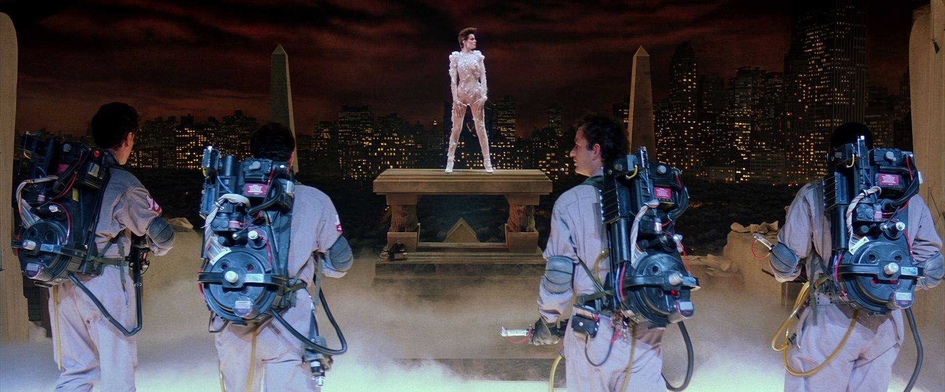
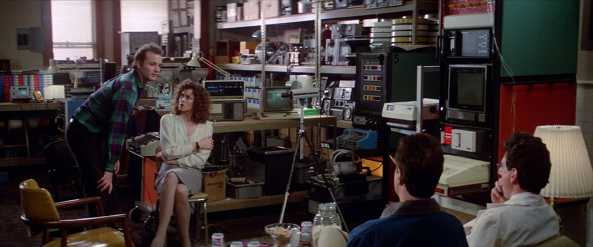
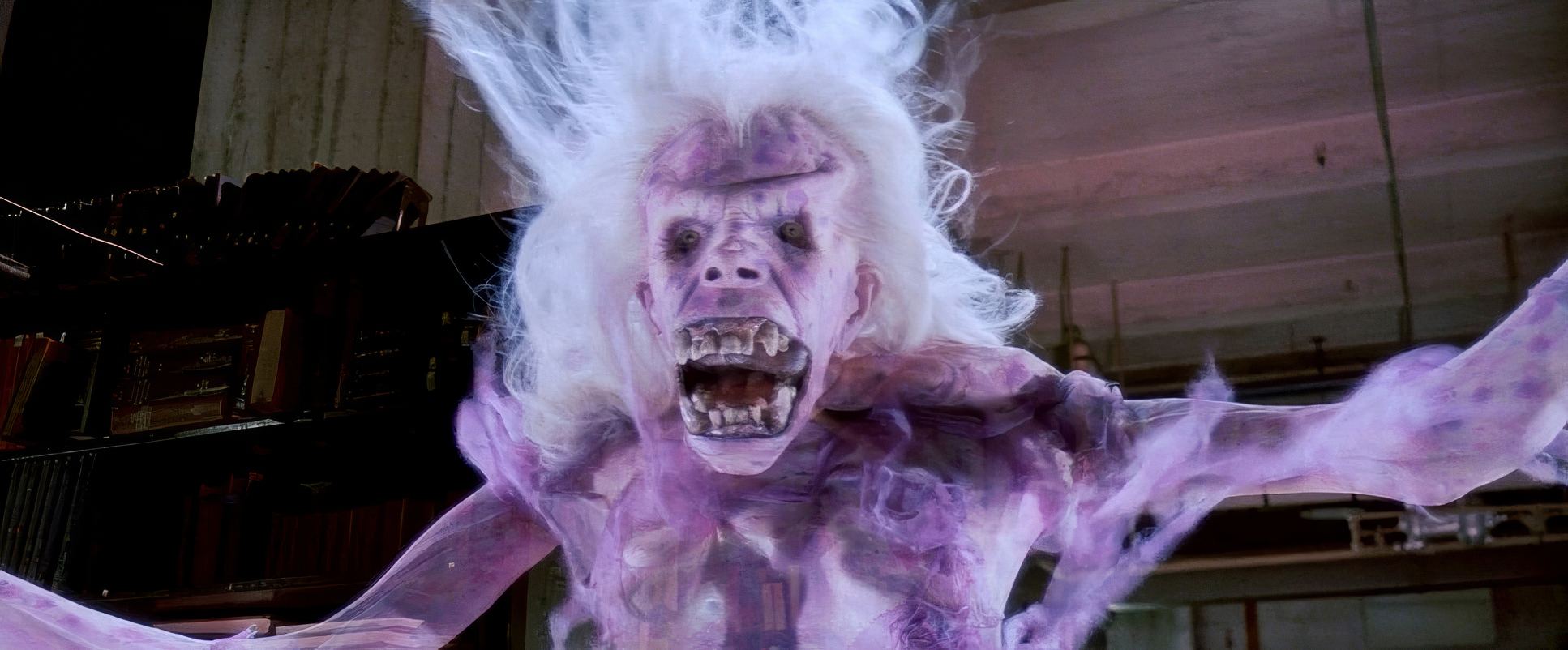
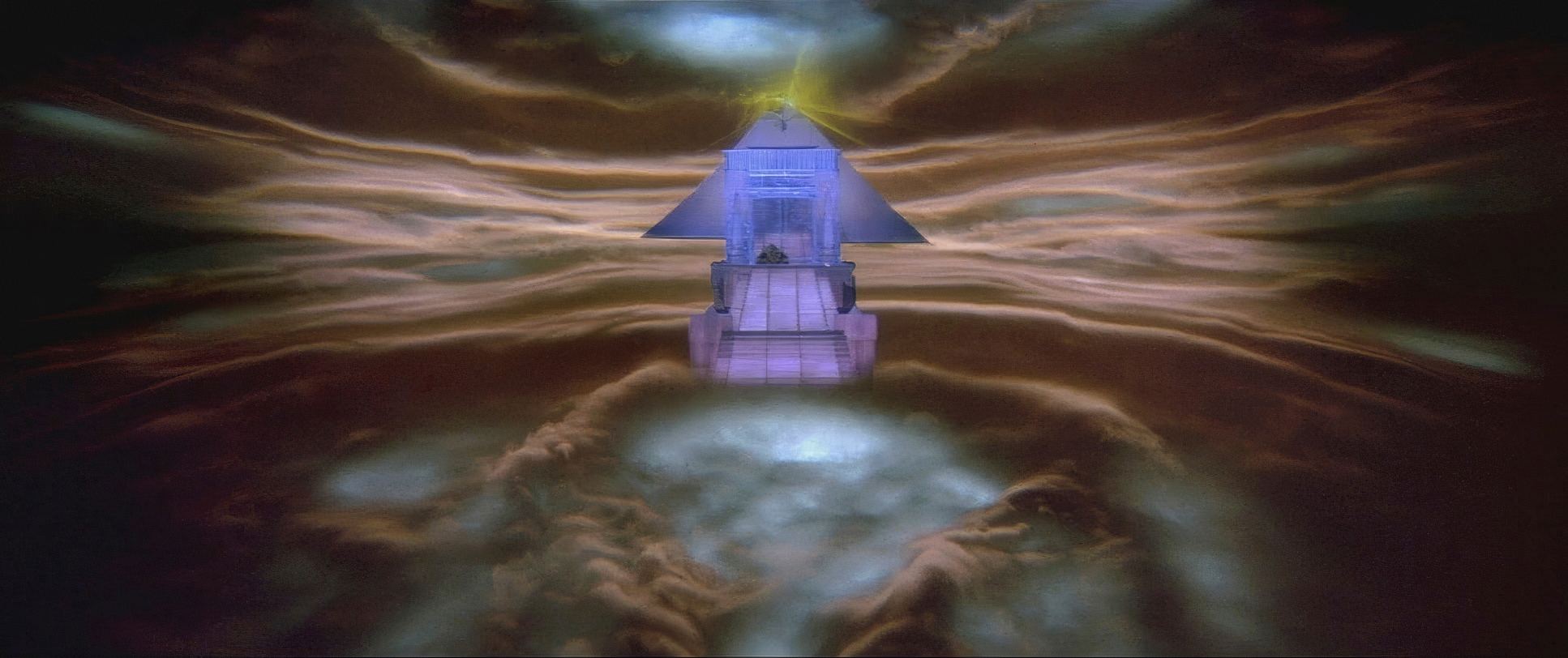
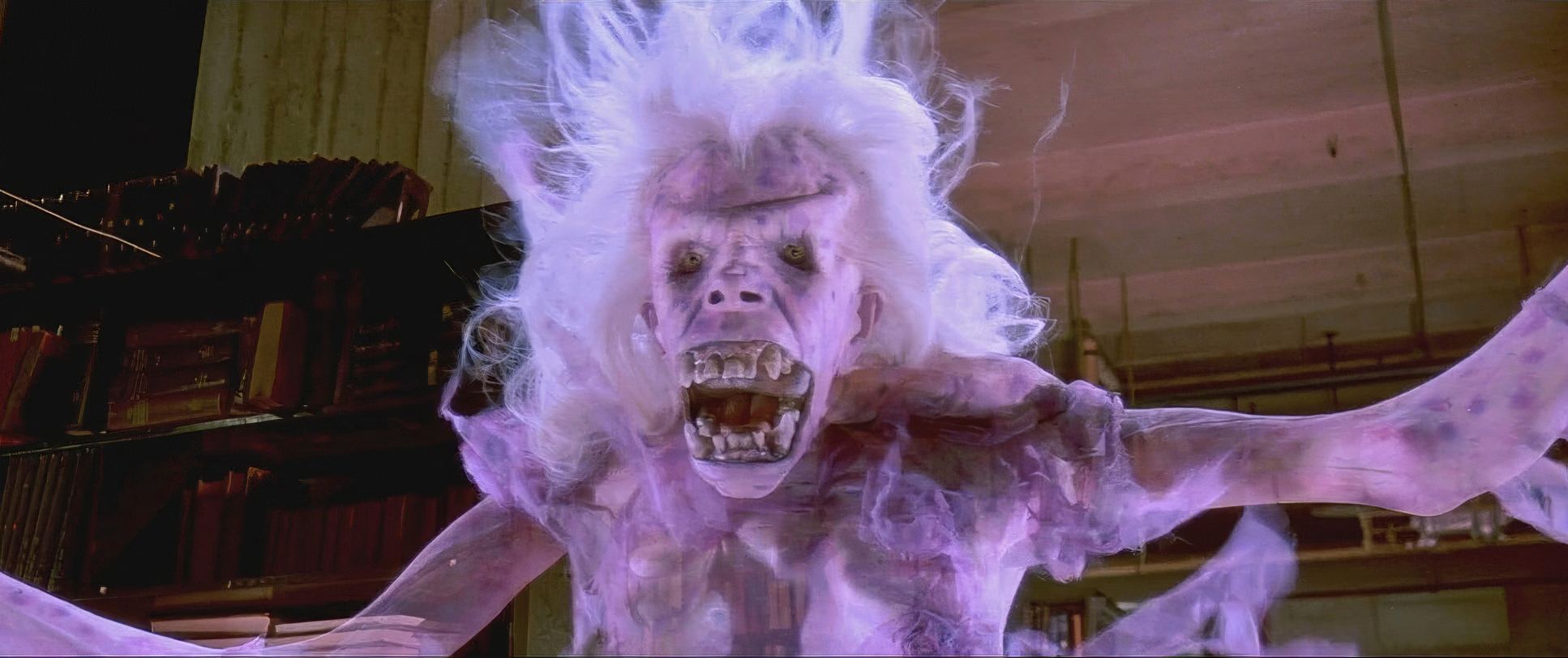
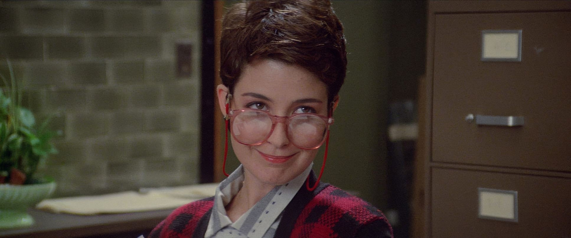
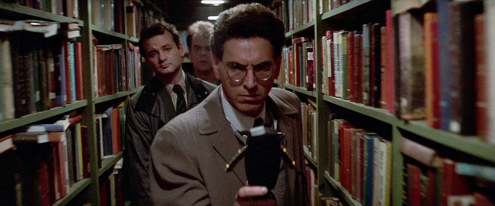
The composition of the ghosts is particularly clever. Look at the library ghost: she’s framed in negative space, which makes her sudden transformation feel like a violation of the frame. For Gozer or Stay Puft, the composition shifts to “Right Heavy” or low-angle power shots that dwarf our heroes. Kovacs also utilized deep focus a hallmark of great ensemble comedy ensuring that Ray’s excitement, Venkman’s sarcasm, and Egon’s clinical fear are all visible in the same shot. It’s about keeping the team dynamic front and center, even when a 100-foot marshmallow man is stepping on a church.
Lighting Style
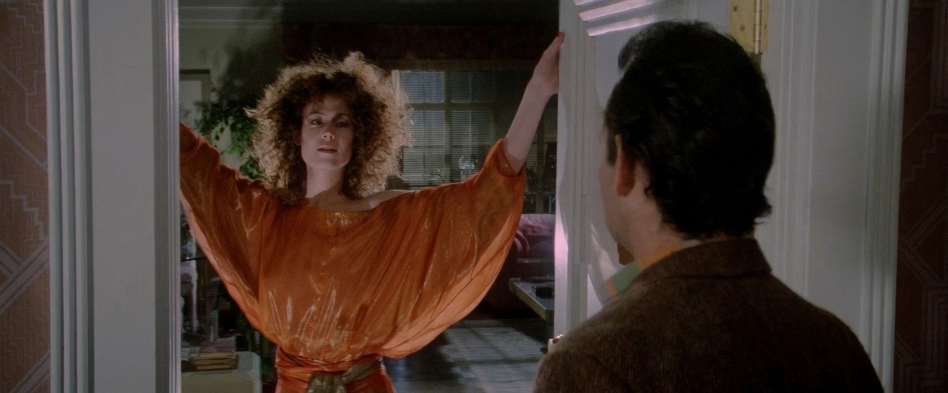
This is where the film’s “quiet strength” lies. Kovacs stuck to motivated lighting sunlight looks like it’s coming from a window, and the firehouse feels like it’s lit by industrial fluorescents and tungsten work lights.
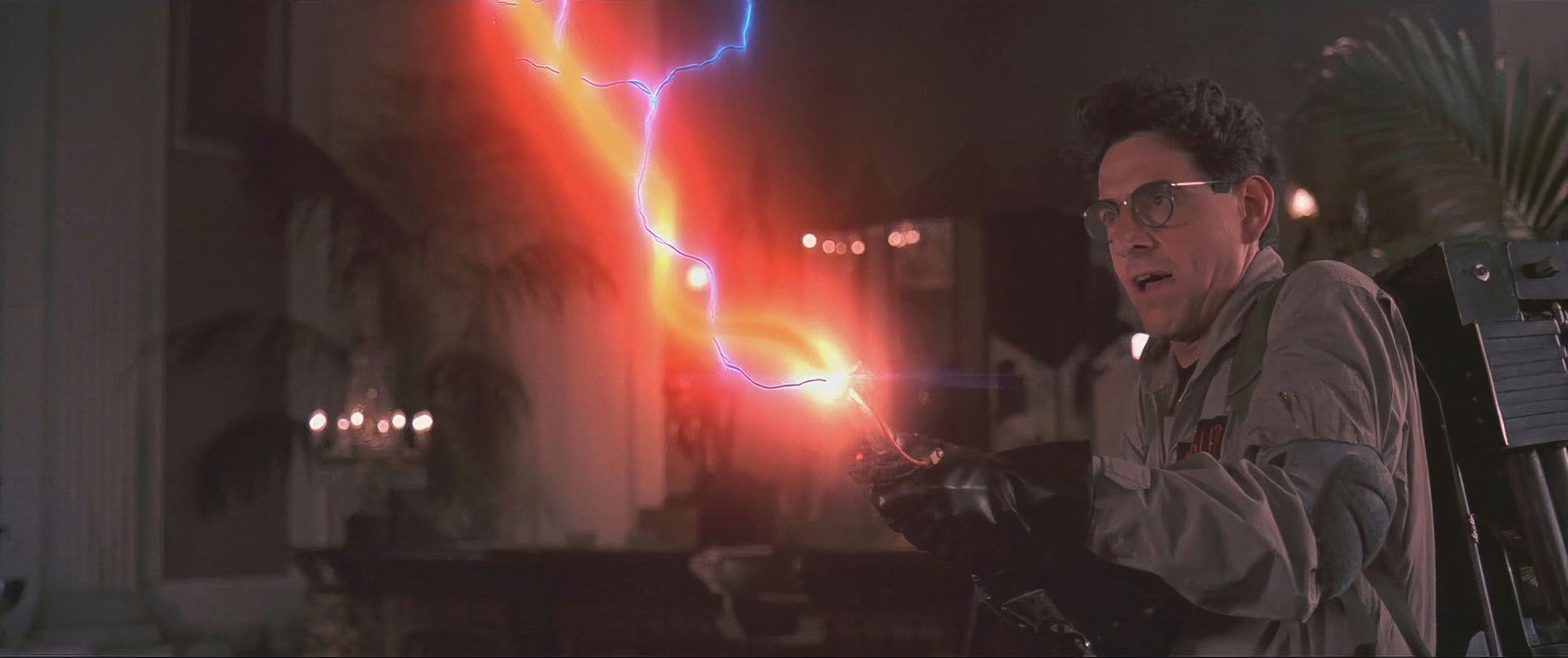
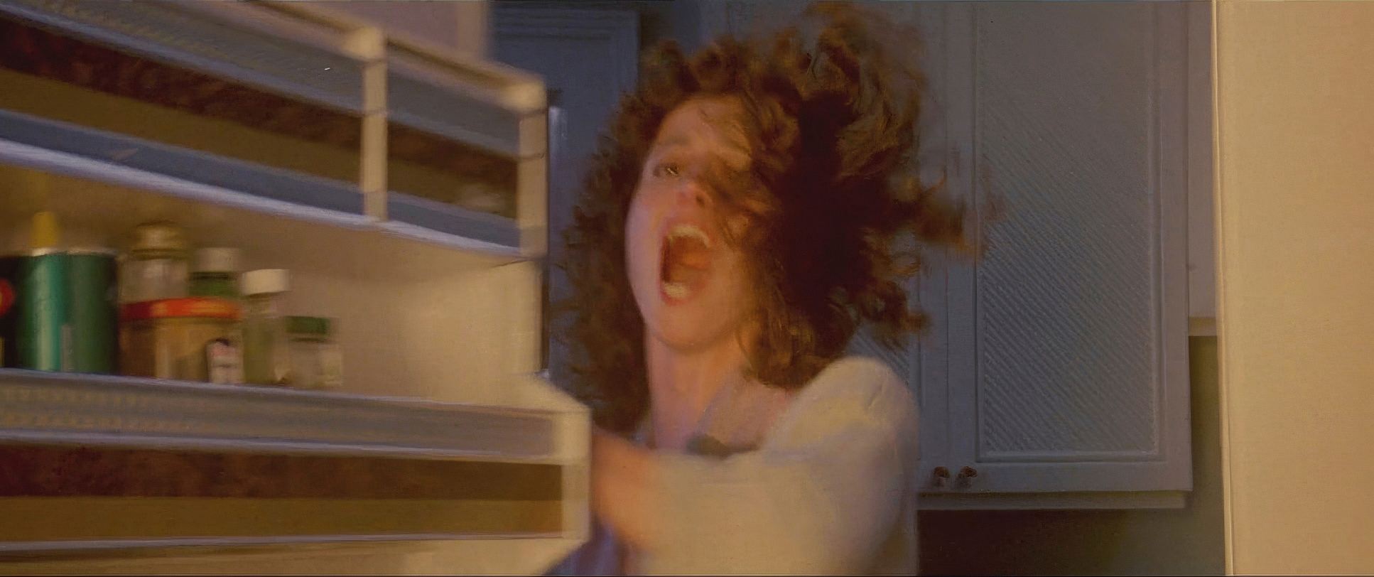
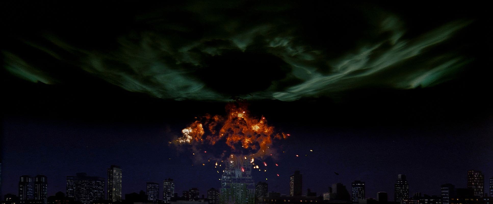
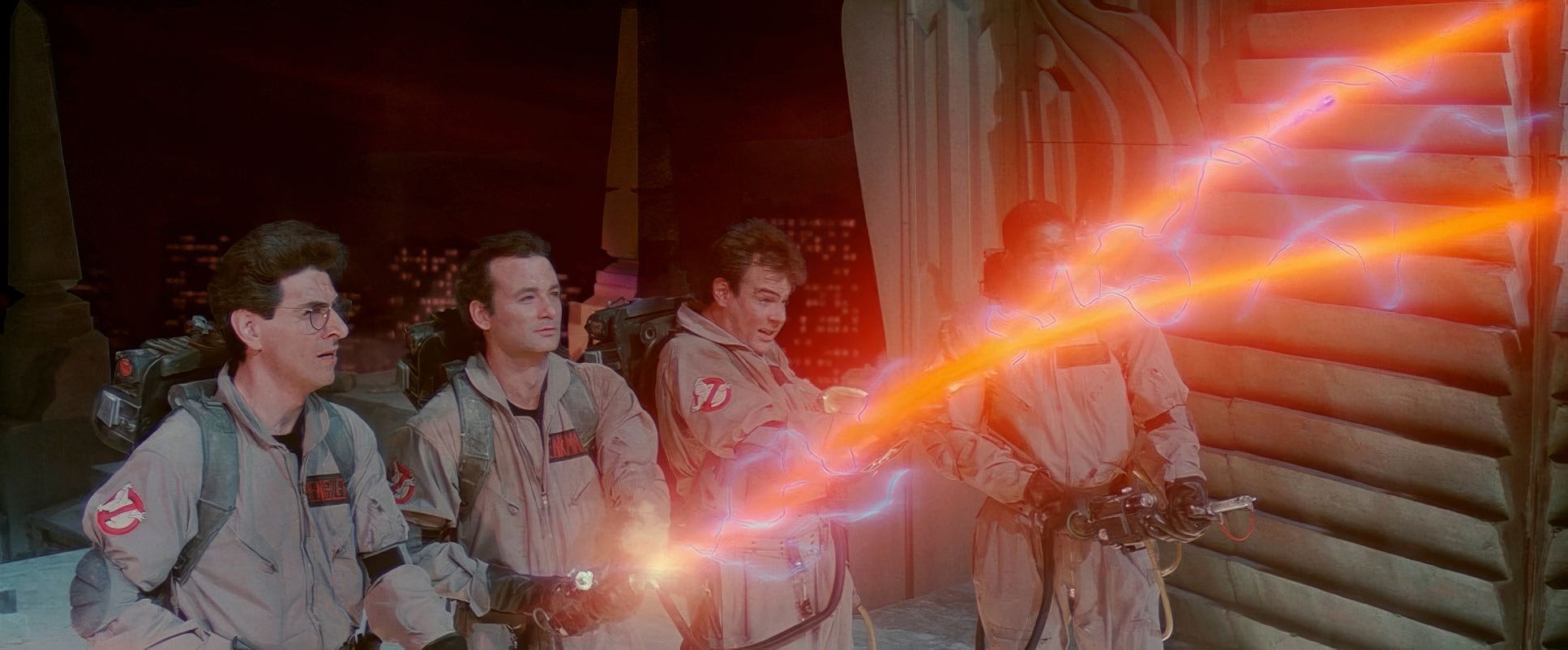
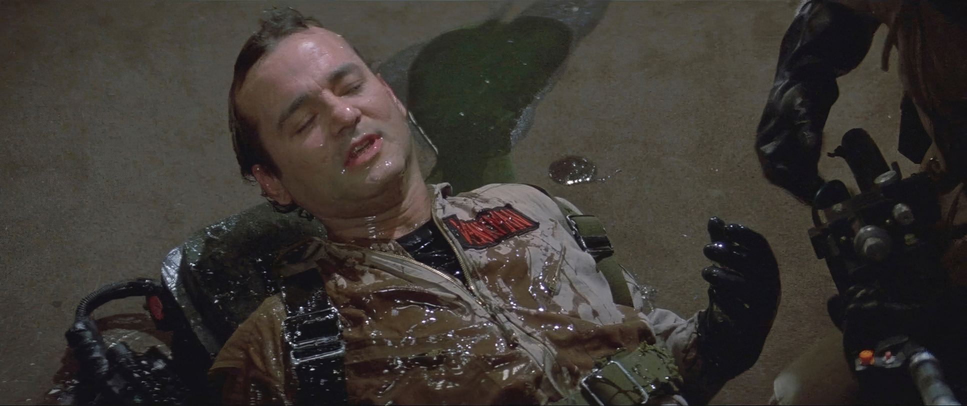
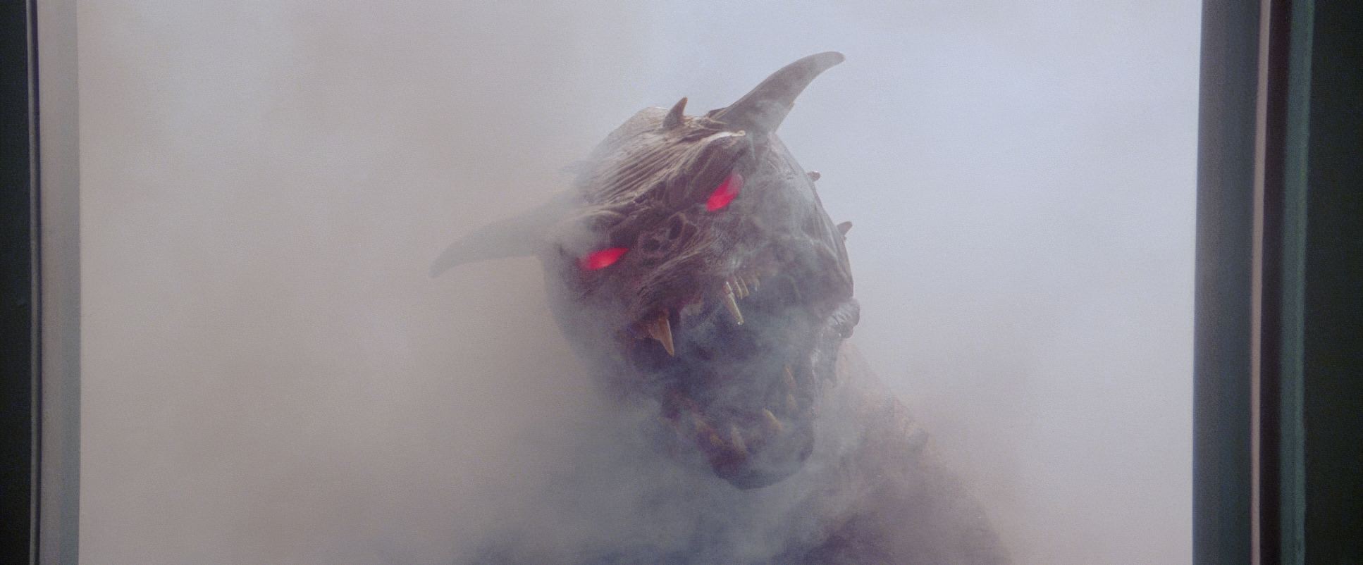
As a colorist, I appreciate how this “normalcy” makes the supernatural pop. When you finally see the ethereal glow of a ghost or the sinister reds of Gozer’s portal, they have a visceral impact because they aren’t competing with “stylized” lighting elsewhere. The comedy is bright and naturalistic, but when the horror kicks in like the hands tearing through Dana’s chair the lighting gets moody, high-contrast, and sharp. The integration is seamless. It’s not about hiding the effects; it’s about lighting them so they feel like they have physical mass in the room.
Lensing and Blocking
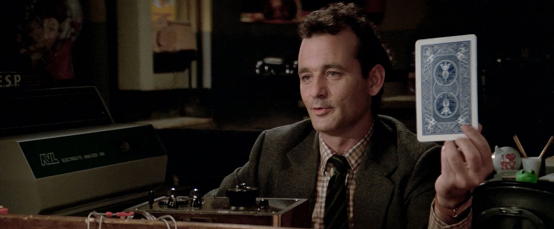
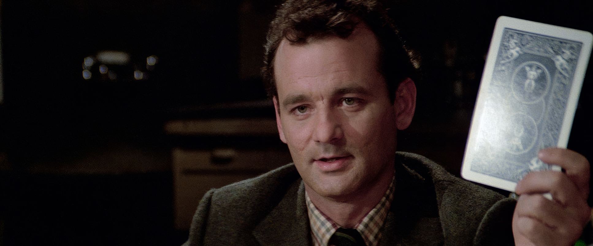
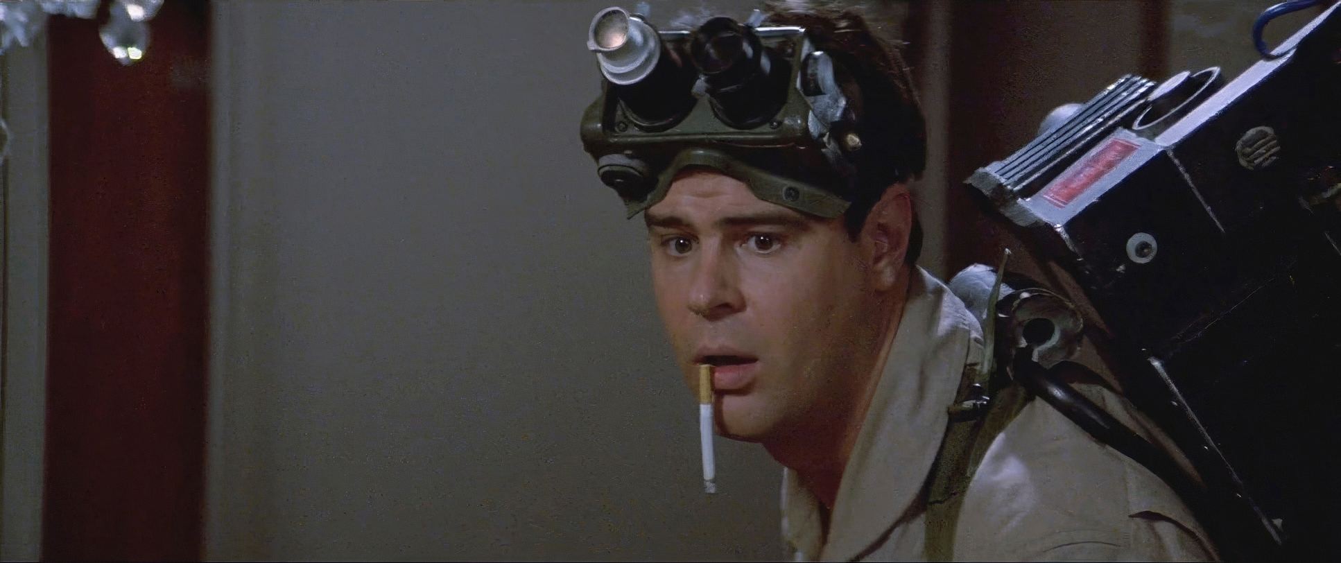
Kovacs’s lens choices were all about maintaining a clean, naturalistic perspective. He didn’t lean on distorted wide angles for dialogue; he stayed in that “human” focal length range (35mm to 50mm) to keep the faces looking honest. However, when he needed to establish scale, he’d go for a Long Lens or a Panavision Anamorphic wide to let the New York architecture swallow the characters whole.
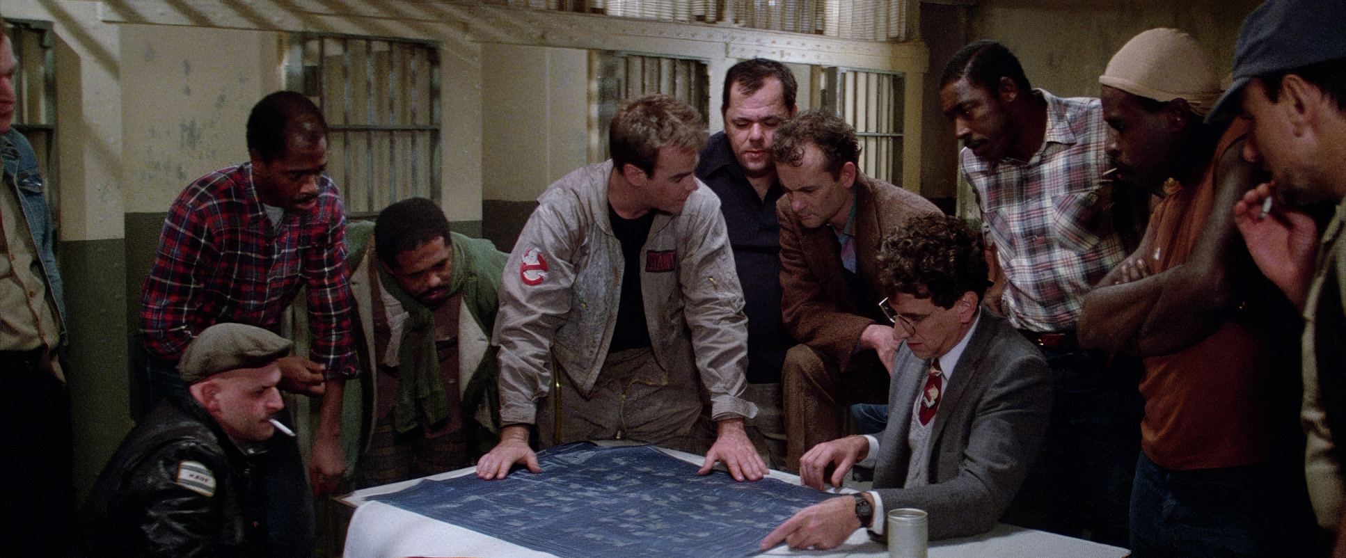
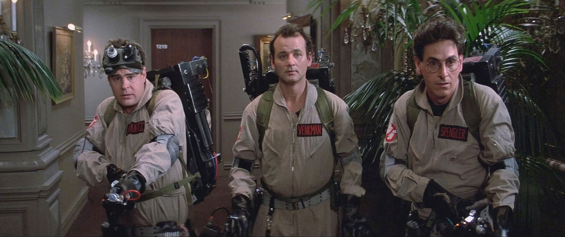
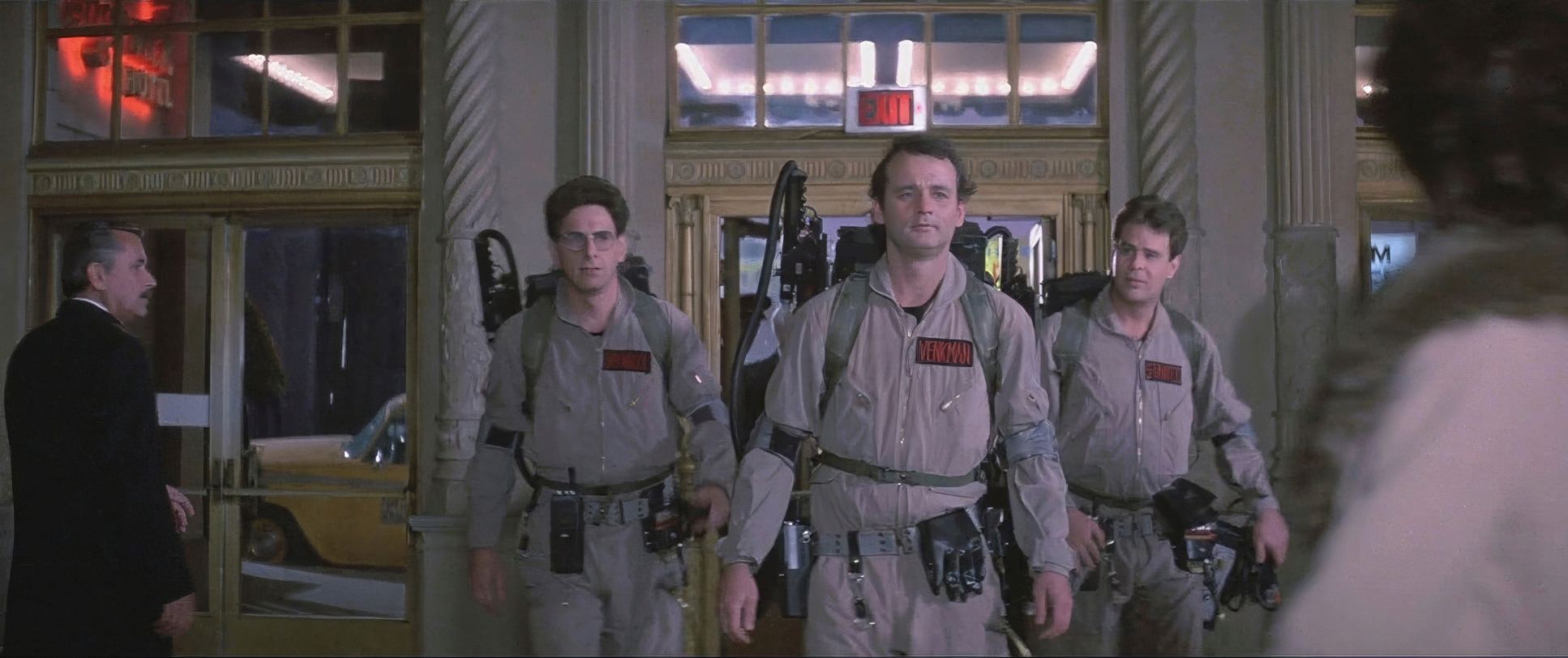
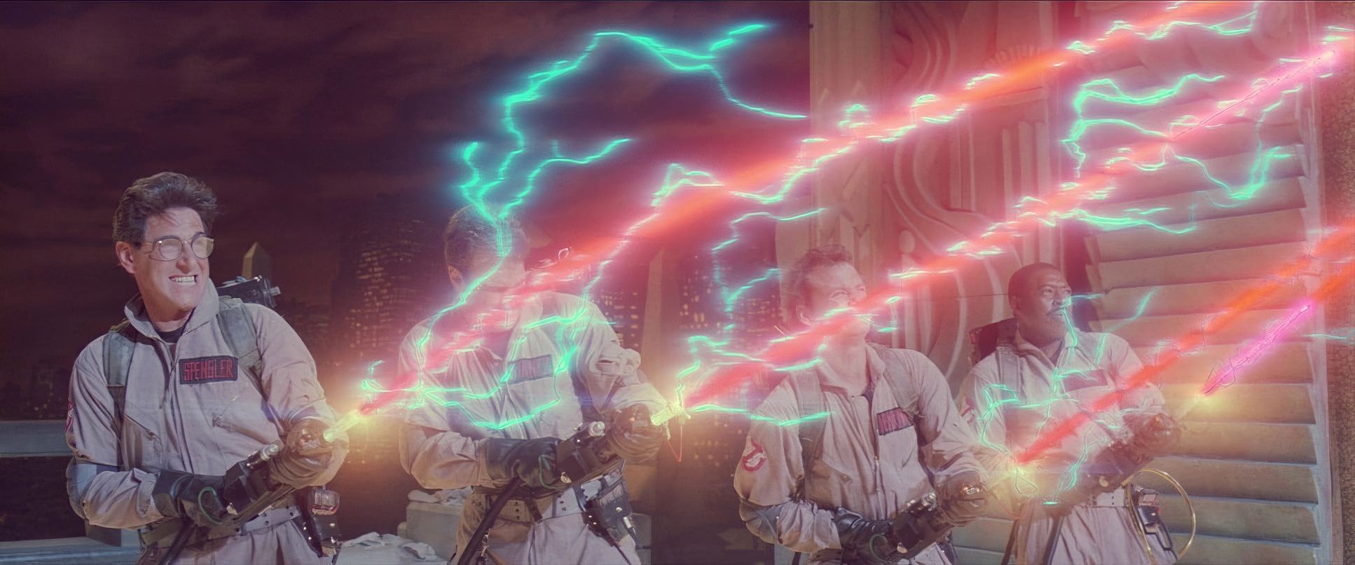
The blocking is equally deliberate. In the elevator, having all three leads in the shot simultaneously is essential for the “ensemble” feel. You see the internal chemistry of the group without needing a single cut. Whether they are crossing the streams or awkwardly walking into a high-end hotel, the way they move as a unit clunky, uncoordinated, and weighed down by gear is perfectly captured by Kovacs’s framing.
Color Grading Approach
Now, this is my “home turf.” When I look at Ghostbusters, I see those beautiful, “earthy” print-film sensibilities of the mid-80s a look I’m constantly chasing at Color Culture.
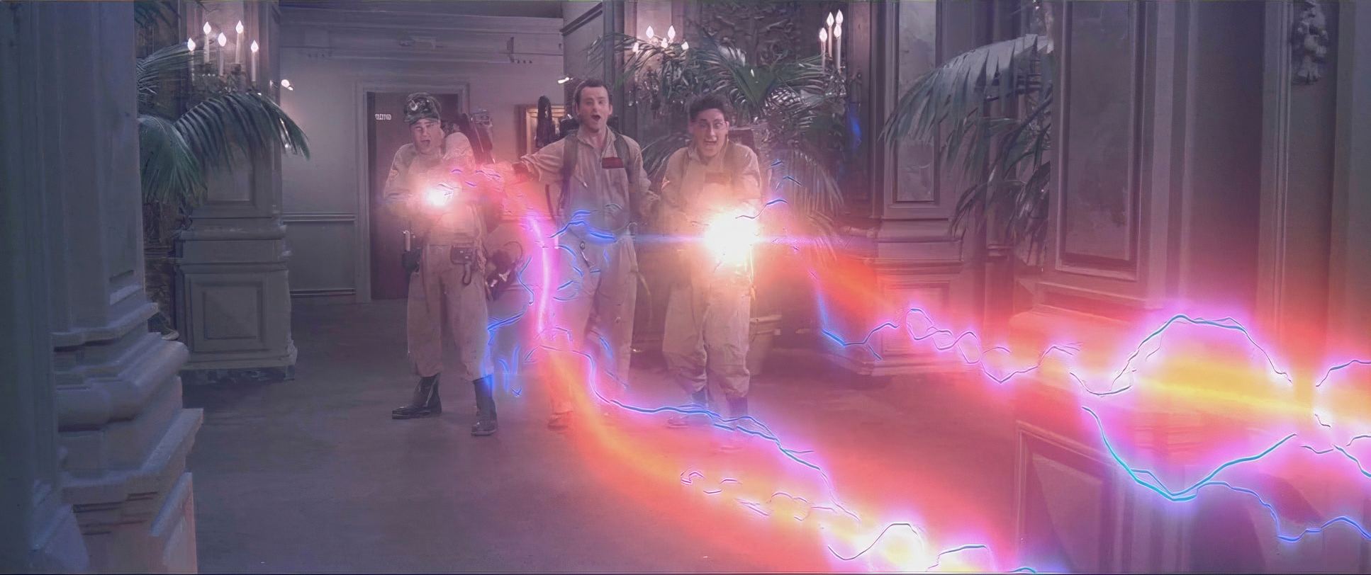
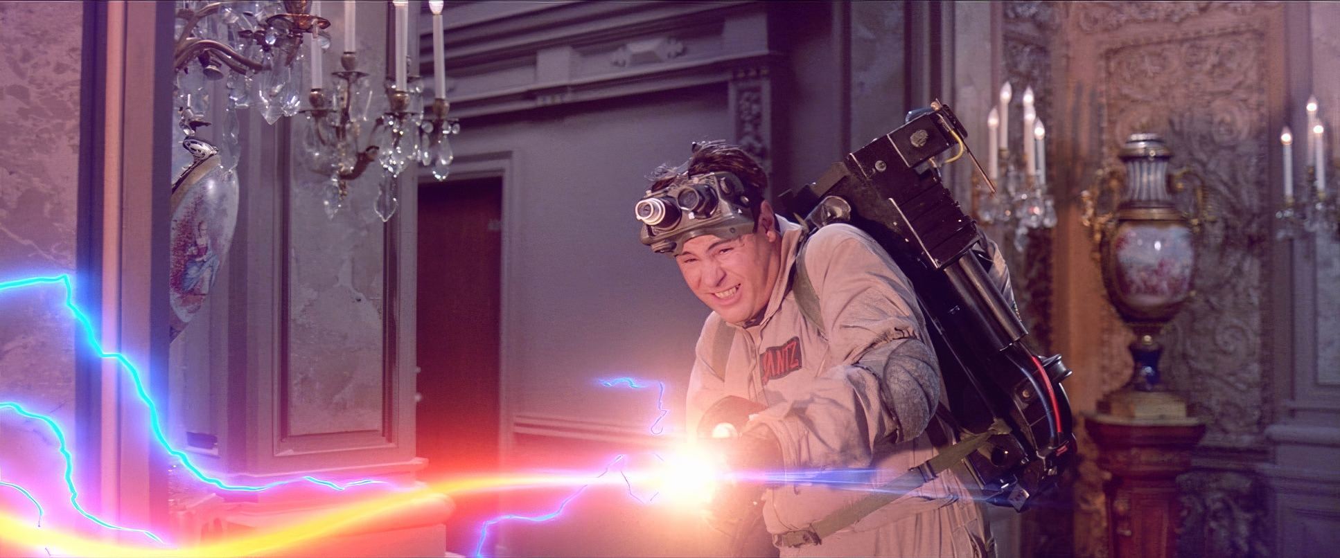
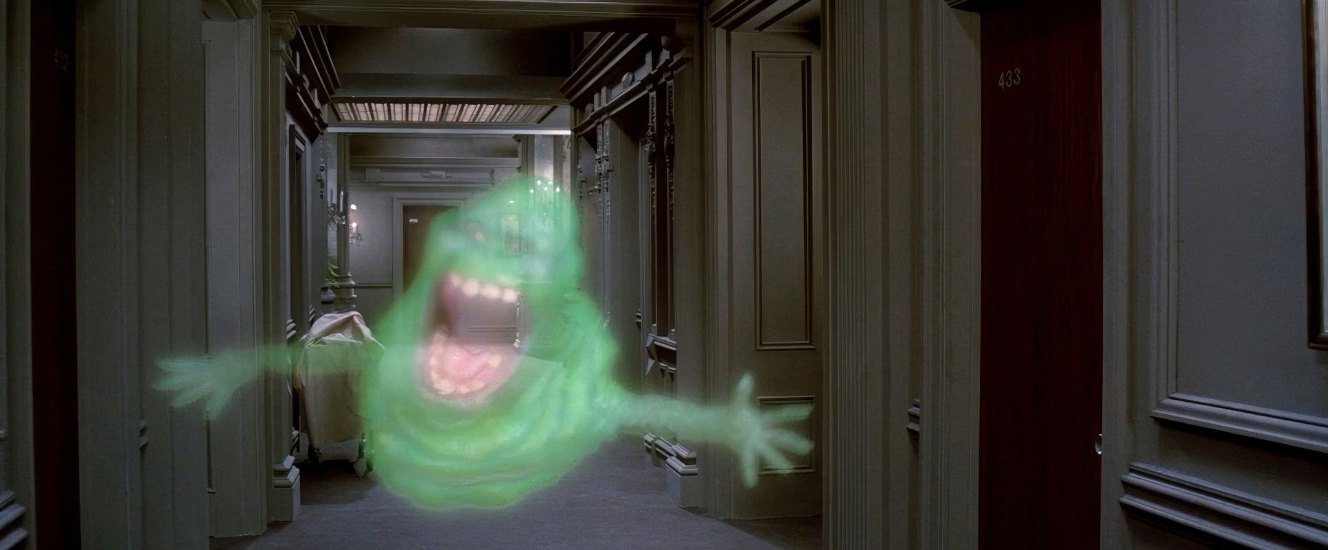
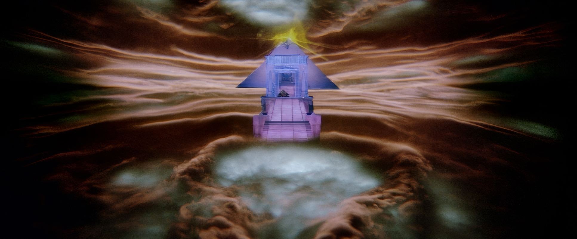
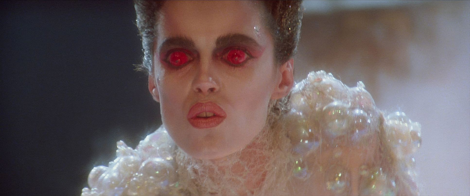
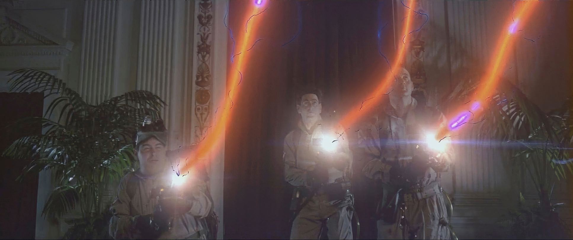
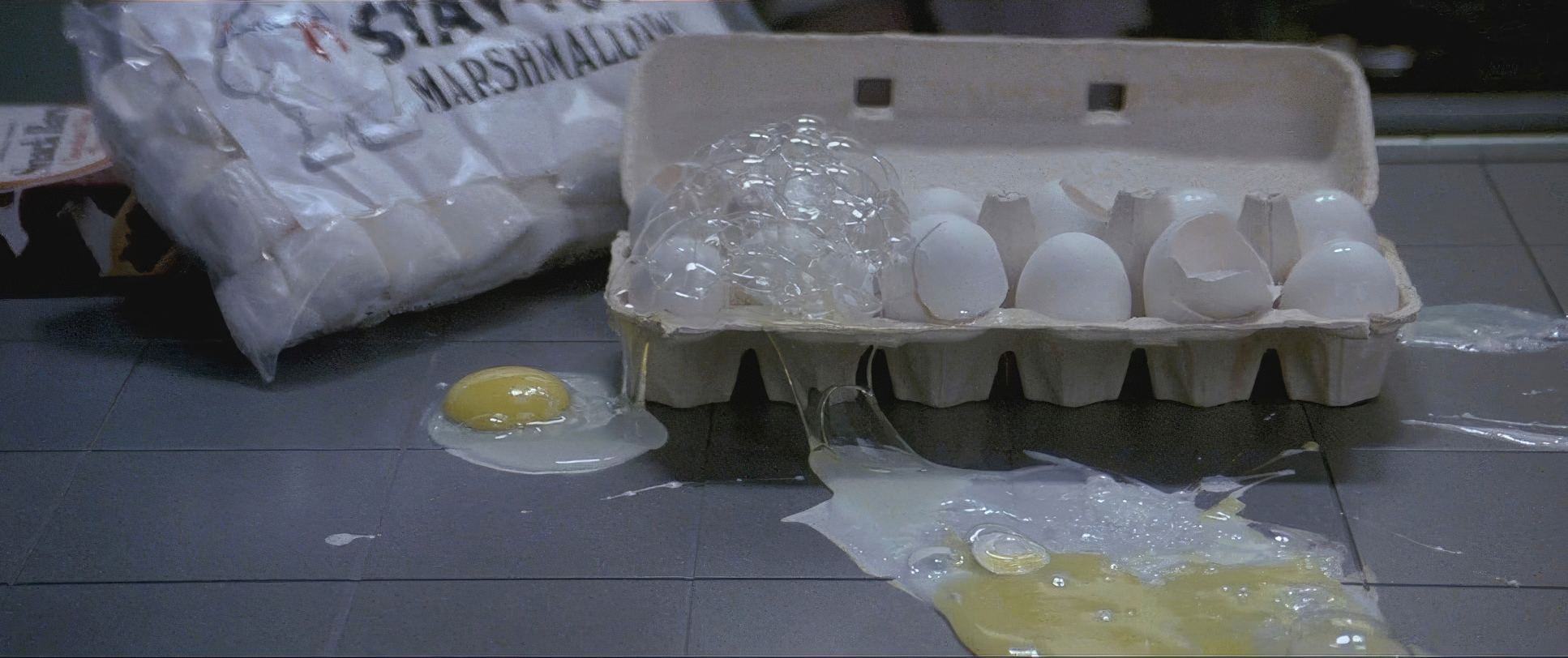
The film has a distinct density. The shadows aren’t “lifeless” like modern digital blacks; they have a rich, chunky texture. The palette for Manhattan is full of cool blues and grays, which makes the “supernatural” colors Slimer’s neon green, the electric purple of the proton streams, the “Zool” red eyes feel like they’re cutting through the film. There’s a tangible softness in the highlight roll-off that you only get from 35mm stock. The hue separation is clean, allowing the ghosts to inhabit the same space as the actors without looking like a “layer” in a composite. It’s tonal sculpting at its finest, guiding your emotions from a dry office meeting to a cosmic showdown without a single jarring transition.
Technical Aspects & Tools
Shot on 35mm Panavision, Ghostbusters is a testament to the organic power of film. This wasn’t a digital process; this was optical timing in a lab. That subtractive process gives the film a soul that modern “clinical” digital grades often lack.
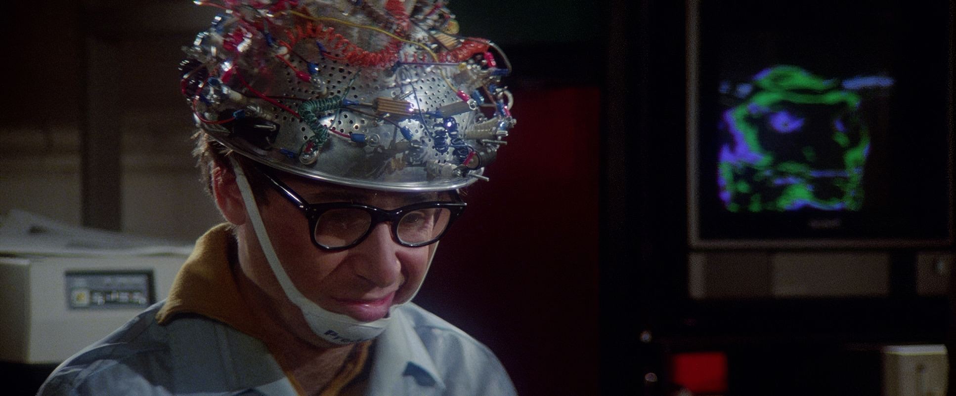
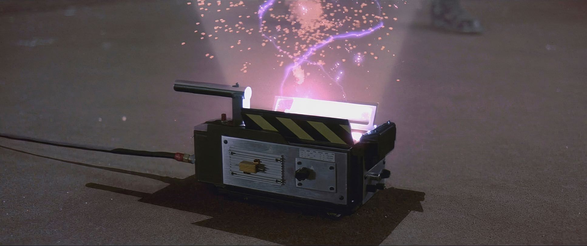
The real genius was the “hybrid” approach to tech. You’ve got early CGI, stop-motion, and massive practical sets all living together. Kovacs used his lighting to bridge the gap between these different mediums. Even though the “unlicensed nuclear accelerators” on their backs were just props, the way they were photographed the weight, the clunky analog textures makes them feel dangerous. They understood that the best VFX isn’t about the highest resolution; it’s about how well that effect is integrated into the visual fabric of the scene.
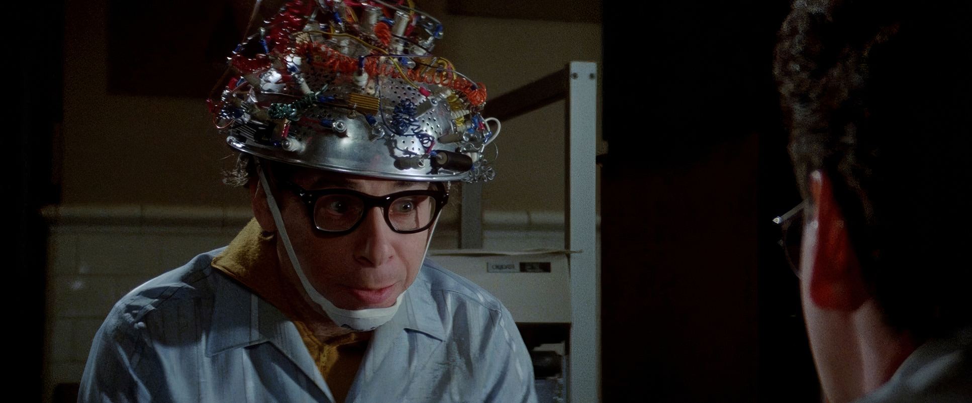
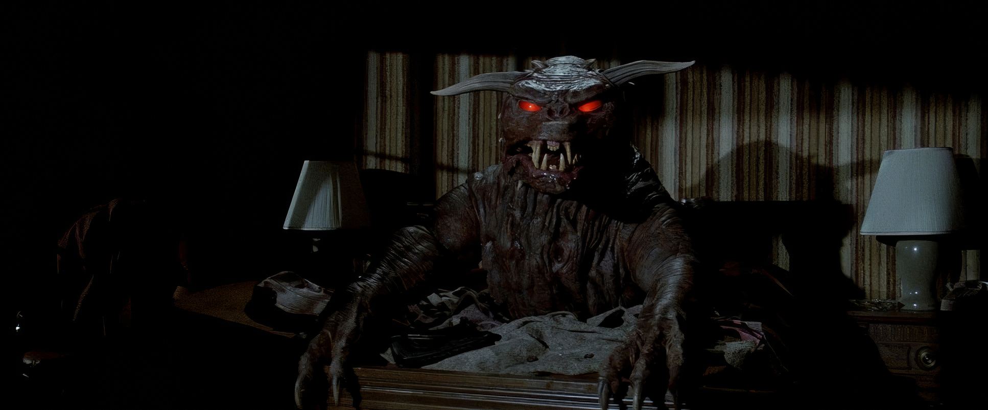
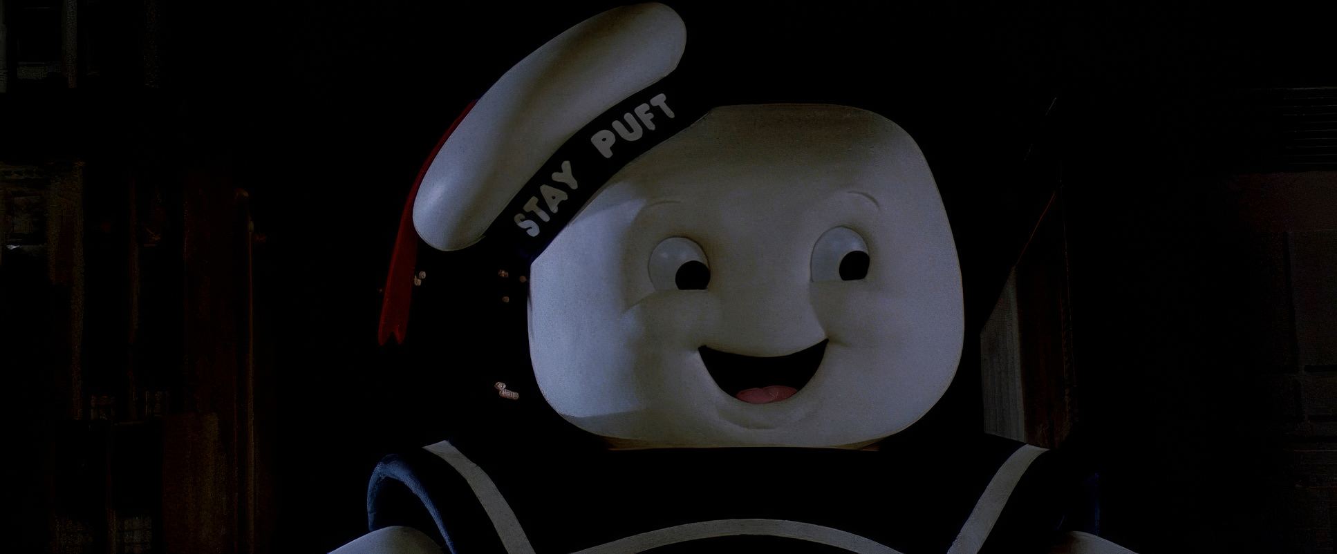
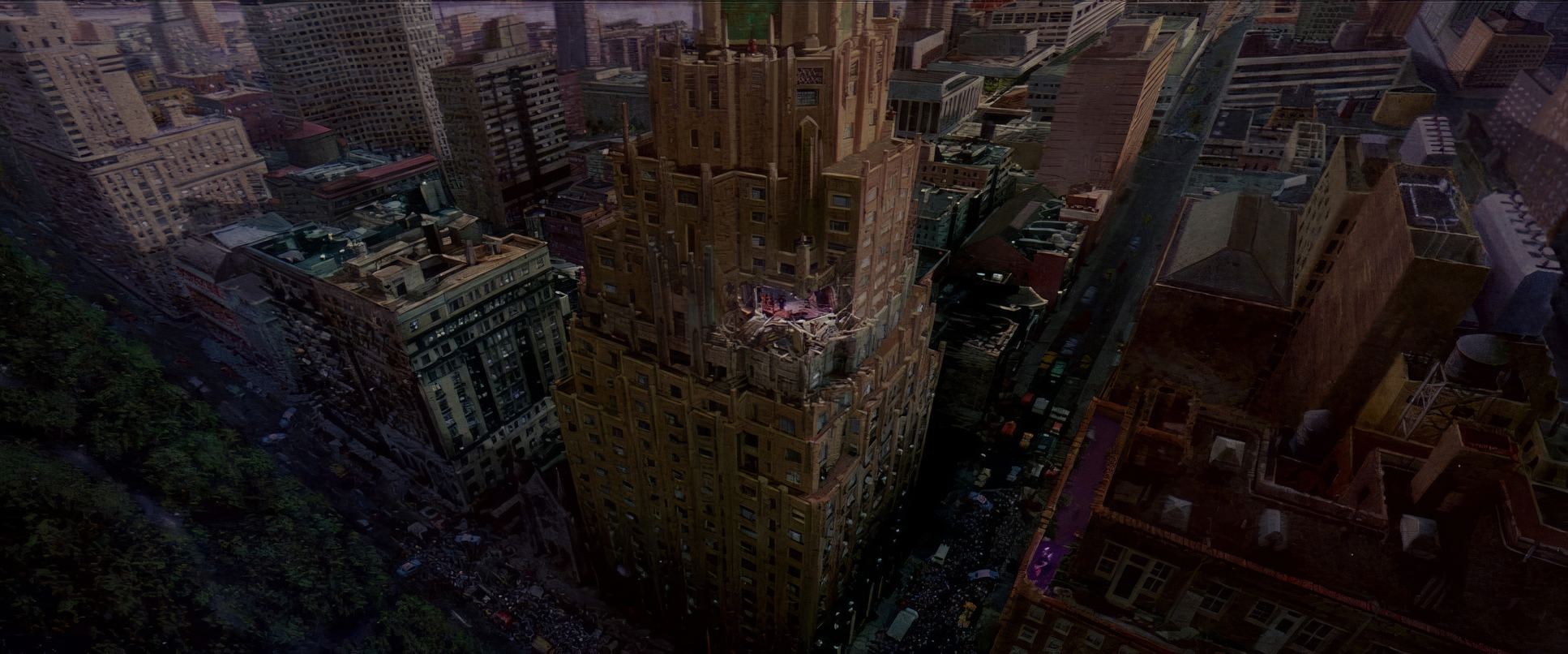
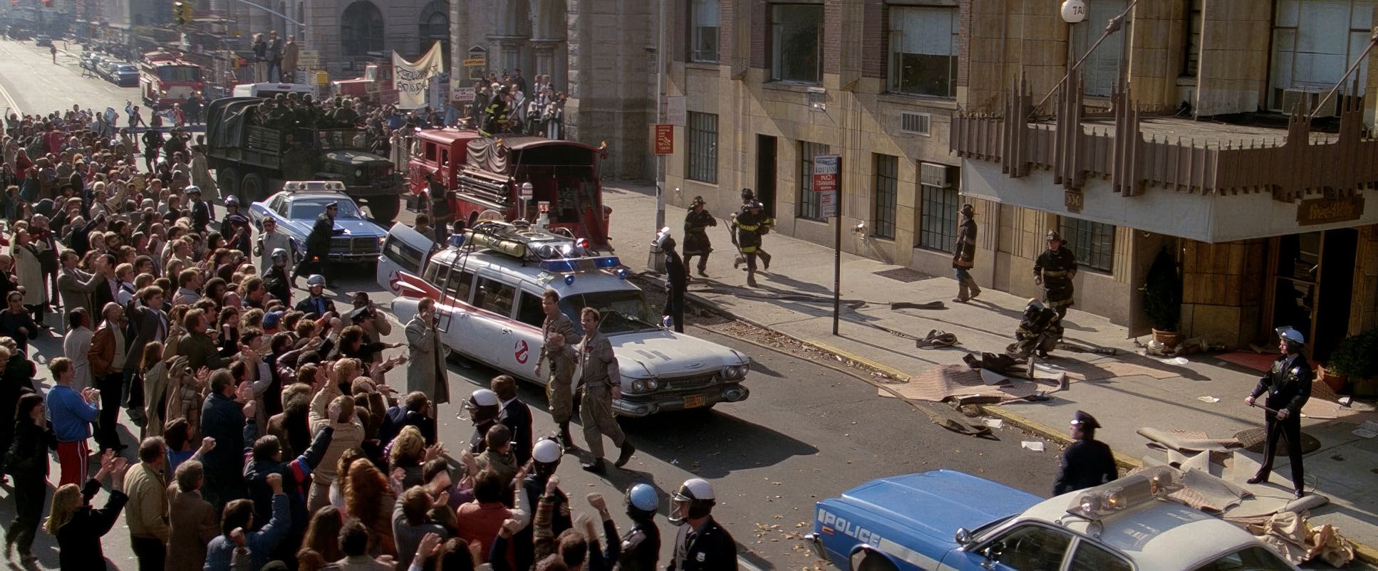
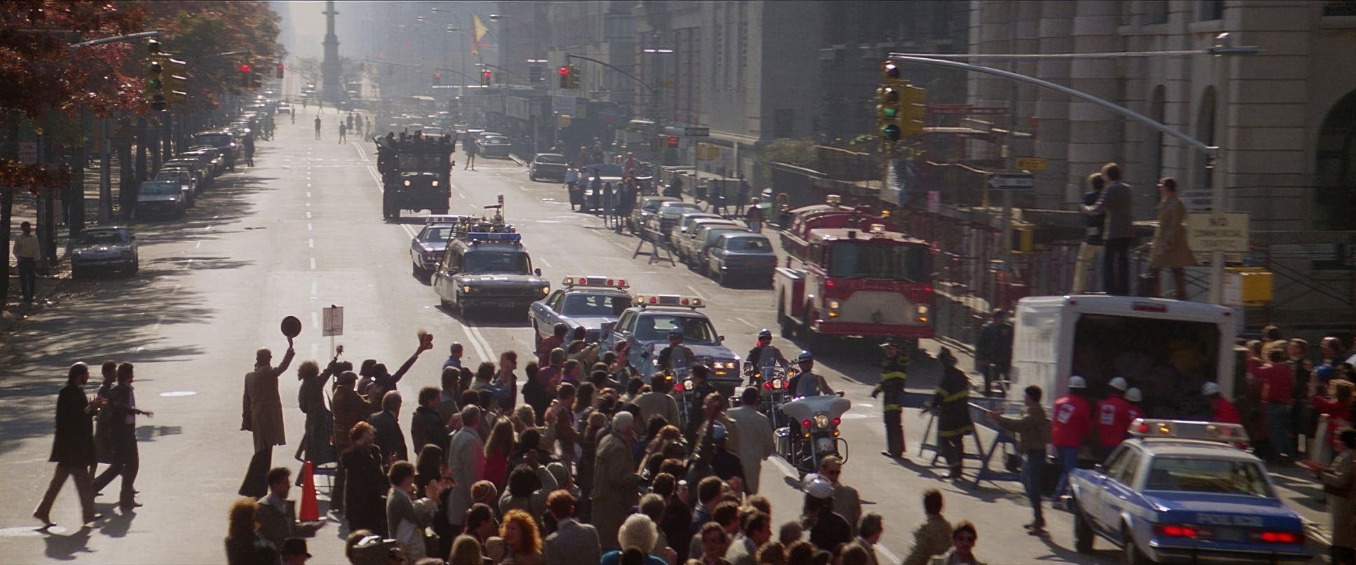
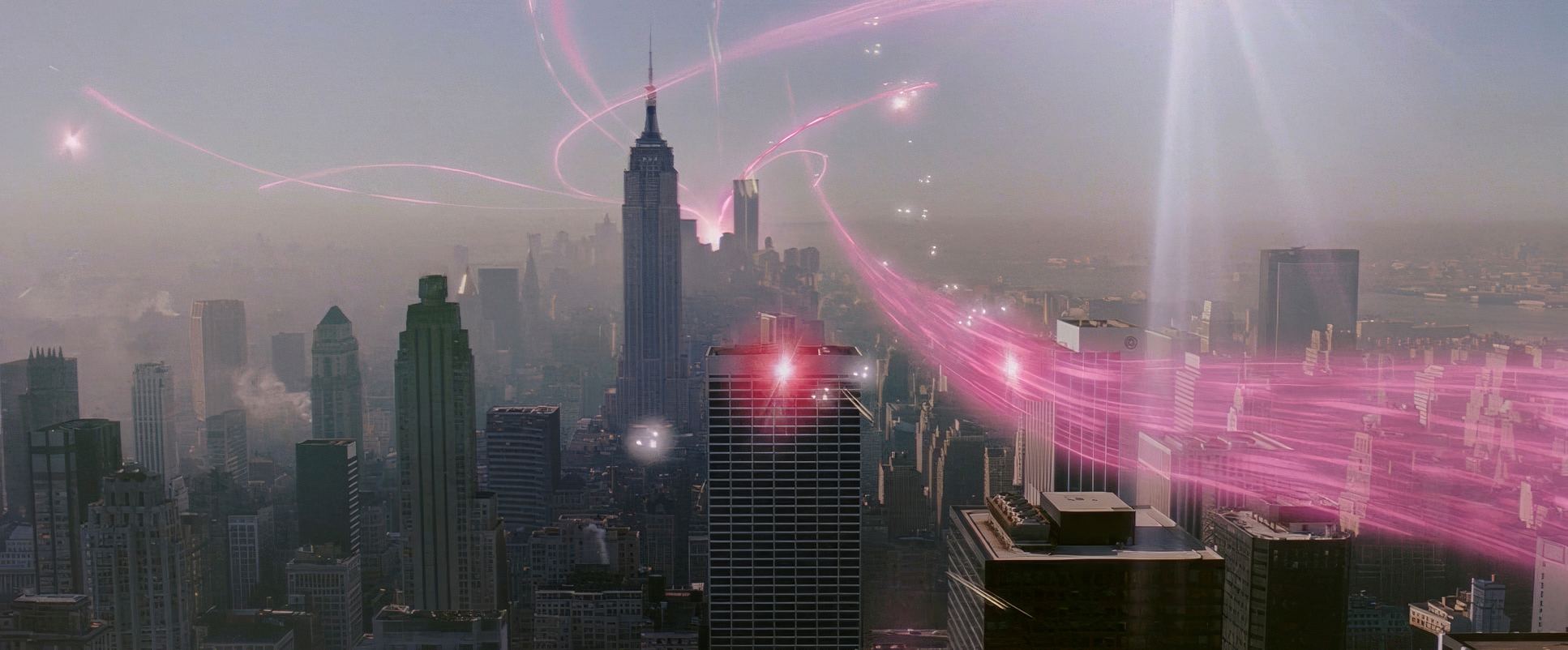
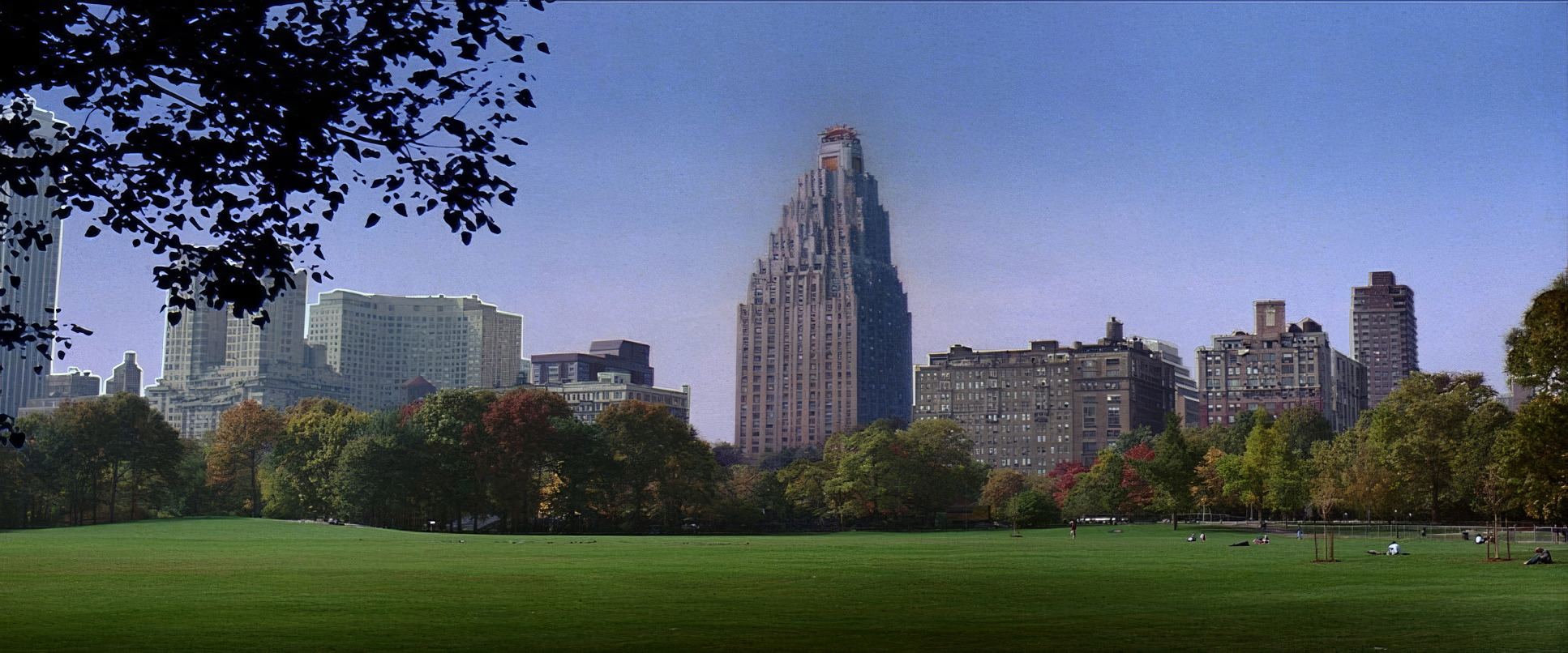
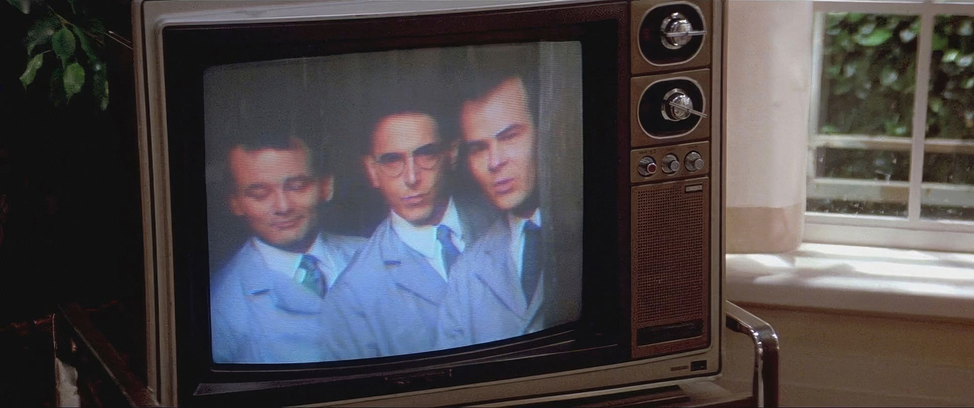
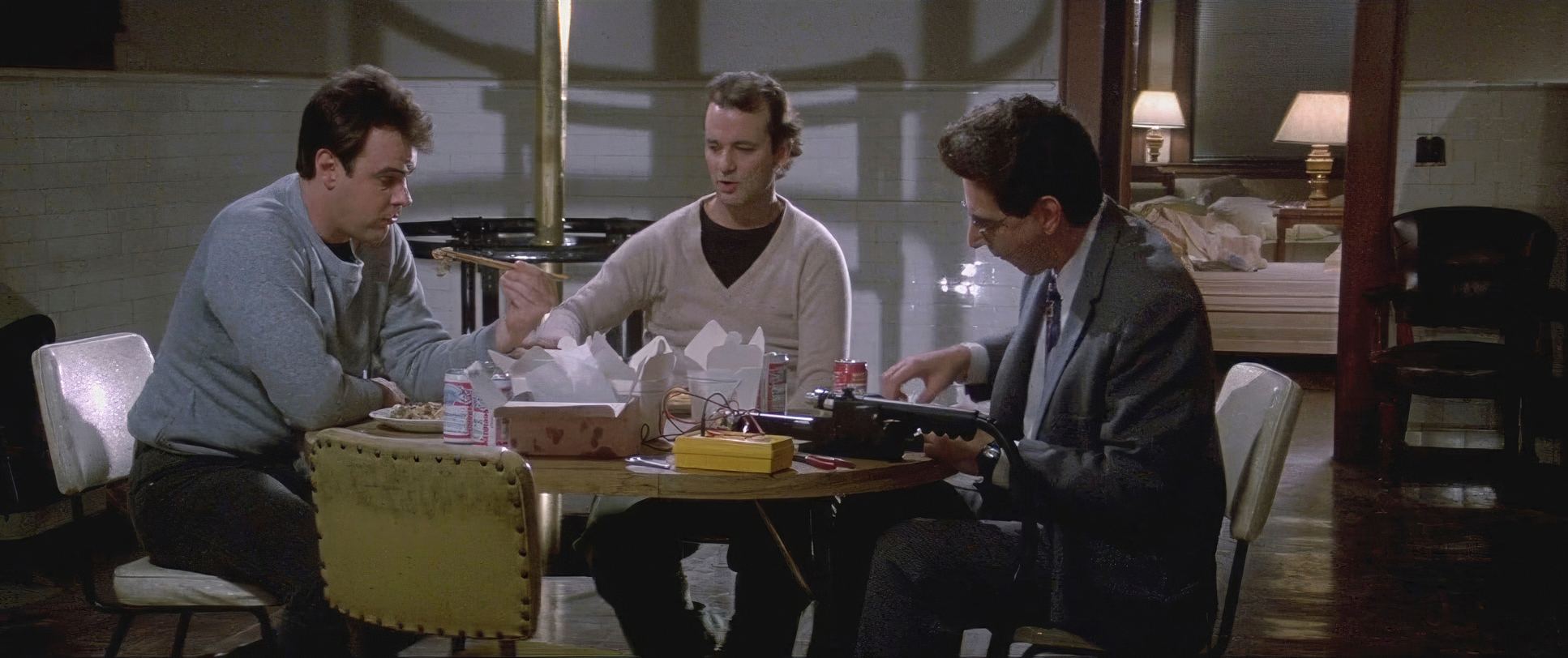
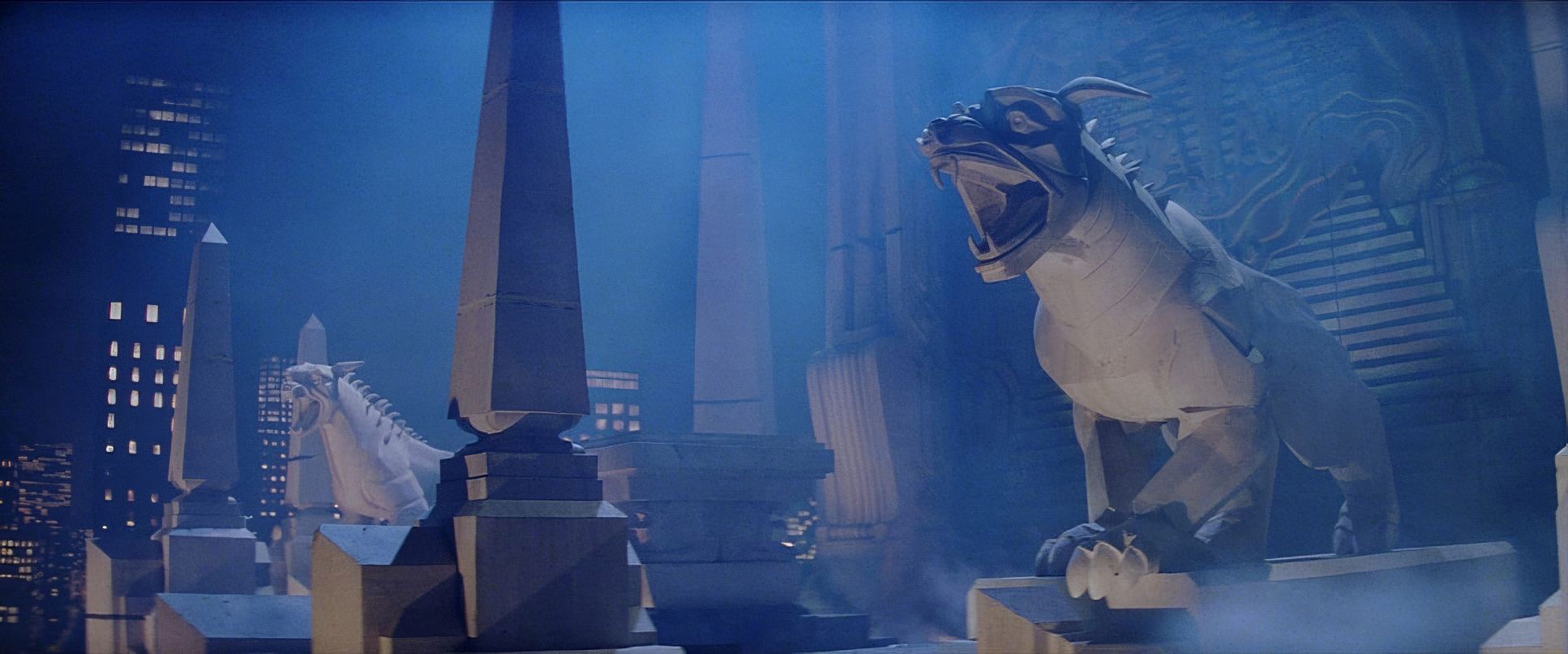
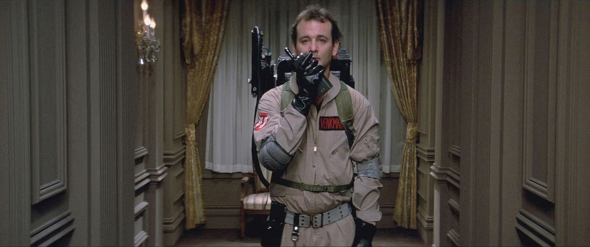
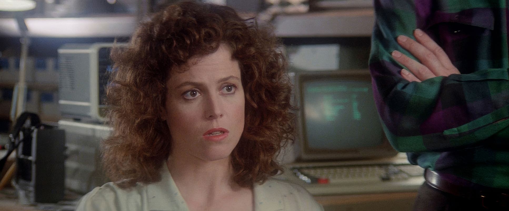
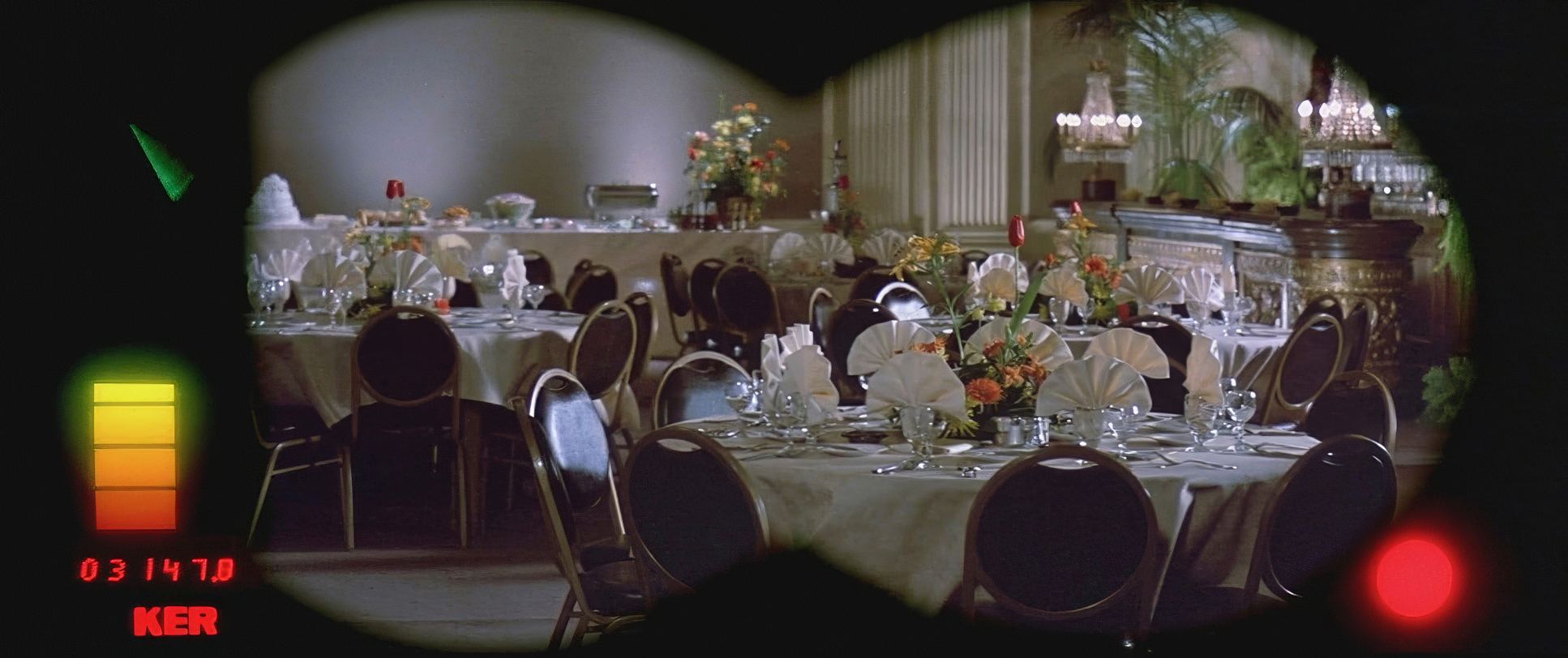
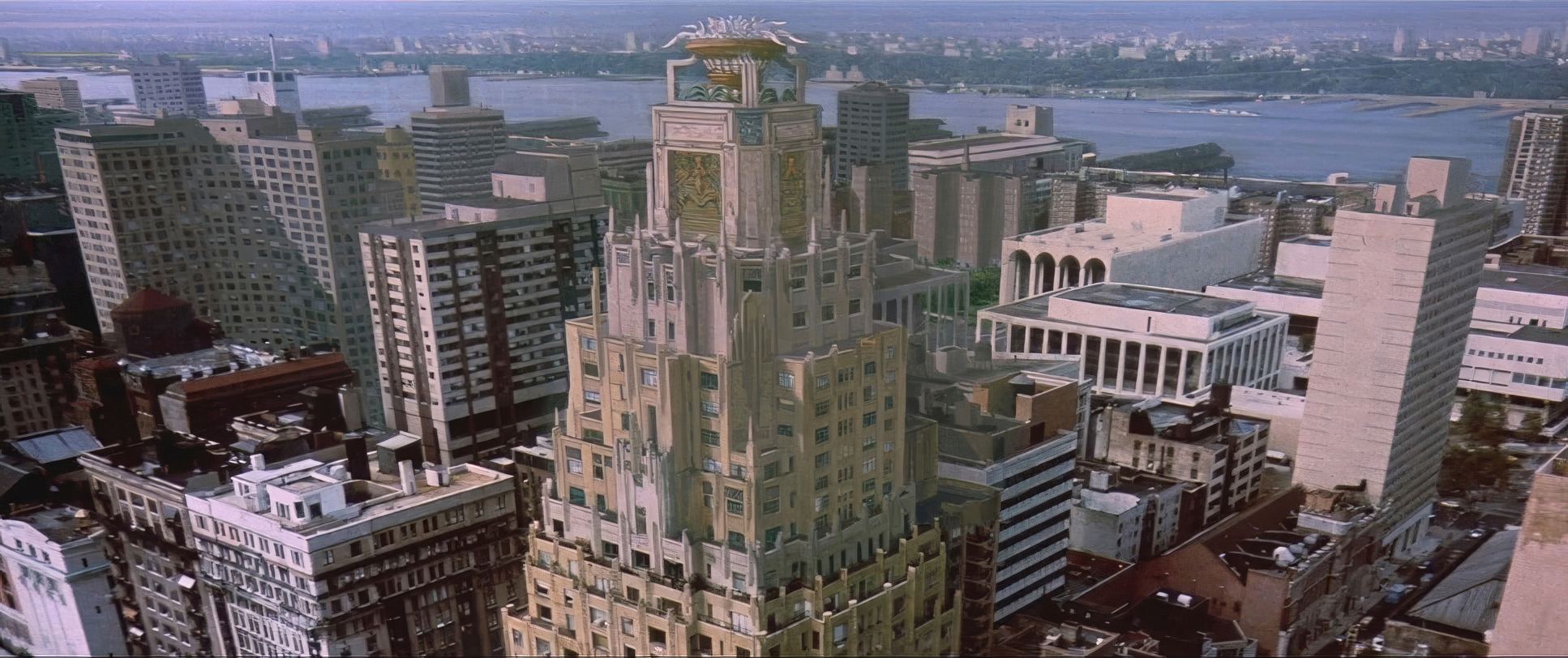
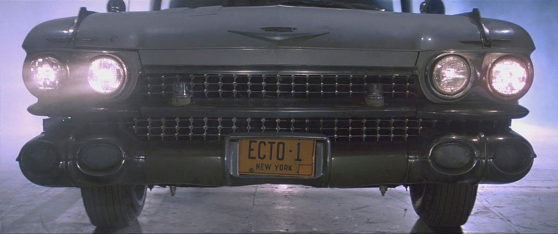
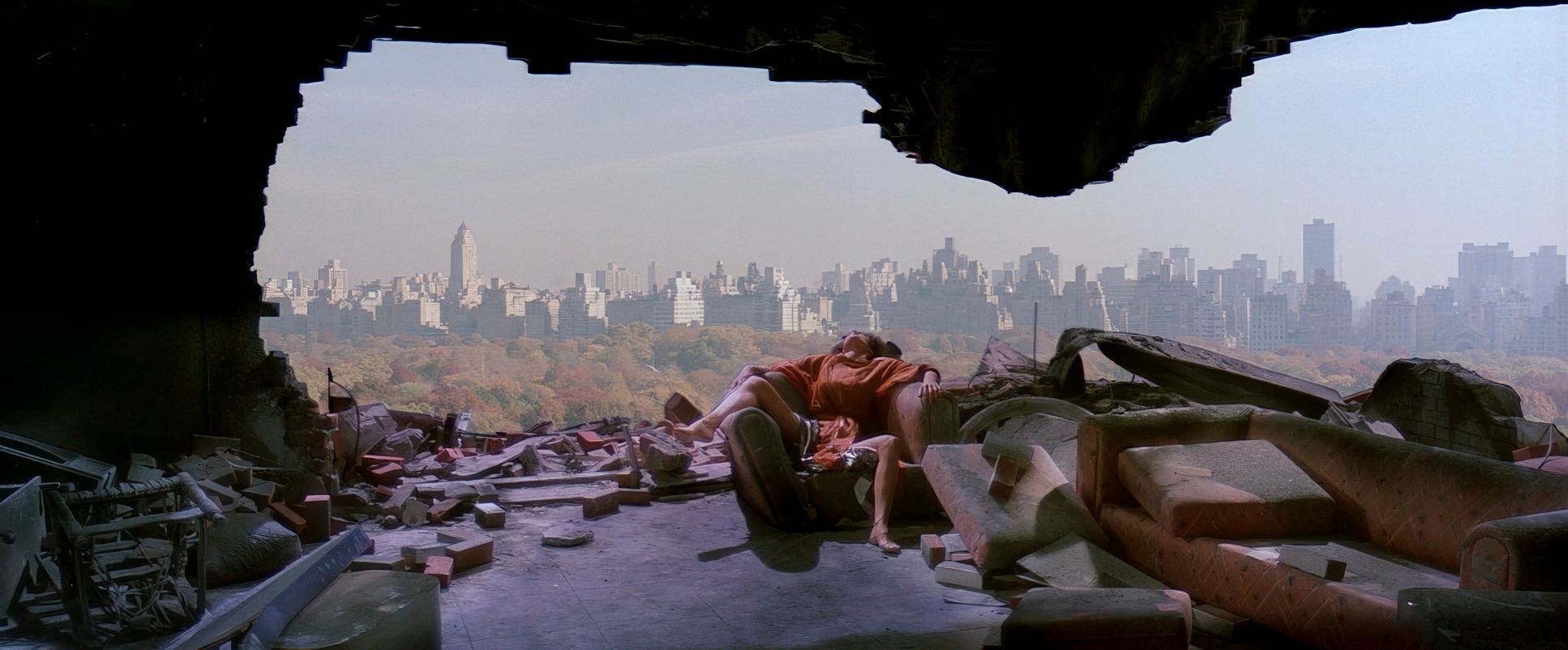
Ghostbusters (1984) Film Stills
A curated reference archive of cinematography stills from Ghostbusters (1984). Study the lighting, color grading, and composition.


- Also read: PREDATOR (1987) – CINEMATOGRAPHY ANALYSIS
- Also read: THE LAST SAMURAI (2003) – CINEMATOGRAPHY ANALYSIS
Browse Our Cinematography Analysis Glossary
Explore directors, cinematographers, cameras, lenses, lighting styles, genres, and the visual techniques that shape iconic films.
Explore Glossary →