Federico Fellini’s 8½ (1963), This isn’t just a movie; it’s a mirror. It’s a swirling, dreamlike exploration of a director’s mind literally unraveling under the pressure of his own reputation. From a visual standpoint, it’s a total masterclass—essentially the Italian Citizen Kane of the 1960s. For me, as a filmmaker and colorist, 8½ is a living reminder that cinematography isn’t just about documenting a scene; it’s about projecting a character’s internal chaos onto the screen. Every frame feels like a gallery print, carrying that soulful Italian spirit that I find myself returning to whenever I need a spark of inspiration.
About the Cinematographer
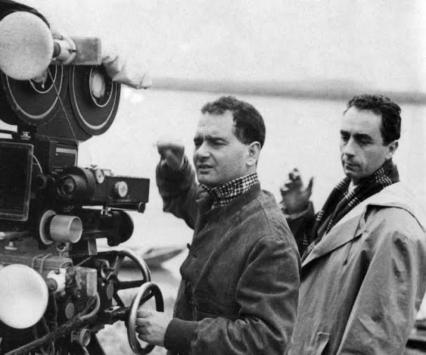
To understand the DNA of 8½, you have to look at the guy behind the glass: Gianni Di Venanzo. He was one of Italy’s giants, a cinematographer who could pivot from the gritty, documentary-style neorealism of the post-war era to something totally psychological. Before this, he was already doing incredible work with Antonioni on La Notte and L’Eclisse, where he proved he knew how to translate “boredom” or “alienation” into a visual identity.
His partnership with Fellini here was transformative. Fellini was moving away from the strict “real world” and getting, honestly, a bit eccentric and psychedelic. Di Venanzo was the perfect foil for that. He was technically elite, but more importantly, he had the gut instinct to translate Fellini’s increasingly weird, introspective visions into a cohesive language. He understood that black and white didn’t have to be “simple.” In his hands, it became a subconscious tour through what I like to call the “fun house of life.”
Inspiration Behind the Cinematography
The look of 8½ was born out of a very specific kind of hell: writer’s block. Fellini literally didn’t know what his ninth film was going to be, so he just decided to make a movie about the fact that he didn’t know. That struggle became the blueprint for the entire visual style.
The cinematography acts as a direct line into Guido Anselmi’s fractured psyche. You can feel Fellini experimenting; he found this “sweet spot” where he was confident enough to be playful and dark at the same time. The world of the film constantly oscillates. One minute you’re in a melancholy adult reality all hazy rooms and thick cigarette smoke and the next, you’re hit with these “psychedelic Fellini-isms” that feel like a fever dream. It’s a visual stream-of-consciousness that captures Guido’s lack of control, his memories, and his fears without ever needing to explain them.
Camera Movements
If I had to pick one thing that defines this film, it’s the movement. It never sits still. Terry Gilliam once said Fellini “shoots like a dancer,” and he’s right. The camera is an active participant in the scene, shifting and weaving through memories and fantasies.
We see these incredibly precise dolly and tracking shots that aren’t just there to look fancy they’re expressive. When Guido is walking through the hotel or the movie set, the camera follows with a balletic grace, but there’s an underlying tension to it. It reflects his inability to escape. People are constantly popping into the frame, demanding his attention, while he “tap-dances” through the chaos.
The camera movement provides this incredible elasticity. Look at the opening: Guido is stuck in a suffocating traffic jam, then suddenly he’s floating out of his car and up into the sky. The camera literally liberates itself from the ground, mirroring his fleeting moment of escape before he’s yanked back down to reality. It’s dynamic storytelling in its purest form.
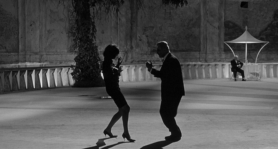
Compositional Choices
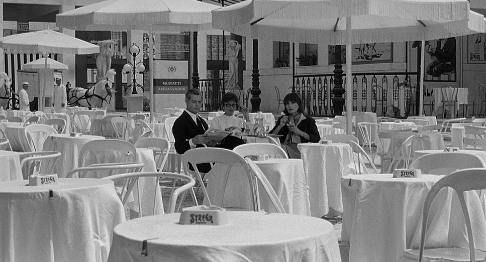
The compositions here are, frankly, operatic. We aren’t looking at stripped-back realism; we’re looking at visual maximalism. I’ve said it before: I’d frame almost any single shot from this film and put it on my wall.
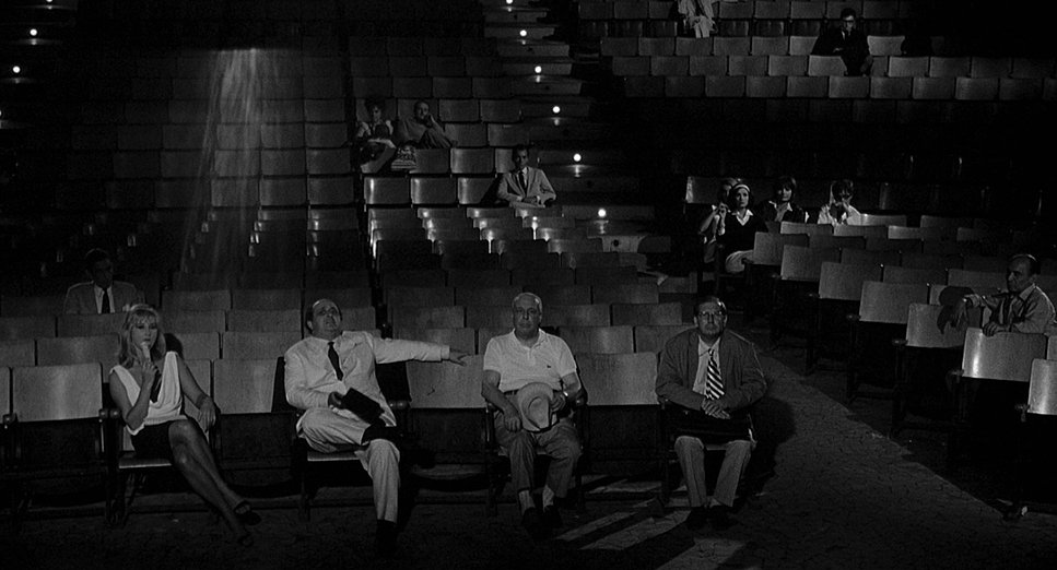
Di Venanzo packs his frames. In the public scenes the spa or the production office the compositions are dense and cluttered. Using deep focus, he creates these layers of reality and subconscious thought happening all at once. It feels claustrophobic, mirroring Guido’s mental state.
But then, he’ll pivot to a shot of striking isolation. Guido will be framed as a tiny speck in a massive, empty space, emphasizing just how lonely he is despite the crowd. There’s a restless energy to the framing; even in the “static” shots, things are constantly entering and exiting the frame at the edges. The final carousel sequence is the ultimate example: a perfectly orchestrated tableau of everyone in Guido’s life circling him. It’s the “circus of existence” distilled into a single, beautiful, absurd image.
Lighting Style
Now, this is where it gets really good. In a black-and-white world, lighting is your only tool for sculpting mood. The way Di Venanzo uses shadows, smoke, and highlights is just gorgeous.
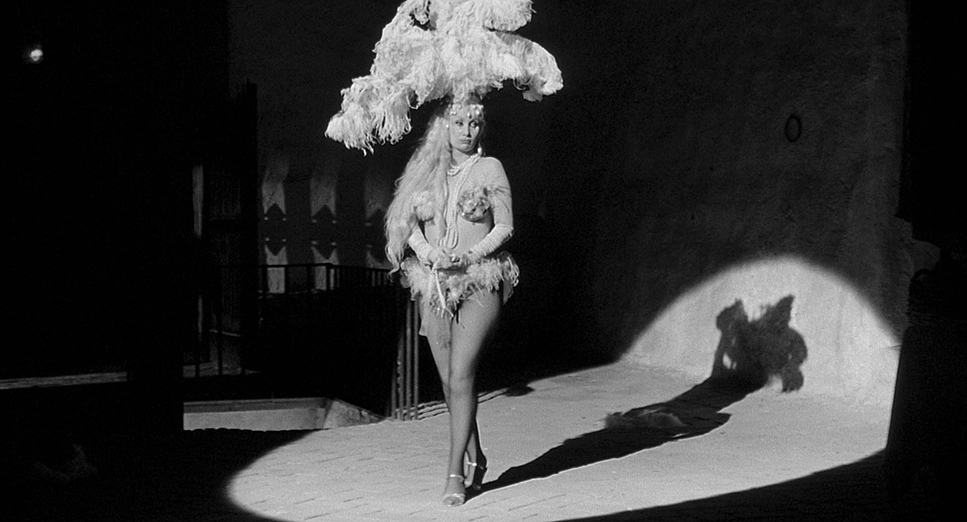
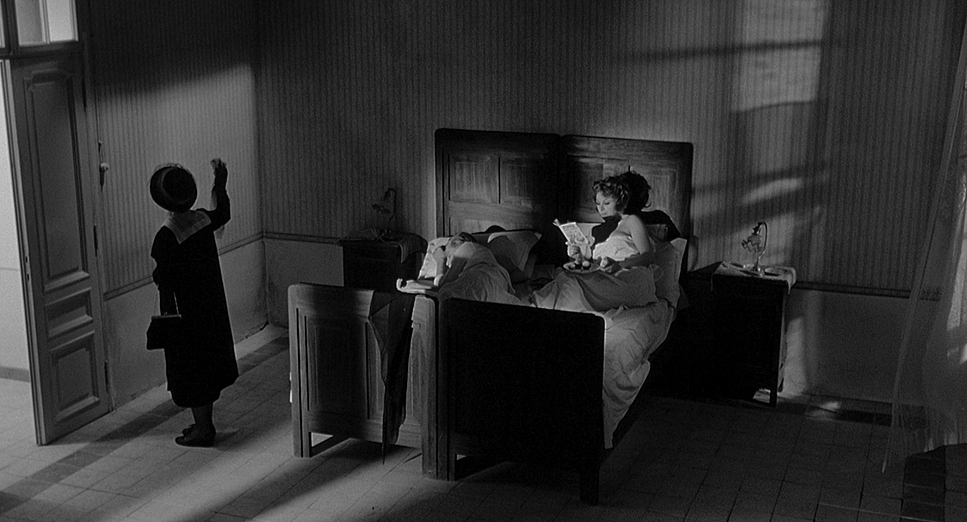
The film uses heavy contrast, almost like a 1960s take on chiaroscuro. Shadows aren’t just “dark spots” they have weight and personality. The smoke isn’t just a prop, either; it’s an integral part of the lighting rig, diffusing the sources to create that hazy, “delirium of alcohol” feel. It softens the edges of the world, making everything feel slightly untethered from reality.
Flashbacks to Guido’s childhood have this softer, almost ethereal glow, while the “harem” fantasy sequence is lit with a chaotic energy that eventually turns quiet and sad. Di Venanzo was a master at using the dynamic range of the film stock to show us exactly how Guido was feeling. Every nuance of his emotional landscape is written in the interplay of light and shadow.
Lensing and Blocking
The “fun house” aesthetic of 8½ comes down to the lensing and the way Fellini choreographs his actors. They used wide-angle lenses to capture the busyness of the sets, but those lenses also add a subtle distortion. It makes the world feel slightly “off,” almost cartoonish which makes sense, given Fellini’s background as a cartoonist. It stretches the world, making the people in the foreground feel imposing and overwhelming.
Then you have the blocking. Fellini’s background in theater is all over this. Characters don’t just stand there; they move with a musical rhythm. The scene where Guido avoids the crowd in the corridor is a masterclass in blocking. It’s a literal dance of avoidance. The way the crowd moves in relation to the camera tells you everything you need to know about the pressure Guido is under without a single line of dialogue.
Color Grading Approach
As a colorist, looking at a black-and-white film like this is a fascinating exercise in “tonal sculpting.” Since you don’t have hue to work with, contrast and luminosity are everything.
If I were grading this today, I’d be obsessing over the mid-tones. For that “psychedelic” and “hazy” vibe, you don’t want to just crush the blacks or blow out the highlights. You need a delicate highlight roll-off and rich, textural blacks that still hold detail in the shadows. I’d want that “melancholy” look, which you get by slightly elevating the black point in certain scenes it gives the image a softer, smoky feel, like you’re looking through a veil.
For the more intense dream sequences, I’d punch up the contrast to give the image more “snap.” It’s all about shaping the light to hit those emotional beats. I’d also be very protective of the film grain. It needs to feel organic and “thick,” adding texture to the skin tones and the environment. In monochromatic work, you’re not just capturing light; you’re carving it.
Technical Aspects & Tools
8½ (1963) — Technical Specifications
| Genre | Drama, Fantasy, Magical Realism, Psychological Horror, Horror, Melodrama |
| Director | Federico Fellini |
| Cinematographer | Gianni Di Venanzo |
| Production Designer | Piero Gherardi |
| Costume Designer | Piero Gherardi, Leonor Fini |
| Editor | Leo Cattozzo |
| Colorist | Ivan Tozzi |
| Time Period | 1960s |
| Color | Desaturated, Black and White |
| Aspect Ratio | 1.85 – Spherical |
| Format | Film – 35mm |
| Lighting | Hard light, High contrast, Side light, Edge light |
| Lighting Type | Daylight, Sunny |
| Story Location | Europe > Italy |
| Filming Location | Europe > Italy |
| Camera | Arriflex |
Back in 1963, pulling this off was a massive technical feat. They were likely using Arriflex 35II or Mitchell cameras the real workhorses of that era paired with Kodak Double-X or Tri-X film stocks.
The fluid camera movements required serious crane and dolly work, especially in those tight, crowded sets. Remember, this was all done before digital monitors or instant playback. Di Venanzo had to be incredibly precise with his exposures because the “look” was largely baked into the negative on set. The sophisticated gray scale and that “hazy” atmosphere weren’t fixed in post-production; they were the result of elite on-set control and master-level lab technicians. It’s a great reminder that imagination and technical discipline are the ultimate tools, even without modern digital “magic.”
- Also read: INFERNAL AFFAIRS (2002) – CINEMATOGRAPHY ANALYSIS
- Also read: PERSONA (1966) – CINEMATOGRAPHY ANALYSIS
Browse Our Cinematography Analysis Glossary
Explore directors, cinematographers, cameras, lenses, lighting styles, genres, and the visual techniques that shape iconic films.
Explore Glossary →