There are certain films that just… stick. They don’t just tell a story; they rewire how you see light, frame a shot, or sculpt a mood. Terry Gilliam’s 12 Monkeys (1995) is one of those for me. Running Color Culture, I spend a lot of time obsessing over image fidelity, but this film throws “clean” out the window in favor of something far more visceral. It’s a dense mix of sci-fi mystery and psychological thriller that defies easy categorization. From the moment I first saw Cole’s haunted eyes scanning a desolate Philadelphia, I knew I wasn’t watching a standard blockbuster. The visual language is as disorienting as the time-bending narrative, pulling you into a loop of questions about fate and perception. It’s a perfect example of how directorial vision and technical execution collide, and frankly, it’s a joy to unpack.
About the Cinematographer
While Terry Gilliam’s authorial stamp on 12 Monkeys is heavy his love for controlled chaos is in every framewe have to give credit to the hands on the wheel: Director of Photography Roger Pratt. Pratt and Gilliam had a serious creative shorthand by this point, having already survived Brazil (1985) and The Fisher King (1991) together. Gilliam is famously hands-on, often sketching his own storyboards with a very specific idea of the frame. Pratt’s genius was translating that sometimes-fantastical, always-gritty vision into actual exposure and shadow. Pratt is known for handling complex lighting setups for practical effects without losing the narrative thread. For 12 Monkeys, he had to navigate two distinct worlds: a grimy, claustrophobic future and a disorienting, cluttered past. He did it with a raw, almost documentary-like sensibility that grounded Gilliam’s surrealism. It’s the kind of partnership that proves a DP isn’t just a technician; they are the translator of the director’s dreams.
Inspiration Behind the Cinematography
You can’t talk about 12 Monkeys without nodding to its source material: Chris Marker’s 1962 French short, La Jetée. That film is famous for being composed almost entirely of still photographs, which gives it this haunted, archival quality. Adapting that static feeling into a moving picture was the real challenge here. Roger Pratt and Gilliam didn’t try to copy La Jetée literally; they absorbed its vibe. The film operates on the theory that the past is unchangeable a painful, never-ending loop.
Visually, they reinforced this by making the cinematography feel like a series of vivid, unreliable memories. The recurring imagery of the airport isn’t just a plot point; it functions like the “still images” of the original short—a frozen moment Cole keeps crashing back into. The disjointed jumps between timelines create a sense that reality itself is a construct, much like the fantasy world the character Catherine Riley thinks Cole is inventing. The camera work forces the audience to question what they see, putting us right in Cole’s headspace where sanity is slippery.
Camera Movements
The camera in 12 Monkeys is an active participant in Cole’s psychological unraveling. There is a sharp, deliberate contrast between the movement in the future versus the past.
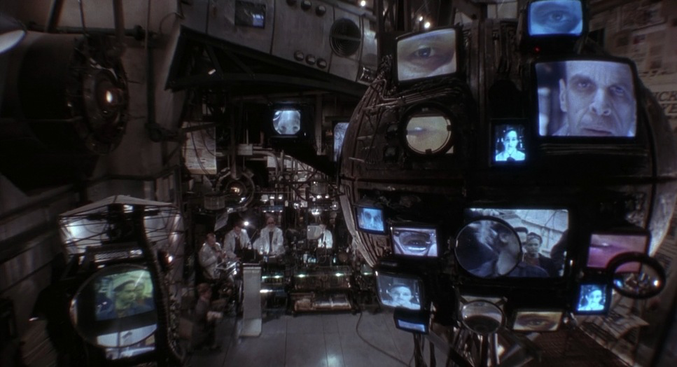
In the future timeline, the camera feels heavy, mechanical, and locked down. It mirrors the subterranean existence of the survivors and the crushing authority of the scientists. We see a lot of lateral dollies and slow, deliberate pushes. It emphasizes claustrophobia and the feeling of being observed. When Cole is strapped into the time travel chair, the spinning camera work isn’t just a flashy effect; it’s a visual assault that replicates the trauma of his projection.
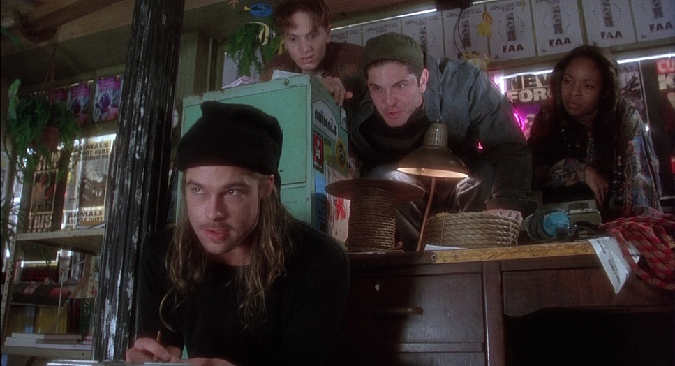
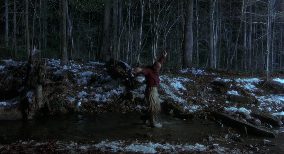
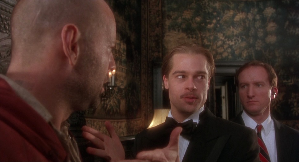
Contrast that with the past, specifically the asylum scenes. Here, the camera goes handheld and jittery. It tries to keep pace with the manic energy of Jeffrey Goins (Brad Pitt). It swerves, cuts abruptly, and often adopts a Dutch angle, reinforcing the instability of the world Cole has landed in. Even when the camera is on a tripod, the compositions feel off-kilter. Gilliam loves to use wide lenses to shoot things at uncomfortable angles, making the world feel like it’s spiraling out of control. It’s a brilliant way to make the audience feel as disoriented as the protagonist.
Compositional Choices
Gilliam and Pratt’s composition here is a lesson in visual density. A hallmark of the “Gilliam look” is the use of wide-angle lenses to distort perspective, stretching faces and bending lines at the edges of the frame. This isn’t just for style; it disorients the viewer. It creates a subconscious unease, blurring the line between reality and delusion.
The film is also incredibly rich in depth cues. Gilliam hates empty space. He fills the frame with clutter, forcing your eye to work to find the subject. Whether it’s the decaying interiors of the future bunkers with their exposed pipes and “steampunk” junk-tech, or the trash-filled streets of the 90s, every frame is packed. This layering often obscures Cole, making him feel small against the backdrop of history’s inevitable march.
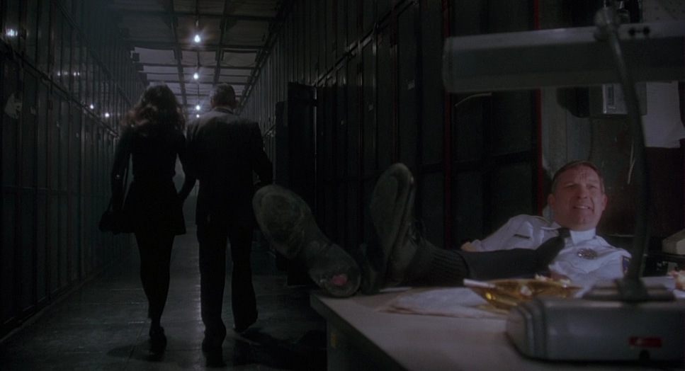
Framing is used aggressively to suggest confinement. Characters are constantly boxed in by doorframes, windows, or intricate set design. Even in close-ups, the framing is tight, capturing the raw emotion while maintaining that sense of entrapment. It creates a dense, immersive world that feels suffocating, which is exactly what the story demands.
Lighting Style
Lighting is the primary tool Pratt uses to separate the timelines. In the dystopian future, the lighting is stark and utilitarian. It’s largely motivated by practical sources flickering fluorescent tubes, raw industrial lamps, or the harsh glow of screens. This creates a high-contrast look with deep, crushed shadows. It feels cold, metallic, and devoid of the sun.
When Cole jumps to the past, the lighting shifts, but it doesn’t get “prettier.” While there is more natural light, it’s often rendered with a sickly or harsh quality. The asylum is lit with practicals that give off a jaundiced green or yellow hue, making the environment feel unhealthy. Street scenes feel dingy, often underlit or bathed in the unglamorous glow of sodium vapor lamps.
Even in the romantic beats between Cole and Riley, you rarely get traditional “Hollywood” beauty lighting. Everything feels a bit exposed and raw. This refusal to glamorize the image keeps the audience off-balance and prevents the film from ever feeling safe.
Lensing and Blocking
This is where the technical choices really shine. We know Pratt utilized Cooke S3 lenses, likely paired with the Moviecam Compact. The choice of Cooke S3s is interesting because, while they are sharp, they have a distinct “Cooke look” that offers a bit of roundness and warmth, which contrasts interestingly with the harsh subject matter.
Pratt and Gilliam leaned heavily into the wide end of that focal range likely the 18mm or 25mm, and occasionally wider. On a Super 35 format, these wide spherical lenses create that signature distortion where the background feels pushed away and facial features are slightly exaggerated. For a colorist, this is fascinating because the lens distortion affects how light falls off in the corners (vignetting), which naturally focuses the eye toward the center.
Blocking is equally precise. Gilliam stages scenes with deep focus in mind. He often places Brad Pitt’s character in the foreground or darting through the background, utilizing the entire Z-axis of the frame. Because they stopped down the lens to keep deep focus, both the manic foreground and the chaotic background are often sharp, leaving the eye nowhere to rest.
Color Grading Approach
Stepping into the color suite for 12 Monkeys today would be a massive exercise in texture management. The film was shot on Kodak EXR 500T (stocks 5298/7298). That is a high-speed tungsten stock known for having a prominent, gritty grain structure.
If I were grading this, my first move would be to preserve that grain. Modern noise reduction would kill the soul of this movie. The future timeline demands a desaturated, monochromatic palette heavy on cyans, cool blues, and steels. I’d lean into contrast shaping, crushing the blacks to feel that underground oppression, but letting the highlights roll off with a metallic sheen.
For the past (the 90s), I’d separate the hues. It shouldn’t look “good” it should look “real.” I’d push for sickly greens and muted yellows in the asylum, creating a palette that feels slightly bilious. However, I’d allow specific primaries like a red sign or a yellow jacket to pop through the grime. The key would be tonal sculpting: using power windows to subtly darken the edges of the wide-angle shots to enhance the claustrophobia. The goal isn’t a pretty image; it’s an anxious one.
Technical Aspects & Tools
12 Monkeys (1995)
Technical Specifications| Genre | Mystery, Science Fiction, Thriller, Time Travel, Post-Apocalyptic |
|---|---|
| Director | Terry Gilliam |
| Cinematographer | Roger Pratt |
| Production Designer | Jeffrey Beecroft |
| Costume Designer | Julie Weiss |
| Editor | Mick Audsley |
| Colorist | Eddie Wilder |
| Time Period | Future |
| Color | Cool, Desaturated |
| Aspect Ratio | 1.78 – Spherical, Super 35 |
| Format | Film – 35mm |
| Lighting | Hard light |
| Lighting Type | Daylight, Artificial light, Practical light, Mixed light |
| Story Location | … Pennsylvania > Philadelphia |
| Filming Location | … Pennsylvania > Philadelphia |
| Camera | Moviecam Compact |
| Lens | Cooke S3 |
| Film Stock / Resolution | 5298/7298 EXR 500T |
The technical specs of 12 Monkeys tell you exactly what kind of movie this is. It was shot on 35mm film using the Moviecam Compact, which makes sense given how much handheld work and tight-space shooting was required. The choice of Kodak EXR 500T was crucial. Since they were shooting largely in dim, industrial sets or practical locations, they needed that 500 ASA sensitivity. That stock naturally brings a level of grain that digital sensors fight hard to emulate.
The Cooke S3 lenses provided the optical personality. They are spherical lenses, but when you go wide with them on a 1.78 / 1.85 aspect ratio, you get that expansive field of view without the anamorphic squeeze. The lighting was a mix of hard HMI sources for the daylight scenes and practical tungsten fixtures for the interiors, requiring careful color balancing in the lab.
In the pre-DI (Digital Intermediate) era, the “grading” was done via color timing on the negative. This meant the DP had to get it right in camera. The consistency they achieved between the practical effects, the miniatures, and the location work is a testament to Pratt’s exposure discipline.
- Also read: THE BOURNE ULTIMATUM (2007) – CINEMATOGRAPHY ANALYSIS
- Also read: INTO THE WILD (2007) – CINEMATOGRAPHY ANALYSIS
Browse Our Cinematography Analysis Glossary
Explore directors, cinematographers, cameras, lenses, lighting styles, genres, and the visual techniques that shape iconic films.
Explore Glossary →